Looking to create or optimize your web design firm’s landing pages, lead generation pages or sales pages?
Want to see some examples with reasons why some of the elements work and don’t work?
In this article, I’ll go over the notable points and downfalls of 3 landing pages advertising web design services.
Let’s go over some quick reminder points first on the purpose of a landing page. This will help provide a bit of context to remember as we critique these landing pages.
You have a website, right? Well that website has different parts of it – different pages visitors click-through.
Well, when we use one of those pages in a marketing context (like we are now), we refer to it as a landing page – a page within your website that exists for a single purpose. This purpose is usually either lead generation or a step in your sales funnel.
Are we on the same page now? If you’re feeling a bit out of your league, check out this article for a guide to landing page terms. Okay, let’s get to it.
oDesk
oDesk is an online job marketplace where freelancers create profiles and businesses go to find job candidates.
What I like:
The Call-to-Action button: I like that it contrasts with the background of the landing page. The word “free” makes the risk vs reward ratio favorable, and it also works well as a value proposition.
The customer testimonial: I love how it cites a real company and person, not just “Marjorie.” This makes you trust the legitimacy of the customer testimonial, as it’s more specific.
Top client’s logos as trust symbols: If a successful business such as Pinterest uses oDesk to find web designers, why am I not using oDesk? This works in the same type of way as a brand saying that a celebrity uses their products.

The social endorsement: Mentioning that one million people use oDesk doesn’t hurt. Social endorsements are known as another type of value proposition. It’s an assumed value that we place on things because others have.
The Guarantee: It’s a promise that you will be compensated fairly. This provides a sense of assurance and trust with the fact that they track the time you worked so you don’t get screwed.
What I’d change or test:
Make the Call-to-Action more noticeable: Yes, the CTA button contrasts with the background, but not the whole landing page. I would suggest testing purple or red for the CTA button.
An image: This landing page doesn’t have a focal, visually appealing image to draw users in. Images should flow nicely with your page yet not stand out too much. Check out this article to read about image psychology and how it can increase your conversion rate.
Using their social endorsement alongside a form: Having one million businesses using their platform is a total win. I would capitalize on this by using a form with it. It could still say “More than 1 million companies use oDesk with the client’s logos”, but beside it have a form saying something along the lines of “Get access to over 100,00 web designers.”
Unique Web Development
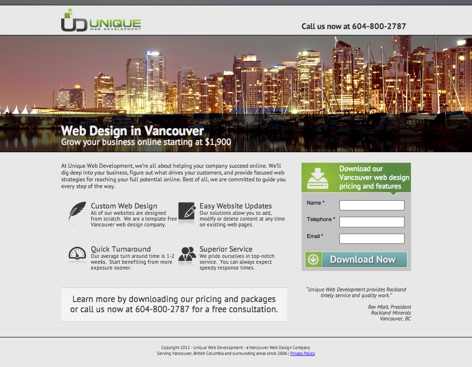
Unique Web Development is a web design company in Vancouver. Let’s check out their landing page.
What I like:
The benefit list: Unique Web Development is focusing on the benefits as opposed to just listing the features. This is a good tactic because it hones in on true value for the client.
The customer testimonial: It’s succinct and compliments their benefits. Plus, it also details the exact person they quoted, so you know it’s legitimate.
The encapsulated form: This form stands out but doesn’t overwhelm the page like many forms do. It’s clear that the purpose of the page is to get the visitor to download their pricing and features.
The length of the page: This landing page was among one of the few that didn’t drag on with distracting links and too much text. Instead, it gets straight to the point – a great tactic for landing page optimization.
The price: People looking for web designers are likely comparing your business with others. Price points are definitely going to be a deciding factor for some businesses. Making their price point large and noticeable is a big plus.
The free consultation: We all know that free is best. What is better than free?
What I’d change or test:
The visual: As much as the photo of Vancouver is captivating, it’s not about to encourage a lead to download your form unless they have a soft spot for Vancouver. I would test using a photo that would be more useful, or even featuring an example of one of their more visually appealing landing pages they’ve designed for a client.
The form’s offer: I’d recommend offering contact about designing a lead’s website as opposed to offering only pricing and features. This could be featured in a lightbox on the landing page.
Making the customer testimonial more obvious: It’s hiding in italic font tucked below the focal pricing and features form, which means your attention won’t be on the customer testimonial. I would test placing it in a more obvious space, making it larger and changing the font color to something that contrasts more with the gray.
Wix
Wix is another web design company, providing easy-to-use templates. Let’s take a look at their landing page.

What I like:
The modern aspect: This page has a very current look to it. It’s not outdated like some web design websites are. And since this is your field of expertise, you should keep with the trends.
The flow of the page: The page clearly has distinct sections that it walks you through, making the information on it easy to consume. The page also doesn’t give you any irrelevant information.
The clean font: It’s a great size and easy to read. The color of the header text isn’t overwhelming but it still stands out well because of the large font.
The benefit list: It’s really simple and requires very little effort to realize what’s in it for you.
What I’d change or test:
This landing page is actually pretty solid. Here are a couple things they could try to further optimize conversions:
A customer testimonial: Perhaps since they’re a widely used tool they don’t think they need one. But I would consider at least testing it for the people that haven’t heard of the tool.
A more obvious CTA: There are a lot of places you can click on this landing page. I would focus on just one, such as their “Sign up for free to browse all templates.” I would also make the call-to-action a bit larger and change the color to contrast with the page (give orange a try).
Conclusion
How are you feeling about your landing pages now? Are they close to perfect or are you going to be testing everything ASAP?
I hope this article at least sparked a few good ideas for some good ol’ optimization, because there’s always something to test when it comes to landing pages.
Do you have tips or tricks when it comes to marketing your web design service online? Feel free to let me know in the comments below.
Read more on Business 2 Community
(720)
Report Post
