Do you use landing pages on your website? Do you want to build landing pages that capture your visitors’ attention and increase your conversion rates? Everyone wants higher conversion rates online, so let’s take a look at some landing page ideas that’ll boost your conversion rates.
Great landing pages use multiple tactics to draw you in and get you to buy or click the call-to-action (CTA.) You can’t help but click the link at the bottom of the page or enter your contact information.
Here are 10 simple ideas that’ll improve your landing pages and increase the conversions you get from it. Use these ideas as inspiration and enhance your landing pages today. Or create new ones that work better.
1. Make It Simple: Some landing pages are very flashy, use the latest fonts and design layouts, and that’s great. But sometimes, simple works best for landing pages. Shopify does that on their landing page as it articulates a simple idea with a simple CTA to “Start Today.”

2. Reveal the Face Behind the Product: Using an influencer can be a powerful way to get people to click on a landing page offer. So can revealing who’s behind the brand or product because it’s someone people will relate to as they read your copy. They’re more likely to buy because they see themselves in that person’s place and understand how your product or service can help them.
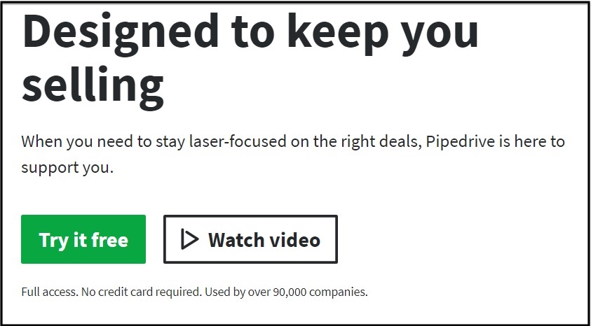
3. Define Your Value Proposition Immediately: You’ve only got seconds to capture your audience’s attention when they arrive at your landing page. So, articulate what the page offers compellingly and efficiently. For example, “Skype makes it easy to stay in touch. Talk. Chat. Collaborate.” and “Designed to keep you selling.” (That’s from Pipedrive.)
4. Use a Pleasing Design: Simplicity applies to your landing page design too. Be sure to choose a layout that works on both desktops and mobile, has colors that work well together, and uses font combinations that are legible on all devices. A landing page app can help you create a landing page that looks good, is mobile responsive, and doesn’t require any coding. They have multiple templates you can choose from to make your landing page, saving you time and effort, but still ensuring it works for anyone who sees it online.
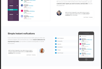
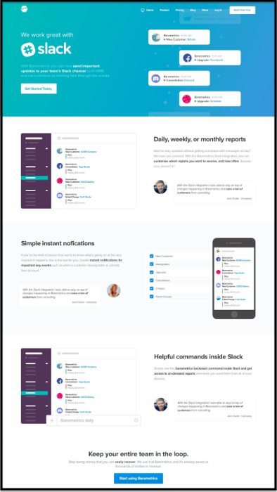
5. Add a Dash of Color: Bright colors used to be forbidden because early computer technology couldn’t handle them well. Today, however, we’ve thousands of pixels of resolution to play with on smartphones, which means you can do whatever you want when it comes to color on a landing page. Slack’s landing page uses bright colors that match their branding and don’t distract from their message.The pop of color at the top of the page and hints of similar colors later on in the page draw the eye down and keep you reading to the bottom.
6. Offer two options: People like it when you give them a choice, so add a couple to your landing page to take advantage of people’s psychology. We love making choices, but only if it’s deciding between a small number of options. Anything more than three options on a landing page is too much, so don’t go overboard.
7. Guide people through a journey: By using visual cues like boxes, arrows, and different colors, you can guide people through the landing page visually. It keeps people moving through it as they read, drawing them deeper into your copy and increasing their likelihood of converting. But beware, this only works if you thoroughly understand your audience.
8. Add social proof: No one wants to be the first one on the dancefloor, right? The same thing applies to a landing page. TrustPulse found that 83% of people trust reviews over advertising and that over half of all online users suffer from FOMO (the fear of missing out), so take advantage of that! Publish social proof on the landing page through testimonials and reviews or show off who’s already signed up on the landing page.
9. Link to a FAQ: Many people hesitate signing up on a landing page because they have questions that aren’t answered on the page. You can increase conversion on your landing page by linking to an FAQ that you publish on your page. You could even post the top Q&As on the landing page itself and then link out to the main FAQ directly. It empowers people to find the answers and help overcome objections.
10. Create urgency with a countdown timer: The timer is a classic tactic of the landing page, and for a good reason. When you see the numbers counting down, you’re immediately overcome with a sense of urgency and want to get through the signup process as quickly as possible. Use it to great effect for limited time deals,or for campaigns you want to remain exclusive to small segments of your audience.
There you go, ten simple ways you can increase conversions on your landing pages. Try them individually or combine them to boost the power of your landing pages.
Digital & Social Articles on Business 2 Community
(45)
Report Post