— February 16, 2019

tswedensky / Pixabay
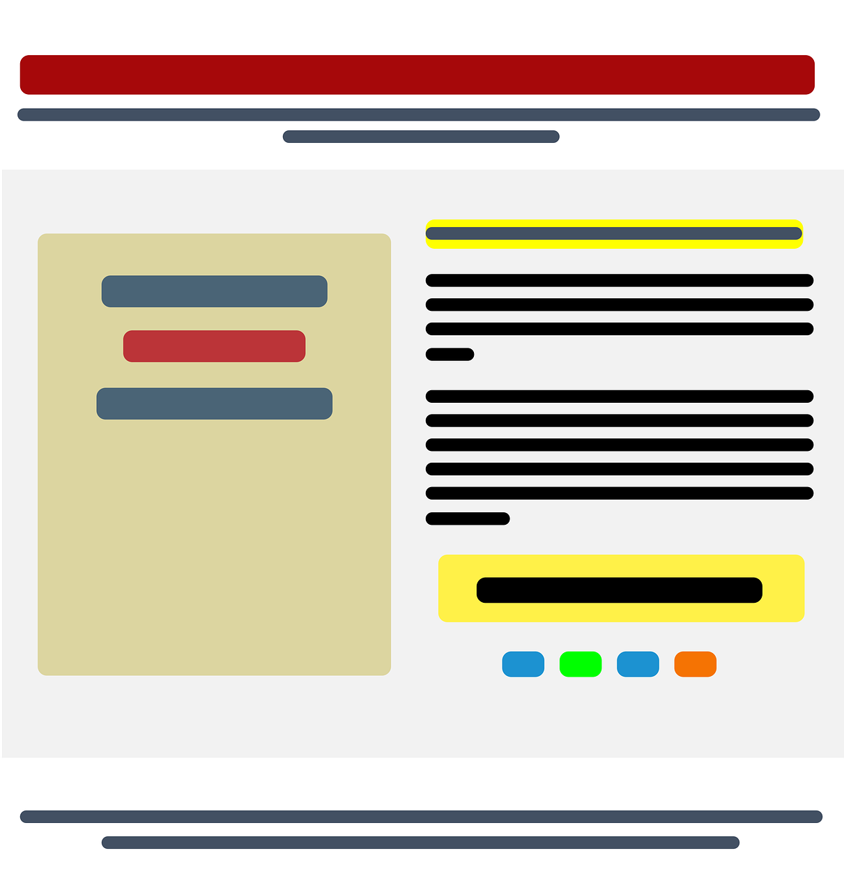
Landing pages are an essential part of lead generation, as they are a primary tool to gather contact information from visitors and increase conversions. A powerful landing page simplifies the offer process and eliminates distractions, so the design of your landing page is key to its effectiveness.
When visitors land on your page, they should be able to quickly understand what they’re downloading and how it will be valuable to them. It requires a different strategy than that of other pages on your site, so we’ve outlined ten design tips for a landing page that converts.
1. Consistent branding and logo
It’s important for your landing page to look like it belongs on your website. This doesn’t mean it needs to look exactly like the rest of your website or have a complex design – in fact, simple is best when it comes to landing pages – but they should have consistent branding. Having your company logo at the top of every landing page ensures that visitors know where they are and who is providing the content.
2. Negative space and limited navigation
To achieve the goal of your landing page, you should make clear for visitors the action you want them to take and how to get there. Avoid cluttering the page. There should be a significant amount of negative space to make the page elements and their hierarchical relationship clear. This will guide the user to your call-to-action. Unlike websites where there are multiple journeys for a user to take, a landing page should have a specific path for the user to take to easily accomplish the actions you’ve anticipated. Since you want to keep the user on a specified journey, it’s also best to exclude any exit links and to limit navigation. Having a menu and other secondary links may lead users to abandon the landing page.
3. Clear, compelling headline (and sub headline)
Your headline should be clear, direct and explain exactly what the offer is. It should also be consistent with the copy that was used in the original call-to-action or email that promoted the landing page. The headline is usually the first thing visitors see when they land on your page, so it should be catchy and attention-grabbing but still clearly state the purpose. As a complement to the heading, a subheadline should be written to persuade the user to stay on the page and encourage them to take action.
4. Premium offer
Landing pages should promote a premium offer that your visitor receives in exchange for providing information in a form. The offer could be premium content like a whitepaper, eBook, report or webinar, or another type of offer like a free trial, demo or free consultation.
5. Enticing visuals or video
Content including images improves engagement and can make your offer more exciting. Images and icons on your landing page could be interactive, tell a story, or even give directional cues that point a visitor towards your call-to-action.
In 2019, video can be very effective on a landing page. Having a landing page video can increase conversions by 80%, and 96% of consumers find videos helpful when making online buying decisions. Videos should be strategically placed on the page with a good thumbnail and have a clear call-to-action. Be sure to keep your videos short, as users are then more likely to watch the whole video. It can also be optimized for SEO and help your search engine ranking! Just be sure that all multimedia is purposeful and pointed to the desired user behavior, which is usually a call to action to submit a form.
6. Simple, direct copy
Your landing page copy should be short and to-the-point, and it should be relevant to the call-to-action. It should explain exactly what the prospect will learn or what value they will receive from your offer. Bullet points or bolded words are a great way to get your point across quickly. Use benefit-oriented language that speaks directly to your visitors, and while the copy should be concise, you can also personalize it so it’s less generic.
7. Standout call-to-action (CTA)
Your landing page needs a clear call-to-action button that demands attention. To increase effectiveness, use a contrasting color (which doesn’t necessarily have to be a bright color) and an actual button, as users have been trained to expect one. Design the page without clutter or distractions, and make the button big enough so there’s no doubt where to go to redeem your offer. You can take into consideration the F-Pattern and Z-Pattern of eye movement when deciding where to place the button. Be sure to use only one CTA per landing page so you don’t confuse your visitors.
8. Lead capture form
This may arguably be the most important part of your landing page. It’s best not to ask for too much information on the form, as you don’t want to overwhelm or intimidate visitors. You should require a visitor to provide key information like name, company, email and job title. If you want to learn more about a lead, you can make certain questions optional or implement progressive profiling so that you are able to ask additional questions each time they interact with one of your forms. Overall, design the form so that it’s quick and easy to complete.
9. Trust indicators
Consider including a few elements that add credibility to your offer such as statistical evidence, testimonials and reviews, or trust badges, like awards or customer logos. Social proof can also be effective in increasing conversions, as people are 71% more likely to make a purchase if referred by social media. You can display the number of reads, shares, likes, or subscribers on the page, and you should include social media sharing buttons, too, so visitors can share your offer with others. Including your company phone number and address on the landing page is another way to add credibility as it provides proof to visitors that you are a real company, especially since the design and navigation of a good landing page will be limited.
10. Mobile friendly
Today, mobile optimization is table stakes for any website or page, and that applies to your landing page, too. More than 60% of B2B consumers say mobile played a significant role in a recent purchase, and 50% of B2B queries are made on smartphones. That number is predicted to grow to 70% by 2020. So as you design and develop your landing page, remember that designing it to be responsive and optimized for mobile is essential.
Test your landing page for best results
After you have designed the perfect landing page, consider testing multiple versions with an A/B test, especially if you’re undecided on the layout or social proof elements. You can then study the analytics, and make adjustments depending on your findings. Landing pages can be a great way for your company to turn website visitors into known leads. But always remember, if a visitor is going to give you their contact information, they will expect to get something of value in return.
Digital & Social Articles on Business 2 Community
(57)
Report Post


