— October 20, 2017
It is a huge disappointment for all email marketers how email clients always block the images by default. You put in all your ideas and hard work in ‘designing’ an email, and email clients just ruin it by suppressing that visual oomph.
Many email marketers turn their backs on HTML emails because of this reason.
But you know what?
Every cloud has a silver lining! And this cloud is no exception.
We’re talking about Alt text, also known as alternative text or Alt tag that’s displayed in place of the blocked image.
Alt text is not just ‘plain text’; it gives you a huge playground of words and creativity to apply in your email marketing strategy.
Have a look at this email by Juicero.
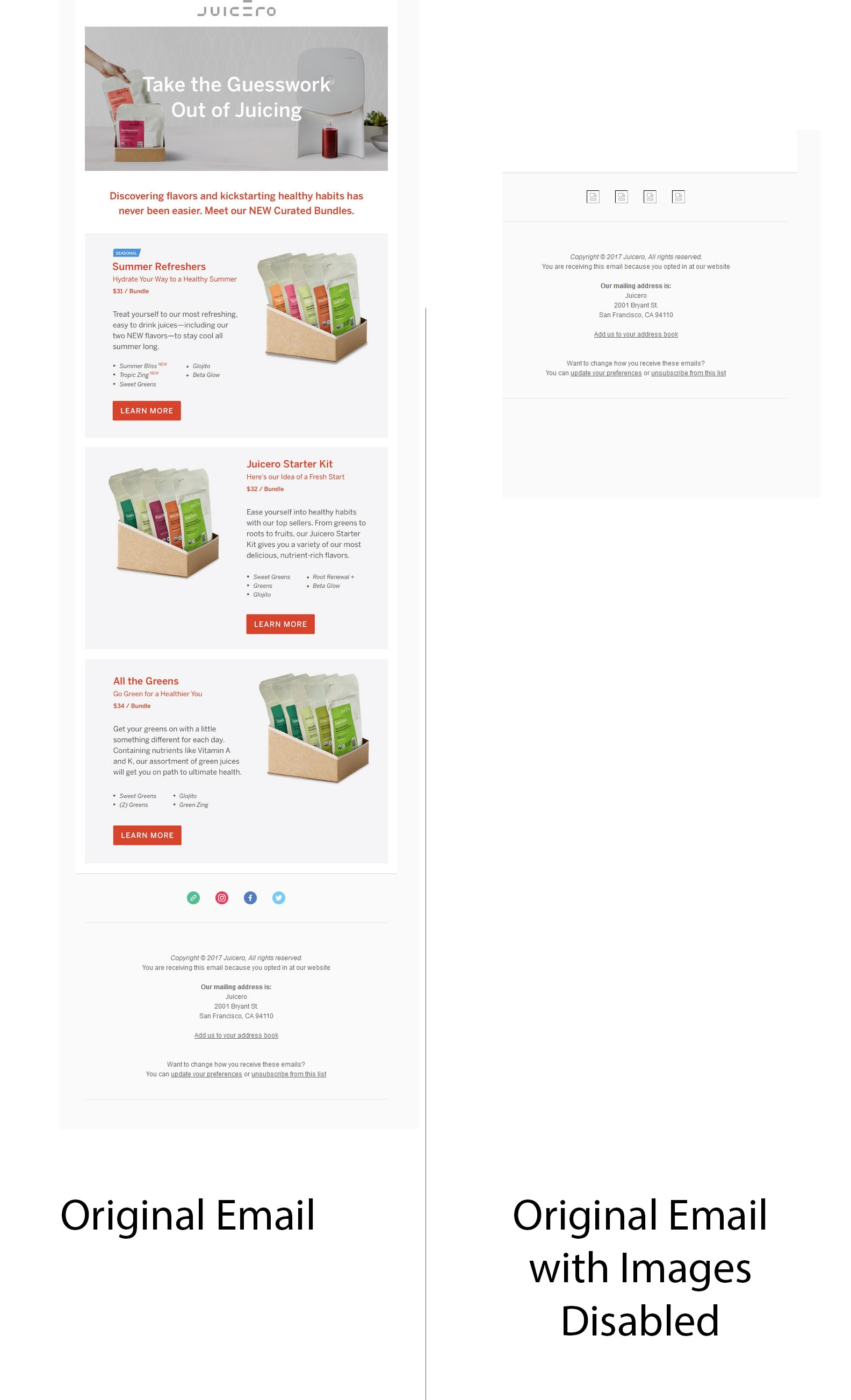
Could you figure out what the email wants to convey?
The obvious answer is a resounding No.
Now, consider this email by Jack Spade.

The elaborate alternative text gives a complete idea of what the images could be about!
That’s what Alt text is for!
So, here are some great Alt text tips for all those email marketers who wish to use images in their emails, but are reluctant to do so.
1. Keep it succinct
One or two sentences are more than enough in your Alt text. It should be meaningful and enticing enough for the subscribers to view the image.
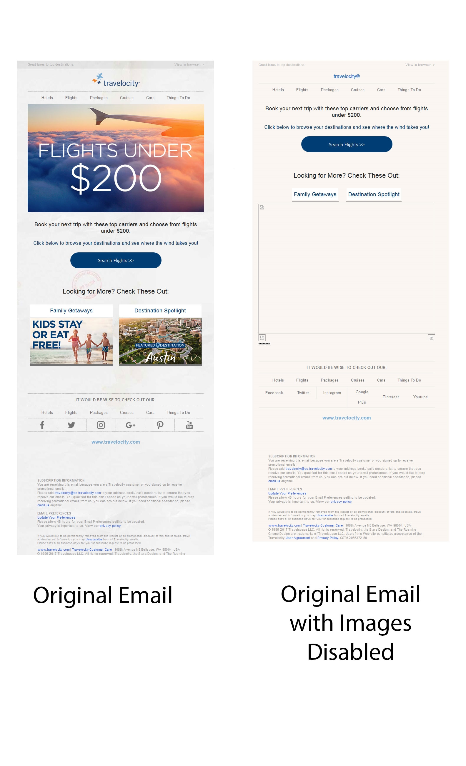
The email by Travelocity has short Alt text supported by a clear description of their offerings.
Right from the subject line to the content and Alt text, everything is in sync with the email purpose that encourages the subscriber to view the images or click through the CTAs.
2. Proper punctuation is a must
Use proper punctuation for your screen readers to know where to take a pause and read your content better.
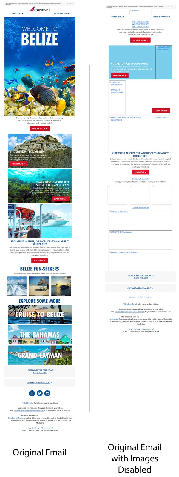
Carnival Cruise Line takes the punctuation rule quite seriously. Each image has a distinct Alt text that makes it very easy for the subscriber to know what the image would be about. They sure have studied Alt text best practices thoroughly! (grin)
3. Include the text that is present in the image
Include the exact phrase that appears in the image to make the email message obvious. The safe bet is to also have important information in the Alt text, that doesn’t appear in the image.
GAP includes the most noteworthy part from the image in their Alt text to grab the subscriber’s attention on the discount offer even when the images are turned off.

4. Don’t ‘COPY and PASTE’ image captions
Screen readers and display read the captions even for blocked images. Your Alt text should offer additional information that’s not conveyed through the caption.
5. Count on context
Just like your image and content should be relevant to each other, your Alt text also should consider context. You should contemplate on the information the reader is likely to get from the surrounding content and then write an Alt text that goes with it.
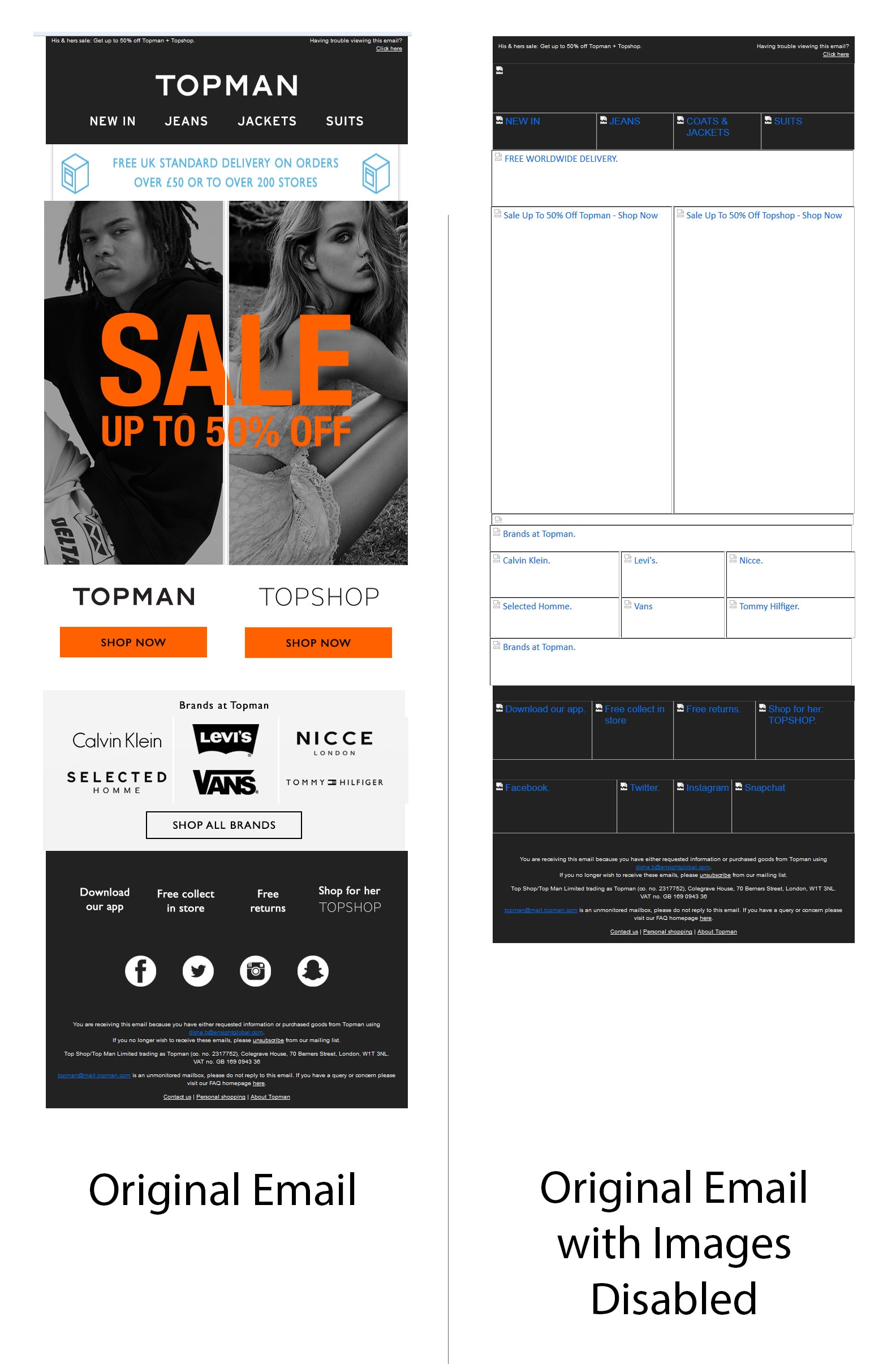
Topman includes straightforward Alt text and makes the email purpose clear in the first glimpse itself.
6. Quotes are not needed
Let’s get a bit technical now! When you use Alt attribute in the HTML code of your email campaign, it uses double quotes to define the beginning and end of your Alt text. If you use quotes again, it will lead to broken HTML.
7. Distinguish the decorative images
Write ‘Decorative image’ as Alt text if the image is just for email ornamentation. That would enable quicker email scanning for the subscriber.
8. Test
There are certain email clients that don’t show Alt text if it crosses the image width or if the image is linked. It is strongly recommended that you send out test emails across various email clients and check the Alt text by disabling the images.
9. Style it a little
Make your Alt text more artistic by adding colors and style to the font. However, system fonts would be the safest as they will render in all devices and email clients. You can even change the weight and size of the fancy font to make it classier for your audience.
Oh! That also reminds me of adding chocolate syrup to my plain vanilla ice-cream! (wink)
10. Innovate
Your subscribers are always looking for something new in emails. Pixel art is one such innovative idea.
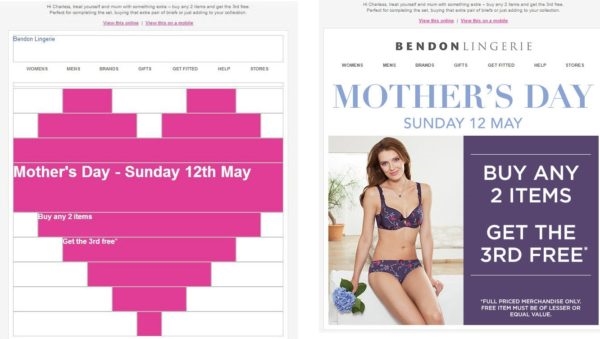
Check out the pixel art used as creative alt text in the Mother’s Day email sent by Bendon Lingerie.
Chubbies uses another creative idea for using Alt text. All their images begin with the Alt text “download images, bud” followed by relevant text displayed in different ways.
In the following email, the word “Party” has been written in several different ways that match the Independence Day theme. Quite interesting, right?

Wrapping Up
There’s no need to disown images just because of the injustice imposed by the email clients. Use the best practices of Alt text as described and your subscribers will still love your emails regardless of the image blocking issue.
Digital & Social Articles on Business 2 Community
(110)
Report Post
