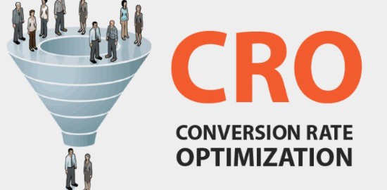
A lot of the things that digital marketers spend their time doing is conversion rate optimization (CRO) – even when they don’t realize it. CRO is anything that you do to drive the percentage of people who convert on your website, i.e. the effectiveness of your site – everything from small tweaks to major re-designs.
The beauty of CRO is that it doesn’t need to be complicated, and here are 10 tips to prove how simple it can be.
1) Get The Basics Right First – Before you embark on your CRO journey, make sure you get the basics right: are all of the functions of your website actually working? Check and fix these first before fine-tuning.
2) Be Transparent – If you are running an ecommerce site, this is crucial. Not being able to find the right information is one of the key factors for people not buying from a site: returns policy, delivery charges, reviews, etc.
3) Test Different Calls To Action – Buy Now, Add to Basket, Add to Cart, Order Now, etc.? You should test what works best with your customers, don’t just follow your competitors. You should also test moving the position of the call to action button.
4) Add Testimonials – Happy customers, particularly if they are very close in description to the person reading the testimonial (e.g. work in the same field, have the same lifestyle) can be hugely powerful and be the deciding factor in whether to convert or not.
5) Challenge Your Copy – Your website should say everything about you – and that includes tone of voice. Keep it appropriate to the market that you operate within, but don’t be afraid of testing your copy at key stages. Should it be persuasive, reassuring, detailed…?
6) Have Snappy Contact Forms – I once worked with a client who had a huuuuuge contact form. Worried that asking so many questions would put people off, I asked the client what happened to the additional info. The answer…nothing. So I cut the form down and saw enquiries rise three fold! If you don’t absolutely need the info, don’t ask for it.
7) Have Site Search And Breadcrumbs – These are pretty basic, but there are still a lot of sites which don’t have them. Breadcrumbs ensure that the user doesn’t feel lost on the site, and site search can help where navigation can’t. Also, you should check what people using site search for and create content to answer the most popular questions: people typically use site search out of desperation, so save them the stress.
8) Home Page Segment Your Audience – There are not too many sites which only attract one type of visitor. So use your home page options to allow users to segment themselves. This is pretty tricky to get right, so prepare to run a number of tests before finding a solution that works.
9) Use The Right Image Resolution – Image resolution is a balancing act: too high and the page will take too long to load (upsetting your visitor and Google too), too small and the image will pixelate. But there is a happy medium and you should use it more than once by having a number of images available for each product.
10) Don’t Get In The Way Of The Consumer – The best advice I have ever received about the user experience was not to get in the way of the consumer: make the conversion process that the user needs to go through as short and easy as possible.
Bonus 11) Get Close To Your Analytics – You don’t want to do all this work and not know which of your tests are working well (or if you’re making the results worse!). The only way that you will be able to tell if all of the good stuff that you’re doing is actually working is by getting close to your analytics, setting up control metrics and having robust reports in place.
What is your favorite CRO tip? Leave a comment and share your thoughts!
(193)
Report Post


