— August 9, 2018

Have you ever stumbled across a website that was confusing, overwhelming, or just hard to use? If you’ve ever used the Internet, you probably have. While most websites nowadays follow standard best practices in web design, there are still some sites that lag behind and are clearly still living in the 90s.
Am I going to call some out? Yes, yes I am.

For a site that probably gets hundreds of thousands of visits each day, the My United Healthcare website is pretty terrible. There’s no navigation at the top that makes it clear what I can do on the site. The slider, news, links, tools, FAQs, and ‘learn more about’ section are all competing for my attention, and I haven’t even scrolled down yet! And if a site has to offer a Site Demo, then you know that’s a sign that people have had trouble using it.
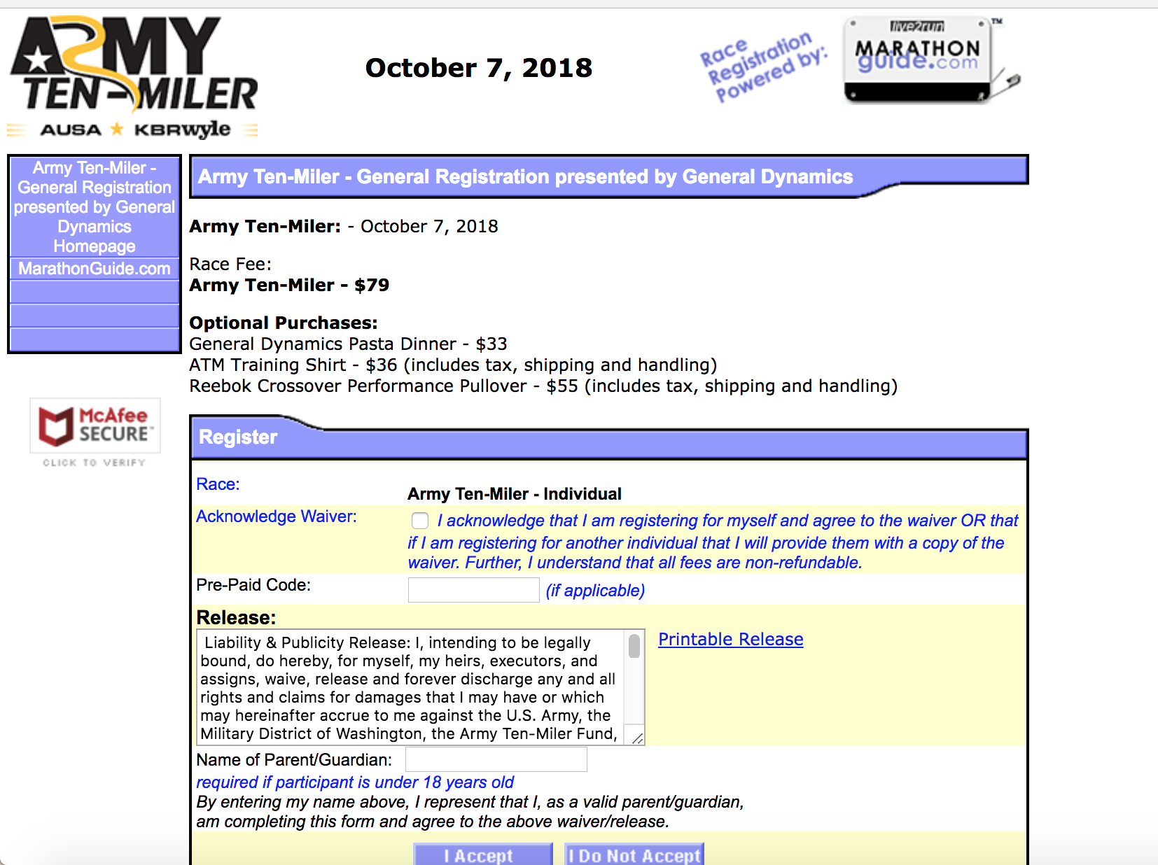
This is a terrible website that I encountered while trying to sign up for a race. While the race website itself is great, I am taken to a third-party website to register that looks, frankly, sketchy. Throughout the registration process, I found myself wondering, “Should I be giving these people my credit card info?” Further, the form was not intuitive. For example, I was asked to sign a waiver in the very first step of the form, before I had even filled anything out! Waivers and legal jargon typically come at the end of forms.
You get the point. Websites like these are frustrating to use, force us to question ourselves, and turn what should be a 5 minute task into a 15 minute task.
Websites built with user experience in mind, on the other hand, are fun to use. They save us time. They make us feel smart and powerful because we don’t have to stumble through confusing forms or pages to accomplish what we’re trying to do. They make us feel appreciated because we know the web developers and business owners kept us in mind when they built the website. And overall, we leave happy and are thus much more likely to come back and use that site again.
In this post, I’m going to discuss 10 best practice UX methods to keep in mind as you’re building a website. (P.S. UX is not to be confused with UI. Learn more about the difference between the two here). So let’s get to it! In no particular order…
These are only best practices based off of research done across many websites in many different industries in many different countries. Just because they are best practices across most website does not mean that they will be best practices on yours. Following these best practices does not eliminate the need for thorough user testing, ongoing A/B testing, and research of your own. These tips are just meant as a guide if you don’t have time to do your user testing and just need a place to start.
-
Organize content in a way that users will be thinking about it and processing it.
In Western countries, users read from top to bottom and then left to right. So, it makes sense that your content should be organized in the same way.
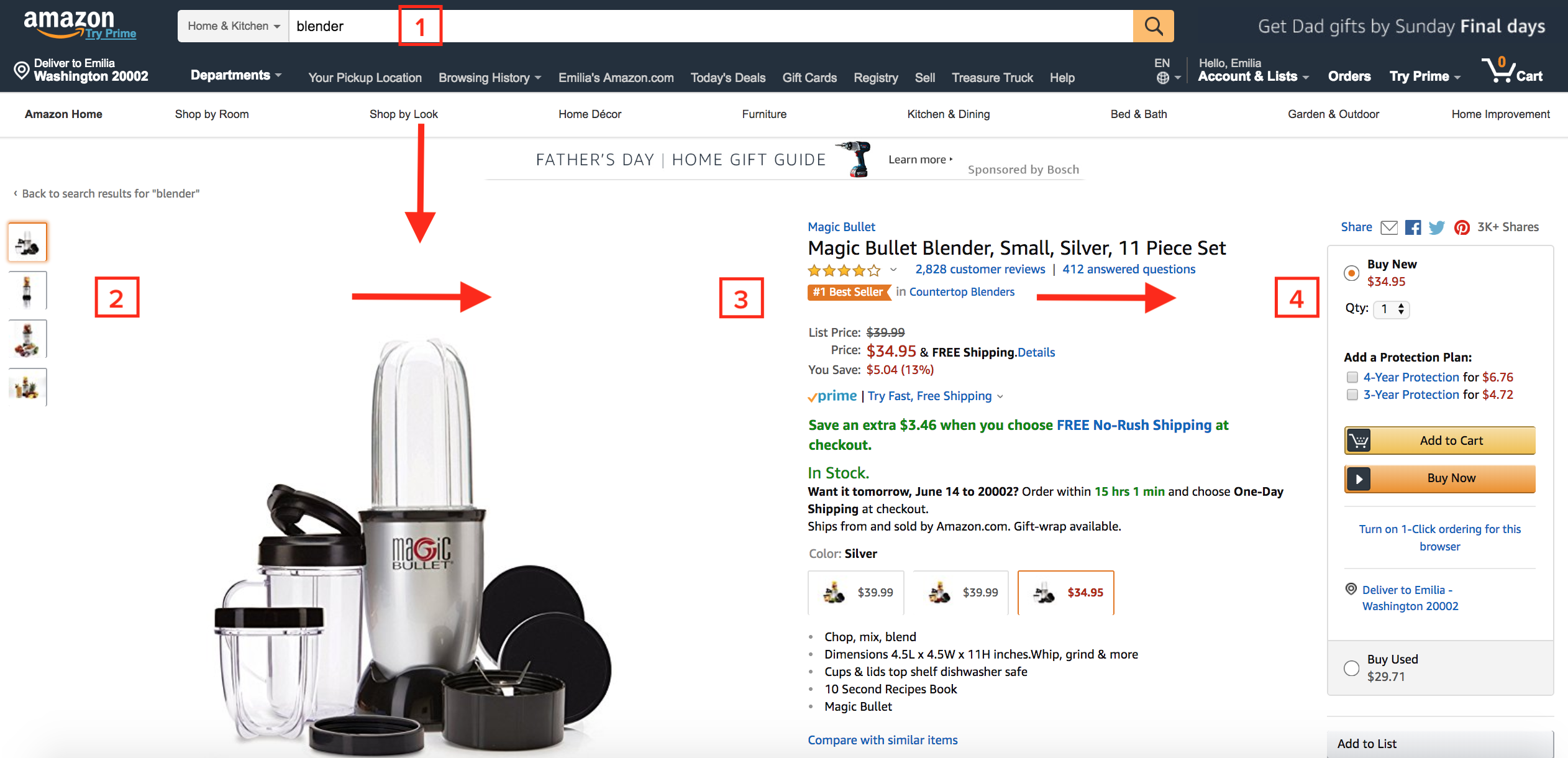
Amazon does a great job of this. Starting at the top (1), you input what you’re searching for. Then, as you scroll down the page, starting from the left, you can see an image of the product (2). Then, you eyes move to the right to the product name and description (3). And finally, you eyes move to the “Add to Cart” or “Buy Now” button (4). This design is very intentional – it mirrors exactly how you’d search for and evaluate a product. (And if you think about it, this is kind of what happens in a physical store as well. You search for a product –> see it and examine it –> read the product description –> look at the price tag and decide if you want to buy it).
-
Give users feedback for every interaction.
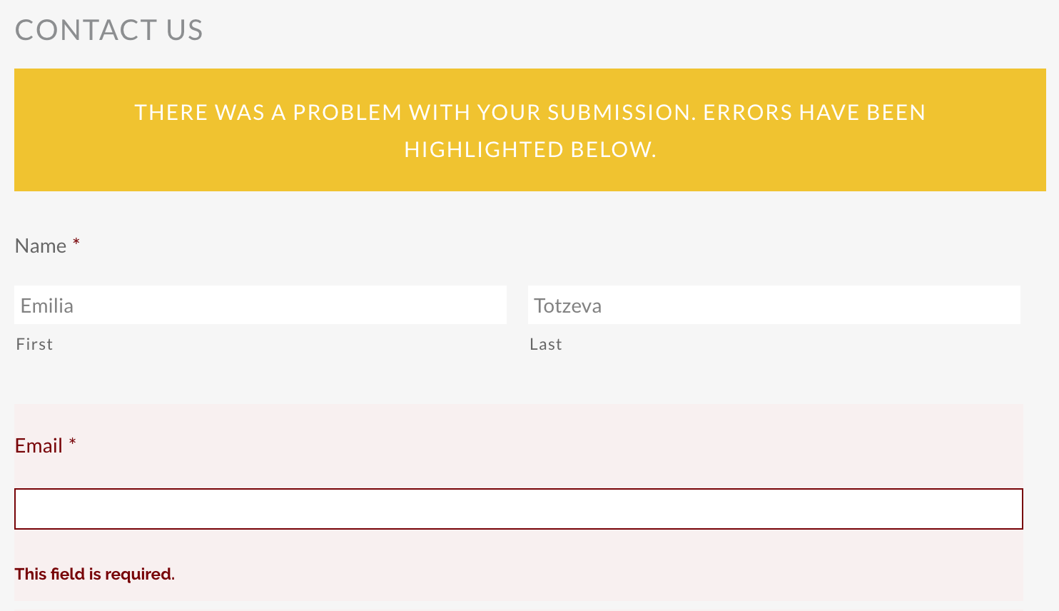
There are a lot of ways to give feedback to users. One way is to add effects when hovering, such as when a user hovers over a button or a link to indicate that they are clickable/tappable. Or, you can indicate feedback after an action is completed – such as an error message if a user forgets to fill out a required field, or a confirmation page when a user successfully submits a form. Either way, feedback is important to indicate what is (and is not) possible.
Yay hover effects!


-
Make your content scannable.
No one ever reads everything on a webpage. Instead, we furiously scan a page to find information slightly resembling what we’re looking for. Why? Because we’re in a hurry to find what we’re looking for, and we’ll skip over anything that’s irrelevant.
What can you do about this? Make your content easy to scan. A couple of ways to do that are:
- Use bullet points to break up long lists
- Use numbered lists
- Use lots of headings (h1 through h6 are your friend), with the biggest headings representing the most important information
- Use short paragraphs
- Use bold to highlight important text
- Avoid unnecessary instructions, fluff, and “small talk”
-
On forms, don’t hide the field label.
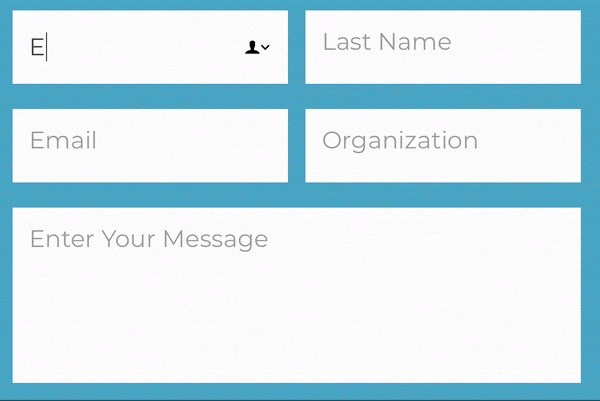
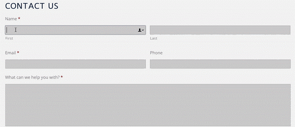
On a lot of websites, I’ve seen the field label display inside the field in the form of placeholder text. While it looks much cleaner from a design perspective, it’s poor UX because when a user clicks or taps into the field, the field label disappears and they’re forced to use their memory to recall what they’re supposed to be inputting.
Although some people might think that short forms with inline labels are intuitive, we can’t assume that users will know how to fill them out, so it’s always good to include the label above or below the field.
Don’t:
Do:
-
On mobile devices, the hamburger menu should be easily accessible at the bottom left or bottom right of the screen.
Try this: hold your phone in one hand and try to put your thumb in the top left or top right of your screen. If you’re on most new smartphone devices, you probably can’t easily and comfortably reach the top part of your screen. The problem? That’s where most mobile navigation menus are! Make your hamburger menu at the bottom of the screen so people can easily reach it. The Facebook app does a good job of this.
-
Remember accessibility needs.
As much as 20% of the traffic to your website could come with people living with some sort of disability, so it’s really important to make sure your site follows accessibility best practices. Aside from that, it’s just the right thing to do and if that doesn’t convince you – it’s the law.
There are lots of things you can do to make your website accessible, but here are a few important ones:
- Use alt tags for images to describe what’s in an image succinctly and clearly.
- Offer alternative ways to read content, such as transcripts or subtitles on videos or text versions of infographics.
- Make sure you have a sitemap.
- Use headings, bullet points, and lists. Users with disabilities scan websites and dislike “fluff content” just like everyone else.
- Make font sizes enlargeable.
- Don’t use flickering or flashing effects.
- Use colors that have high contrast. This is especially important for colorblind users. Here’s a tool that tells you if the colors on your website are accessibility friendly.
- Add a “Skip to Main Content” link. This is important for people with screen readers, so that the screen reader doesn’t have to read the main navigation over and over again.
- Make sure all forms have labels (see #4).
-
Make your site as fast as possible.
Every second counts. 47% of users expect websites to load in 2 seconds or less. And 40% of people abandon a website that takes more than 3 seconds to load. Page speed also affects your ranking in search engines. Invest in making your website load as quickly as possible because it will lead to better user experience, happier users, and ultimately, more conversions on your website. Some tools that we use are Ironscan.io, the Google Mobile testing tool, and the GTMetrix desktop testing tool.
-
Use consistent navigation with clear labels.
The most important thing to remember about your navigation is: it should be the same on very page. If it’s changing from your homepage to the interiors, you’re going to lose and confuse your users. Be sure to use clear, specific labels for each item in your navigation. It’s good to get creative, but make sure it’s clear where you’re sending people. “Work With Us” could mean a variety of things; it could lead to a Services page, a Careers page, or a Contact page. Be specific.
Aside from the menu, your navigation should also contain your logo or website name linked back to your homepage. I’m a big fan of sticky menus, which scroll down with you as you scroll down a page. They allow for easy access to the navigation at any time. Just be sure they don’t take up too much space.
Try to keep your navigation to 3 or 4 levels deep. If it’s more than that, you’ll lose people and you may want to rethink how you’re structuring your website content. You may want to consider breadcrumbs on larger websites to help users understand where within the website they are.

-
Have a search field.*
*As long as it works really, really well.
There are two types of users: those who arrive at a website and try to find what they need by clicking around and using the main navigation. And then there are those who will immediately search the website for what they’re looking for. You need to make sure you account for those that like to search. Unless you have a small website, you should always have a search field.
Make it prominent, in or near the main navigation. And make it clear what people will be searching. For example, in the search bar for my local library’s website, I know that if I enter a keyword, I can search all of the fields, or I can specify if I am looking for a specific book title or author.

Your search field must work really, really well. Users should be able find what they are looking for quickly and intuitively. If they can’t, you run the risk of your users spending more time looking for what they need, which is frustrating. Don’t have a search bar just for the sake of having one. Make sure it works. And the only way to know if it works perfectly is to test, test, test.
-
Don’t try to make everything stand out.
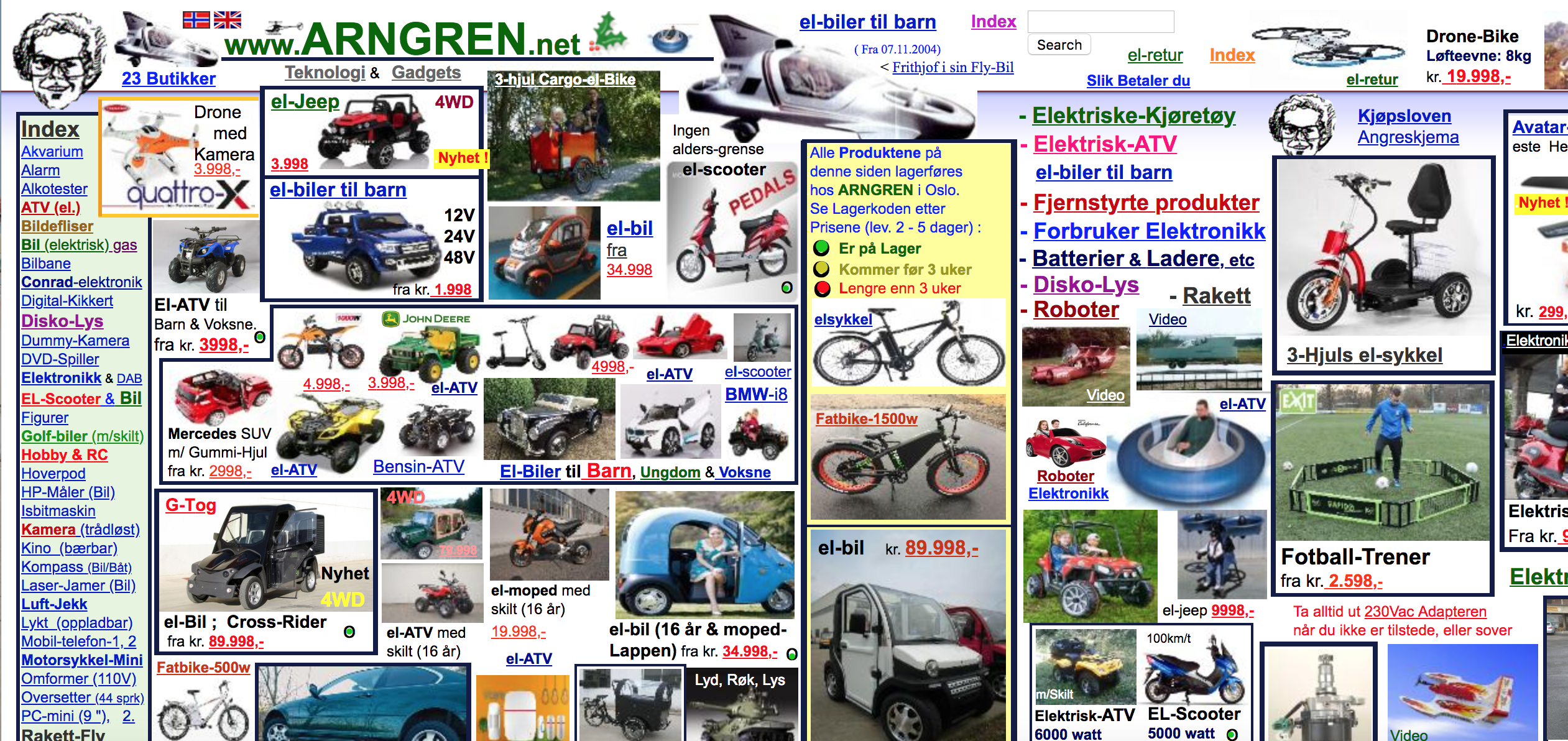
On the web, we have a tendency to try to make every heading, button, or page stand out. In theory, this makes sense, but what ends up happening is that users get can’t decide what’s most important, causing them to get overwhelmed and leave.
Instead, decide what is the single most important thing you want your user to do on a given page – whether it’s getting a specific message across, getting them to download an e-book, or getting them to subscribe to your newsletter – and then make that single call-to-action stand out.
So, for example, don’t do this (yes, this is a real website that exists).
Instead, do this:
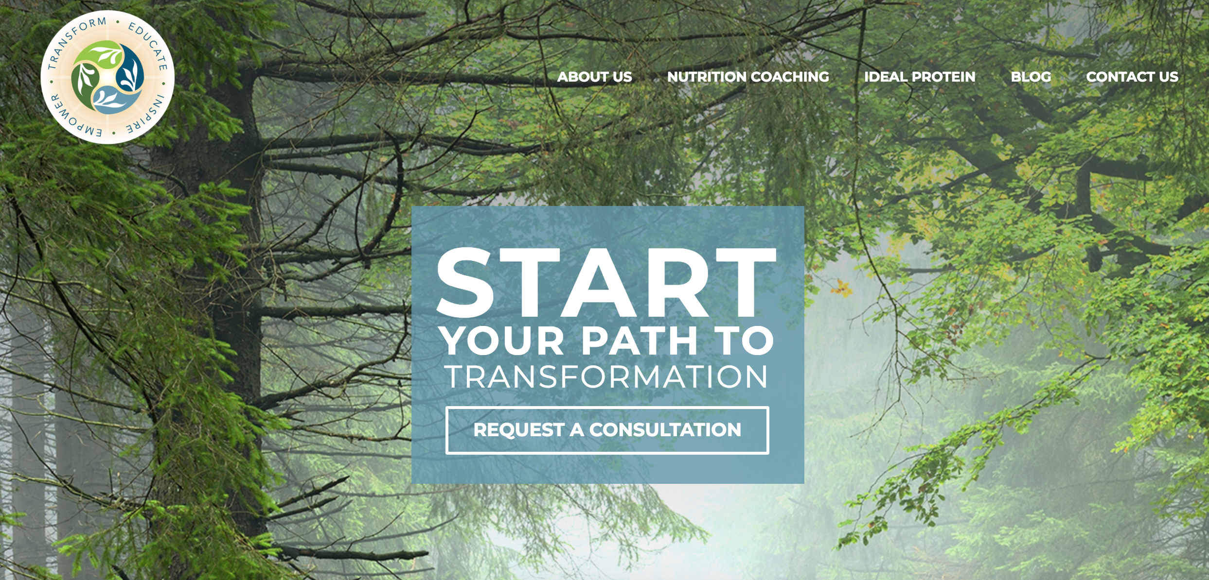
Ah….clean and simple.
In summary…
…we notice bad design and poor user experiences. They frustrate us, waste our time, and force us to have to overthink every step of our experience. But good design and good user experience is so seamless that we often don’t notice it. We go online, get a task accomplished, and leave. We feel powerful, smart, and productive. And those are the kinds of experiences we should be striving for.
Digital & Social Articles on Business 2 Community
(115)
Report Post