1. Ensure a Responsive Design
Always near the top of Vordik’s list is making sure that a website’s design is entirely responsive. Responsive design means that with the variety of devices currently on the marketplace, your website will need to be able to adapt to screens with a range of width – from a tiny 320 pixels to over 3000. In order to ensure the smoothest experience for your end users, a UX/UI Designer needs to fully understand the implications of user interaction for desktops, tablets, mobiles and more.
2. Simplify Your Navigation
Especially if you work for a company that is heavy on content and information, it can be very tempting to create an elaborate menu with layers of links and tabs. Web design best practice, however, tells us that having a top-level navigation with a maximum of 5 to 6 links is a much more effective and much less confusing experience for users. When it comes down to it, as daunting as it may seem, taking all of that information and organizing it properly will save time and help speed up conversions in the long run. More often than not, optimized navigation means converting your users in 3 clicks or less.
3. Don’t forget the Legal
The print may be fine, but the consequences for not having it are definitely not. Not only are Privacy Policy and Terms Of Use sections a legal requirement, but making sure it’s done correctly will keep your company out of trouble and help protect you from threats. Not sure what to include in these sections? The BBB provides a great sample Privacy Policy, while Entrepreneur offers up a guide to terms and conditions. It’s important to remember, however, that a one-size-fits-all approach rarely works, and these templates will need to be looked over carefully and customized to your needs.
4. Make Sure You Meet Accessibility Requirements for 2016
Did you know that as of January 1, 2016, all websites and web content within Ontario must comply with the Web Content Accessibility Guidelines (WCAG) 2.0 at Level AA? Not only are these standards put in place in an effort to make the web a more accessible space for individuals with disabilities, but failure to meet the standards laid out by AODA and WCAG can result in a $ 50,000-100,000 fine per day. So, prior to launching, make sure to triple-check that everything is up to code – pun intended.
5. Optimize Your Speed
In an earlier article, we went in to all of the details about web speed optimization, and what you can do to get things moving if they are running a bit slow. Just to re-iterate the importance of that point, even if you have the nicest designed website in the world and top-notch content, it is proven that the average visitor will leave a website as quickly as 6 seconds if content doesn’t load fast enough. Long gone are the days of dial-up, and today a slow-loading website can truly impact the bottom line.
6. Fix those broken links
Broken links are one of the biggest online annoyances; so much so, in fact, that many companies have gone out of their way to create cool or funny 404 messages in order to distract annoyed users. However, why don’t we eliminate 404’s altogether? Far beyond annoying users, these links can be detrimental to the all-important SEO score. Luckily, there are many free tools available that can help diagnose a website for links that need fixing. It’s a simple step that can go a long way.
7. Users should know how to get in touch
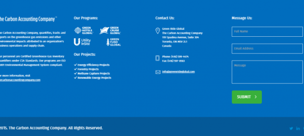
While it’s nice to have as much information as possible made readily available on the website, it should never be difficult for the customer to find alternate ways to get in touch with a representative. At Vordik, we usually find it helpful to keep a standard footer with all of the relevant information at the bottom of each web page. Don’t forget that beyond an email address and phone number, users may enjoy a quick contact form and access to any relevant social media account.

A sample footer taken from http://www.greenrideglobal.com
8. URLs should be SEO-friendly
This piece is another quick-fix that is often overlooked. As an important element in the SEO algorithm, all website URLs should be kept concise and contain relevant keywords. Whereas in the past it was acceptable to have a URL address such as www.example.com/12hqkapdiaok56/ref/article3456ft, a user must now be able to understand exactly what the webpage is about simply by glancing at its URL. The same criterion can be used for Google as well, as the URL is the first indicator of what keywords bots need to be picking up on.
9. Create a sitemap
A site map is essentially exactly what it sounds like; it is a map that allows both visitors and crawlers to find pages and content on your website more easily. This is especially important for large and confusing websites, where pages have complicated relationships, but is considered best practice for any website that has more than 10 pages. Sitemaps come in two formats: XML and HTML, and if you are unsure how to go about creating one, it may be useful to consult Google or enlist a web developer.
10. Flash is dead
Finally, we have absolutely reached the end of Flash days – don’t let anybody tell you differently. While it is safe to say that the web has been headed in this direction for a very long time, Google has recently announced that Chrome will no longer be supporting any websites that utilize flash technology. If you have a Flash website, or have any elements that utilize Flash, it’s best for you to have them recoded in HTML5.
Digital & Social Articles on Business 2 Community(202)


