— October 13, 2017
In the world of fine art and graphic design, rules are often bent, or even broken.
It’s encouraged. Breaking the rules is considered to be edgy, unique, and forward-thinking.
With the career field of graphic design becoming more accessible in recent years, everyone wants a piece of the pie.
Unfortunately, most newcomers to the design profession are unaware of certain graphic design rules — especially the ones they should NEVER break.
By not following these rules, the end result can be a visually jarring design, forcing your target audience to lose trust in your ability or competence.
By having poor graphics, potential customers can view your brand as unworthy of their patronage.
That means you won’t get paid.
To assist you in creating more successful designs, I’ve created a list of the 10 most commonly broken graphic design rules…
Let’s dive in.
Graphic Design Rules — #1 — Design With Consistency
Consistency is Graphic Design Rule Numero Uno!

You have to maintain consistency across all design elements and branded materials so your target audience clearly recognizes that the brochure or flyer in their hand is an extension of the same brand they see on your website.
By being consistent with your design and branding on your marketing materials, you are ensuring your brand is never mistaken for another or represented poorly to your target audience.
Be consistent with the following:
- Color palette — use no more than 5 colors (including shades) in your branding (2-3 is probably best)
- Typography/web fonts — don’t use more than 3 fonts, or stick to one font family
Use similar elements throughout, but make sure that not bit of marketing material looks exactly the same — a little variability within the parameters you’ve set is OK.
Basically, you want all your branded materials to look like they belong to a series without being the exact same piece of marketing material in a different medium (so your brochure doesn’t look like you took your website and printed it out).
Graphic Design Rules — #2 — Avoid Poor Legibility
Legibility is of utmost importance when choosing fonts, and this applies to both web and print design. If it isn’t legible, then you won’t be able to convey your intended message, but more importantly, you might drive your audience away…
And lose them forever.
It’s also important to consider what fonts would appeal most to your target audience while still aligning with your brand.
If your target market was predominantly made up of men and women over 55, then it might be a good idea to opt for a sans-serif font with a larger pixel size to increase visibility — this can improve user experience and keep customers happy.
Nobody wants to be annoyed by text that’s hard to read.
Legibility can also be improved by adding an overlay of contrasting color to your chosen web font.

In the above example, a subtle overlay of black was added to the photograph to increase contrast, therefore improving legibility when contrasted against the white webfont, Oleo Script.
White against black (and vice versa) will always have the highest contrast, which generally equates to better legibility.
Graphic Design Rules — #3 — Avoid Color Discord
Color is a powerful tool — but it can be used for evil!

Make sure that you choose colors that complement each other — avoid creating color discord.
See how the red letters against the green background almost vibrate?
The red shapes are fighting for the viewer’s attention, which can be visually jarring and difficult to read.
That doesn’t mean you can’t use a complementary color scheme, like the yellow and purple above. The light-on-dark scheme helps to alleviate vibration or color discord.
Graphic Design Rules — #4 — Prevent Non-Proportional Scaling of Graphics and Text
Whenever you scale graphics, be sure you maintain the same proportions while scaling.
To put it simply, don’t stretch your images folks — it looks terrible, it looks unprofessional, and you’ll basically get judged for it immediately.
Size matters… if your image doesn’t fit properly the first time you try to upload it to your website, use it on a social media ad, or slap it on a brochure, edit it! Small images do not scale well — you may need to hire a graphic artist to fix these issues for you before preceding.

The image on the left looks like crap — stretched horizontally, the snowflake doesn’t maintain the same proportions when scaled down.
On the right, the image looks fine — bad design always draws the eye and always distracts the reader from your message and your brand.
Don’t make the mistake of distracting a customer from what you want them to buy — get your images right.
Graphic Design Rules — #5 — Stay Away From Raster-Based Images
Oftentimes, newcomers to graphic design will use raster-based images in their design. Whenever they enlarge or reduce the size of a raster-based graphic, they wind up with pixelation.
You can avoid this mistake by using larger images with higher resolutions; it keeps them crisp, even after you scale them.
Regarding icons or symbols, it’s best practice to use vector graphics, which can be scaled with no loss in quality. Adobe Illustrator is a vector-based application, so any icons created in Illustrator will not become pixelated when resizing.

Usually, raster-based graphics end up in designs because newbies use Adobe Photoshop to create their posters and flyer illustrations — that’s a rookie mistake there champ, and one you need to avoid like the plague.
Graphic Design Rules — #6 — Maintain Alignment
Randomly placing graphic elements or text within a design can make your print or web design look unorganized and messy.
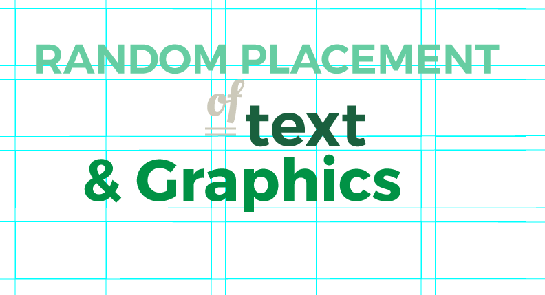
Messy designs look unprofessional and reflect poorly upon your business, and honestly, it takes very little work to align objects properly.
Make sure you use guides and align objects in relation to one another on the canvas/artboard, but follow a simple rule of thumb — pick a line somewhere on your page and try to align your graphics and text with it, whether horizontally or vertically, rather than randomly placing text and graphics across a page.
Even a simple left alignment for every element on your page can look generations better than boxes of text strewn about the page — it makes us dizzy, it hurts our hearts, and it drives your customers away.
Columns help too, and you might find that you can come up with a more complex alignment arrangement after a little thought — but put the thought in first, or you’ll end up with a brochure that only distracts your audience with its bizarre text arrangement.
Graphic Design Rules — #7 — Seriously, Only Choose 3 Fonts
I really want to emphasize this one because I see it so flagrantly violated so often — No matter what you’re designing, limit yourself to no more than 3 different fonts.
Using too many fonts is ugly fam — it’s one of those graphic design rules that should be etched in stone (and in some people’s foreheads).
Make sure that your fonts are appropriate for your industry of course, and for your audience, but this is not a case where more = better.
For example, the customers of a modern, well-established architecture firm are going to expect a certain look (please ignore the grammar mistake on this image — we’re not talkin’ GSP here folks).

A sans-serif font family, such as Muli (in the right-hand image) suggests innovative, high-quality work — traits that are important to implant in the mind of the audience that’s going to be able to afford the work that this kind of company can provide.
Graphic Design Rules — #8 — Establish a Visual Hierarchy
You have to establish some type of visual hierarchy throughout your design. Basically, a visual hierarchy is the use of size and color to emphasize one item over another and draw the viewer’s eye to a certain item above others.
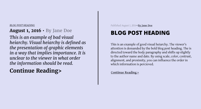
This is especially important on pages with many different items of text. In most blog posts (like this one) you can see size being used to establish a hierarchy. Look at the heading at the top of this article — it’s huge!
The second level headings are large, and the paragraph text is small — but the buttons are fairly large and stand out.
That’s a visual hierarchy — weighting different elements by importance and using color and size to either draw the eye or let the eye wander as it pleases.
Without clear visual hierarchy to guide the viewer’s eye through the piece, they will be unable to determine the order in which the information needs to be read.
In the example on the right, the visual hierarchy is almost backwards — we want to start reading at the bottom even though it makes more sense to start with the heading and even though the natural way to read this in English is going to be to start at the top.
The huge letters at the bottom literally force the eye of a reader of English to start at the end — crazy, right?
On the right, it’s clear that we start with the heading, read the body text, and then click to move on.
Easy peasy lemon squeezy.
Graphic Design Rules — #9 — Watch Your Grammar, Spelling, and Punctuation
I took a little dig at GSP earlier, but the truth is, you can really hurt your relationship with a potential client if your marketing materials are riddled with GSP errors.
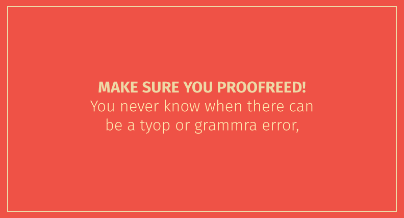
A few typos every now and then are no big deal, but a bunch of large mistakes can kill a relationships before it even begins.
Always take a little extra time at the end of each project to proofread for grammar, spelling, and punctuation (GSP) mistakes.
Don’t be afraid to ask for help! Everyone makes mistakes and it can never hurt to have a extra set of eyes. If you can’t find someone to proofread your stuff, consider using software to help you, like Hemingway or Grammarly.
Graphic Design Rules — #10 — Embrace Whitespace
Oftentimes, people new to design want to cram as many graphics onto one poster or booklet as they possibly can.
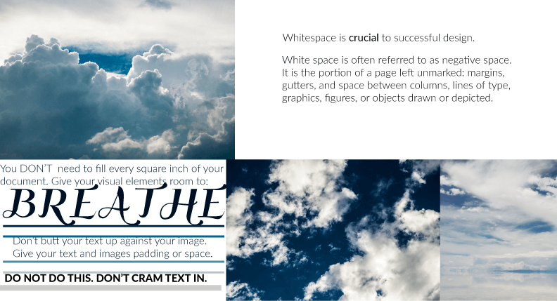
Calm down Jack — no one’s gonna die from a little extra whitespace on the page.
This is one of those graphic design rules that can make or break your design. Please, for the love of all that’s good in the world, conserve your whitespace!
Whitespace is the negative space in whatever you’re designing, the part of your page that has nothing in it — no graphic elements, no colors, no icons, no text, nada, zip, zilch. Having ample amounts of whitespace within your design can add a greater sense of professionalism and sophistication.
It also allows the viewer a moment of rest — you don’t want to cram so much information onto one flyer that the viewer becomes disoriented.
Get the Free Style Guide Template and Apply These Graphic Design Rules
Now that you understand the basics of graphic design, the rules are yours to break — but don’t get cocky just yet…
First, you need to put those rules into action for your brand.
Go ahead and grab the free Style Guide Template. It will lead you through the process of mapping out how your brand should be applied on any and all marketing materials. You can apply these graphic design rules directly and ensure that anyone who’s going to help you with your design, branding, or marketing is going to represent your brand the way you want them to.
Click the button to grab it free.
Digital & Social Articles on Business 2 Community
(110)
Report Post
