If you’re embarking on the path of inbound marketing–or any marketing approach at all, really–then you’ve decided to put in place a lot of efforts aimed at driving more people to your site, and hoping they will engage with your site.
But if the site isn’t worth looking at, then your efforts will be for naught.
It’s like making the plans for a family vacation. You pump up the whole family about all the things that they’ll be able to do at such-and-such destination you’ve picked, all the things they’ll see, and make reservations for these great activities and tours. But then you get there, and frankly, you chose the wrong hotel. It’s a dump. The rooms are small, the food is bad, housekeeping is rude, and when they said they were connected to the beach, they neglected to mention that several streets served as the points of connection.
You planned and planned, but now your kids are in a foul mood–the ugly package of this trip presented by the accommodations have dampened their spirits, and made them not so inclined to follow the rest of your grand ideas. After all, you were the one who chose the hotel…
It’s the same thing with your company’s website. You are planning all of these things to get your customers excited and engaged with your company. But if they arrive at the website, and they find a boring, outdated, static template, they likely won’t be so inclined to go further on the journey from prospect to customer that you mapped out for them. You want to capture their attention, and get them engaged and eager to see what’s to come.
Think of this as an investment in your business. You’ve had your website in place for maybe 5, 10 years. Now it’s time to put in the work to update it for the the next 10 years. You don’t have to reinvent the wheel with your redesign, but there are a few tips to keep in mind when working on optimizing your website to make it more appealing to your audience.
Space. The amount of space on your website will dictate its flow and readability; make sure there’s enough whitespace between and around paragraphs so that visitors aren’t overwhelmed by crammed, tight content.

Simple navigation. Your navigation menu should be simple to identify and simple to use. The easier it is for people to navigate through the site, the longer they are likely to interact with it, and the deeper they will explore it.
Buttons style. Quite simply, every button on the site should be easily identifiable as a button. Develop a distinct set of buttons that’s unique to your site, and follows a consistent theme through color, shape, or texture.
Mobile optimization. This is likely the most self-explanatory detail on the list, but must be included nonetheless. We live in a mobile world; 80% of internet users own a smartphone, and mobile digital media time in the US is now significantly higher at 51% compared to desktop at 42%. The take away is clear: if your website isn’t optimized to meet your audience where they are, on mobile search and display, then you’re not providing a satisfactory enough experience, and you’ll miss out to those who are.
Digital magic. High-res images are nice, but on a website you have more graphic and design tools at your disposal than you would in say a static brochure. You can produce a short video walking a customer through your product or service, or feature a simple animation that draws their attention to a call-to-action. In 2015, there is no reason for a website to look like it was written on a word processor and then pasted into HTML. Make it stimulating.
Great images. But that’s not to say that images don’t matter. Not every section of your website will have a spot for digital magic, and you need to keep things visual. Great images will draw users to your site, period. Don’t use too many stock photos or your site might end up looking like someone else’s. But as with anything, moderation is key–make sure your graphics support your message, and don’t make you lose sight of what you’re trying to convey.

About us. Many companies just take long, wordy blocks of product summaries, employee bios, and company history, paste them onto their “About Us” page, and call it a day. You of course need to convey to your audience who you are, what you do, and some key company philosophies, but you also want to keep your audience engaged. Put just enough information so that visitors don’t get bored or overwhelmed by the amount of text. Use the page to give your brand some personality. Perhaps consider an engaging design element, like small photos of your team that can be clicked to reveal more information.
Social buttons. The point of a dynamic website is to keep your audience engaged with your brand–not just the page they’re on. To that end, incorporate buttons that will easily direct them to your social media pages. They can be unobtrusively included in your informational footer, or wherever your contact information lives. Promote the ability for your users to engage with you across all platforms.

Remember that much of what determines the above elements are your buyer personas. If your audience isn’t the type to engage with videos, then videos aren’t the right fit for your website. What social media sites do your personas visit? Because that will determine which social buttons you include–LinkedIn is likely a given; Pinterest, maybe less so. You can optimize your website with as many keywords as you want, but if it isn’t appealing to the specific audience you’ve identified, then you’re not going to get the quality traffic you’re looking for.
In addition to the factors that will dictate your website’s design and layout, there are a few crucial textual elements that need to be considered for your website–and in particular, your homepage. After all, unless visitors access your site through a link to a particular blog post or product page, the first moment of interaction they’ll have with your site will be the homepage. So more than anything, you need to make it personal, direct, and engaging.
In addition to utilizing the design and layout tips above, particularly ease of navigation and a strong visual component, the best way to build your homepage is to ensure it includes the following components:
- Headline: answers in a clear, simple, and immediate way: “What does this site offer?”
- Sub-headline: offers a brief description of what you do. Don’t use jargon, or talk only about yourself–show the value of what you do in a clear, consumable manner.
- Benefits: elaborates off of what you do into why it matters, and lays out the benefits and advantages you’ll provide.
- Features: more neutral than benefits in providing people with a more general understanding of what you offer, though similar to benefits in that they should be presented in a way that serves the site visitor.
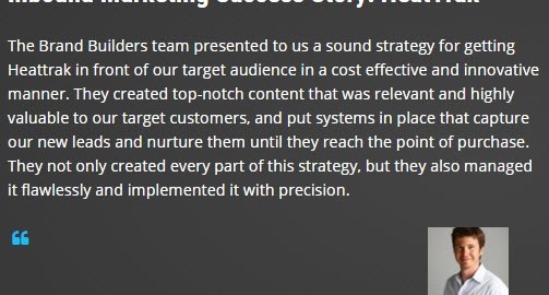
- Customer Proof: the best short quotes/testimonials you have from past customers, alongside a name and photo if possible, which will help build trust with new prospects.

- Success Indicators: Awards and recognitions work alongside customer success stories in making a good first impression.
Redesigning your website is not a simple or short process. But the reason why is clear: your site is the foremost representation of your brand, and it needs to be treated accordingly. These steps will help make your website attractive, personal, and easy to find, to help get a larger audience through the front door.
Digital & Social Articles on Business 2 Community
(159)
Report Post


