— September 27, 2017
Get Better Conversions from Your Home Page
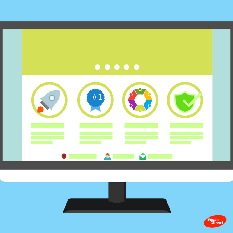
Your website’s home page should highlight your products or services in way that captures leads right away. In other words this is prime real estate where the sales ideally flow out of your website.
It’s important that your visitors know right away what you have to offer them. Your content should be well optimized and written in an emotionally compelling way that speaks to their needs and desires.
As you take a look at your current website or are thinking about starting a new one ask yourself exactly what action you would like your audience to take and why?
In order to draw interest there are several important elements of a successful home page that you should include.
1 – Share-worthy Headlines
The titles of your pages and posts are the first point of reference, and are read more than the rest of the copy on your page. You should create headlines that are unique, specific, urgent and useful. The words and position of your headline are important in increasing subscribers and conversions. Use a good headline checker like CoSchedule or Sharethrough to ensure you are capturing the reader’s attention immediately. Emotional words rank the highest according to an article on Kissmetrics, which shows CoSchedule’s study of over one million headlines:
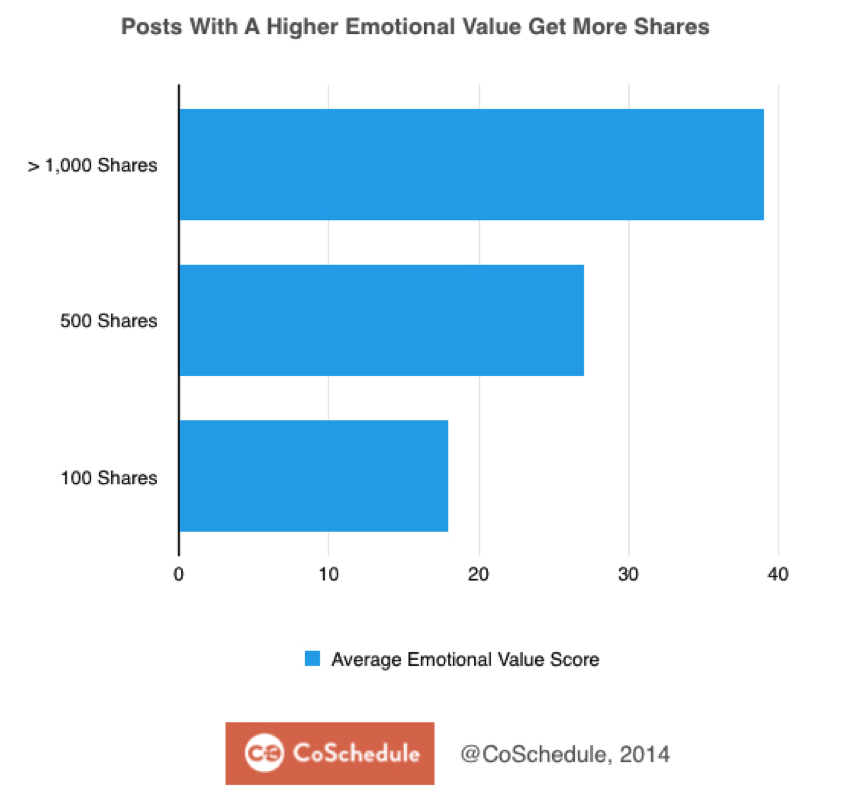
You have merely seconds to grab the reader’s attention so it’s important to start off with a promise that catches their attention and imagination. Don’t be boring, long winded, or give away the farm. You want them to be compelled to read more.
2 – Include Your Brand Story on the Home Page
Your brand story will capture the reader’s interest as they learn more about the human side of your name or company. People are more likely to opt in or buy what you’re selling if they can personally relate to you. Write a story that keeps your prospects interested and tells the reason of why you’re producing products or services. Showcasing what is unique to your business helps you stand out from the rest of the competition and makes your brand memorable.
3 – Build Credibility & Establish Rapport
As you are writing the content for your home page, include words and details that make the reader feel as if you know them personally, and that you understand exactly what they are looking for. With target market research you can discover more about your audience — when you know them well enough, you will be able to include the exact keyword phrases that get you entrance into their world.
Some creative ways to present this are:
- Online quiz or survey
- Free informative webinar or report
- Real testimonials
- An introduction video addressing them personally
4 – Relevant Images
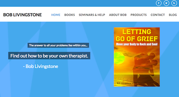
People are visual by nature, so you want to include strong imagery in strategic places. It’s important to not allow visual content to be too cluttered or take over the main page, but rather be used to enhance what you’re trying to convey. Simple is best — especially when it comes to mobile readability and website speed, like this example from one my clients, Bob Livingstone:
5 – Personal Connection
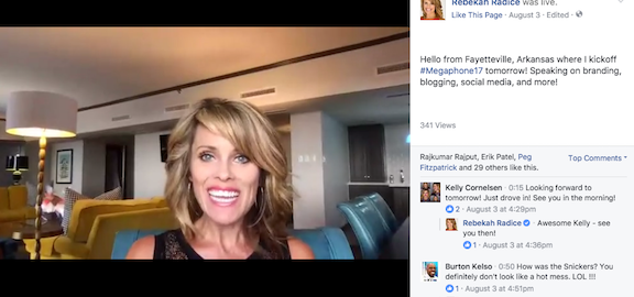
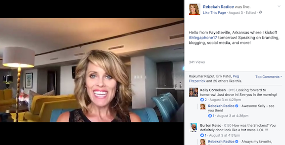
Make is easy for your visitors to get in touch with you either by phone, in a live event or in person. By making yourself available you are more reachable, and trusted. One of the best ways to accomplish this is through Facebook Live webinars for those who subscribe to your website. After you have made a connection your prospects can further connect with you to learn more about what you can offer them. Here’s a great example from marketing expert, Rebekah Radice:
6 – A Great Offer
Remember that you are selling solutions, not features, and you want your offer to convey the benefits of buying to the reader. You also want to make the offer hard for them to refuse. For example, you could include any of these elements:
- Free tips on a particular topic that leads to a full purchase of a book, membership, or product
- Sample chapter of an upcoming book or a product sample
- Coupon or discount for an event, product, or service
- A one-time free consultation
The point here is to provide a high value freebie that your prospects will want to share with their friends, family, and coworkers, and compel to them to make a full purchase.
7 – Reduce the Fear Factor
Many people choose to turn away from a purchase based on fear — they may not know enough about your business or can’t find a lot of reviews or recommendations from others. The more you can reduce their risks the better. Offer a risk-free incentive along with ways to find you online such as Facebook, Instagram, and Twitter where you are actively engaging with your audience and customers.
8 – A Strong Call to Action
Before leading your visitors to a sales message be sure to remind them about the benefits of your product or service. Let them know that they have a chance to change their lives by subscribing to your website to learn more or download a freebie. You don’t want them to leave your website wondering why they came there in the first place.
9 – Responsive Home Page Design
A good landing page must work well on any platform — both computer and mobile. Nothing can be worse than losing valuable click thrus after presenting an exciting headline yet your readers cannot view it or act now because the page is not responsive for mobile. If you have an older website now is the time to do an upgrade in order to rank higher on search engines and attract more readers.
10 – Take Them to a Sales Page
With software like LeadPages or Instapage you can have a money making page made up in less than hour, assuming you already have your images created, testimonials collected, and story ready to tell. These resources help you create a specific landing page where you can sell directly to your interested subscribers in very little time.
A sales page is designed to lead your prospects through the process of finding out more about what you have to offer them quickly and easily while integrating with many other marketing platforms such as Aweber, Ontraport, Facebook, WordPress and more.
Anyone who wants to increase their opt in rates, sales, and improve conversions should use a sales page separate from their landing page. If you’re running any type of marketing campaign for yourself or a client, you’ll enjoy using these to get the most out of your offers. You won’t have to come up with the design or layout on your own — everything is already included in services like these.
A website that speaks directly to your audience without an upfront sales pitch and includes a modern design can greatly improve your chances of not only capturing leads, but converting them into loyal customers. The best visitor experience is one which is simple, clear, friendly, and informative. Don’t be afraid to showcase who you are, and to include an easy way they can make a direct connection with your or your company.
Digital & Social Articles on Business 2 Community
(55)
