With 2020 just around the corner, now is as good a time as any to assess what web design trends lie ahead next year. Trends come and go in our industry but, in this article, we’re going to focus on the ones that are likely to shape web design for years to come.
The key web design trends we’ll be looking at are:
- Designing experience, not only websites
- Hyper-personalisation
- Minimal navigation menus
- Micro-interactions
- Dark modes
- Augmented reality
- Designing for voice search
- Designing for SEO
- Bold, custom typefaces
- Accessibility
- Avoiding design fads
Some of these are completely new trends while others have been talked about before but haven’t really taken off – normally due to lacking technology or slow adoption among designers. Either way, these are the key principles brands and designers alike need to implement for 2020 and beyond.
#1: Web Experience design
The most important design concept for brands to understand in 2020 is the importance of designing experiences, not only websites.

According to research from Google, today’s consumer journeys can involve anywhere between 20 and 500+ touchpoints. This can involve searches, engagement with your ads, page views, social media interactions, remarketing campaigns, more page views, multiple emails and all kinds of other touchpoints.
Your website is the hub of your online presence but the majority of touchpoints actually take place elsewhere: in search, social, email, over the phone or even in-store. These touchpoints define the experience users need from your website and how it fits in with the other channels/platforms making up the broader consumer journey.
A common mistake brands make is thinking the experience ends with the purchase/conversion. In reality, this is where the consumer journey really begins and the priority then becomes keeping these customers engaged with your brand to turn them into repeat buyers and maximise customer lifetime value.
#2: Hyper-personalisation
With consumer journeys becoming more diverse, the growing number of touchpoints reveals deeper insights into your target audiences. You’ve already got your buyer personas drawn up but now you have a wealth of behavioural data telling you what individual users want from your brand.
Every user is an individual with their own unique needs and 80% of shoppers are more likely to buy from a company that offers personalised experiences.
With AI and machine learning coming of age, designers and marketers are able to create hyper-personalised experiences that cater to individual users, rather than generic buyer personas. The most famous examples of this are probably Amazon’s product recommendations and Netflix’s content suggestions, both of which compare user data with millions of other user habits to spot patterns and make relevant recommendations.
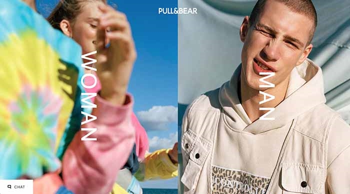
Data-driven personalisation isn’t your only option, though. You can also use navigational segmentation to guide users through personalised experiences.
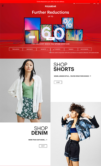
We’re also seeing a growing number of retail brands who build their entire business model around hyper-personalised experiences. We’ve previously looked at how Stitch Fix and other eCommerce brands use hyper-personalisation to tailor experiences to individual users.

Care/of is another brand that delivers a 100% personalised service to each individual user and the best part of this approach is people willingly hand over the data you need because it makes the experience what it is.
#3: Minimal navigation menus
The old days of mega menus and nested links are long behind us in the mobile age, which has forced designers to consider alternative approaches. The hamburger menu certainly caught on as the go-to responsive solution but hiding menus with ambiguous symbols makes a number UX compromises.
Now, designers are increasingly taking a more refined approach to website structure and menu design.
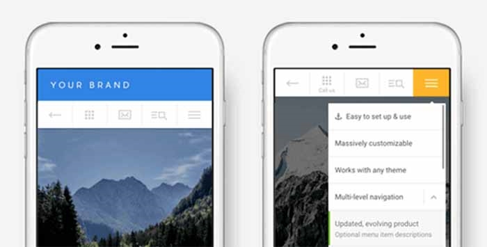
The Touchy 3 WordPress plugin from Ink Themes creates minimal mobile navigation menus
Minimal navigation menus stick to 3-5 links in the top tier, making them small enough to stay on-screen for mobile users. Keeping navigation visible provides contextual visual clues about your site/app operates and reduces the number of clicks for basic navigation.
Multi-tiered navigation can still be implemented with popup sub-menus or segmented, on-page navigation that guides users through predefined paths – perfect for navigational personalisation.
#4: Micro-interactions
Micro-interactions are essentially UI animations that communicate action to users and create a more immersive experience. Some of the most common examples are the likes and emojis on Facebook or a percentage counter when you upload a file to some cloud software.
In the last section, we said that on-screen navigation provides important contextual clues about how your site operates and micro-interactions take this concept even further by increasing visual feedback to create a more interactive experience that encourages engagement.
For the likes of Facebook, this is important for maximising likes while it’s also a powerful technique for guiding users to the most important parts of your website.
#5: Dark modes
Dark modes are cropping up everywhere at the moment and there’s not much chance this web design trend has gone unnoticed – it’s hardly subtle.
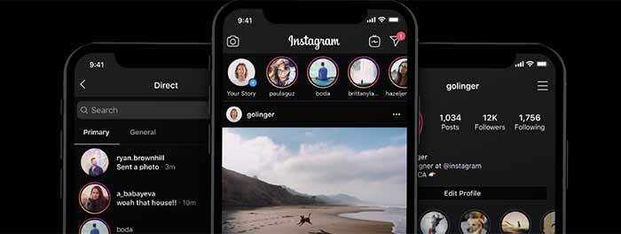
However, dark modes aren’t simply there for visual perks; there are some important design principles behind them:
- They’re more energy-efficient, particularly on OLED and AMOLED displays.
- White text on dark backgrounds reduces eye strain in low-light conditions.
- Darker screens reduce glare, flickering and blue light.
Essentially, dark modes are a product of the smartphone-addicted insomniacs we’ve all become. Five years ago, white text on black backgrounds would have been a mockery of basic design principles, but midnight Instagram sessions are more important than all that stuff.
#6: Augmented reality
Augmented reality (AR) has been on the cards for a while now but the technology hasn’t really lived up to the hype. However, we are starting to see implementations that genuinely add to the experience of engaging with brands and buying products.
Happi: “ModiFace, the international leader in AR and AI for the beauty industry, which was acquired by L’Oréal in 2018, will now provide its AI-powered tech to enable the first virtual try-ons for cosmetics on Amazon.”https://t.co/mIKShcEY47 pic.twitter.com/WkDOIdfnkv
— ModiFace (@ModiFace) June 11, 2019
L’Oréal is now using some AI-powered AR to provide virtual try-ons for cosmetics buyers on Amazon. While IKEA has its own implementation for allowing potential customers to see how items will look in their homes.
AR still has some growing up to do but there’s a lot the technology can already do for consumer brands selling items people want to try on first or place in their immediate surroundings.
Gucci’s new #AR try-on app is pretty cool https://t.co/Qsq4Oybjsf pic.twitter.com/ytXqJdQk4E
— Ricardo (@RicO2O) June 28, 2019
#7: Designing for voice
Voice search is another technology that still needs time to mature but designers need to start thinking about creating platforms/experiences for it now. Above all, brands need to make sure their sites are designed for voice search and this is one of many areas where designers and SEOs need to work together (more on this in the next section).
Optimising for voice search will be crucial for visibility as the technology continues to become more prevalent, but that’s not all designers need to think about.
Voice provides an entirely new kind of interface for designers and developers to integrate into the wider experience. This opens up a lot of room for innovation where apps can be operated hands-free and conversational interactions with brands can take place. We don’t really know how far this technology can really take us but 2020 is the year for designers to start pushing current limits.
#8: Designing for SEO
According to Unbounce’s 2019 Page Speed Report, only 3% of marketers say faster loading times was one of their priorities this year. That’s bug fail for UX design and SEO alike, considering the same report says almost 70% of consumers admit that page speed influences their likeliness to buy.
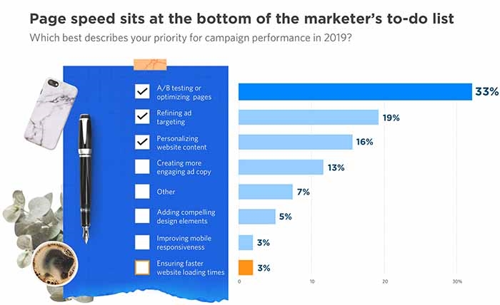
Google research has found that loading time of more than three seconds seriously damage your conversion prospects and moved to make mobile page speed a ranking factor in 2018.
This isn’t the only design factor that impacts your search ranking, though. You also need to consider the following:
- Website structure
- Navigation
- Layout
- Content quality
- Content placement
- Internal links
- Use of JavaScript (eg: dynamic content)
- Mobile optimisation
- Intrusive content (popups, autoplay videos/audio, ads, etc.)
The list goes on and poor design choices are going to hurt key engagement metrics like bounce rate, pages visited and time on page – pretty strong indicators of whether Google should keep sending traffic your way.
Every year, Google incorporates more design factors like mobile optimisation and page speed into its algorithm. Design and SEO are becoming increasingly inseparable and this means the two departments need to work very closely, from the early concept stages.
#9: Bold, custom typefaces
This is a trend that’s been gradually gaining momentum in the design industry over recent years and it’s now ready for wider adoption. We’ve seen a lot of tech giants like Google and Facebook create their own custom typefaces for logos in the past few years while the world’s leading brands have a long history of creating their own typographic stamp.

As Shawn Sporckett explains in his article for the UX Collective, “Airbnb, Google, IBM, and even Jagermeister, have all created custom typefaces in the past year to help them overtake impersonal marketplaces with more personable experiences.”
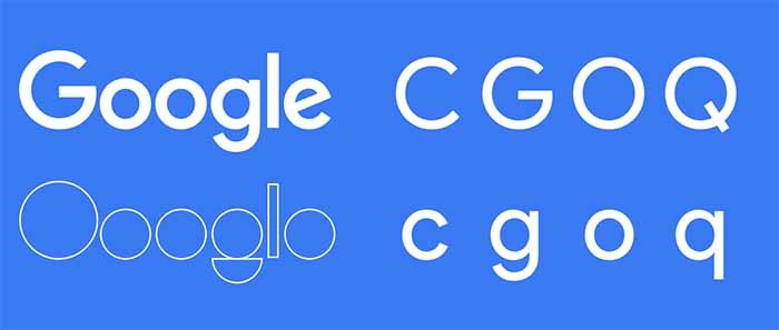
In the case of Google, the tech giant provides products for marketers, advertisers, B2B brands, B2C brands and even government sectors. As Shawn Sprocket points out, Google’s logo redesign means all of its products “now share a common typeface that creates a visual connection of clarity with just the right amount of levity.” He describes the new logo as “a great example of communicating friendliness without being juvenile; of inspiring trust and competence without appearing intimidating or overbearing.”
The branding power of custom typefaces has been evident for decades, as a tool for differentiating from competitors while simultaneously creating something people can familiarise with.
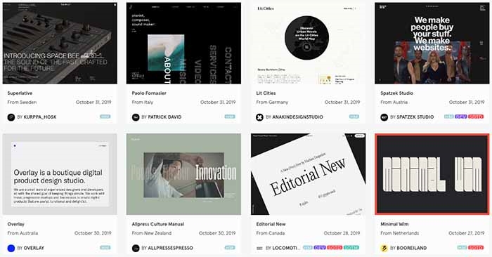
Custom typefaces also allow you to differentiate through typographic design, making you less reliant on bulky images throughout your website. It’s amazing what you can achieve with a custom typeface, bold text, whitespace and high contrast – a combination that’s very undemanding when it comes to server requests and loading times.
#10: Accessibility finally goes mainstream (we hope)
It’s a real shame to be including this in a web design trends article for 2020 but Domino’s recently losing a court case in the US over poor accessibility for blind users reminds us how much progress still needs to be made. If that particular court case should teach brands anything it’s that there are specific legal requirements when it comes to making websites and apps accessible.
In the UK, the latest version of these regulations are called the Public Sector Bodies (Websites and Mobile Applications) (No. 2) Accessibility Regulations 2018.
For websites created on or after 23 September 2018, the deadline for being compliant with those regulations was 23 September 2019 and sites created before then need to be compliant by 23 September 2020.
Mobile apps need to be compliant by 23 June 2021.
#11: Avoiding design fads
From parallax and infinite scrolling to video backgrounds and browser-stalling animations, there are plenty of design “trends” that should never have caught on. This year will be no different and there’s already a lot of talk about 3D animations in 2020. That may sound cutting edge but, until the average internet connection drastically speeds up and web browsers become more efficient, the practical application of 3D animations are basically nonexistent.
More to the point, what value are they really going to add to the experience of using your site?
Brutalism is another design trend that continues to pick up steam but there’s no need to jump on the bandwagon. If that fits with your brand images and/or principles, then go for it. For the vast majority of brands, though, this is a stylistic fad that will soon disappear.
Focus on the web design trends that add value to the end user because these changes will outlive any superficial makeovers.
Digital & Social Articles on Business 2 Community
(80)
Report Post

