Whenever you hear a marketing practice referred to as “easy,” it’s usually not. Contributor Ayat Shukairy looks at some common CRO misconceptions and their uncommon realities.

A lot of content on conversion rate optimization (CRO) is published every day. Most of it is spot-on, but some articles make me cringe a little.
A lot of the advice being shared gives people false hope that if they conduct CRO correctly, they’ll see the millions roll in. It’s not that easy. The process is vigorous and requires a lot of time and effort — much more than the advice being shared will lead you to believe.
Whenever you hear a marketing practice referred to as “easy,” it’s usually not. Let’s look at some common CRO misconceptions and their uncommon realities.
Misconception 1: Anyone can do it
Not hardly! To do well in CRO, you need good people on your team. A conversion rate optimization team usually includes:
- Two or three conversion optimization specialists.
- A UX designer.
- A front-end developer.
- A customer research specialist (can be part-time).
- An analytics specialist (can be part-time).
- A data analyst (can be part-time).
- A product or program manager, depending on your business.
With all the different job types and responsibilities, how can one person do it all? Unless they’re Wonder Woman, they can’t.
Now that we have an idea who we will need on our team, let’s look at common statements you’ll hear about CRO that aren’t always accurate.
Misconception 2: There are CRO best practices
Everyone wants best practices, but in CRO, best practices simply don’t exist. We wish we had best practices, but it’s not a reality because what works on one website may not work on another.
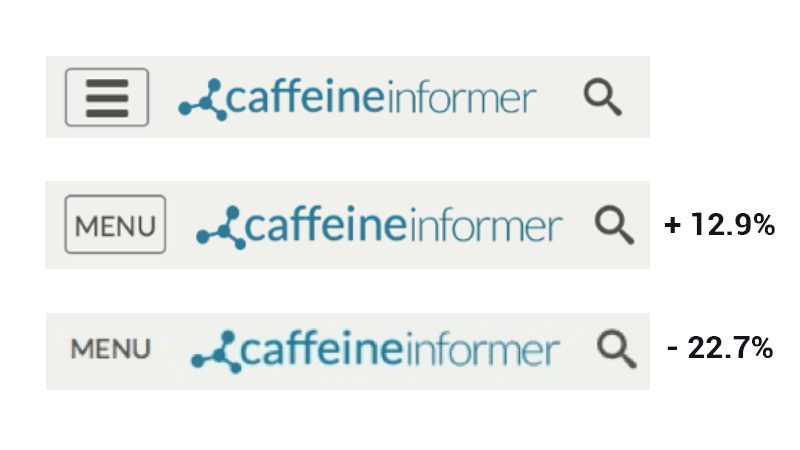
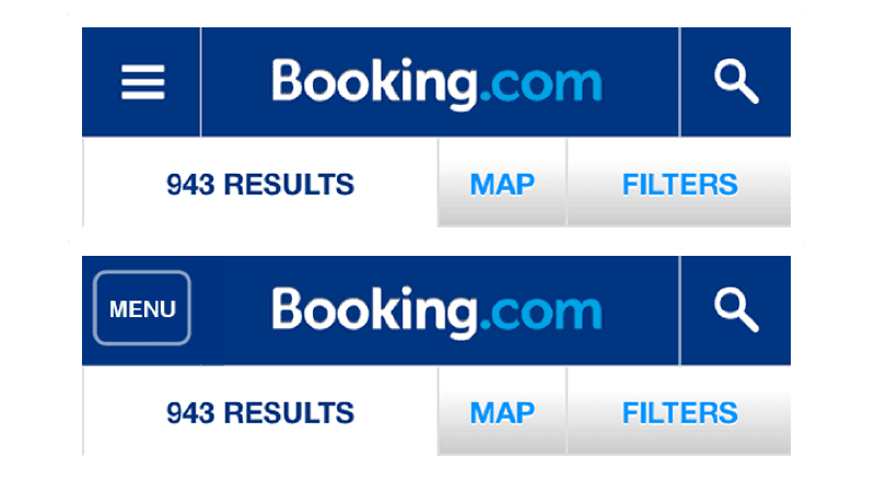
For example, CaffeineInformer and Bookings.com both tested the same navigational menus and found the most commonly recommended menu worked for one but not the other.
CaffeineInformer tested the hamburger menu (an icon made up of three bars) versus the traditional word MENU enclosed with a border and one without a border, writing up and publishing the results online. You can see that the boxed MENU results were clicked on more often than MENU without a border, and the hamburger menu showed no use.

When Bookings.com ran their test results, which a designer wrote about on the company’s blog, they found no difference in the number of clicks for their MENU options:

Representatives from Booking.com said:
With our very large user base, we are able to state with a very high confidence that, specifically for Booking.com users, the hamburger icon performs just as well as the more descriptive version.
So, although your competitors may inspire you, most of the time you’ll find what they introduce on their site may not work on yours. In the case above, it’s a small change, but we have seen companies make a bet on a change that costs hundreds of thousands of dollars and produces a negative impact on their site.
My advice is to know what is out there and get inspiration from other sites, but validate through research, prototyping and usability testing before rolling out a change on your site (especially if it’s major). If it’s something minor like a hamburger menu, go ahead and test, but ask yourself, what are you really trying to achieve with the change? Consider the validity of the concept to begin with and see if it fits within the overall roadmap you have for your site.
Misconception 3: More testing yields positive results
Statistically speaking, more variations = greater possibilities of false positive and inaccurate results.
My staff experienced this when we were first starting out as CRO practitioners. We would start testing by running a control versus variant 1, variant 2 and variant 3.
Once we found a statistical winner, we would launch just the control versus the winner. For example, if variant 2 reached statistical power with a significant statistical lift, we would launch control versus variant 2.
Of course, variable 2 completely tanked. What happened? Well, statistically, each variant brings a chance of a false positive. So of course, more variants = more chance of false positives.
According to Sharon Hurley Hall’s blog post on OptinMonster.com:
Most experienced conversion optimizers recommend that you don’t run more than four split tests at a time. One reason is that the more variations you run, the bigger the A/B testing sample size you need. That’s because you have to send more traffic to each version to get reliable results. This is known as A/B testing statistical significance (or, in everyday terms, making sure the numbers are large enough to actually have meaning).
If you have low conversions (even in the presence of a high volume of traffic), you definitely shouldn’t test beyond one variation.
Anyone with a sufficient number of conversions should be cautious and test, then retest the winning variation over the control to ensure it sticks.
Misconception 4: CRO is A/B testing
A/B testing is a part of the conversion rate optimization process, but they are not one in the same.
Our methodology for conversion rate optimization is combined into the acronym SHIP:
Scrutinize, Hypothesize, Implement and Propagate
Over 70 percent of the time we spend doing CRO is the scrutinize (planning) phase of the process. An unplanned test that is not backed by data does not usually do well.
When we talk about conversion optimization, the mind should go to design thinking, innovation and creativity. Ultimately, you are optimizing an experience and bringing it to a new level for the site visitor. You’re putting a spin on solutions to complex problems to ensure the visitor not only converts but has a memorable, enjoyable experience they’ll buzz about.
That is no easy feat!
Misconception 5: A simple change will impact your bottom line
Sometimes a simple change can have an impact. but let’s be real: that’s the exception, not the rule.
Expecting a color change on your site will increase conversion by 40 to 50 percent is really a stretch. When someone says it will, I immediately wonder, “How long did the test run?” and “Did it reach statistical power?” I think Allen Burt from BlueStout.com said it best in an expert roundup on Shane Barker’s blog:
I love talking about how we can increase conversion rate and how we can optimize it, because most sites, especially ecommerce merchants, get this wrong. They think it’s all about A/B testing and trying different button colours, etc. In reality, for 90% of small to medium-sized businesses, the #1 change you can make to your site to increase conversion rate is your MESSAGING.
Don’t try and take the easy route; usability issues need to be addressed, and testing colors and critical calls to action like a “Proceed to Checkout” statement is a viable test. But expecting a “significant impact” on your bottom line for simple changes is asking too much
One of the key components of a successful CRO program is the creativity behind it. Test and push limits, try new things, and excite the visitor who has been accustomed to the plain and mundane.
Misconception 6: A/B test everything
In the past, there was a strong emphasis on A/B testing everything, from the smallest button to the hero image. But now, the mood has changed, and we see A/B testing differently.
Some things just need to be fixed on a site. It doesn’t take an A/B test to figure out a usability issue or to understand that conversions increase when common problems are fixed. A simple investigation may be all that is required to determine whether or not an A/B test should be done.
When evaluating a site, we find issues and classify the fixes for those issues in “buckets,” which helps determine further action. Here are the four basic buckets:
- Areas and issues are evaluated for testing. When we find them, we place these items in the research opportunities bucket.
- Some areas don’t require testing because they are broken or suffer from an inconsistency and just need to be fixed. We place these issues in the fix right away bucket.
- Other areas may require us to explore and understand more about the problem before placing it in one of the two former buckets, so we add it to the investigate further bucket.
- During any site evaluation, you may find a tag or event is missing and not providing sufficient details about a specific page or element. That goes into the classification instrument bucket.
Misconception 7: Statistical significance is the most important metric
We hear it all the time: The test reached 95 percent statistical confidence, so we should stop it. However, when you look back at the test, between the control and the variation, only 50 conversions were collected (about 25 for each), and the test ran for only two days.
That is not enough data.
The first step to consider when launching an A/B test is to calculate the sample size. The sample size is based on the number of visitors, conversions and expected uplift you believe you will need to reach before concluding the test.
In a blog entry on Hubspot.com, WPEngine’s Carl Hargreaves advised:
Keep in mind that you’ll need to pick a realistic number for your page. While we would all love to have millions of users to test on, most of us don’t have that luxury. I suggest making a rough estimate of how long you’ll need to run your test before hitting your target sample size.
Second, consider statistical power. According to Minitab.com, “[S]tatistical power is the probability that a test will detect a difference (or effect) that actually exists.”
The likelihood that an A/B test will detect a change in conversion rates between variations depends on the impact of the new design. If the impact is large (such as a 90 percent increase in the conversions), it will be easy to detect in the A/B test.
If the impact is small (such as a 1 percent increase in the conversions), it will be difficult to detect in the A/B test
Unfortunately, we do not know the actual magnitude of impact! One of the purposes of the A/B test is to estimate it. The choice of the effect size is always somewhat arbitrary, and considerations of feasibility are often paramount.
Another important point here is to understand that it’s important to keep your business cycles in mind. In the past, we’ve seen sites where conversions spike on the 15th and 30th of every month. In order to run a test that would account for the entirety of that 15-day business cycle, we would need to test for a minimum of 2 1/2 weeks (including one of the spikes for each testing period).
Another example is SaaS companies, where a subscription to their service was a business decision that often took two months before closing. Measuring conversions for less than that period would skew data tremendously.
Misconception 8: Business owners understand their customer base and visitors
A client of ours insisted they knew their customer base. They are a billion-dollar company that has been around since 1932, with 1,000 stores and a lot of customer data. But they have only been online for about 10 years.
Based on our experience, we told this brand their online customers will behave and act differently from customers in their brick-and-mortar stores and may even vary in terms of overall demographics.
However, our client insisted he knew better. After doing research, we suggested running some experiments. One particular experiment dealt with the behavior and actions of visitors on the cart page. Was the cart used to store products until they came back later? Or was it just not effective in persuading visitors to move forward? Our theory was the latter. We shared that from what we observed, there was hesitation to move beyond the cart page.
This suggestion was met with a lot of resistance from the brand’s director of marketing, who claimed we didn’t understand their customers as they did. To compromise, I suggested we test a percentage of traffic and slowly grow the percentage as the test gained momentum. If the customer follow-through did not grow, we would end the test.
The test was launched and reached sample size within days because of the amount of traffic and conversions they have, and it revealed a 20.4 percent improvement.
The brand was stumped and realized there was another way to think about how their customers were using their shopping cart.
According to William Harris from Elumynt.com (also published in Shane Barker’s roundup):
It’s easy to get stuck in the “A/B testing world,” looking at data and numbers, etc. But one of the best sources of learning is still having real conversations with your customers and ideal contacts. It also increases the conversion rate.
The point of my story is this: You think you know, but until you do the research and conduct testing on theories you’ve built, you can’t be sure. Additionally, the landscape is ever-changing, and visitors are impatient. All of that plays into your ability to persuade and excite visitors.
Misconception 9: Only change one thing at a time
The next two points are related. Some people feel you should move slowly and make one change at a time in order to understand the effects of the change. When you’re testing, you create a hypothesis regarding the test, and it may involve one or more elements.
It isn’t template tweaking (e.g., just changing locations and design of elements); it’s testing against an entire hypothesis which is backed by data resulting in data-driven changes that visitors can see and feel.
Misconception 10: Make multiple changes each time
Counter to the point made in number 9 above. Sometimes we find a hypothesis becomes muddled because other changes are included within a single test. That makes it difficult to decipher the authenticity of the results and what element impacted the test.
Always stick to the hypothesis, and make sure your hypothesis matches the changes you’ve made on the site.
Misconception 11: Unpopular elements should be avoided
We had an account that simply did not believe in carousels. I’m not a fan, personally, but because the account sold a specific product, we felt carousels were necessary and recommended they be used.
But the account resisted until customers started complaining. It wasn’t until then the account realized carousels will help visitors find what they need and give breadth to the range of products they were selling.
Elements that have been deemed unpopular aren’t always unpopular with your customer base or your specific needs. If the research shows an element can provide a solution for you, test it before you completely discount it.
Misconception 12: Your site is too small for CRO
Conversion rate optimization is not only about testing. CRO is about understanding your visitors and giving them a more engaging experience. All digital marketers and webmasters owning a site of any size should be implementing CRO.
If you have the traffic to justify your theories, test! Otherwise, continuously update your site and measure your changes through observation of key metrics through your analytics or through usability testing.
Opinions expressed in this article are those of the guest author and not necessarily Marketing Land. Staff authors are listed here.
Marketing Land – Internet Marketing News, Strategies & Tips
(67)
Report Post


