Imagine if shopping in the real world were the same as shopping online. You walk into a supermarket or a department store, start filling up your shopping cart, only to be suddenly distracted by a kitten playing with a nerf gun in Aisle 3. You promptly forget about whatever it is you were thinking of buying, watch the kitten for a while, then walk out of the store.

Admittedly, this scenario is… unlikely. However, this happens all the time in the world of ecommerce. Despite your best-laid plans, users visit your site, start shopping, then close the tab so they can watch the latest trailer for Season 6 of Game of Thrones, never to return.
Shopping cart abandonment is one of the most crucial problems for online businesses to overcome. Unfortunately, it’s also impossible to mitigate against entirely – some people will inevitably abandon their carts before crossing the line and making a purchase. That said, it’s definitely not impossible to improve your ecommerce experience to reduce and combat shopping cart abandonment, and in today’s post, we’ll be looking at 13 ways to do just that.
13. Establish and Build Trust in Your Transaction Forms
Some online retailers see transaction forms as a mere formality in the sales process – they’ve already tempted you with their wares, so why wouldn’t you fill out a lengthy form without question? However, this is most definitely not the case, and your transaction forms are just as vital a tool in establishing and building trust in your site as any other part of the process.
Remember that, by asking your customers to fill out a transaction form, you’re essentially asking them to trust you with their personal information. This goes far beyond just their contact details; you’re asking for their credit card details, something many people are (understandably) hesitant to part with.

To offset the hesitation of handing over their hard-earned money – and financial identity – use your transaction forms as an opportunity to build and establish trust. Include trust signals such as security logos in a prominent position somewhere close to your transaction forms.
Also, make sure the logos are recognizable and commonplace (such as the “Norton Secured” logo, which replaced the commonplace “VeriSign Secured” logo). Data cited by Shopify indicates that almost 61% of consumers had not purchased something online because trust logos were missing, but also that more than 75% of consumers had chosen against making a purchase because they didn’t recognize the trust logos.

Data via Shopify
12. Include a Progress Indicator on Checkout Pages
You know when you’re standing in line at Target and the cashier asks you for your zip code, or your phone number, or your star sign? Whether you have a rewards card? Whether you’d like to save 10% by opening one? All of these things are irritations that prolong the checkout process – and should be avoided in any ecommerce experience. One of the best ways to do that is by including a progress indicator on your checkout pages.
By clearly showing customers where they are in the checkout process, you’re eliminating the potential worry that actually buying something from you is going to take more time than the prospect is willing to commit. It assures visitors that they’re almost done, and they’ll soon be able to get back to looking at cat .gifs online or whatever it is they’d rather be doing. It also helps eliminate ambiguity and makes the process clearer and easier for customers to understand. Several studies have shown that a majority of consumers prefer having a clear indication of their status in the process of completing a task, and ecommerce is no exception.

Ideally, a progress indicator should have as few steps as possible. The example above makes it clear that this three-step process is all customers have to do to finish up, making the experience more straightforward and less intimidating. Compare this example with the one below – which do you find more appealing?

Even if it isn’t, it looks like a lot more work, which may deter prospects from completing the checkout process. I’d argue that, in the example above, the entries for delivery address and delivery method could be combined into a single step, as could the payment and confirmation stages.
As with anything else, it’s worth A/B testing variants of your progress indicators before making any firm decisions. What works wonders for one site might not necessarily work for yours, so be sure to base any decisions you make on actual data based on your site users’ behavior.
11. Include Thumbnail Images of Products Throughout the Purchasing Phase
Most people aren’t going to forget what’s in their shopping cart (unless they’re on a serious shopping spree), but like a progress indicator, including thumbnail images of the products they’ve placed in their cart can be another “grounding” technique that reassures the customer of what they’re purchasing.
When you buy something in an actual store, you can see whatever you’re buying right there in front of you. This might not necessarily be the case in an ecommerce experience. By including thumbnail images of products in the customer’s cart, you’re not just helping them remember what they’re actually doing – you’re eliminating the possibility of distraction, specifically of the hesitation a customer might experience if they can’t immediately remember what they’re buying.

The checkout page above is an excellent example of how effective this technique can be. Not only does the page include small (yet easily identifiable) thumbnails of the products in the customers’ shopping cart, it also streamlines the three-step checkout process into a single page. This is much less intimidating than a multi-page process, and the customer can see exactly what they’re buying throughout the entire checkout experience. Another benefit of the thumbnails is that it keeps the actual products front-and-center in the prospect’s mind, reinforcing the desire to buy them that prompted them to begin the checkout process in the first place.
Optimizing any ecommerce checkout experience is all about minimizing friction and making it as easy and comfortable as possible for customers to buy things. Including thumbnails of purchases in customers’ carts helps ground the visitor throughout the process and greatly reduces the risk that they’ll abandon their cart in a moment of apprehension or hesitation.
10. Make Navigation Between Cart and Store Effortless
Consumers rarely decide on a purchase, efficiently and quickly find and select it, and check out in a single streamlined experience. Just like in a real store, shopping online can be indirect, inefficient, and far from linear. The easier you make it for customers to move between their cart and your store, the more likely they are to stick with it and actually check out.

However, while making navigation between a shopping cart and an ecommerce store is one of the most effective ways of reducing friction during the checkout process, it’s also one of the hardest to get right. Even gigantic ecommerce retailers like Amazon are constantly experimenting with checkout flow to precisely optimize the checkout experience and make it easier for consumers to buy more stuff.
Many of the same principles of web navigation that apply to the rest of your site also apply to your checkout pages. The old web design adage of “the Back button doesn’t exist” rings especially true for your checkout process. If you force your visitor to click “Back” (or commit other crimes against web navigation) you need to rethink your navigational flow.
Make it effortless for customers to save – and later return to – their carts-in-progress, and help them to navigate your site by offering logical, intuitive navigation options between your checkout and product pages. The more work you force your prospective customers to do, the less likely they are to cross the line and convert.
9. Offer Multiple Payment Options
When designing your ecommerce checkout pages, you don’t want anything – anything – to come between your customers and a satisfying, rewarding, and ultimately seamless shopping experience. However, if you’re only offering a single payment option (or very few choices), you’re putting unnecessary obstacles between your prospects and your sales.

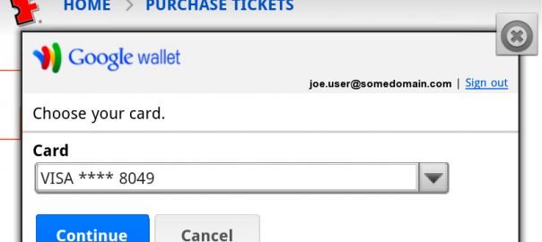
Credit card payment options are a no-brainer, but today, consumers have more choices than ever before of how to pay for goods online. PayPal is still going strong (somehow), but mobile payment systems such as Apple Pay and Google Wallet are becoming increasingly popular, particularly among younger demographics.
Offering more payment options minimizes – or eliminates – another potential reason a customer has to abandon their cart and take their business elsewhere. Sure, the more payment choices you provide, the more hassle it is for you as a business owner (and the higher your merchant services fees may be), but you’re giving your customers what they want, and that’s what it’s all about.
8. Include a Strong Call to Action on Checkout Pages
Many sites fail to include any calls to action on their checkout pages whatsoever. The “logic” behind this seems to be rooted in the assumption that if a prospective customer has added something to their cart, then they no longer need any incentive to actually buy it – a fatal flaw in the marketer’s mindset. On the contrary, checkout pages are the perfect place for strong, clear calls to action that strengthen the resolve of the prospect to complete their purchase.

While it’s important to include strong CTAs on your checkout pages, it’s equally important to ensure that the messaging of these CTAs is consistent with others across your site and marketing materials. Remember that you’re aiming to provide a continuous, seamless experience from discovery through purchase. If you suddenly change the tone of your CTAs on your checkout pages, this might seem jarring to visitors – even if they don’t immediately grasp why. It’s also important to make your CTAs as clear as possible.
If your CTAs include ambiguous words such as “Continue”, consider testing them against clearer, more active verbs to see whether your CTAs can help visitors understand exactly what they’re doing and what’s expected of them.
Keep the messaging consistent throughout your CTAs, right through to your checkout process. If you favor friendly, connective language in your marketing material, maintain this approachable tone during the checkout process. If you’re leveraging urgency or another incentive, keep this pressure on during checkout. Also be sure to use appropriate and consistent CTAs depending on where the prospect is in the process, especially if you’re using a progress indicator – don’t jump the gun and make assumptions about users’ understanding of where they are in the process.
7. Make Saving Carts Effortless
When you shop at a brick-and-mortar store, you either commit to buy something or you don’t. You can stand in line and wait to pay for whatever’s in your cart, or you can leave the store with nothing. Shopping online isn’t as straightforward, however. Consumers expect to take advantage of the benefits of shopping online, including the ability to return to an ongoing order – sometimes repeatedly. To improve your conversion rates, make it effortless for users to return to carts-in-progress.
Saving a shopping cart should be as easy as clicking a single button. With so many potential distractions (both in “real life” and online), you should almost expect disruption in the checkout process, which is why it’s crucial to allow shoppers to return to their carts later to complete their purchase at a time that’s convenient for them.

There are several ways you can help users save a shopping cart. You can require that users sign into their accounts – which isn’t always the best approach, as we’ll learn in tip #6 – or you can use browser cookies to “remember” customers’ carts without forcing them to log in (which can be either incredibly helpful or a serious invasion of online privacy, depending on the perspective of the user). Most browsers offer users the option of remembering login credentials for sites such as Amazon, reducing the friction of demanding repeated sign-ins and making it easier for users to temporarily abandon their carts and return to them later, a convenience that most online consumers have come to accept and even expect.
Ideally, saving a cart for later completion should be as easy for the user as possible – or even literally effortless. You might want to test whether saving shoppers’ carts by default helps your conversion rates, as sometimes even the most determined bargain hunter won’t think to manually save their cart. However you choose to help prospects come back to ongoing purchases, be upfront about it. Don’t creep your customers out by saving their data without their knowledge or permission.
6. Offer Guest Checkout Options
You might see the checkout process as an invaluable opportunity to collect data about your users – and it can be – but forcing customers to create an account with your store can be a major deterrent to completing a purchase.
According to data from Invesp, failing to offer a guest checkout option is one of the leading causes of shopping cart abandonment. Approximately 14% of online shoppers indicated that forcing them to log in to complete a purchase was sufficient reason for them to abandon the process – a more serious obstacle than asking for too much information and an overly complex checkout experience:

Image via Invesp
By offering a guest checkout option, you will have to sacrifice some of that sweet, sweet data that marketers crave. However, you’ll also make things a hell of a lot easier for your customers, which is exactly what they want. The easier you make it for people to buy from you, the more sales you’ll make. Plus, if you offer as frictionless an online shopping experience as possible, you may find previous customers will be more willing to not only purchase from you again in the future, but also create accounts to take advantage of loyalty programs and other incentives.
5. Offer a Bulletproof Money-Back Guarantee (or Other Assurances)
Hesitation and uncertainty are the mortal enemies of ecommerce retailers. The more you can do to either preemptively overcome potential objections or continually reassure prospects, the more likely you are to see your conversion rates increase. One of the best ways to overcome hesitation in the online purchasing journey is by offering bulletproof money-back guarantees or other assurances.
By virtue of the nature of ecommerce, there is a great deal of trust involved in the transaction process. Users cannot “see” what they’re buying, only images. They can’t touch it, feel it, kick the tires – they only have whatever you give them to go on, and that’s before you even take the “sending credit card information into the ether” element of the experience into account. Sure, ecommerce has come a long way since Amazon started way back in 1994(!), but there’s still a great deal of hesitation and uncertainty for online retailers to overcome.

Great examples of preemptively overcoming risk aversion
by Neil Patel
Offering a no-questions-asked money-back guarantee (or similar offer of assurance) greatly reduces the potential objections a prospect might have about buying from you. It shifts the focus from the price and terms of sale to the actual product, which hopefully should speak for itself. If a customer does have reservations about buying from you, it shouldn’t be out of fear of losing their money.
Do whatever you can to make customers feel better about buying from you. Zappos is famous for its service and generous returns policy (which includes 365 days to make a return and free return shipping), so be equally bold in your commitment to taking care of your customers. Even if you already have an awesome returns policy, don’t hide it in the depths of a terms and conditions page – put it front-and-center somewhere in your checkout process to offset potential hesitation in your prospects, as Neil Patel does in the example above.
4. Be Crystal-Clear About All Costs Upfront – ESPECIALLY Shipping
There are few things more frustrating about shopping online than expecting to pay one price, only to discover you’re being stung with a whole mess of hidden costs, fees, and surcharges – and one of the worst costs to discover after you’ve begun the checkout process is outrageous shipping charges.
Data from UPS suggests that, of all the costs associated with online retail, shipping costs are the most universally loathed. Consumers absolutely hate paying for shipping costs – so much so that it’s the single biggest reason for shopping cart abandonment.

Data via UPS
Not only will a majority of consumers go to Herculean lengths to avoid paying shipping costs, they’re also highly sensitive to how shipping costs are presented. Data from KISSmetrics reveals that unexpected shipping costs account for almost one-third of all abandoned ecommerce shopping carts:

Image via KISSmetrics
So, we now know that consumers hate paying for shipping – but they hate being surprised with shipping costs even more. With that in mind, it’s vital that you’re as forthcoming about shipping costs as you possibly can be. Don’t try to sneak shipping costs in toward the end of a transaction. Your customers deserve (and expect) better than that. Be upfront about how much it will cost to get your products to your customers.
Another factor to consider with regard to shipping is delivery estimates. If you’ve ever been presented with a vague, indeterminate estimate of how long you can expect to wait before your package will arrive, you know how frustrating this can be. Check out this example from Shopify:

Not only does this “Standard Shipping” option fail to tell customers how long they can expect to wait to receive their goods, it also forces them to navigate back to the product page to find this “production timeline” mentioned in the poor disclaimer at the top of the page if they want to try and calculate it themselves. In this example, it turned out that the production timeline was equally vague (between 1-2 weeks), and that customers could expect to wait up to a total of SIX WEEKS for their goods to arrive.
Now take a look at how different the experience could be with a little more transparency:

This changes the expectations of the user considerably. Not only do we now know roughly how long we’ll have to wait to receive the goods via standard shipping, but the company even tries to leverage this lengthy wait period as an opportunity to reinforce a selling point, i.e. the fact that their goods are made individually by hand.
3. Identify ‘Leaky’ Spots In Your Conversion Pathways
One of the biggest mistakes marketers can make about an experience or process is making assumptions about user behavior. Something might seem obvious, but the ways in which people interact with your site (especially a relatively complex interaction such as an ecommerce checkout experience) are often anything but straightforward. This is why it’s so important to examine your conversion pathways closely to determine where the “leakiest” parts of your process really are.

You probably already have a solid idea of where your traffic is coming from, but seeing how your visitors actually flow through your site to your checkout experience may be quite revealing.
This approach can also help you ask smart questions about your ecommerce strategy as well as answer them. Are your conversion rates being affected by traffic from foreign countries dropping off due to your shipping options? Is there a bottleneck you weren’t aware of in some of your product pages? Is your site navigation more confusing to visitors than you thought? These are all questions that can help you refine your ecommerce experience, and examining your visitor flow and conversion pathways in Google Analytics is an excellent way to identify these questions.
2. Optimize Your Page Load Times
According to Visual Website Optimizer, ecommerce shopping cart conversion rates drop 7% for every one-second delay in your page loading. Checkout pages that are slow to load practically beg impatient shoppers to take their business elsewhere, so optimize your checkout pages to be as fast as possible.
Some on-page technical elements are more easily optimized than others. For example, your images should be as optimized as possible to maintain that crucial balance of quality and speed. You can also limit the use of ad network trackers, poorly implemented tags, social plugins and other bloat to increase your page load times.

Other elements, however, are farther beyond your control – such as the delay between a customer clicking “Place Order” and your financial institution/payment provider actually processing their payment. If you’re aware of an inevitable delay when processing payments, consider introducing a visual representation of the delay to assure customers that something is actually happening, such as a loading bar or progress indicator. The last thing you want is for a customer to not know if they were able to successfully place their order or not, so preempt this concern by letting them know that things are indeed happening behind the scenes, and that they’ll be done momentarily.
1. Use Remarketing to Target Abandoners
Our best tip for combatting shopping cart abandonment is to accept that some customers will inevitably abandon their carts, and go after them with remarketing campaigns later.
Remarketing is absolutely essential for ecommerce retailers, perhaps more so than for any other type of online business or advertiser. If you’re not remarketing to people who came close to crossing the line, you’re effectively restricting yourself to just one shot at getting visitors to convert in a single session – an almost inconceivable feat in today’s multi-device online environment.

Facebook remarketing is perfect for targeting shopping cart abandoners. As Facebook ads are inherently visual (limiting advertisers to just 20% of available ad space for text), they’re ideal for capturing the aspirational qualities of your products that attracted your visitors in the first place. That said, remarketing with Google AdWords and Bing Ads is also a great idea, especially for products or services that may not have as much innate visual appeal or boast a unique selling proposition that’s difficult to convey with imagery.
However you do it, you absolutely must remarket to customers who abandon their shopping carts. Although the previous tips can help reduce shopping cart abandonment, remarketing helps you win back the prospective customers that you will lose along the way.
Find out how you’re REALLY doing in AdWords!
Watch the video below on our Free AdWords Grader:
Digital & Social Articles on Business 2 Community
(105)
Report Post