As marketers, it’s a never ending challenge to get stakeholders to take action on our recommendations.
But…I get it. It’s difficult to digest spreadsheets with thousands of rows of data.
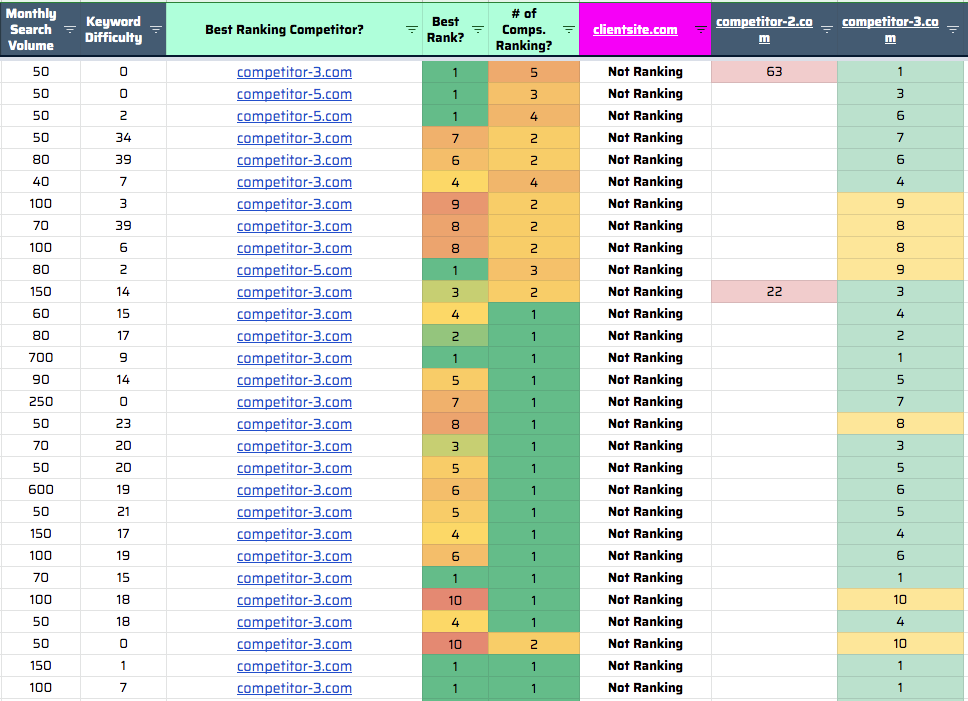
In all fairness, this is terrible communication tool.
Enter data visualizations.
Visuals help to quickly communicate our findings and get resources approved for implementation.
This blog post will cover our 14 favorite data visualization tactics for managing SEO data, along with some helpful links to incorporate them into your organization’s practice.
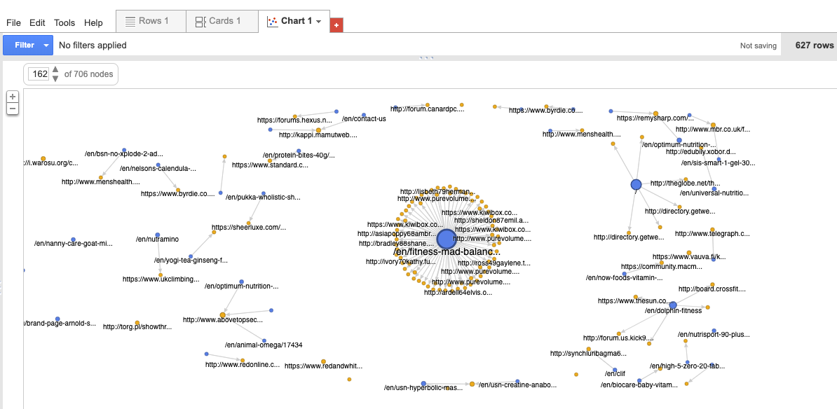
1. Linkscape relationship analysis
By far one of my favorite SEO visualizations. Use it to spot issues with canonical tags, orphaned pages and internal link deficiencies. Personally, I like to use it during link building audits to display the most powerful pages on a site and how those pages and redistributing equity via internal links. Although there’s a slight learning curve to build the chart, there’s a TON of actionable ways to use this data.
- Data source: Google Search Console (0r) Moz (0r) Ahrefs (0r) SEMrush
- Viz tool: Google Fusion Tables or Gephi
- Cost: Free
- More info: How to build Fusion Tables
2. Organic revenue + traffic crosswalks
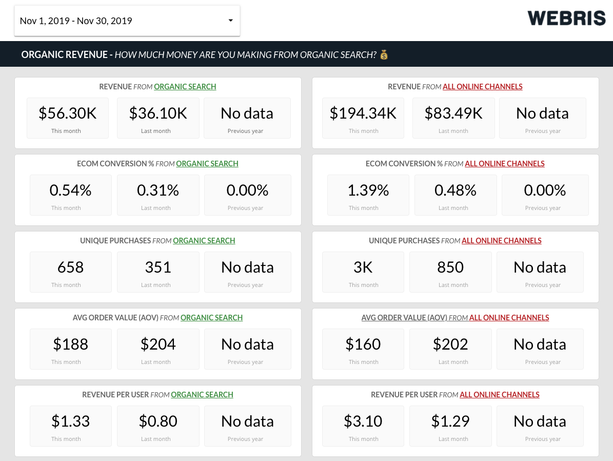
Executives tend to invest in marketing tactics that drive quantifiable returns for the business. That’s why revenue reporting is so critical – it makes it easier to demonstrate an ROI from SEO. We like to use Google Data Studio to pull in revenue data and format it into simple charts to clearly demonstrate the economic impact of our services.
- Data source: Google Analytics
- Viz tool: Google Data Studio
- Cost: FREE
- More info: How to build a monthly SEO report
Page 1 is a dashboard that compares organic search to all traffic sources.
Page 2 is a dashboard that breaks down who is buying from organic search.
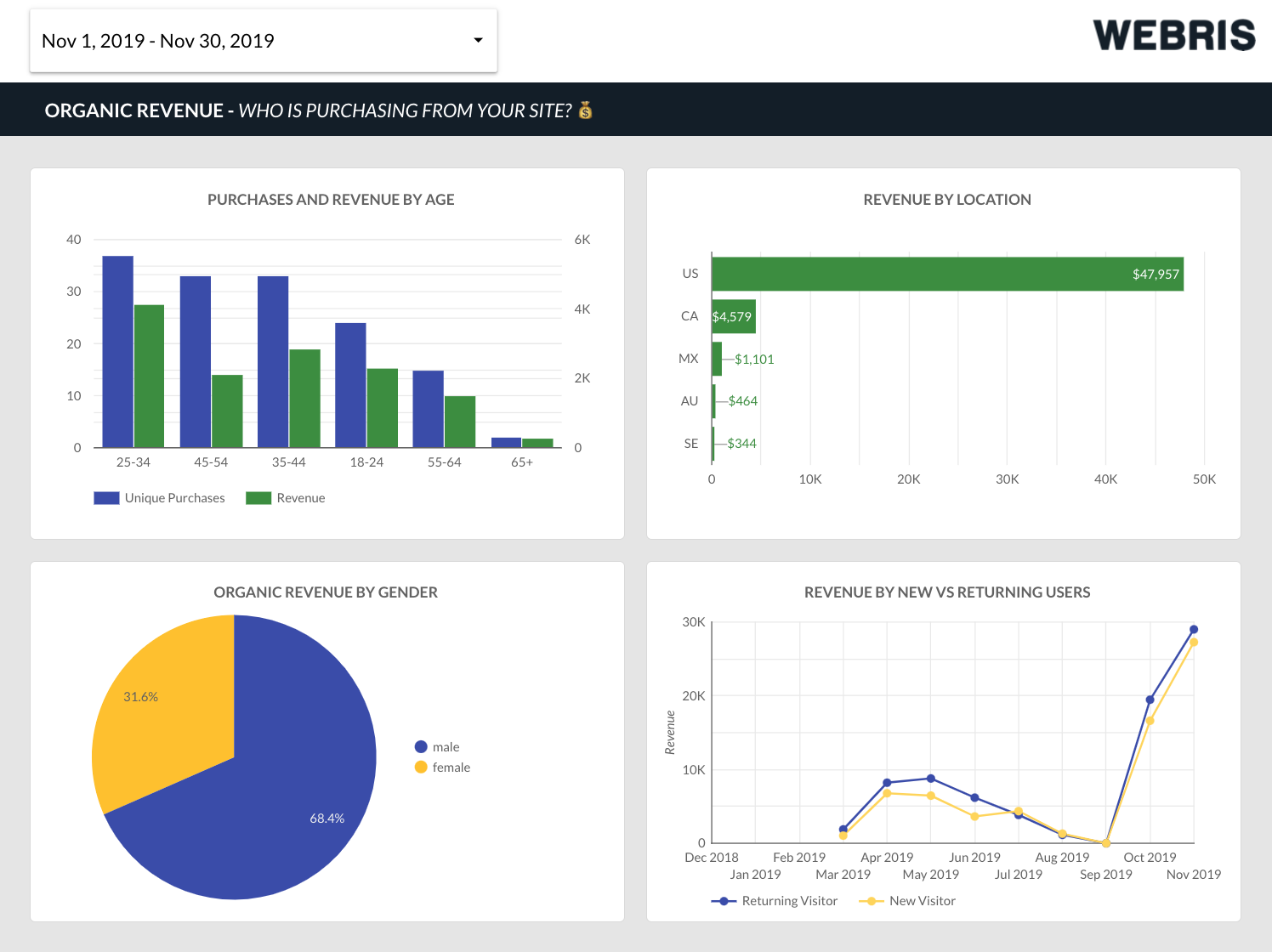
Page 3 provides even more detail on who / how they’re buying.

3. Striking distance keywords
Google Search Console provides keyword ranking data, filterable by query. We like to filter out “branded keywords” to understand the commercial intent of the website’s current positions.
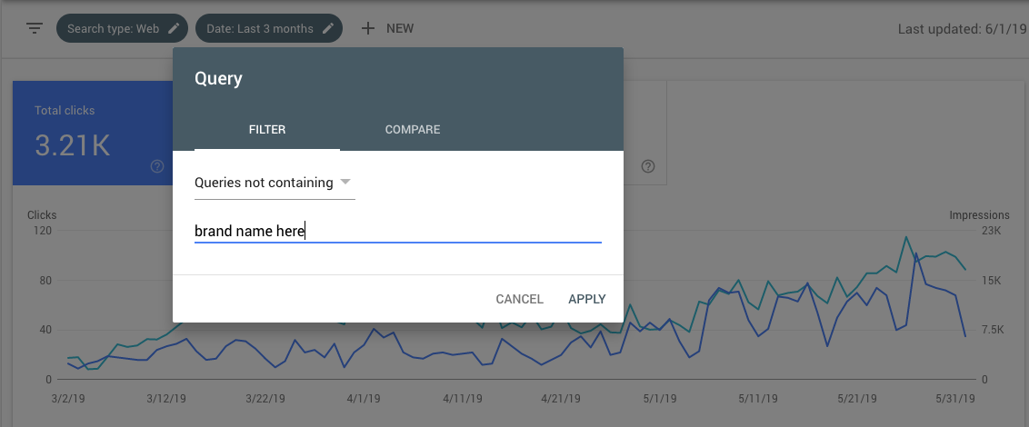
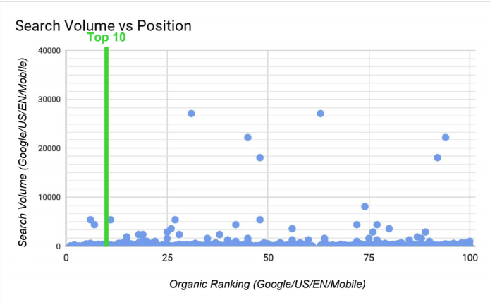
We can pull that data in Google Sheets and use a scatter plot to visualize the positions of all the keywords, from 1 – 100. This helps build a top level strategy for how many keywords are in “striking distance” of receiving traffic (keywords in positions 8 – 20 need a nudge to reach higher rankings and traffic). This helps you understand if you have a ranking problem (no keywords in the top 100) vs a visibility problem (no keywords in the top 10). This will change your approach to building an SEO strategy.
- Data source: Google Search Console
- Viz tool: Google Sheets
- Cost: Free
- More info: How to build a scatter plot in Google Sheets
4. Technical SEO implementation matrix
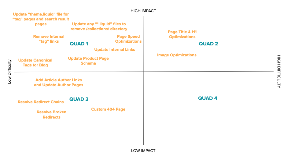
After completing a technical audit there’s a landslide of items that need to get implemented, some higher priority than others. This simple quadrant graph is built manually by our consultants as a means to help clients understand the priority of issues found
Of course, we add them into their project plan, but this chart helps leadership understand where to place their resources in a single image.
- Data source: Technical SEO audit
- Chart type: Quadrant graph
- Tool: Google Slides
- Cost: Free
5. Page to keyword ranking distribution
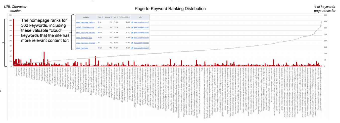
This chart counts the number of keywords each page on a site is ranking for. We like to look for a pretty even distribution (as the image below shows) which tells us that pages across the site are picking up rankings. If the chart certain page clusters picking up more keyword rankings than others, it could point to some potential issues (need for internal links, issues with indexation on subfolders, lack of external links, etc).
On top of that, it helps inform if we need to create new pages to capture keyword rankings that big pages (like the homepage) are picking up (but shouldn’t be).
- Data source: SEMrush
- Viz tool: Google Sheets
- Cost: Free
- More info: How to build charts in Google Sheets
6. Website depth structure (flat vs deep)
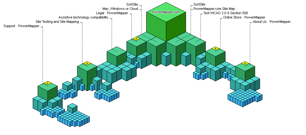
Depth refers to how a site’s hierarchy is structured – we refer to website’s as “flat” vs “deep” (as illustrated below).

The 2 images are the same site organized in different ways: flat (left) vs deep (right). Generally speaking, “flat” websites are better for search engines and users:
- Pages are easier to discover when they’re not buried under multiple sub folders
- Search engines place more relevancy on pages located closers to the top level navigation
- Deep websites can be more challenging to use and find desired content (for crawlers and visitors)
- Flatter websites are easier to create more distinct and topically relevant silos for content to live under
We use software to help us visualize the architecture of a website. This helps inform us (at a glance) if the website is built properly instead of having to dig through millions of lines in a spreadsheet.
- Data source: Website crawl URLs
- Viz tool: PowerMapper
- Cost: $ 149
- More info: Flat vs deep website hierarchy
7. Indexation roadblocks by depth
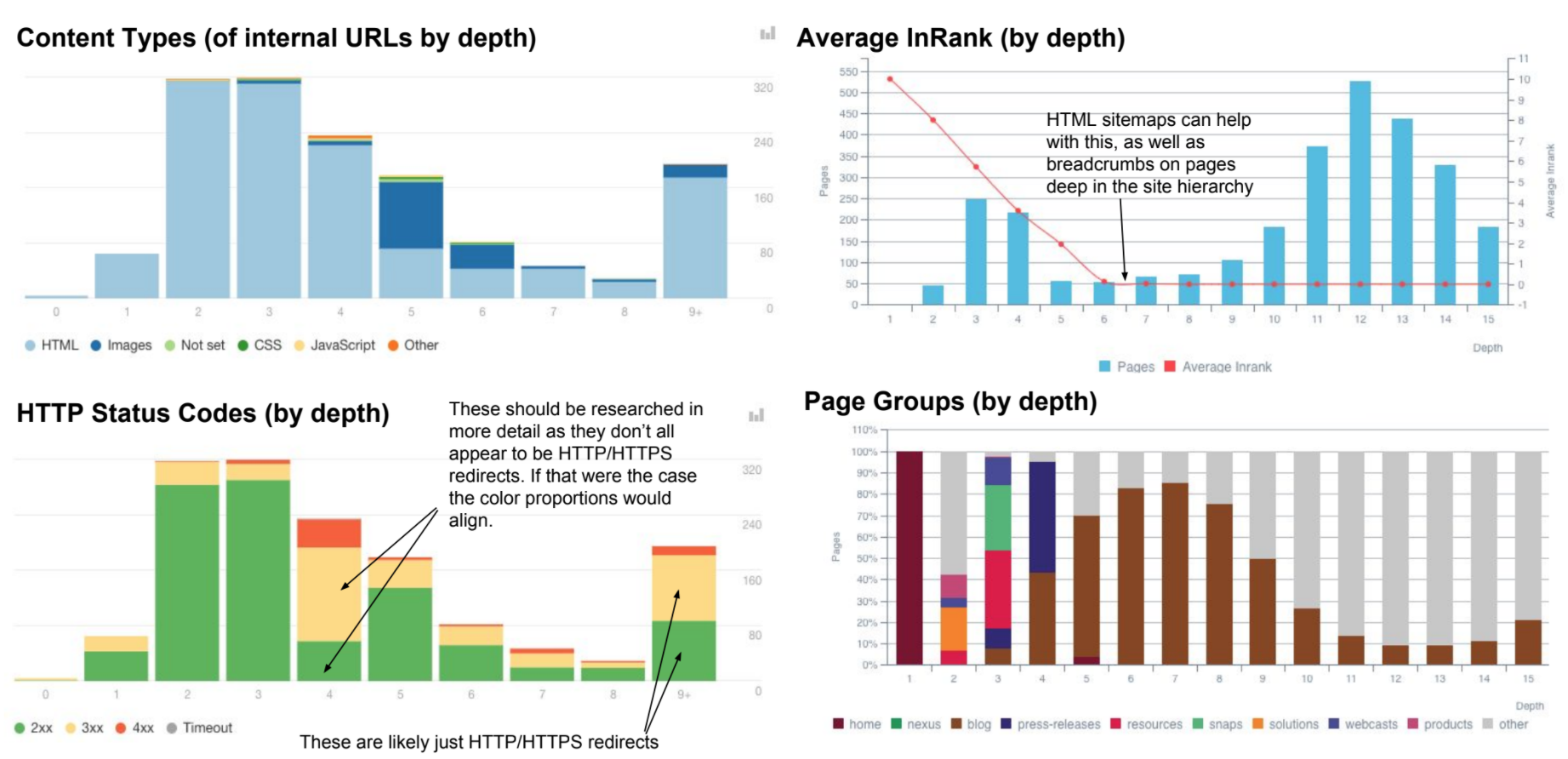
Working on SEO fixes with developers can be challenging – enter OnCrawl. This series of reports is critical for us when trying to communicate SEO roadblocks with the current site’s build. These 4 charts clearly demonstrate where issues are by directory (i.e. JavaScript on product pages, images concentrated at level 5, etc). This helps developers contextualize SEO issues with clear visuals.
- Data source: Oncrawl
- Viz tool: Oncrawl
- Cost: $ 49/month
8. Organic keyword growth over time
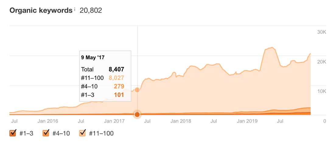
This is the visual I check the most – it’s a quick and dirty chart that shows my keyword progressions over time, filterable by position. Not only do I check this twice a week, but it’s a cornerstone of monthly SEO reporting.
- Data source: Ahrefs
- Viz tool: Ahrefs
- Cost: Read breakdown
- More info: Ahrefs keyword reporting
9. Keyword visibility over your campaign
We don’t use rank tracking software – we find it expensive and unreliable. Instead, we built our own using Google Search Console, Sheets and Data Studio. Each month we pull a snapshot of keyword rankings from GSC into a Google Sheets file. Then, using a stacked bar chart we’re able to show how their keyword rankings have shifted over time, ideally pushing their % into the top 3 positions.
- Data source: Google Search Console
- Viz tool: Google Data Studio
- Chart type: 100% stacked bar chart
- Cost: FREE
- More info: Rank tracking in Google Sheets

10. 301 redirects based on page equity
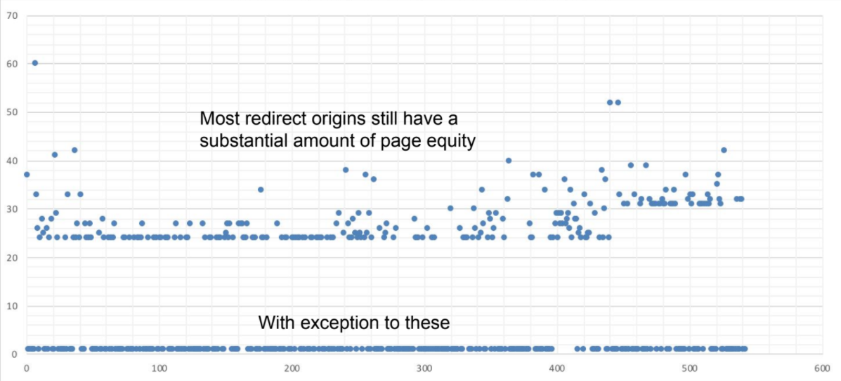
301 redirects are a way to deprecate pages into another one. When working with a big, legacy website we may want to remove 301 redirects after they have been properly de/re-indexed in search results. However, you wouldn’t want to remove 301 redirects from pages who have external link equity, as that 301 redirect passes 100% of equity across pages. This chart crosswalks URLs that have a 301 redirect in place with the PA (or UR) of that page. This helps understand the link equity of your redirected pages and make decisions about how to handle them easier.
- Data source: DeepCrawl, SiteBulb or Oncrawl + Moz PA / Ahrefs UR data
- Viz tool: Google Sheets
- Chart type: Scatter Plot
- Cost: FREE
11. Unoptimized titles and meta descriptions
Page titles and meta descriptions are key influencers in helping searchers determine which result to click on. This chart pulls through all the URLs on a site with title and description issues (duplicate, short, long, etc) and crosswalks with Google Search Console CTR data. The result is a visual priority of which pages you should focus on to rewrite page titles and meta descriptions.
The bigger boxes and lightest shades are the most problematic. They’re getting a lot of search impressions but very low CTR. The sizing of the boxes is traffic opportunity (impressions) and the coloring is by CTR (lightest are lowest, darkest are highest CTRs).
- Data source: DeepCrawl (0r) SiteBulb (0r) Oncrawl + GSC CTR data
- Viz tool: Google Sheets
- Chart type: Tree map
- Cost: FREE
- More info: How to write page titles for SEO

12. Crawl + ranking changes
Log files help spot Google crawl behavior changes. That’s usually an indicator for a technical issue or an algorithm update. Segments allow you to see what page types Google crawls every day, which shows you if one of them have an issue or not.
SEO Visibility is a reflection of your share of voice in organic results. It’s a lagging indicator but a helpful one for the strategic perspective. Since organic ranking positions only say so much in times of SERP features, SEO Visibility can be a helpful performance indicator for organic traffic.
A change in crawl rate is often reflected by a change in SEO Visibility. Looking at both metrics helps me put into context what could be going on and quickly diagnose potential problems.
Mind you, none of the metrics are perfect by themselves but help to raise the right questions. There are more numbers and reports I’m looking at but I found SEO Visibility and Log Files to be underrated und helpful.
- Data source: Botify, SEMrush
- Viz tool: Botify, SEMrush
- Cost: Botify (Request only), SEMrush ($ 99/month)
- More info: This tip came from Kevin Indig, VP of Content and SEO at G2

13. Competitor authority analysis
We build this chart off the back of our keyword research file. While our consultants are discovering keywords, they’re also recording the DA and PA of the sites ranking for our target keywords.
This allows us to build simple visualizations in Google Sheets that show the client the “gaps” in authority compared to the competition.
This helps us to frame the conversation around link building and how much effort we need to spend to acquire them each month.
- Data source: Ahrefs (or) SEMrush
- Viz tool: Google Sheets
- Cost: FREE
- More info: How we do keyword research for clients

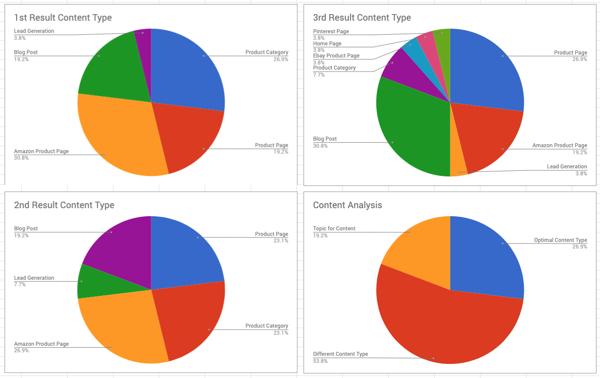
14. SERP result type analysis
While recording keywords for clients we’re also analyzing the SERPs to understand the types of content ranking. This helps us understand the exact type of content we should create to rank for our set of target keywords.
This also helps frame the conversation with clients about content deficiencies and the need to invest in production at scale.
- Data source: Google Search
- Viz tool: Google Sheets
- Cost: FREE
- More info: How to analyze SERP Intent
Wrapping it up…
Sending massive spreadsheets or presentation decks don’t work for busy executives or stakeholders. Data visualization helps stakeholders quickly understand your work without having to spend hours digging through your work or sitting on a call.
Moreover, data viz is incredibly handy for search professionals. This post only scratches the surface on what you can do with your data.
Digital & Social Articles on Business 2 Community
(64)
Report Post


