Before you set your sites on slaying the competition with your amazing website redesign, you may want to consider a few things.
Not every website is ready for a redesign. Neither is every business.
Instead of diving in and having wireframes and graphic mock-ups (or hifis) done and spending hundreds or thousands of dollars, stop and take time to develop more awareness.
Don’t launch a sinking ship…

If you’re thinking about redesigning your website, these signs below may indicate your project is doomed from the start.
1. Your current site is not SEO optimized
Let’s start with why you have a website in the first place. People are online. You need to be online. Okay, good.
Next, you have to be discoverable. Can people find you?
Where’s the first place you go when you have a question about almost anything? We’ll say search engines to be generic. But it’s probably either Google or Siri. And Siri generally searches with Google so…
If you current site isn’t SEO optimized and has little-to-no SEO power, your website redesign won’t matter. Work on your search engine optimization first.
2. Not mobile friendly
In addition to general SEO work, making sure your site is mobile-friendly will help with getting found in search and in user experience.
The quicker your site loads for example, the more weight Google gives it because people won’t bounce due to lagging load times.
Plus, considering why people might access your website from their phone is helpful in UX design. For instance, if you’re a restaurant and they’re mobile, they might be looking for your hours and maybe directions. Offer those solutions in responsive-design modules and solve for your visitors right away.
3. You didn’t look at what’s working
You can’t know where you’re going if you don’t know where you are.

Have you looked at your current bounce rates? What about conversion rates of visitors to leads or contacts?
If you’re not considering what’s not working on your current site before you decided to make changes, you may want to slow the ship.
Are your service pages sending you marketing qualified leads?
Does anyone visit your team page?
By looking at what’s working and what isn’t, you just might find a website refresh with a conversion optimization strategy is more cost-efficient than a full website redesign.
4. Asking a staff member (who is not a professional, strategic web writer) to write it
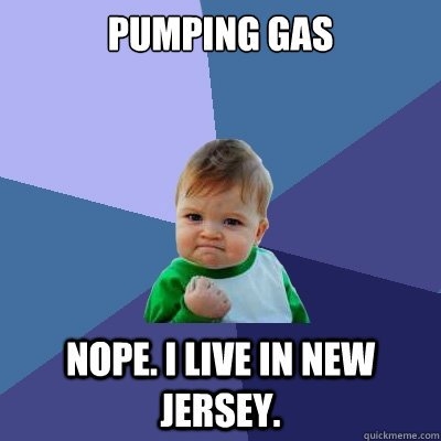
You probably don’t need a skilled individual to pump your gas. And unless you live in New Jersey, you pump it yourself.

But if you need to fix your transmission, change spark plugs or swap out a piston in your car, you’ll probably call a mechanic.
If you want something done well, look to someone with the right skills. If you want your website to generate traffic and revenue for your business, make sure you have a skilled professional writing your copy.
And if you’re not considering rewriting the copy on your website during a redesign, we need to talk…
5. Not assessing your competition and industry trends
You don’t want to copy your competition. And you don’t want to follow old trends.
But you can look at what your competitors are doing and where the industry is right now, and strategically plan for the possible future.
If you’re taking on a website redesign without looking at the world around you, you’re likely going to miss something that may have sparked a genius addition to the new site.
6. “They” suggested an image slider as your hero section of your home page
Your home page is the front door to your digital world. It’s an important piece of the puzzle. When it’s slow and lags, or when it makes for a poor user experience, you’ll face a difficult road to getting viewers to become contacts.
A slider for a hero image is not searchable, it makes the users eye uneasy, it’s bad for heat mapping technology and the good stuff is usually a few slides deep and never seen.
If your hero image is already a slider and you’re thinking of keeping it, or the partner you’re working with suggests it, you’re setting your website redesign up for failure.
7. No home page You Statement that is optimized for the visitor
When a prospect, lead or customer visits your website they need to know right away that they’re in the right place for the thing that they are looking for. They also need to know that that thing is the thing you specialize in. You can do this through a well-crafted You Statement.
One of the core principles is to use the words you and yours in the You Statement several times. That way the prospect lead or customer internally takes ownership of the statement they are reading.
Then next thing to put into place is the understanding that the You Statement is a two-part act. Each piece plays a specific role. A great two-part You Statement looks a little something like this:
Dramatically Improve Your Digital Sales & Marketing Communication.
At Acme Agency, we offer training, consulting, and workshops for businesses, and agencies just like yours around the world.
Your prospects and leads will immediately know what you solve, how, for who, and where. All the things they need to know about to start to build trust and start a conversation with your team.
Crafting a great You Statement for your website before a redesign will set you up to think about the users through the process.
8. Overly complicated menu and bad UX
Speaking of thinking about your website visitors… if you’re planning for a complicated menu and too many buttons and not thinking about how the end user will navigate your site, you’re setting yourself up for user experience (UX) failure.
Every website redesign needs to include a discussion about UX.
9. No major buckets based on products, services, or personas
Lead the buyer’s journey by setting up your site with your buyer personas in mind and focusing your products and service offerings on solving for their needs.
Whatever business niche you’re in, you’ll want to make sure you understand why your ideal contact needs to talk to you. Are they solving a specific problem that you can teach them about? Can you speak to that specific need? Yes you can!
Imagine a viewer coming to you website and seeing that you speak directly to their needs, whether it’s driving more revenue from their website or growing the best garden in their neighborhood. Knowing your buyer personas and offering the best content based on what you know about them means you have a great website.
If your current site doesn’t have this in place, make sure your redesign does.
10. Every sentence starts with “we”
Who wants to interact with someone who always talks about themselves?

The same is true of businesses. If your website copy is littered with personal pronouns, you’re in for a rude awakening.
Viewers, those people who could become leads and customers, want to see themselves in your copy. Here’s an example:
At ACME Eyeglasses we’re the premier eyeglass maker. We’re the best in town and we make the most stylish glasses. We can’t wait to welcome you to our store so we can find the best glasses for you.
Or…
You want to look your best while seeing the beautiful world around you. And you want to do it without breaking the bank. Find the best glasses within your budget so you look great without going broke at ACME Eyeglasses. Be sure to see yourself in new glasses with this augmented reality tool here!
Which copy draws you in?
Thinking about what you want/like rather than what your customer or prospects want or like will only drive people away.
11. Poor or non-existent content strategy
If your content strategy lacks definition, you’re in for a difficult journey.
What kind of content will you create? Who are you creating it for? Will it include video, long form content, social media content and more? Will you pay for promotion?
In addition to the content tactics, how will you measure the success? You’ll want to set your mission and your goals, establish key performance indicators (KPIs) you’ll measure, get to know your intended audience and more.
When you start off a website redesign without a content strategy, you’re just treading water. You won’t win a race for real revenue.
12. You delay launch until every last detail is PERFECT, and never actually push a new site
Have you ever suffered from paralysis by analysis?

Voltaire is credited with saying, “Perfect is the enemy of good.” We like to modernize it and say “Perfection is the enemy of done.”
If you’ve started and stopped and started and stopped a website redesign, you’re setting yourself or your team up for a doomed project.
Instead, use the MVP method. A minimum viable product (MVP) is a version of a product with just enough features to satisfy early customers and provide feedback for future product development. Make that work for a website redesign and grow from there.
That’s actually the secret to the marketing strategy of growth-driven design. Strive for continuous improvement of your online presence rather than a giant project.
With the bare bones of a new site, typically a homepage, about page, blog and top-level pages. Then, build the rest of your website over time with the data-driven insight that comes from seeing how users interact and convert on each page.
13. Lack of conversion opportunities
Where there is a lack of clear next steps or clear path for people to take, there is confusion. If you’re not looking at your conversion opportunities and your conversion rate optimization, you’re likely to have a doomed website redesign.
Like all effective marketing, conversion path development starts and ends with your customers. Serve them what they need when, and build opportunities for them to take the next step in their buyer’s journey—that’s your path to them becoming a customer.
Conversion opportunities can be call-to-action (CTA) buttons or links, a bot at the right spot, social media calls-to-action, video CTAs and more.
If no one visiting your newly redesigned website can convert, why are they there?
14. No social proof and testimonials conversation on home and sub-pages
When you make a major purchasing decision, do you like to know if others have had the same experience? If restaurant reviews, where a meal might cost $ 50-$ 100 are any indication, most of us like to know if anyone else has interacted with a brand.
Does your website redesign include sharing Google Reviews, Facebook Recommendations or other third-party social proof and reviews? Let’s hope so…
15. Thinking about your website as a traditional business with only one entrance
We love thinking of a homepage as a front door. We referenced it above. However, it’s not always that linear. While your homepage is important, entrances to your website can come from many places.
Think of your website as more of an auto shop with multiple bays. Viewers may come in through a blog article, a service page, a landing page or another route.
Maybe a viewer found you via social media where someone shared a website page you’d never have thought of as an entrance.
Tools like UX-friendly navigation, clear copy and engaging visuals will help your website redesign journey start off on the right foot.
Is Your Website Redesign Project Sinking Before Your Eyes?
If this checklist gave you anxiety, don’t worry. A lot of very smart business owners and marketing professionals get taken in by the exciting prospect of a website redesign and leap before looking. You’re not alone.
Sinking photo by insung yoon on Unsplash
Digital & Social Articles on Business 2 Community
(22)
Report Post


