— May 31, 2019
Landing pages are web pages that users land on by clicking on a search result, an online advertisement, link on a website, social media or email campaign. Landing pages are built for a specific or a single conversion objective and with one business goal in mind. For instance, if you’re creating a landing page to capture leads for an ebook that you’ve published, your primary goal is to drive your visitors to complete the form, and downloading the ebook should only be their single-minded intent. In addition, removing any navigation option would avoid distracting users, increase conversions and minimize the abandonment rate.
To help you design successful landing pages, I’ve put together 20 great landing page examples from well-known brands and we highlighted their key success factors as well as some areas for improvement.
1. Google Cloud Platform
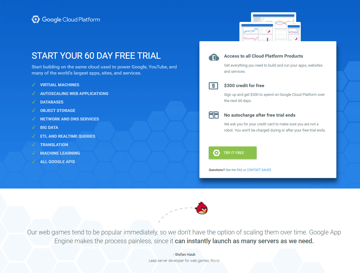
Google Cloud Platform’s landing page type used above is a click-through page that asks people to try their service for free.
Here’s what they did great:
- The blue color conveys comfortability and trust.
- The headline is short, to the point and calls for action.
- The offer “60 Days Free Trial” is tempting.
- The sub-headline communicates a clear benefit and shows visitors what they will receive if they use the platform.
- The way the items are listed with their tick-marks encourage the audience to try the tool.
- The CTA button in green stands out on the page and includes the word “FREE” which also confirms to the audience what is mainly stated in the headline.
- Leveraging on the popularity and success of Angry Birds game by featuring a testimonial from its makers empowers the company’s credibility.
- There’s an option that if users are not ready yet to try it, they can contact sales or check their frequently asked questions.
2. Airbnb

Airbnb’s page is a homepage as a landing page with the primary purpose of asking prospects to become hosts.
Below are the points worth to be highlighted:
- The headline includes a clear and promising end benefit.
- The image showing the woman smiling creates acceptance and a visual representation of the end benefit.
- The CTA button in red stands out in the page and entices users to convert.
- Conditional formatting to personalize the page title with the user’s geolocation.
- Customized experience using a dynamic profit calculator based on the user’s input.
3. Shopify
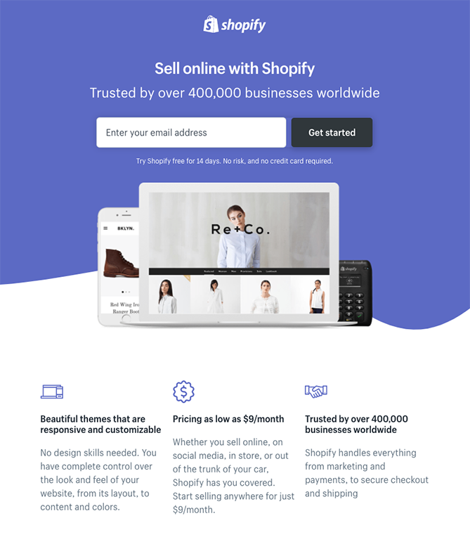
Shopify’s landing page type is a lead capture page whose main purpose is to ask their users to enter their emails to benefit from a 14-day trial.
Here are the good practices that they applied on this page:
- The modern purple and white color are comfortable for viewers eyes.
- There’s only one field for the user to enter with a big CTA button for a better and more comfortable user experience which leads to a higher conversion rate.
- The call to action is only a few words and communicates a clear benefit.
- The social proof in the subheadline “Trusted by over 400000 businesses worldwide ” highlights the company’s credibility.
- The image shows the end product through an example and its responsiveness on multiple devices.
- The guarantee that there’s not any risk after subscription boosts the users confidence to convert.
- The benefits of the product are clearly emphasized with helpful icons, relevant titles, short and explanatory paragraphs.
In this page, we don’t think there’s a serious issue that should be considered except if the logo is hyperlinked to the homepage so it might serve as an escape path for visitors.
4. WebProfits
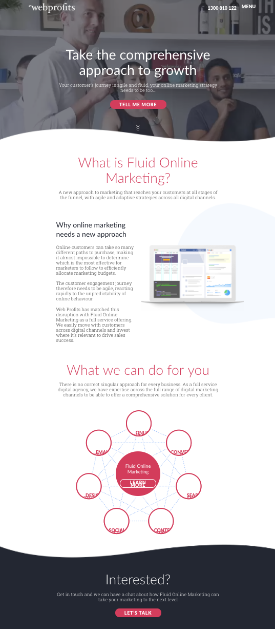
Webprofits landing page is an infomercial page that educates their target audience about their product and what they can do for them.
The following are the good tactics they did:
- The page includes the primary colors of their website and the curvy bottom of the above-the-fold grabs visitors’ attention.
- The image showing people looking in the same direction with a smile creates a good impression for users that there will be positive results awaiting them if they use their services.
- The darkened image mirrors the target audience making it relevant to their business environment while it reflects the headline.
- The headline “Take the comprehensive approach to growth” provides a value proposition that would be appealing to their target audience.
- The use of interrogative sentences is a smart way to intrigue interest and engage the user with the conversation to continue reading.
- The laptop image shows the platform in action.
- The red CTA buttons stand out from other elements in the background.
- The first CTA button “TELL ME MORE” induces curiosity and encourages users to scroll down to read the content.
- The first person pronoun “ME” in the first button stimulates the users intent and involve them by speaking from their perspective.
- The second CTA button “LET’S TALK” asks users to contact the staff via chat to make the process much easier; this button is short, action-driven and marks 2 way communication because of the “us” which includes “me” and “you” unlike the first CTA that refers to the user only.
The only thing that should be revisited in this page is increasing the font size of the headline “Take the comprehensive approach to growth.”
5. Moz
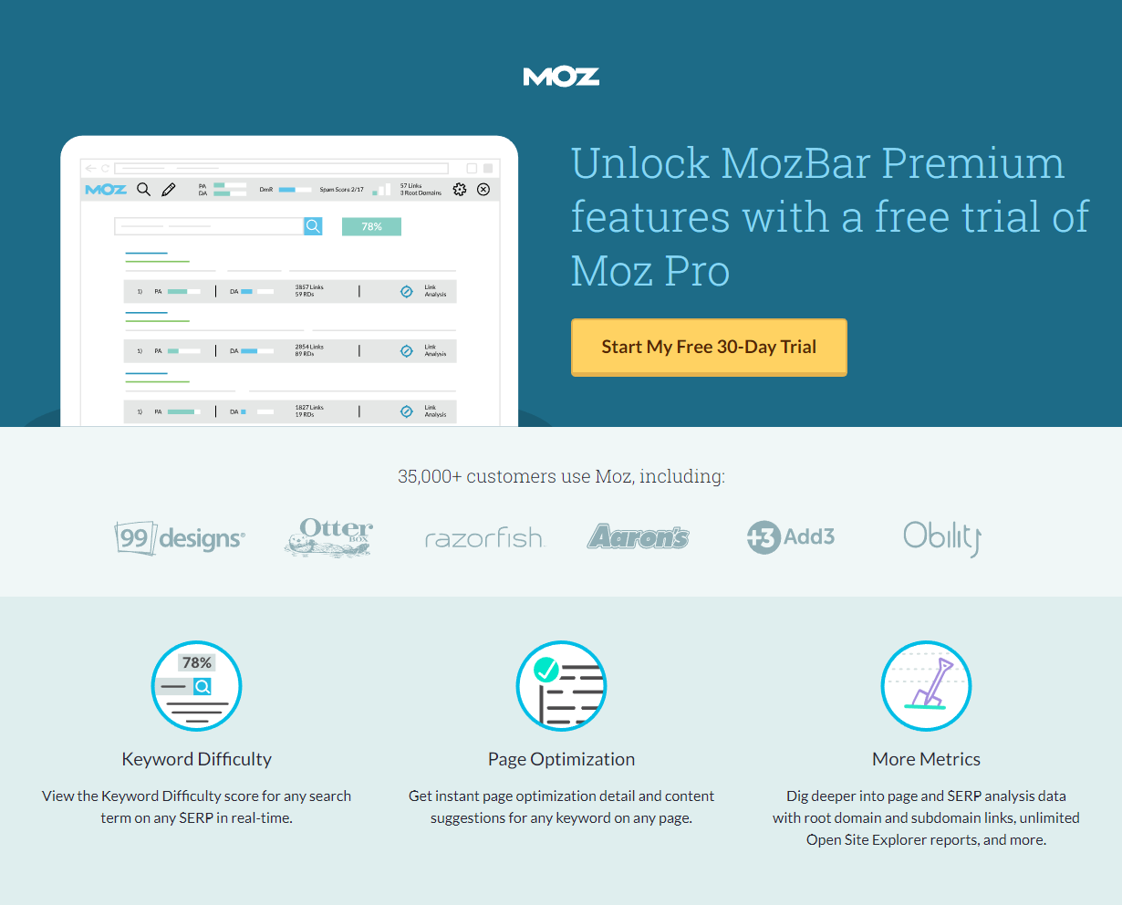
This landing page by Moz is a click-through page whose principal objective is to redirect users to signup for a 30-day trial.
Here’s what they’ve done greatly:
- The colors and themes are the same as their website which reflects their consistency in branding.
- The image on the left side of the headline shows a visual representation of the actual software.
- The value proposition is presented in a smart way; Moz wants to earn the trust of their users first before asking them to pay.
- The yellow CTA button, as well as its copy stand out on the page. The first pronoun “My” shows users that they are more selective in their decisions.
- The supporting proof element “35000+ customers use Moz” as well as the well-known brands presented in this page emphasize on credibility.
- The features are simplified and visually represented by unique icons which make it distinctive from what we usually see.
6. Acorns
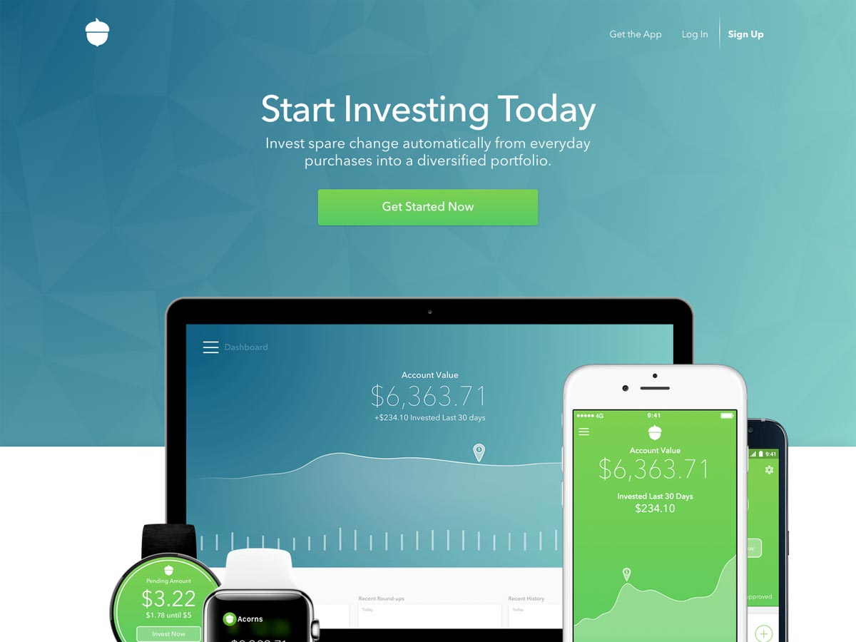
Acorns landing page is another example of a click-through page that asks users to start using their service.
Here’s what they did well:
- The headline communicates a call to action, the end benefit and a sense of urgency.
- The subheadline shows the value proposition by stating in a short sentence, what the audience will get.
- The green CTA button is compatible with other colors on the page and includes a call to action as well as a sense of urgency.
- The image shows a representation of the product and indicates that it’s mobile responsive.
- The example featured in the image shows a high number which grabs the attention and interest of the visitor.
However, there’s an area that can be reconsidered which is dropping the navigation options on the top right of the page.
7. Upwork
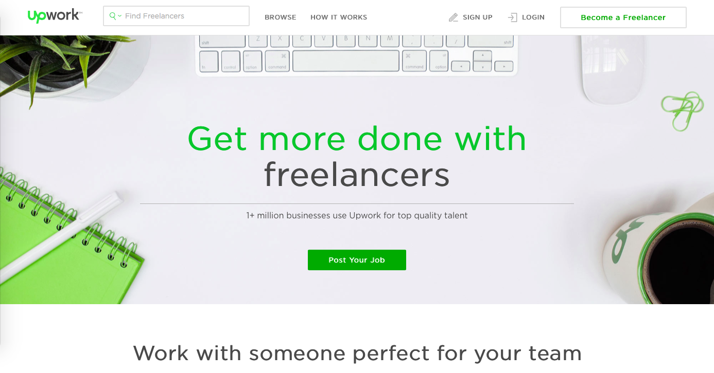
The type of Upwork’s page above is a homepage as a landing page whose primary purpose is to get their prospects to find suitable freelancers. Below are the points worth to be listed:
- The colors of the headline, CTAs, mug, copybook, and paper clips are the same as their logo which shows their consistency in branding.
- The landing page content and its background image are featured with matching colors presented in a harmonious way.
- The CTA button “Post Your Job” in the first image stands out on the page.
- The copy targets a specific target audience by including the end benefit.
- The CTA button “Become a Freelancer” in the sticky header provides a path for freelancers who might mistakenly land on this page and avoids them from leaving.
8. UBER
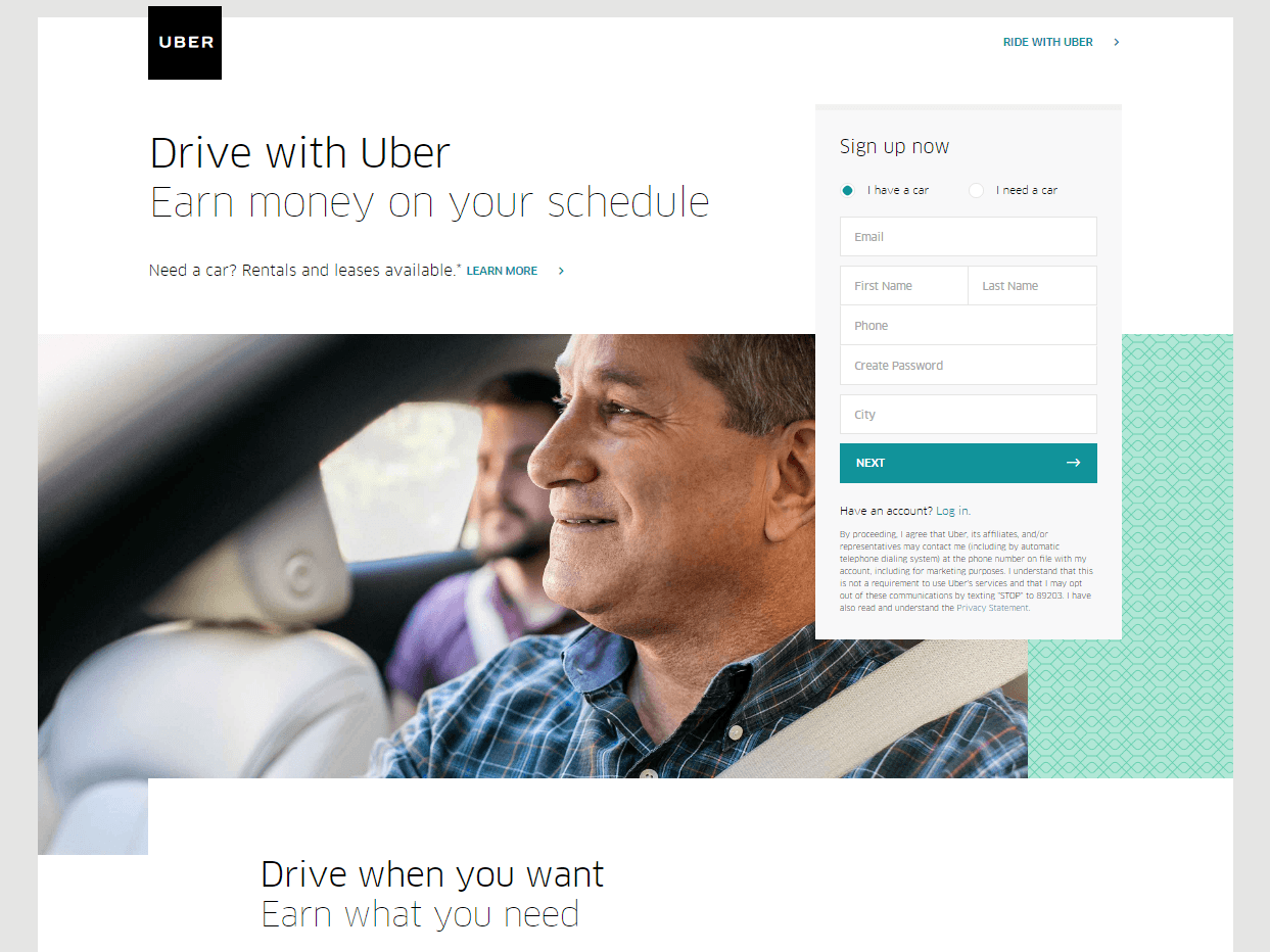
UBER’s landing page is a lead capture page that asks their users to become drivers.
Here are the effective practices they applied:
- The headline communicates a clear benefit to drivers.
- The use of the white background makes it look comfortable to the eye and reflects flexibility.
- The question “Need a car?” helps Uber capture users who have the skills but miss the tool.
- The “Ride with Uber” gives the riders a segmenting option to ride with UBER. This is a great navigation option in order not to lose the potential riders segment in case they landed on this page by mistake.
- The privacy policy below the form shows that the company cares about the privacy of their page visitors.
- The CTA button below the form is used in a green background color with a white font which makes it look distinctive from other elements in the page.
- The image clearly provides a visual presentation to their target audiences (drivers and riders), staging the dynamics of the service provided.
Interestingly, the whole production team tried to address several elements in this image:
- The driver smiling indicates that the prospect would be happy working with Uber.
- The driver with the seatbelt on shows that UBER is a law-abiding company and encourages safe driving and security measures.
- The passenger sitting at the back corner of the car sets up the context of the service.
- The way the passenger is blurred in the back is an excellent production technique to highlight the driver’s role and focus on him as the hero of this landing page.
- The driver seems to be greater than 45th years old, and his ethnicity is somewhat neutral. This allows UBER to indicate that anyone can become a driver.
9. Paypal
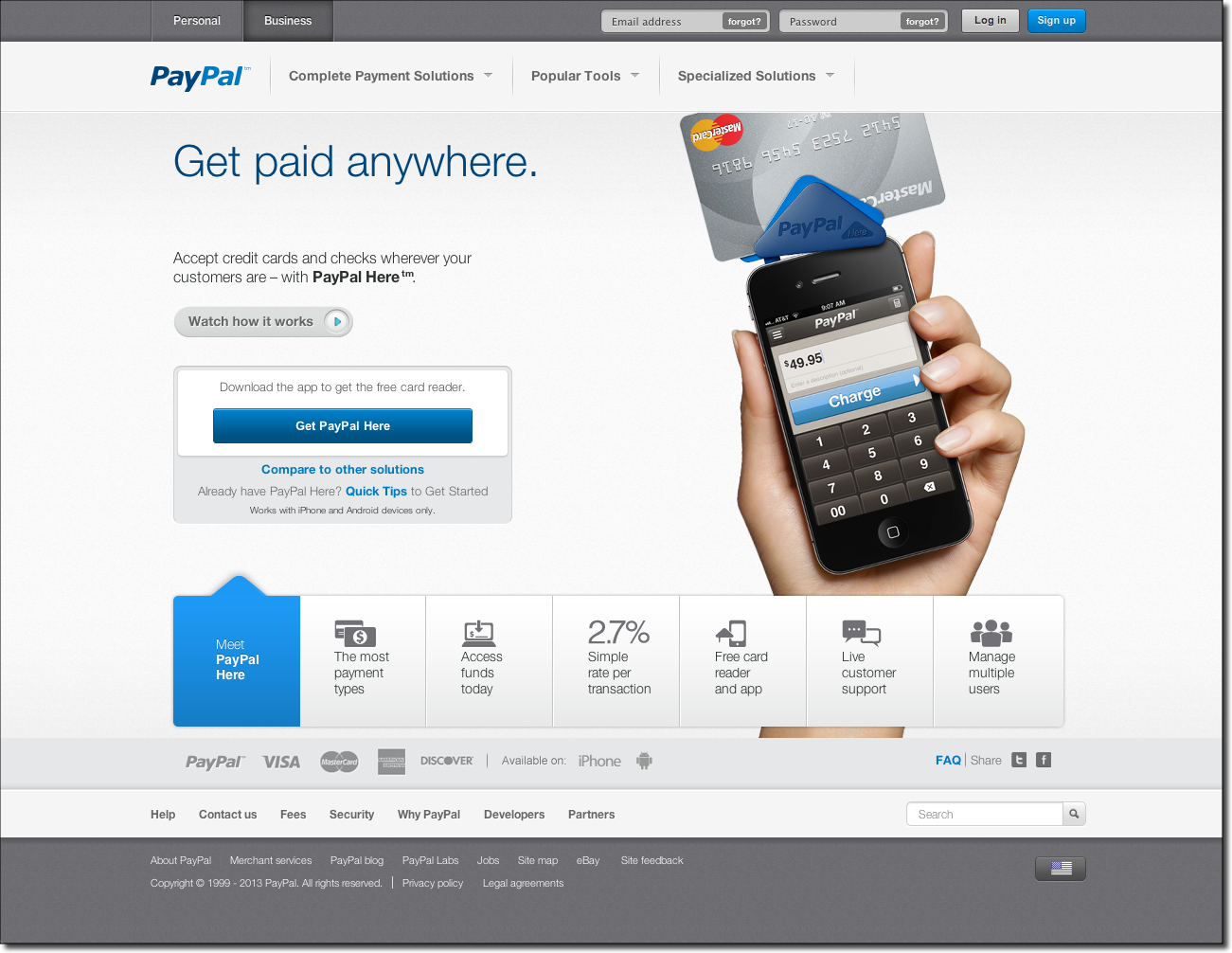
Paypal’s page type above is a homepage as a landing page that mainly asks users to download and use their app.
Here’s what they did well:
- The CTA button in dark blue and the columned features below that show in a lighter color when selected indicates a relevant and powerful branding.
- The grey color projects modernity and high tech.
- The headline and subheadline are simple and provide an end benefit.
- The video includes all the details and technicalities visitors might need to know about, encouraging them to engage with the page and discover more about their service. It also makes the page simple without having to include too many explanations.
- The main CTA button “Get PayPal Here” stands out on the page and supports the claim of the headline “Get paid anywhere.”
- The image shows the app in action.
- The card reader shows visitors how they can use their mobile device to swipe credit cards. This image proves the “anywhere” claim in the headline and supports the mobility of this particular service from PayPal.
- The features are simplified and visually represented by unique icons which make it distinctive from what we usually see.
- The grey color in the footer which is the same one used in the header creates a similar landing page.
10. Stripe
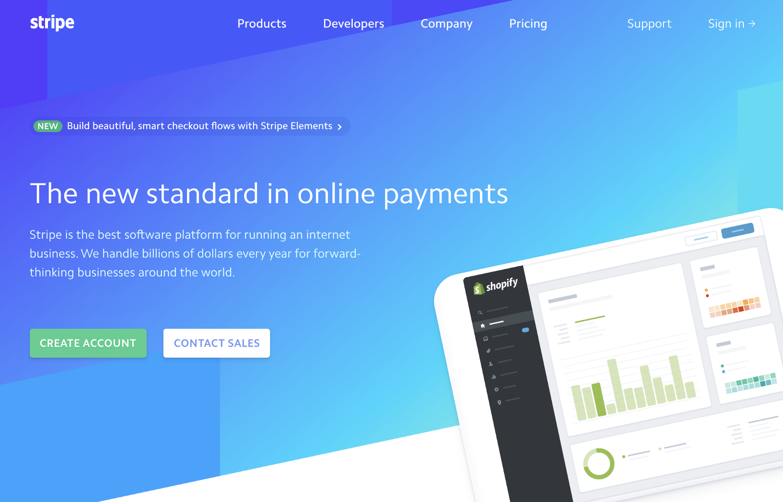
Stripe’s page type is a homepage as a landing page whose primary purpose is to ask visitors to create an account.
Below are the good practices that they did:
- The company starts by informing visitors of the new feature they launched. This entices them to engage with their products and convert with different options. Although the word “new” is small, it’s highlighted.
- The headline is highlighted in a bigger font, and “new” indicates that the company is regularly keeping up with the changing trends that fulfill their target audience interests.
- The subheadline clearly explains what the company is about.
- The CTA buttons stand out on the page and are used in matching colors.
The image on the right drives visitors attention by revealing to merchants that:
- The company integrates with a well-known ecommerce software.
- Customers are allowed to create their online store with Shopify while accepting credit cards from Stripe.
There’s only one thing that needs to be revisited which is removing the second CTA button “Contact Sales” below the text as it might draw visitors away from the page.
11. LinkedIn
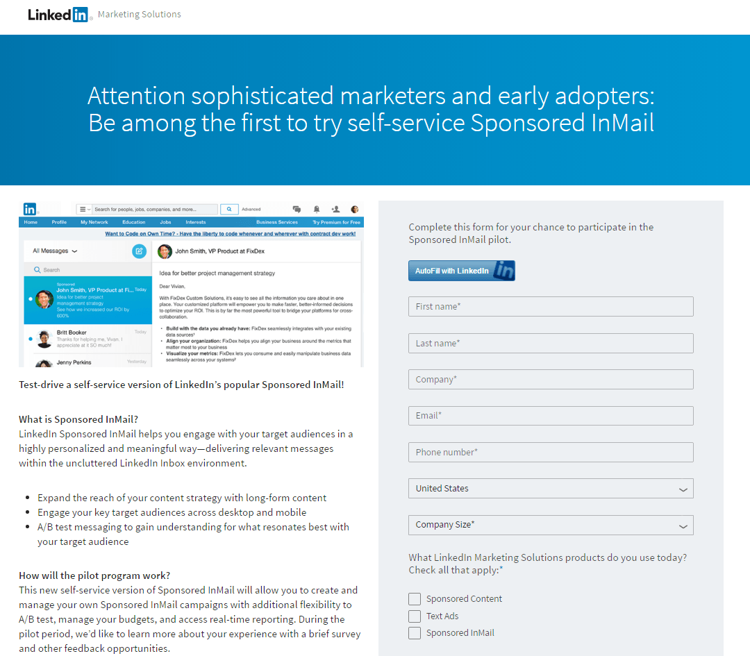
LinkedIn’s landing page is a lead capture page that asks users to use the channel’s inmail service to engage with their target audiences.
Here’s what they did well:
- The words “Sophisticated” and “First” drive a sense of exclusivity, playing on the ego of the target audience.
- The colors of the page go well with LinkedIn’s logo.
- The image clearly shows the service provided.
- The explanation shows what the page is about with the benefits that visitors will gain if they use the service.
- The call to action headline above the form clearly informs prospects why they should fill out the form.
- The 3 options below the form address their target audience needs and push them to convert.
However, few elements need to be rechecked such as making the lead capture form shorter to drive more readers to fill out the form and placing the CTA button below the form to avoid any confusion. Also, the text can be reduced.
12. GEICO
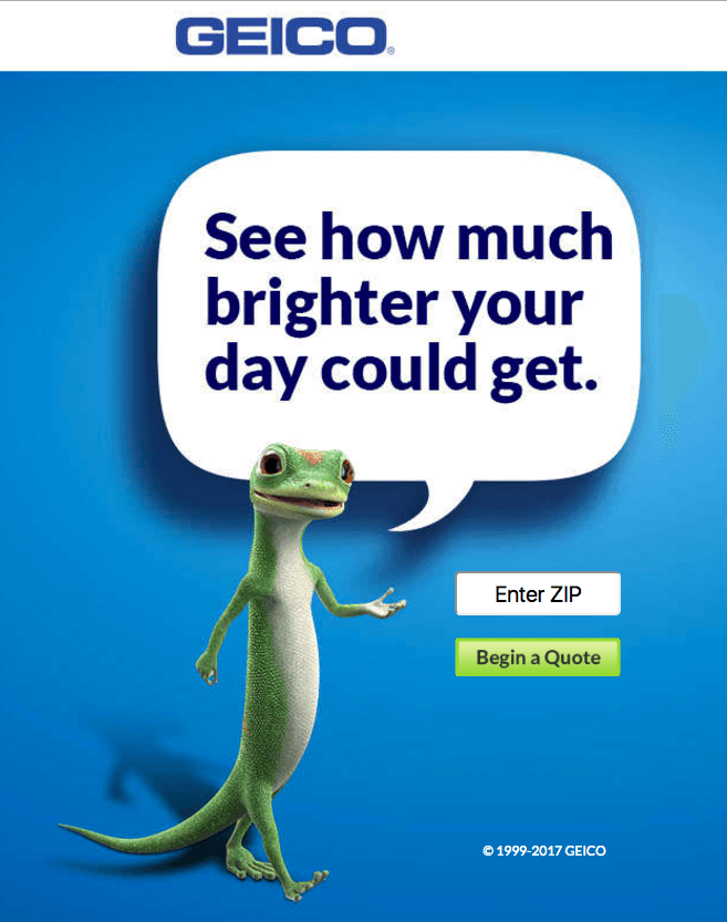
GEICO’s landing page is a lead capture page that asks users to get free insurance quotes in return for merely providing their zip codes.
Here are the points that are worth to be mentioned:
- The headline and the visuals are dominant and quickly grab the user’s attention.
- The headline creates curiosity.
- The lead capture form has only one field to fill out which increases the conversion rate.
- The CTA button “Begin a Quote” is specifically tailored to the offer.
- No navigation options in the header or footer.
The only thing that should be reconsidered in this page is the headline as it doesn’t show the actual benefit. Also the placeholder text inside the field “ Enter Zip” should be in a lighter grey in order not to confuse it with a clickable button.
13. Jeff Bullas
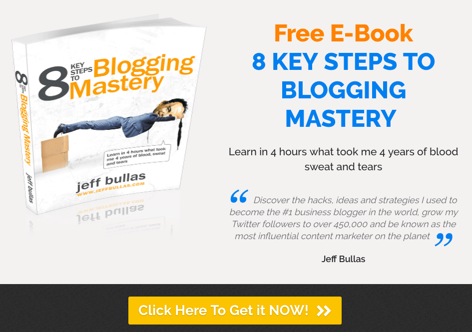
This landing page created by Jeff Bullas is a click-through landing page that asks visitors to download his ebook.
Below are the good practices he managed to execute on this page:
- The caricature style of the ebook cover grabs visitors attention.
- The headline provides a clear benefit and starts with “Free” and is highlighted in a separate color to encourage users to get the ebook.
- The subheadline is showing that they can learn what took a long time “4 years” in only “4 hours” encourages the target audience to convert.
- The CTA button includes different elements: “Click Here” shows the call to action, “To Get it” emphasizes the benefit and “NOW” marks immediacy.
- The absence of any navigation element.
Nevertheless, few things can be revisited on this page. Firstly, the testimonial is written by Jeff Bullas; it would be better to showcase a social proof written by a user or an influencer which boosts credibility and adds more value to the page. Alternatively, it could be directly written in a way that clarifies what the subheadline above is about without putting it between quotation marks. Secondly, the CTA button can be placed above the fold.
14. Fabletics
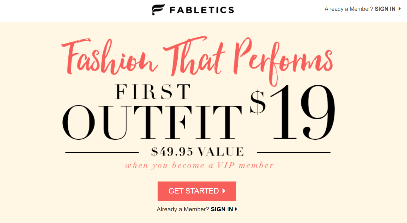
Fabletics landing page type is a click-through page that asks their online shoppers to buy their outfit.
Here’s what they did well:
- The red headline “Fashion That Performs” stands out on the page and grabs visitors attention.
- The prices indicate transparency and showing that they can save almost $ 31 when they become VIP members entice them to convert.
- The red color of the CTA button is the same as the headline’s color.
- The absence of additional navigation elements helps increase the conversion rate.
- There’s an option for users who have already created an account to sign in from the same page. This avoids losing the other target audience who mistakenly land on this page.
There are few things that should be revisited such as unifying the font style and leaving more spacing between the headline, copy and the CTA button to make it easier for visitors to read. The link below the red CTA button is bolder than it should be which may distract visitors from the primary objective “GET STARTED”.
15. Oribi
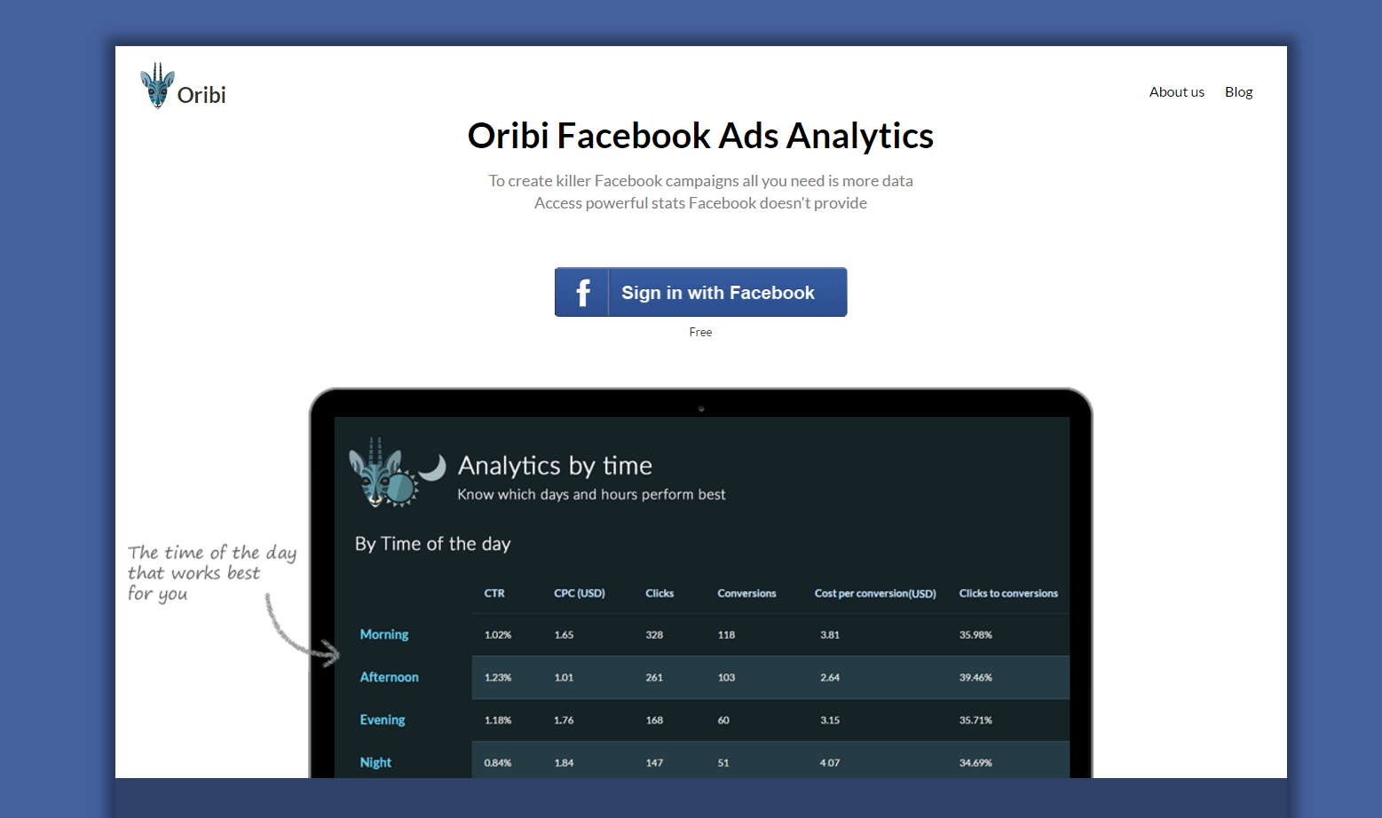
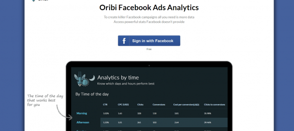
Oribi’s landing page is a click-through page that asks users to sign-in to have access to advanced analytics that Facebook doesn’t have.
Below are the successful points that they implemented on the page:
- The headline clearly explains what they provide and includes the keyword “Facebook Ads” which is beneficial for SEO, copywriting as well as their branding.
- The image shows the service in action and grabs users attention by advising about the appropriate time that works best for them. It’s also revealed in a user-friendly, smart and handwritten way.
- The simplicity and spacing make the page comfortable to the eye.
The primary considerations that should be reconsidered are showing the word “Free” in a bigger font size to make it easily seen. Also taking out the CTAs “About us” and “Blog” at the top right of the page avoids users navigations.
16. Urban Airship
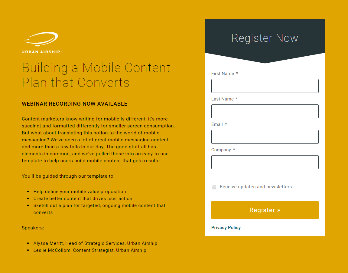
Urban Airship’s page is a lead capture landing page. The primary purpose of this page is inviting their target audience to register for a webinar.
Here’s what they did well:
- The headline provides a clear benefit.
- The subheadline highlighted in bold notifies visitors that they can register to get the recording in case they don’t have time to attend right away.
- The content clearly elaborates on the benefits of registering and lists down what the user will get from this webinar
- The CTA “Register Now” on the top of the form, urges visitors to sign up.
At times, we believe that few elements can be reconsidered such as making the headline thicker to drag more attention, adding headshots for each of the speakers, using a more compelling CTA request in the button such as “Register Now” or “Take me to the Webinar”, “and changing its color to make it distinctive.
17. WalkMe
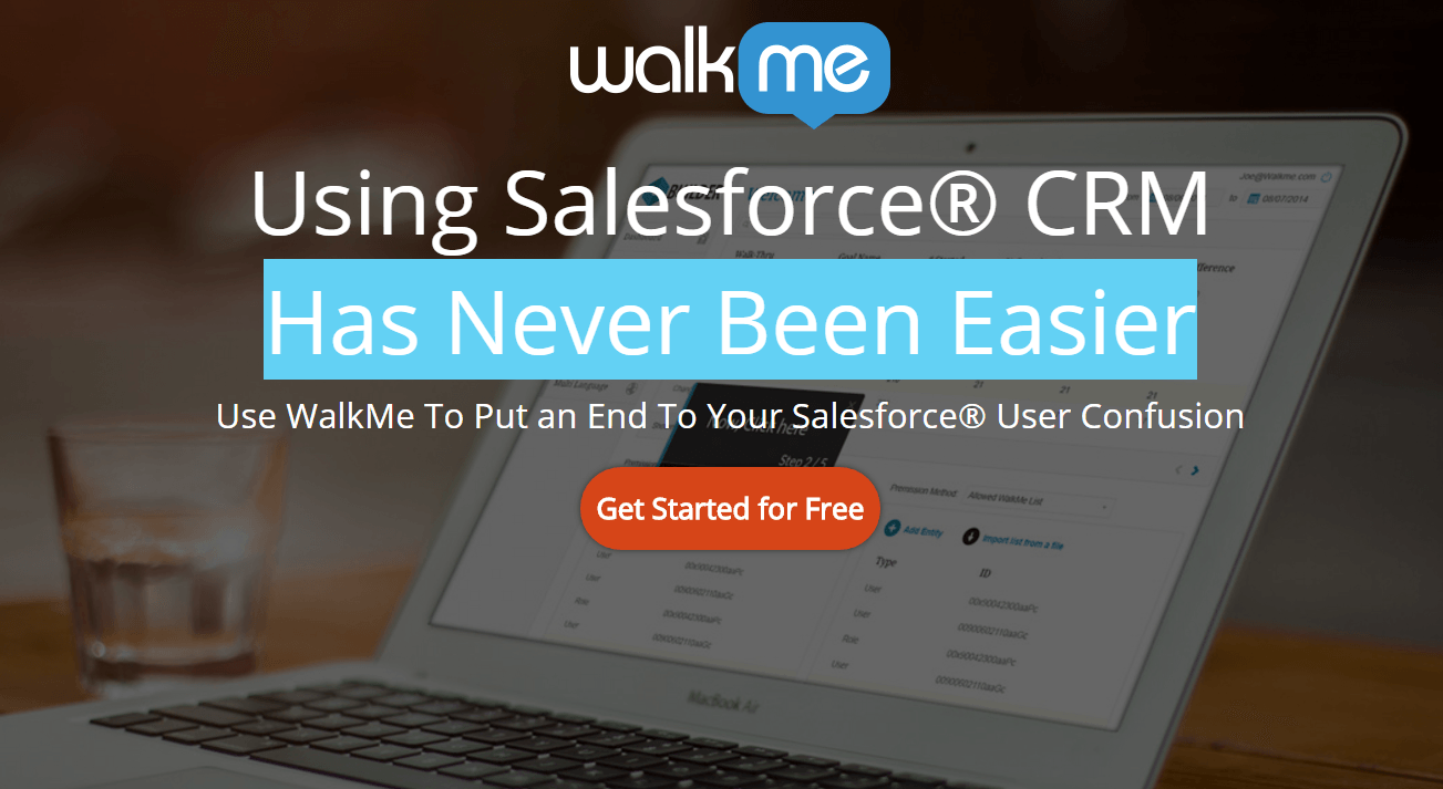
WalkMe’s landing page is a click-through page that asks visitors to try their services.
Below are the successful practices that they executed:
- The presence of a well-known brand “Salesforce” adds more value to the page.
- The use of Salesforce CRM is suitable for both copy and SEO.
- The use of “R” mark gives credibility and also protects them from brand infringement.
- The headline highlighted in blue draws visitors attention and communicates a clear benefit.
- The subheadline complements what was previously stated in the headline and touches on an insight related to the service provided by Salesforce.
- The CTA button stands out and entices visitors to convert.
- The background image showing the software is darkened for the purpose of clearly showing the headline in front of it.
The only thing that we think should be revisited is adding more space between the logo and the text as well as the text and the CTA button.
18. MasterClass
MasterClass offers different online classes created for students of all skill levels in various fields such as music, painting, writing, cooking or any other arts.
Here’s one of their landing pages that we analyzed:
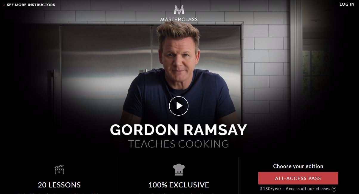
This page’s type is a homepage as a landing page that includes different elements. The main purpose of this page is to push visitors to watch a video by a well-known chef.
The points below are worth to be listed:
- The video shows the thumbnail of a famous chef which encourages visitors to watch it.
- The CTA button in red “ALL-ACCESS PASS” stands out on the page.
- The benefits are clearly presented with relevant icons.
- The pricing “$ 180/year” marks transparency.
On the other hand, we see that some elements can be improved such as changing the CTA button’s copy on the bottom right of the page to include an actionable request. Second, the pricing is used in a small font size; making it large would highlight confidence.
19. Inkling
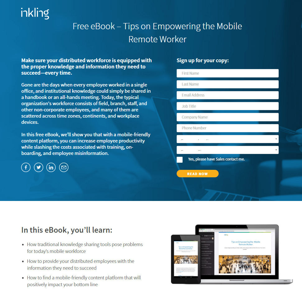
Inkling’s landing page is a lead capture page that asks visitors to download an ebook.
Below are the effective practices that have been applied:
- The headline and content work together to create a strong value proposition.
- The option to request contact from their sales team is a smart way to get high interest and quality leads.
- The blue background color shows a computer in a home environment which reflects the “remote worker” aspect. It’s also darkened to reveal the headline, body text, and form.
- The orange color of the CTA button looks distinctive and shows immediacy which drives users to convert.
- The entire section including the bullet points entices readers to find out what they will learn from this ebook.
- The image on the right provides a visual representation of the ebook’s topic.
However, we believe that some areas can be enhanced such as making the form shorter because it would entice more visitors to subscribe. Also, removing the social media buttons or adding them later on the page prevents users from abandoning it especially in the above-the-fold section before filling out the form. Furthermore, the last two drop-down form fields should be labeled in order not to confuse visitors.
20. Microsoft Power BI
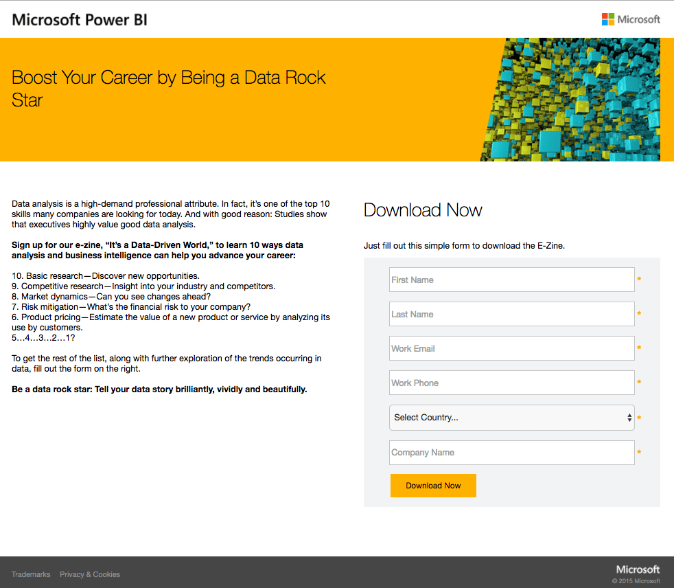
Microsoft Power BI’s landing page is a lead capture page that asks users to give their contact information to advance their career with data analysis and business intelligence.
Below are the effective practices they implemented:
- The headline communicates a clear benefit.
- The introduction includes a clear explanation of what the page is about.
- The benefits in bullet points are listed in a transparent way and create curiosity for visitors to fill out the form to discover the full benefits.
- The CTA request “Download Now” above the form is concise and to the point.
- The orange CTA button drives urgency to download the service now.
- The letters in bold draw users attention to significant sentences.
- The links in the footer on the bottom left are not highlighted, and this is critical not to redirect users to another page.
However, we believe that the copy and the form are a bit long; making them shorter would increase conversion rates.
Landing pages are an indispensable part of marketing campaigns. It connects your other marketing initiatives and integrates with them to serve as a distinct and single-minded point in your customer journey.
Knowing how to create a landing page is key to ensure a high conversion rate and a successful campaign. We hope that the examples we showed you in this article were helpful to give you an idea. But of course, you should create and adapt your landing page in a way that best fits your objectives and needs. Ultimately, you should always measure your landing page analytics to know what works best for your business and optimize it for the best results.
Originally published here.
Digital & Social Articles on Business 2 Community
(82)
Report Post