Friction, defined as “the psychological resistance that your visitors experience when trying to complete an action, is a conversion killer.
You can optimize your value proposition or CTA buttons all you want, but if your sign-up flow contains too much friction, you’re leaving money on the table.
Eliminating friction is one of the most effective ways of increasing conversions. However, it’s difficult to identify sources of friction if you’re just taking guesses.
Friction can occur anywhere on a site, but we’ll take a specific look at the sign-up flow, where a large amount of it occurs.
Friction and the Sign-up Process
Friction is simply the measure of how much effort the user has to exert to sign up.
Though difficult to quantify because of variance and subjectivity, it can be measured using three factors (via Totango):
- Steps to completion – the number of steps or the series of pages that the user is expected to pass through
- Information cost – the number of fields that a user has to fill up
- Effort investment – the number of decisions the user must make, and the number of additional activities required to be completed (e.g. email confirmation, CAPTCHA, etc.)
There are a few different ways to design a sign-up flow, and there are pros and cons to each. The goal, usually, is to reduce friction while maximizing revenue and users.
3 Common Sign-up Flows, and How They Handle Friction
Though there are many ways to design user flows, they usually boil down to the following three. Each one has pros and cons, and of course it’s contextual to your product and audience. Anyway, here are the 3 common user flows with examples and critiques…
1. App Access After a Series of Tasks
Sign up (Email ID + Password) → Account Setup → Email Confirmation → App
Example: MailChimp

This is probably the most common sign-up flow used today. It makes users give all their information up front, and only after do they get access to the software.
What’s good about it?
For starters, users are familiar with this process. Human brains have pre-defined mental models of how things work. So when we see a sign-up flow that is coherent with that model, very little additional input is needed for recognition. Therefore, we feel comfortable with it right away.
Another major advantage of this type is that it helps you keep spammers as far away as possible from your app. Security – well-assured.
Looking at MailChimp’s sign-up process, the first page is where you have to add your email, username, and password:

Then you have to verify everything before even seeing the app:

Lots of friction early on, but you’ve got all of the customer’s info and the sign-up flow is commonly used and therefore familiar.
What could go wrong here?
Asking your users for a lot of information even before they’ve seen your app could backfire.
Marketers tend to get greedy with information, but the more info you require, the more friction you introduce.
If you’re asking for more information up front, make sure to justify each action to eliminate friction. Here’s how Samuel Hulick from UserOnboard put it :
 Samuel Hulick:
“When a user signs up, their attention is so precious. You can think of it like air leaking out of a space suit – you want to make as much use of it as you possibly can while it’s still around. This goes beyond just removing friction – it means taking clear and meaningful actions that will motivate the user throughout the initial workflow.
For example, if you wanted somebody to make a pizza, you wouldn’t want to first say, “let’s start kneading dough and simmering sauce and…”
You would want to say, “let’s make a pizza, and we’re going to start by kneading dough and simmering sauce.” When you frame these two activities around the end goal, it helps the user understand why they’re important and builds motivation to complete them.”
To sum it up, if you’re making access to the app the last thing users experience, make sure they know why they have to finish each task.
See how Slack clearly explains (using microcopy) how entering a Team Name would help the user at a later stage, leaving no space for uncertainty…

2. Account Setup After App Access
Sign up (Email ID) → App → Email Confirmation → Account Setup
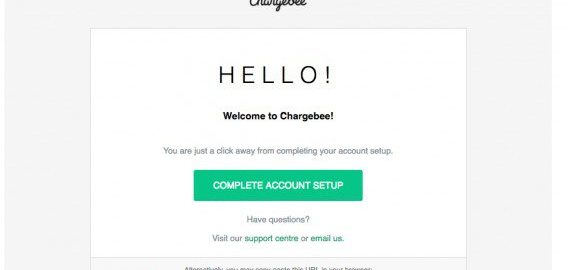
Example: Chargebee

As you can see, the user is taken to the app as soon as they type in their email address, after which they’re asked to verify their email address, and to claim their account by furnishing the other details.
What’s good about it?
This one eliminates a lot of friction by delaying certain required information – like the password.
To come up with a good, secure password can be a daunting task. Removing the password requirement (as well as the email verification) earlier on is easier on the user, and you still get their email address for retargeting.
Samuel Hulick was asked where onboarding friction is most common in SaaS companies. He explained that email confirmation was a big one…
 Samuel Hulick:
“Email confirmation definitely stands out. I have yet to come across a great reason to take all the momentum a new sign-up is bringing to the experience and tell them to go into the distraction nightmare of their inbox instead of progressing further into the product.”
The logic is simple: once a user likes your product, they’re more likely to take the effort to confirm their email address and set up their account.
Chargebee’s sign-up flow follows this framework.
During the initial sign-up form, we ask for the user’s email address alone…

…after which they’re taken directly to the app…

And only when they come back to the app for the second time and try to sign in do we nudge them to verify their email address and ask them for a password, username, company name, and other information.

The result? Our sign-ups doubled almost immediately.
By following this approach you nail two things:
- The entire flow is user-focused – people get to try the product before exerting extraneous effort setting up accounts.
- A user who sets up a complete account is a serious evaluator. You can easily segment these serious evaluators from your casual signups, and therefore, you can streamline your marketing and sales efforts, wasting less money on tire kickers.
What could go wrong here?
One drawback: you won’t be able to keep away the spammers and tire kickers. But at the same time, customers want to explore your product, and verifying emails upfront is unnecessary friction in terms of that goal.
Also, you’re not getting as much information from the user. Sometimes, if an act requires lots of upfront work, it results in commitment bias, which could mean higher quality leads. But usually, less information upfront is better for quality and quantity of users.
3. Access App Immediately
App → Sign up (Email + Password) → Email Confirmation → Account Setup
Example: Typeform

The lazy or soft registration process – where the user’s taken straight to the app, only after which are they prompted to sign up.
What’s good about it?
The major benefit of using this kind of sign-up flow is there’s really no friction. There’s no sign-up required, at least immediately.
Luke Wroblewski believes that “sign up forms must die.” Instead, he believes a gradual engagement (that’s how he refers to lazy registration) is the ideal approach to onboard new customers.
Showcase your product, let your visitors get a first-hand experience, and only when they advance to a specific stage in terms of product usage do you ask for their information. Here are the best practices he recommends:
 Luke Wroblewski:
“When planning a customer’s initial experience for your web service, think about how you can avoid sign-up forms in favor of gradual engagement.
If you do opt for a gradual engagement solution, ensure that it gives potential customers an understanding of how they can use your service and why they should care.
If you choose to auto-generate accounts for potential customers, ensure there is a clear way for them to access their account. Chances are that people will either ignore or not see account creation emails, and may be uncertain if they have an account or not.
Avoid gradual engagement solutions that simply distribute the various input fields in a sign-up form across multiple pages. It’s a good possibility that this will reduce efficiency and not delight anyone.”
What could go wrong here?
Every coin has two sides, and this one is no different.
From the business’s point of view, you’re losing out on a very valuable user information – their email address. So you’re left in the dark with no way to reach out to your prospects. You’re fully relying on them to act on their own accord.
And if you’re just starting out, connecting with your audience will be crucial. That’s the only way to receive real-time feedback and tweak/test your product iteratively.
Oh, there’s a customer-side drawback to this model as well. Harry Brignull set out to give this flow a try, and this was what he had to say about it (bolding ours):
 Harry Brignull:
“We designed (a) job-seeker website to use lazy registration (aka “passive registration” or “progressive sign up”), so people didn’t need to register before they applied for a job or set up email alerts.
This was so successful at boosting conversions that we decided to do the exact same thing with the recruiter job posting UI– this is the place where employers and recruiters post their job ad, categorise it in various ways and then pay.
We took it to usability testing, and it flunked with every single recruiter who tried it. Why? Because they didn’t like the idea of spending 15 minutes creating a job ad without the reassurance that it was definitely going to be saved somewhere safe. They far preferred the version of the app that required up-front registration.
It’s funny that for once, user research pointed towards the option that requires substantially less development work. It’s also another nice little piece of evidence showing that you can’t just blindly copy and paste design patterns from one context to another and expect the success to be magically transferred. Context is key.”
And that brings us to the next question – is friction always a villain?
Friction Can Sometimes be Good for Sign-up Flows
…provided that it is a “purpose-driven friction” – friction that has been intentionally incorporated in your sign-up flow. This is usually to either:
- Increase the quality of your sign-ups, or
- Improve the user engagement
Take Pinterest for instance.

They deliberately add friction to the sign-up process by asking the user to follow a minimum of five interested topics. Then they nudge them to install the Pinterest browser before taking them to their page.

The reason? Enhanced user experience and efficient activation of sign-ups.
We’ve taken a similar route in Chargebee.
Once the user clicks the sign-up button, they’re asked to choose the industry (SaaS/services/e-commerce) to which they belong. Then we ask their email address. Finally, they are taken to the app where the test data is customized according to the selected industry.

This little change in our sign-up flow contributed in boosting our trial-to-paid conversion from 8% to 15%.
Friction can also be used to qualify leads, especially if you’re B2B and sales calls cost money. ConversionXL Agency uses a qualifying question about budget size to eliminate tire kickers. Though less leads probably come through, the ones that do are worth it.

Introduce productive friction upfront, to avoid counter-productive friction at a later stage.
Conclusion
Each sign up flow has pros and cons, and each one works better in different contexts. Nothing is absolute in user experience or conversion optimization. Instead, ask yourself:
- What’s the purpose? What are you trying to accomplish with the sign-process and how does each step help you do that? Info-gathering, lead quality, lead quantity, user experience – what are you trying to accomplish?
- What’s your audience like? Different people respond differently to privacy concerns, they have different attentions spans, and they value their time/security differently. Test it on your own audience.
- What’s the product? How complicated is it? What problem does it solve? Mold the product to the target market, and make the user flow as seamless as possible.
It all comes down to bringing users to that “Wow!” Moment as soon as possible on the onboarding journey.
Remove unnecessary friction, only ask for information that cannot be done without, and take your users to the “Wow!” Moment as fast as you can.
Digital & Social Articles on Business 2 Community
(128)
Report Post