So far in 2017, nearly 70 Macy’s locations are set to be closed. Sears and Kmart are closing 150 stores across the country. Amazon is currently poised to take the throne of the retail industry and Uber has claimed dominance over transportation. Yet, Amazon doesn’t own any physical stores, and Uber does not own any cars. This phenomenon proves one thing: the world is changing.
People prefer products to come straight to them. Therefore, now is the time for brands to institute online buying options into their business model.
The harsh reality is the e-commerce landscape is unbelievably crowded. Regardless of what your business does, chances are, there are hundreds of other brands trying to accomplish the same feats. So how can you set yourself apart? The answer is creating and maintaining a top-notch, authentic ecommerce website filled with compelling elements right out of the gate. The more value you provide, the better you will do in the search rankings leading and the more stuff you will sell. Let’s talk about what you can do to solidify your presence.
The Foundation
Let’s start with choosing a domain name; this is a decision you will have to live with for a long time. Domain names have a huge impact on web traffic, click-through rate, and visibility. The name of the game here is brand-ability.
Keep it simple. When you say it out loud, does it sound like an actual business? For example, let’s say you are starting a business for selling furniture. How does the domain “furniture-shop.com” sound? Super generic, and nearly impossible to brand. Stay away from hyphenated terms. Avoid using exact match keywords too. Choose a name that is catchy and memorable. Don’t rush this part. It’s the basis for your entire operation for years to come.
If you need help choosing a domain name for your ecommerce store, here’s a nice guide and a Quora thread.
Moving on to the homepage, this is the central focus of your online store and will most likely be the point with the highest traffic. This page serves as the first impression of your brand and should be designed accordingly.
Here is a great example of what a homepage should look like:
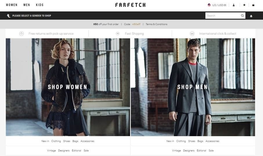
The message is simple and users are provided with everything they need to browse the entire online catalog within seconds of landing.
Keep in mind, you only have a few seconds to capture people’s interests. Your homepage is responsible for building trust, introducing the sales funnel, and creating lifetime customers.
And creating and integrating all these elements is by no means a simple task. Every element on your site contributes to making the sale. Opt for a customizable retail platform such as Shopify to make sure everything from landing pages to blog integration, product inventory, and payment processing to traffic reports, is equipped for all devices, so that your structure, navigation, and ecommerce functionality is foolproof.

Regardless of how many products you are selling, there are three factors to keep in mind:
1. Speed – It’s no secret that attentions spans are shorter than ever and patience is an increasingly rare trait. That being said, pages need to load within seconds. Be sure your images are optimized and complicated plugins are kept to a bare minimum.
2. Simplicity – Most retailers use the homepage as means to communicate the values of their company and highlight special offerings. However, having too much messaging can come across as unorganized. Only add information that is absolutely necessary. The homepage should just be a powerful jumping-off point to other pages.
3. Flow – If visitors have trouble finding what they need from you, be assured, they will have no problem whatsoever leaving for greener pastures. In addition to being simplistic, all pages of your site should clearly point visitors in the right direction for anything they might be looking for.
Product Pages
The product pages are the heart and soul of an e-commerce platform. Think of each one as a different sales pitch. They should all be consistent and provide the necessary information to prompt a conversion. Poorly constructed product pages will be the death of your business.
Here is an example of a perfectly designed product page from online eyeglass retailer Firmoo:
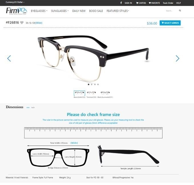
You’ll notice the dynamic CTA button “Select Lenses” near the top right corner. The customer is provided with measurements and different looks at the product, supplemented with all the necessary technical information. At the bottom, there is a selectable tab where they can look at customer reviews and even schedule consultations.
Ultimately, your online store should be a one-stop resource center eliminating the need to navigate anywhere else. Put yourself in the shoes of a customer. Brainstorm all the potential questions they might have about your product or service and answer them thoroughly on these pages.
Finally, social sharing buttons should have a prominent role in your product page design. By not integrating share options, you are leaving money on the table. In the current age of social media, information is passed around like crazy. Sharing buttons should be on the category pages, product listings, and following every purchase. This is essentially free advertising.
Checkout Process
Ah, the checkout process. This is where everything on your entire website leads to. The end of the funnel. Unfortunately, this is by far the trickiest part of the puzzle. In fact, the average cart abandonment rate last year was 69.23 percent. This can be due to wide variety of reasons.
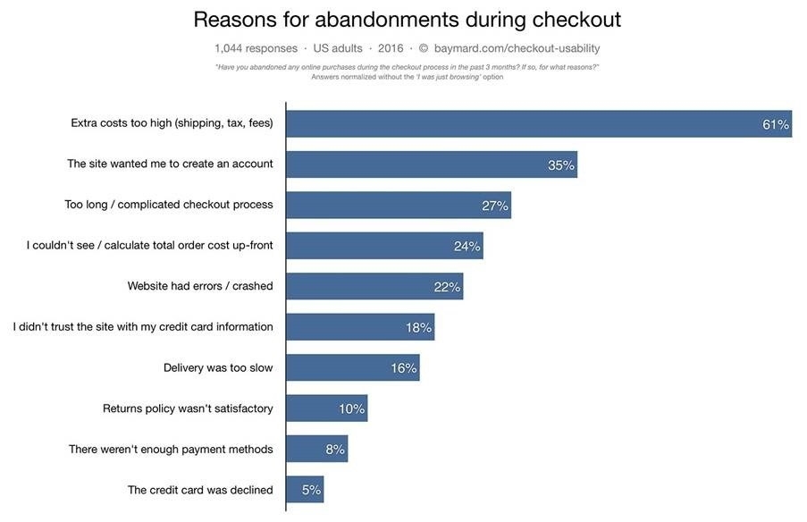
Source: Baymard
The checkout process is perhaps the area in which simplicity (and mobile-friendliness) is valued the most. The more hoops a customer has to jump through, the more opportunities they have to reconsider.
First of all, DO NOT require every user to create an account to place an order. Most people assume that forking over their email address will result in unwanted spam mail. It’s just another barrier standing in the way of making a purchase.
Second, cut down on any unnecessary forms and provide a clear view to the end of the process. Using a progress indicator is a great way to help navigate the checkout.
Third, be transparent with total cost. Hiding things like shipping costs and taxes until the very end looks untrustworthy and will annoy any customer.
Take your time with this part. A poor checkout process can render everything else on your e-commerce website useless.
Over To You
E-commerce is taking over the worldwide market at an incredible rate. Jumping on board as early as you can will be one of the smartest moves of your career. Keep in mind, designing a high-converting online store does not happen overnight. Even when it is complete, there will always be the need for testing and improving. Websites must keep up with the times to survive.
* Adapted lead image: Public Domain, pixabay.com via getstencil.com
The post 3 Critical Components That Affect Ecommerce Sales appeared first on Search Engine People Blog.
(103)

