Image credit: Unsplash
People have more than enough options to choose from when it comes to online shopping. Global brands, giant retailers, local businesses… All of them are happy to offer the desired item, a truly personalized approach, and amazing customer service. And to bite a chunk of this cake!
But sometimes it’s enough to tweak a couple of things to lure new clients and return those who once lost loyalty. Let’s talk about 3 common marketing mistakes in eCommerce linked with various aspects of the website. And, of course, about ways of salvation from the poor experience of your customers.
1. Slow and Mobile-Unfriendly Online Store
Statistics state that 40% of people leave a website that loads for more than 3 seconds! And just a one-second delay can diminish the conversion rate by 7 percent.
M-commerce in the US alone is predicted to grow from $ 128.4 billion in 2019 to $ 418.9 billion by 2024. That’s way more serious than you thought, right?
In fact, these numbers clearly determine what to focus on if you don’t want your clients to fall short of expectations while making purchases via phones. The main focus is improving mobile conversions.
The first thing is to minimize loading time, and the second one is to eradicate all imperfections in terms of UX/UI. Besides practices like image optimization and creating a responsive design for a website, we’d recommend switching a regular site to a progressive web application: have a look at some examples of Magento PWAs.
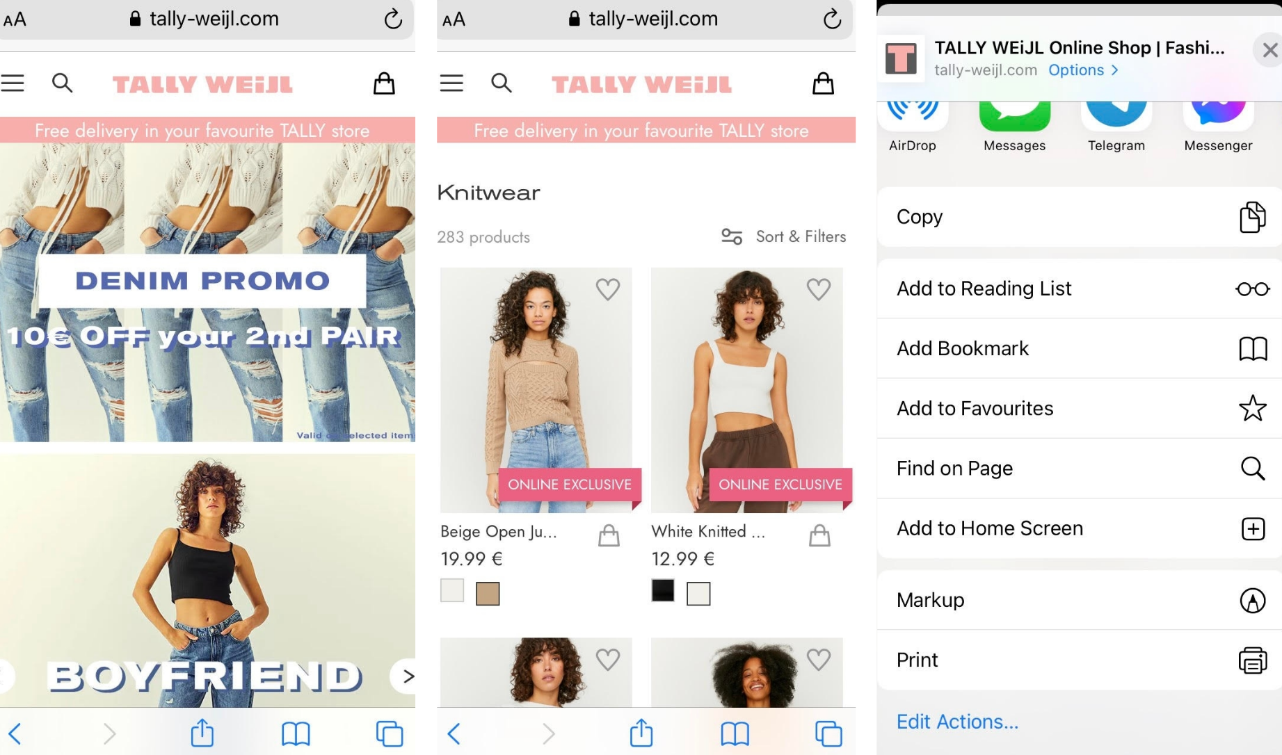
Screenshot taken on the official Tally Weijl website
Progressive web apps give users a native app-like look and feel with their outstanding speeds and handy navigation. At the same time, PWAs are still websites that don’t take up space in the device’s memory. For marketers, PWAs also open the opportunity to re-engage customers through push notifications.
Take a look at the screenshot above. Here you can see a website of Tally Weijl whose design looks delightful. It’s simple, intuitive, and handy in use. And it’s so fast!
2. Absence of Customer Retention Hooks
a) Promos & Coupons
Surveys show amazing stats regarding varied promos. For instance, up to 90% of consumers use coupons!
Thus, pop-ups with tempting offers have become a golden standard for eCommerce, yet not everyone uses them. The same applies to promo codes and visible banners in the header of an online store. Let’s fix that!
Take a look at the screenshot from the ASOS site that constantly uses this marketing tactic.

Screenshot taken on the official ASOS website
b) Subscriptions & Loyalty Programs
As a marketer, you can also offer people a reward for the subscription to the newsletter. It helps both to convince a person to buy something now and gives a chance to later return them.
This will be handy for your email marketing strategy and for customer retention. See how it looks on Levi’s website on the screenshot below.
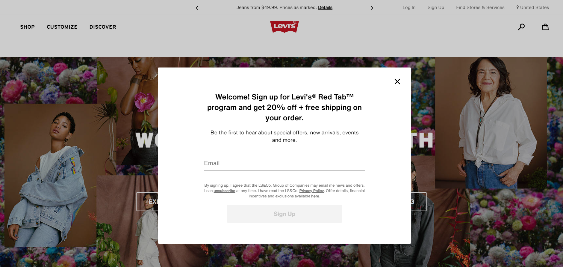
Screenshot taken on the official Levi’s website
3. Refusing to Help with All Available Means
The more useful information people gain from the eCommerce shop, the higher are the chances of buying. Digital marketing together with IT constantly create new means to show off the product better online. And not using them is one of the silliest marketing mistakes in online sales.
a) Gift Sections
Gift finders and wish lists have finally become conventional, but still there are many stores that haven’t added such a section to their sites. Follow the example of a nicely structured Guess gift finder.
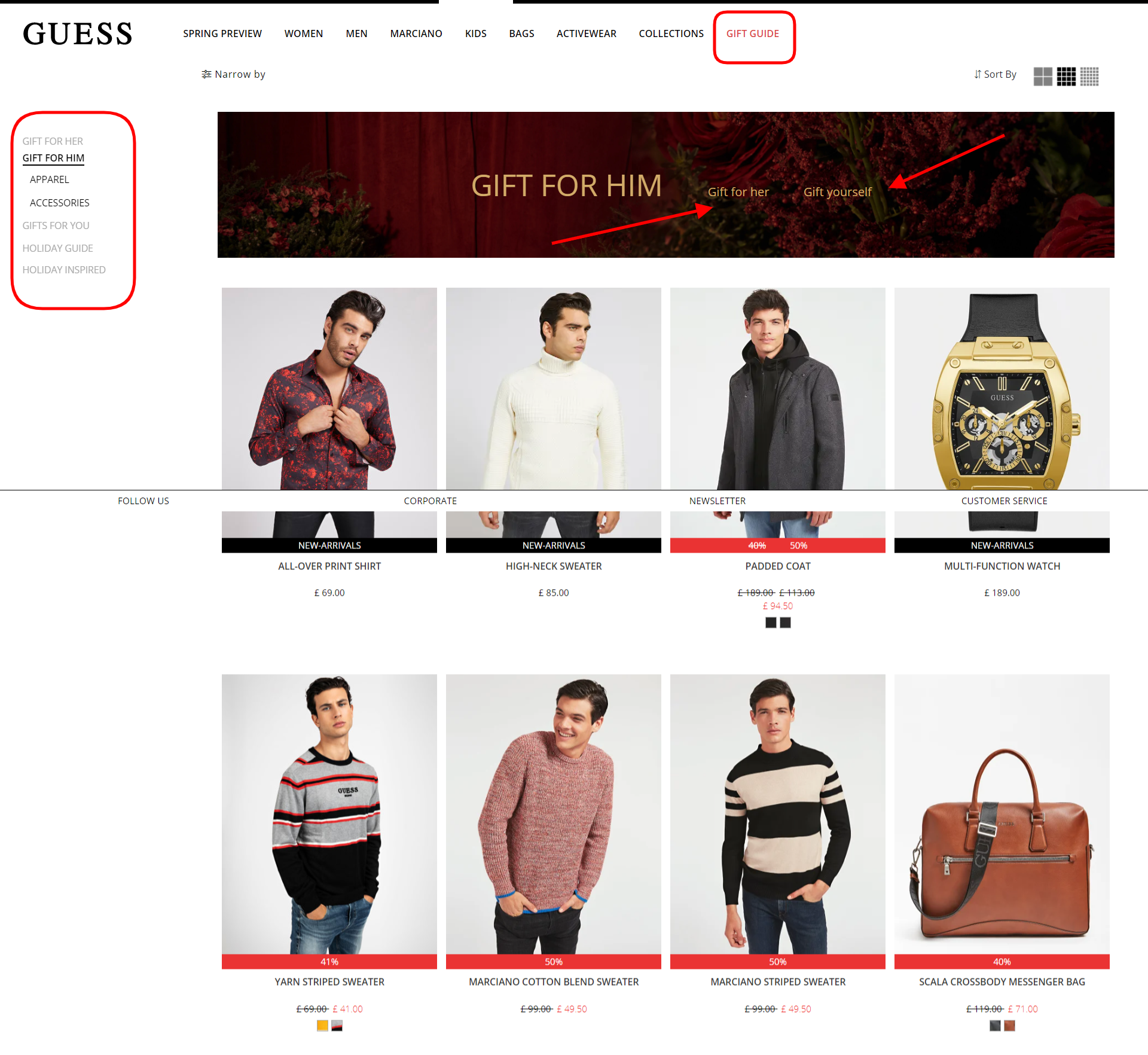
Screenshot taken on the official Guess website
b) Virtual Try-on
The AR-based “Try on” feature is the latest trend for footwear, clothing, and cosmetics brands.
As it’s shown on the screenshot from Lancôme online shop, the service eases the selection of mascara, lipstick, and foundation. The website suggests uploading a photo, using a camera, or choosing a model with a similar type of appearance. It’s become easier to find a perfect match! From the marketing perspective, such a feature can take product presentation a whole level up.
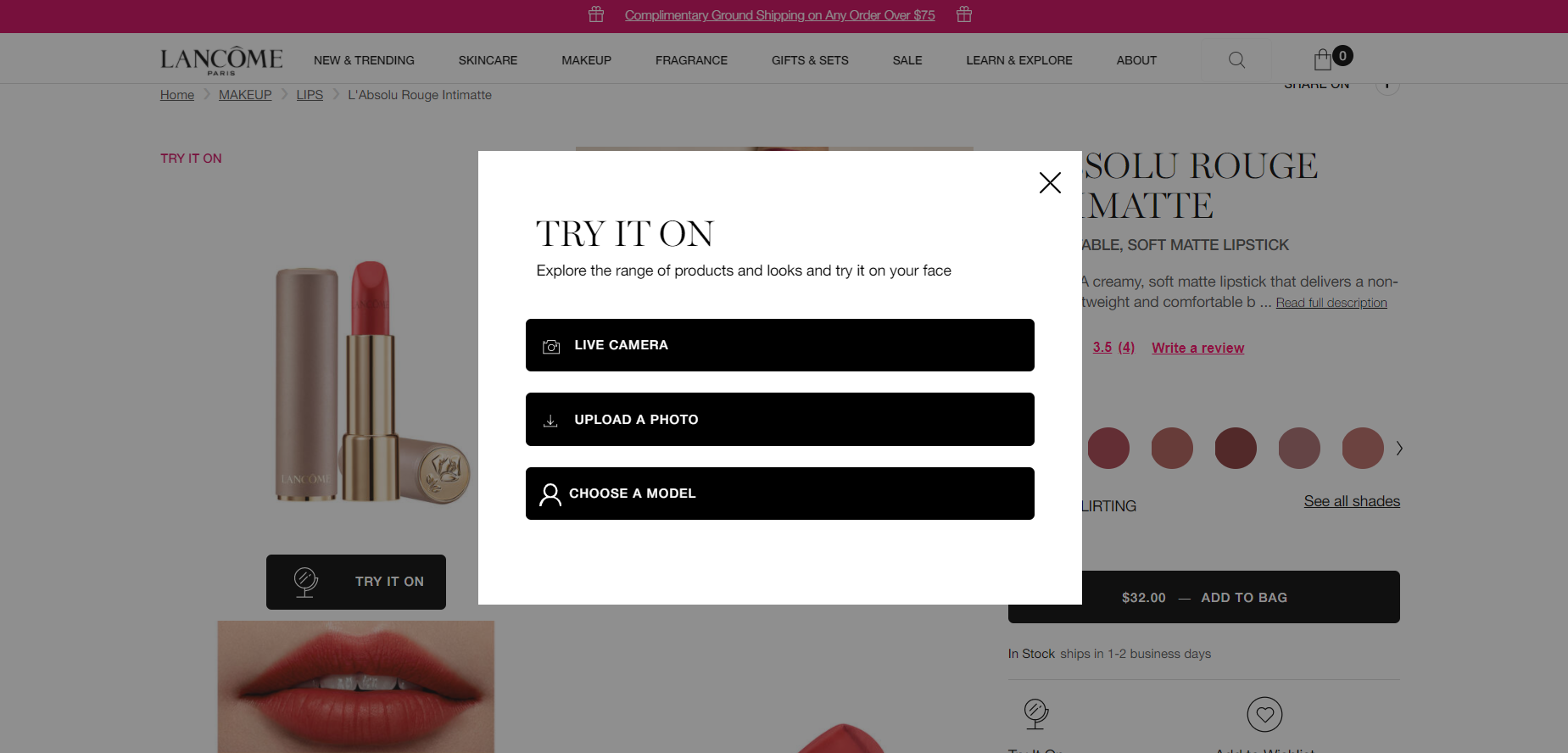
Screenshot taken on the official Lancôme website
Final Word
The message for marketers here is obvious. Just try to avoid as many mistakes listed above as possible and don’t be afraid of trying something new like live streaming and other trendy approaches. When you are able to tick all those issues as resolved, then your eCommerce store will be more profitable and loved by buyers.
Digital & Social Articles on Business 2 Community
(24)
Report Post

