Before you jump right into a website redesign, there are a few things you’ll want to do. I know you’re excited but some preparation will seriously cut back on gray hairs.
If you gather what you need according to the list below, you’ll be much more likely to see your project succeed.
Redesigning your website isn’t like changing the wallpaper in your guest bedroom. Redesigning your website needs to be about…
- Building a better user experience
- Making it more manageable for internal teams
- Improving performance, marketing, sales, SEO, and otherwise
Let’s dive in…
Number 1 – Analyze Your Website’s User Data and Stats
How can you do something better without first knowing what you have??? Make sure you’re tracking your website’s stats.
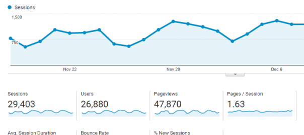
You have tons of options here but Google Analytics (screenshot below) is most common and it’s free.

Regardless of what you use, you’ll want at least a month of usable data to analyze. There will be a ridiculous amount of data to sift through and it can be overwhelming.
At the very least, focus on the following (note – these are from Google Analytics so the naming may vary if you use something else)…
Audience
Who are you reaching and what are their preferences? In analytics you can easily find out the following:
- language/location
- age/gender
- interests
- device – mobile, tablet, desktop – are you losing any of these visitors because you lack responsive design?
- browser (and maybe operating system if you’re developing something more involved)
- screen resolution (big monitors? little baby screens?) – responsive design will also help with this.
Knowing these facts about your audience will help you make better design decisions. How many times have you been in a meeting where decisions about design or development are made based on the meeting attendee’s personal preferences? Not good.
Combine this data with anecdotal information gathered from your sales, customer service, and other customer-facing teams to develop some buyer personas.
This post on the perils of groupthink in a web design process might help too.
Acquisition
How is your audience finding you? For example, organic search is far and away the biggest referral source for Wood Street. But you might see some other combination of the following:
- Organic Search – they are searching for you on engines. If you’re interested in getting more details on this like keywords used, check out Moz.com or SEMRush.
- Social – are your efforts on channels like Facebook, Twitter, Instagram, Snapchat actually driving traffic?
- Referral – are you getting traffic from other sources like directories, things like Reddit? How can you build on this with a new website?
- Direct – they are typing in your URL to get to your website. This could be a good indicator of how well known your domain (and brand) actually are.
- Email – if you do a good bit of email marketing, you want this number to be a solid source of acquisition.
Knowing where your traffic is coming from is useful before a redesign so that you can anticipate future acquisition opportunities and how best to build a website to capitalize on those.
Which brings us to…
Behavior
This is the real meat and potatoes of analytics. What is working for you? What isn’t? If you don’t know this going into a redesign, you are designing with guesses and good intentions. What’s the quote? “The road to Hell is paved with good intentions.”
There is a ton of great stuff in the Behavior section. But at a minimum, you’ll want to look at the following:
- Site Content – what pages are they visiting?
- Time on Site – how long are they staying on these pages?
- Bounce Rate – when they get to a page, how many are going off of your site?
You can get much deeper here. For example, you can set up conversion goals with money values attached to the conversions.
You can also look at Behavior Flow to see how users are moving through your site.
Spend some time in there poking around. You need to know this information before starting on a redesign.
If you don’t you’re headed for
- more of the same (then why bother)
- epic failure (big waste of time and money)
- maybe you get lucky and tons of traffic finds you (pretty risky bet with that kind of expense).
Number 2 – What’s the Competition Doing?
A website redesign is your chance to throw them off their game. What are your competitors doing? Is it working?
Sometimes knowing what your top competitors are doing ends up giving you ideas on what not to do. The point in doing this research is not to copy or to even do the complete opposite.
The point is to find ways to better serve the audience you and your competition are targeting.
You can do keyword and ranking research in tools like SEMRush (screenshot below) to see what keywords your competitors rank for. This is real actionable data.

SEMRush Organic Keyword Report
With this data you can gain a real understanding of what your target audience is looking for and how they’re getting there:
- Organic Keywords – what people actually type in Google to find your competitor. How can you leverage this information to rank higher?
- Backlinks – link building is still alive and well and important in determining the value of a website. Is your competitor getting links from places where you can build a presence, like a directory or blog?
- Competitors – who are your competitor’s competitors? Are you on that list? Are the others on this list your competition too? What can you gain from looking into their keywords and ranking?
But, don’t just focus on ranking against the same keywords. Run the data above through the “filter” of experience, buyer personas and analytics. How can this information be used to better target your audience.
You’re not just trying to beat them in the SERPs (search engine results pages), but also in reputation and brand value. Are you there in their time of need more so than your competition?
The other tool you have is empathy. Get in character as one of your buyer personas and poke around your competitor’s website a bit. Is it a good experience? Where could it use some improvement? What bothers you? What excites you?
Number 3 – Your Culture
We’ve hinted at this a bit in the last part on competition. Humanize your marketing. What is it about your company that your clients love? How does this translate online.

Too often clients will focus on explaining culture and value when they need to show it. If I wrote a long winded article about how great Wood Street is, would you believe it? Maybe, but you’d also be a little put off by the arrogance and ego.
Now, if Wood Street had a well-designed, easy-to-use, and helpful website, would you think we’re great? Maybe. Probably more so over time. The proof is in the value returned to you through using the site.
If your website contains some of the best information around but it looks like crap or is hard to use, think any of that useful stuff gets used? Not likely.
People online are distracted. A.D.D. is not a strong enough descriptor for a typical web user. They are in a constant state of complete and total, squirrel!
Take some time and really think about this. What is it about your company that truly matters to your customers? How can you bake that into your new website?
- Great Customer Service – your clients love you because you fix things and solve their problems. Think about this when you set up your website’s sitemap and structure? How can you organize information visually such that your clients can find the help they need quickly and easily?
- Thought Leadership – do your clients love you because you get them info and analysis on important topics before anyone else? How can you build on this with your new website? Can you leverage this asset to gain leads or sales by adding calls to action to popular pages or posts? Use this thought leadership to grow a membership or loyal following by aligning the two goals using smart web design and development.
- Amazing Products – maybe your goods are so stellar that they are your biggest selling point. It’s what you’re known for. Now, if you tell people how awesome your stuff is, will they believe you? Probably not. Show them! Create videos of people using your products and talking about them. Include testimonials – not the written one-liners, but a video or detailed case study about someone loving your stuff and why.
There could be other reasons you matter to your audience. If you know this audience and their needs, you’ll then know why or how you matter to them. From there you can construct a website that helps you amplify the aspects of your company’s culture that your audience loves!
Your website is still an important part (some might say the most important part) of your marketing. Don’t build a brochure website. Build a website that lives and breathes. Develop a web presence that matters. By doing a little extra homework up front, you will!
Thoughts? Let me know in the comments section below.
Digital & Social Articles on Business 2 Community(60)
Report Post


