Small changes often equal small gains.
That was just one of the many conversion truth-bombs Larry dropped in his popular post “Everything You Know About Conversion Rate Optimization Rate is Wrong.”
Sure, switching your landing page’s button from orange to green might help. A bit.
However, data shows that small improvements from small changes often regress back to the mean over time.

So while those initial results seem promising, many times they’re short lived.
Instead, the unicorns – the accounts regularly topping 10% conversion rates – are playing a different game altogether.
What do the unicorns to increase conversions do that you currently don’t? Here are the three top areas to focus on – none of which involve changing your button color or other small-time A/B tests.
1. Upgrade Your Offer
Free trials, discount coupons, and free consultations. Three things your site probably has in common with every other product, ecommerce, and service website out there.
That’s an issue, because Point #1 in Larry’s article was: “Across all of the high-performing landing pages, we saw massively creative and differentiated offers.”
It’s fair to say that if your core offer is generalized and cliché, it literally doesn’t matter what the landing page even looks like. There’s no compelling value proposition to get strangers to buy-in.
Instead, you need a differentiated offer to build everything else around.
That was the genesis for the AdWords Performance Grader.

Marketing graders and other calculator-like offers are commonplace now in the marketing industry. They work because they give people:
- A quick, painless audit of their current performance
- Benchmarking data to see how they compare with others
- A personalized action plan with recommendations to improve performance
In short, they do all of the hard work and provide prospects with an immediate solution to a problem. In exchange, the company gets some basic user data to begin nurturing each lead over time.
Another great example (brought to my attention from this post by Brian Sun) is Lowe’s Lawn Care Plan.

This interactive feature helps people plan out their lawn (you know, city folk, those things with dirt and grass in them) based on their desired style, even factoring in your local climate (which also nets Lowe’s your zip code).
After answering a few very basic questions, the result offers users instant answers, and a customized, step-by-step roadmap to follow for improving the quality of their lawn.
They also include a GINORMOUS purple email subscription call-to-action at the bottom of the page to encourage people to sign-up for reminders.

In both cases, these interactive tools are focused on the primary problem or pain point people are experiencing first. They’re using that compelling hook to get your attention, before building a little interest and eventually showing how their products or services can fix said problem.
This final example is completely different, and focuses on large-scale, industrial real estate transactions. But the overall objective is the same.
When new companies are opening or moving warehouses (for product storage), they’re primarily concerned with availability and cost when searching for vendors. Things that take too long, or cost too much, threaten to throw their project timeline off the rails or kill their budget.
So when my company worked with United Material Handling to revamp their website, we wanted to bring their internal inventory system to the forefront of the site, allowing customers to browse their product line and get this feedback instantly.

Customers can simply select a Part Type and the Condition (New or Used) they’re looking for to get results. For example, if they selected Carton Flow and Used, here’s what they’d see next:

Here are the results they get:
- Sizing: Users can scroll through the exact sizing they’re looking for.
- Quantity: They can enter their desired quantity, and we also show how much of a given product is currently in-stock and ready to ship.
- Price Estimate: We then give users a rough pricing estimate based on the selected product type, condition, size and quantity.
If it all looks good, they can immediately “submit” this information to the company for an official quote (or keep browsing, similar to an ecommerce experience).
Even though the execution and context is different, the goal is the same:
Find out what’s most important to customers (based on their biggest pain points) and figure out a way to give them a sample solution (which leads to your products or services).
2. Analyze Your Conversion Flows
If your offer is good, you should have something compelling to share, promote, and drive new leads at a faster pace.
That flywheel momentum leads us to the next step:
“Identify the obstacles keeping prospects from converting and get those roadblocks out of the way by changing the flow. Test different variations to find out exactly which path to conversion works best for your audience.”
Friction is an important concept to keep in mind when trying to increase conversions. Generally speaking, less is more; as in, the fewer steps, fields, or pages required prior to a transaction, the better.
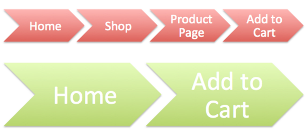
For example, instead of making people click through your Shop and Product pages before adding their desired widget to a cart, you can bring these most popular items to your homepage and eliminate a few unnecessary steps.

Marketing Experiments tested and proved this theory, first looking at what happens when customers need to go through seven (!) different steps before signing up for a subscription.

The results, predictably, were abysmal.
Zero registrations. And only a tiny fraction (1.88%) of the audience even bothered to begin this lengthy sign-up process.
Next, they tried reducing this down to four (and later three) stages to see if it improved conversions across the board.

The result? Simply changing from four steps to three (so reducing one page) resulted in a conversion increase of 32.35% (or 0.34% to 0.45%).
BUT…
There’s always a but.
Introducing more friction isn’t always bad. Sometimes, it’s desirable.
For example, Moz has found that their most profitable customers are ones who visit their site at least eight (!) times. These users tend to stick around longer, while those that convert quickly also don’t have the time, patience, or understanding to use Moz’s tools, and churn quickly.
This is dependent entirely on your business, and should be tested thoroughly (probably much earlier than any simple landing page A/B test).
If you zoom in a little bit to individual pages in this “conversion flow,” there are other things that can (and do) affect success.
Ideally, you want to give people an idea or indication of where they’re at in the conversion flow and what it’s going to take to get them over the finish line.
You can do this explicitly, like Amazon does with their checkout page (which also condenses important steps like Shipping and Billing into one final page).

You can also do this subtly, providing visual cues to help people figure out where they are, and where they should go to finish.

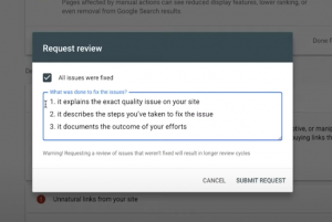
Along the way, bottlenecks or problems can pop up and throw people off their tracks. For example, this lightbox feature pops up on one site BEFORE you can even add something to your cart.

While legally prudent, the nature of the strong warnings and language here – at this first step! – will undoubtedly make a few people second guess their decision.
However if you located this step last, AFTER adding to cart but BEFORE purchasing, it probably wouldn’t have such a potentially damaging effect.
3. Implement Remarketing!
One thing you can almost guarantee is that NOBODY is looking at your display ads.
86% of consumers today are banner blind.
As is always the case, you don’t beat grim stats like that with more ads, but better ones. Ads that are more relevant, more personal, and better timed: Like remarketing ads.
Three out of five people notice these ads. Previously dismal ad responses can raise 400%. Even Larry agrees:
“Use remarketing to recapture [the 98% of] people who showed intent but didn’t convert.”
Larry went on to present this information at Inbound a few years ago, highlighting how ad fatigue affects remarketing much less over time.

Using Google’s Customer Journey to Online Purchase tool, you can even see how (and where) remarketing display ads can influence purchases in your industry.
For example, you can see how remarketing display ads for small beauty and fitness ecommerce businesses influence customer purchases – specifically, AFTER they have the chance to discover and become familiar with the brand’s products.

Otherwise, start with one of these common remarketing audiences, scenarios that apply to most industries:
- New Recent Visitors: New visitors to your site who bounce, but might be interested in a related content piece that helps them become aware of the need for a product or service like yours.
- Product/Service Viewed (or Added to Cart) But Not Purchased: These people have shown a little interest, but aren’t quite ready to convert just yet. (Here are a few more ways to combat cart abandonment.)
- Upsells to Recent Purchases: Now that you’ve got a new customer, introduce them to additional products or services that could enhance the core offering they purchased.
The second audience above, where a prospect shows intent but doesn’t purchase, is especially interesting. You know they’re beginning to check out and evaluate your offerings, but aren’t quite sold for one reason or another (or simply aren’t ready to be sold just yet). The opportunity in this segment of people can be HUGE.
Introducing a lesser commitment for people who aren’t yet ready to buy (for whatever reason), can be a great way to widen your funnel and increase future conversions through better lead nurturing.
Remarketing can help recapture these people (who would otherwise bounce) by delivering that “lesser” offer (like the ones listed above in Section #1).
A simple change like this can result in huge cost-per-click improvements, too. In one case, we saw switching the messaging and offering for remarketing ads reduced CPC’s by 62%.

Facebook’s Dynamic Product Ads are like a cross between Google Shopping Campaigns and remarketing, giving you the power of increased relevancy and scale. You set up a product feed (similar to Google Shopping) that will be used to power your Dynamic Product Ads database.

An ad template can be then set up to help you dynamically pull this data in and tailor each retargeted Facebook ad depending on those specific products viewed on your site.

The result?
Better relevancy, timing, and personalization. The key ingredients to combating (and defeating) banner blindness.
For example, The Honest Company saw 34% CTR increase and a 38% drop in cost-per-conversion using this new remarketing feature (compared with standard Facebook ad costs).
The Real Way to Increase Conversions
Most conversion rates hover around 2%, but the outliers – the unicorns regularly topping 10% – aren’t simply switching out button colors.
They’re focused on BIG changes, because they know small ones typically only yield small gains.
Instead of sticking to the same generic offer, they’re testing multiple offers that target customer pain points and problems.
Instead of focusing on a single landing page, they’re obsessing over how changes to their entire conversion flow affect profits.
Instead of giving prospects only one change to convert, they’re employing remarketing ads to bring people back into the fold and deliver more relevant, personal ads at the exact right time.
Sure, a simple A/B test could give you good results. But most don’t.
These bigger tips might require more time and effort, but it’s worth it when you see the increase in conversions.
Digital & Social Articles on Business 2 Community(73)
Report Post


