While the death of the home page may be exaggerated, it’s certainly on life support. What’s killing it off? Social media and other content distribution platforms that drive traffic directly to individual pages.
According to Columbia University journalism professor Jeff Jarvis, fewer than 10% of site visitors see a news outlet’s home page. Instead, people arrive at articles and other content via direct links — with Facebook referring a whopping 40% of traffic. Even the The New York Times has seen a 50% drop in its home page traffic.
So what can you do to make your blog’s home page more appealing at a time when most visitors are bypassing it? First, let’s start by taking a look at some ways Quartz has played fast and loose with its home page over the years.
Exploring smart curation (and design)
When the digital news property first launched in 2012, there wasn’t a home page. Visitors merely saw the top news story at that very moment (I’m guessing the logic was this: if a story was the most read across social media, it’d be the most compelling to those visiting qz.com).

Two years later, Quartz pivoted and rolled out a more home page-like design that prominently featured a version of their popular Daily Brief email. It eschewed the river of headlines that greeted visitors in 2012 and served up a shortlist of top story summaries.


Near the end of 2015, Quartz drastically re-thought its home page once again. For the latest iteration, its editors went with something that felt more magazine-like, aiming for an experience you’d want to spend real time with. Emphasis was placed on typography, video, animations and data viz.

Making “friendly” recommendations
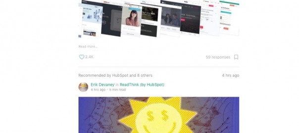
One of the most novel features of blogging platform Medium is how it recommends content based on social connections. Because Medium allows users to sign up with their Twitter, Facebook and Google+ accounts, it’s able to algorithmically push content that known friends and acquaintances have shared.

While Medium was one of the first to apply the “influencer marketing” model to content discovery, it won’t be the last. Case in point: Nuzzel is the upstart news reader that allows users to see the most commonly shared stories from their Facebook and Twitter feeds.

Getting personal
Thanks to a recent update, Whole Foods Market’s website is effectively a blog. One that’s packed with recipes, photos from social media followers, videos showcasing employees, tips on healthy living and much, much more. As you can see, it’s a visual bonanza.
Here’s what you can’t see though: Whole Foods is using behavioral cues and other data signals to serve up content that reflects visitors’ previous site activity. As a result, the biggest difference between old and new isn’t the freshened appearance. It’s that the grocer’s online presence is now individually relevant. Disclosure: Whole Foods Market is a OneSpot client and uses our personalization technology. Click here to learn more about it.

At a time when there’s no need for people to visit your blog’s home page, we encourage you to give them a reason to do just that. Instead of offering a feed of your most recently published content, experiment with the ideas above. By providing blog visitors with the proper motivation to click around, it’s likely you’ll see an increase in time on site and, perhaps more importantly, return visits.
Digital & Social Articles on Business 2 Community(57)
Report Post


