I’ve seen it time and time again: firms spend a lot of money to design and build a great website, and for a few months it looks fantastic. Then begins its gradual and inevitable decline. As the firm adds and updates copy and images, inconsistencies are introduced. The new photos look out of place — somehow different from the rest of the site. New offers replace the old, but they are a bit clumsy and no longer follow best practices. Sometimes, a firm adds new elements or colors that disrupt the harmony of the original design. A year later, the website is a shambles again. And nobody’s happy about it.
Like any property, your website requires ongoing maintenance. But once professional designers are out of the pictures, things can get messy. And that’s bad news for your brand.
Fortunately, there is a simple way to avoid these problems.
Introducing Website Design Guidelines
Website design guidelines (also known as website style guidelines) are a set of instructions, illustrated with examples that dictate every element of your website’s design. These guidelines ensure that any edits or changes made to your website will be consistent with your brand. Guidelines run the gamut from “just the basics” to highly technical and detailed. But if your documentation doesn’t go into a certain level of detail, it loses a lot of its value. For instance, it’s very useful to provide examples of buttons, what a form field looks like, which colors you can use, and how text should be formatted — from the style of bullets to the typefaces and sizes of headlines, subheads and body text.
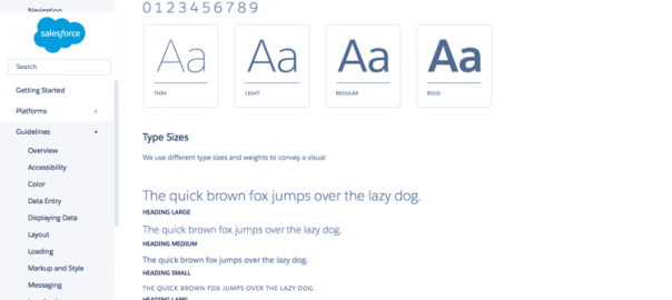
Let’s take a look at a real-world example. Here’s a page on typography from Salesforce’s design guidelines:

As you can see, the guidelines get pretty specific in terms of fonts, headings, line spacing and more.
Now, design guidelines can be a lot of work to produce. Are they worth the effort? I think so. In fact, I can think of at least three ways they can strengthen your website and, in turn, help your firm grow:
1. They Keep Your Brand Identity Consistent and Strong
Guidelines keep your brand identity — the visual part of your brand — from drifting over time. It’s easy to make small changes and not notice how they affect brand consistency. Guidelines can provide enough detail and boundaries to anchor it in place. If your brand begins to drift, it becomes harder to tell a coherent story about your firm. And people may have a tougher time distinguishing you from competitors (you know, those that don’t have any brand discipline).
If you are like many firms, your website can become the inspiration for other visual pieces in your brand. So if you want your brand identity to hold together, you need to keep your website design in check. In fact you can apply the same guidelines to all the other pieces you create, such as collateral, to maintain that consistency. Once set of documentation rules them all.
2. They Force You to Think Through Your Brand
Whenever I’m thinking through a process, trying to structure an argument or even write a blog post, I find that writing it down, even in outline form, helps me clarify and strengthen my points. In that same vein, developing guidelines — and putting them to paper (or pixels) — forces you understand and defend the design decisions you make. How do the colors, typefaces, images, and design elements you choose support your positioning? How do they differentiate you from competitors? When you work through these issues you walk away with a more distinctive, powerful brand.
3. They Make it Easier to Grow Your Site — And Your Firm
Having a set of guidelines at your fingertips means you, your designers and your writers don’t have to waste time figuring out how a new page of content should look or work. That means you can get new materials up faster — and your marketing will be more efficient. When you don’t have to spend time, money and mental energy on relatively mundane tasks you can put more resources toward the things that really matter. You can respond to changes in the marketplace more quickly.
If you have invested many thousands of dollars in a website redesign, it just makes sense to document your design procedures and assets. It may cost a bit more initially, but the benefits are real — and they can save time and money down the line, correcting any branding deviations before they do any damage. And if you haven’t yet begun your website redesign, you may want to consider developing these guidelines as you go along (see #2 above). It will help you put your design decisions in perspective and force you to evaluate and rationalize those decisions.
Website design guidelines will not only keep your website looking its best, they remove a point of friction as your firm tries to grow.
Digital & Social Articles on Business 2 Community
(57)
Report Post


