What is the overall goal of your web design strategy? It isn’t just to have a pretty site or to give a web designer a great addition to their portfolio. So what’s it all about then? Well it should be about more than just aesthetics. The main goal of your website should be to increase revenue through increasing conversions and often times this requires functionality over beauty. If you can combine both that’s even better.
Each aspect of your website design should have the underlying goal of converting your visitors into new leads that you can then nurture into new business. If you have an e-commerce component to your site it becomes even more simple, you want to increase your sales. So, how do you accomplish this? Here are 3 web design best practices that you should always keep in your marketing arsenal.
1. Be Clear.
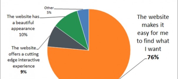
Our brain is designed to ask questions, to probe, and to find the answers. Shopping is the modern equivalent of being a hunter gatherer. So we want to find those answers quickly. Which explains the results to a HubSpot survey below: people need to find what they are interested in. It is the most important principle of web design.

Here’s a great example from payment provider, Square:
This is a great example of how effective a “less is more” approach is. With a very simple and flat design immediately you know what they are offering and there is a clear call to action so I can quickly proceed with getting started.
2. You Need Visual Appeal
The human brain comprehends images 50 times faster than words.
This means it takes only 50 milliseconds (0.5 seconds) for a snap judgment to be made on visuals alone as to whether a customer will stay or leave your website. You only have one very small chance to make a good first impression.
Make sure there is a visual component and that it tells the visitor exactly what you do or captivates their attention enough that they want to stay and learn more.
Important things to keep in mind when designing the visual layout of your website are:
- Color – this should remain consistent with your brand image.
- Font – this should be clear and legible throughout. If you are going to have a variation try and limit it to only two for headers and the body text.
- Consistency – from headers to images to button size, keep things on a level playing field throughout. Remember, your site should clearly establish and portray who you are as a brand throughout your design.
A great example of a visually appealing site that incorporates all of these visually appealing aspects is email service provider mailchimp.com.
3. Grab Attention in 5 Seconds or Less
Getting someone’s attention is easy. Keeping it is hard.
Providing your website has visual appeal, and a visual hierarchy that makes sense, then you need to ensure people stay on the website long enough to finish what you helped them start (make a purchasing decision).
How do you do this?
- Place the most important calls to action, pages, buttons above the fold (“the fold” gets lower as screen sizes decrease and resolutions increase)
- Use images of people. Especially smiling, laughing happy people, looking direct into the camera.
- Neuroscience tells us that larger than life images do a fantastic job of grabbing and keeping the attention of a web visitor.
- Compare and contrast. Our eyes are trained to notice when something is different; we keep looking till we have figured out what has changed.
- Surprise people. Either with images, or unexpected copy, as below, also works wonders.
When in doubt, assemble a small team to perform the 5 second test on your website’s homepage. There are also some free tools for this such as usabilityhub.com. If your testers do not have a clear idea of what your brand is all about and what action you want them to take in those 5 seconds, chances are your visitors will have no clue as well, and with ever shrinking attention spans they might not linger on your site long enough to figure it out.
These web design best practices are worth keeping in mind as you start to implement your web design strategy. Following these rules will surely help you meet your main objective to boost conversion rates and increase your sales.
Digital & Social Articles on Business 2 Community
(147)
Report Post


