One of the principal goals of inbound is to bring in leads organically and there is no better tool to achieve this than your website. The aspects of website design that you choose to employ have a direct impact on how visitors behave on your site and whether or not they convert. Though there are many ways to design a website with leads in mind, these four tactics are effective starting points for driving conversions on your site.
Homepage
Your homepage is the face of your business. It sees the most traffic on the site, so it should be visually appealing with images and clean, concise copy. Your visitors should be able to quickly understand your value proposition and find what they are looking for, whether it be a CTA right there on the homepage or navigation to another page on your site. Keep in mind also that visitors will be accessing your site from a range of devices and if your site isn’t responsive, or designed to display appropriately on all devices, it can easily turn potential leads away. And with about half of consumer traffic to leading websites coming from mobile devices, it’s obvious why a responsive site is crucial.

Example: slack.com
Slack’s homepage pulls no punches when it comes to defining and sharing their value proposition, to make “working lives simpler, more pleasant, and more productive.” The page is aesthetically pleasing and simple to navigate, featuring a call-to-action front and center, encouraging conversions. Slack’s homepage also offers social proof, featuring real organizations (Charity: Water in this case) who use their product and how it is helping them achieve their goals. Pretty impressive that the featured group on this page is using Slack to “change the world!”
Bonus: Check out this great infographic from HubSpot on the critical elements that every homepage should have.
Landing pages

There are several elements to a landing page that effectively converts visitors. Just like your homepage, it’s important to include a strong headline and a clear description of the benefit your visitors will get from your offer and what problem you will help them solve. Unlike your homepage, your landing pages should not contain menus or navigation. For lead generation purposes, you want your visitors’ attention focused strictly on a call to action or form. An appropriate form should capture the information you need without being too long or intrusive and thus turning your visitors away. It’s also best practice to include an image and immediate access to the content that you are offering.
Example: HubSpot
When discussing a great landing page, why not turn to the pros? On the page shown here, HubSpot clearly outlines the purpose of their offer, how it can be used to the downloader’s benefit, and a few of the key questions that readers can expect the report to answer. The page design is clean and simple, features an image, and incorporates a form that emphasizes immediate access to the report.
Calls-to-action
An intriguing call-to-action (CTA) can have a significant impact on your conversion rate. Best practices for CTA design include using colors and copy that are visually appealing and incorporating action-oriented words like “register now” or “learn more.” Your copy should be concise and direct, yet persuasive. Make it easy for your visitors to convert by including CTAs on multiple site pages as well as on your blog posts. CTAs are a design aspect that should be experimented with to see what your audience finds attractive. If your CTAs aren’t performing the way you would like them to , try changing copy, design, and placement on your site and tracking the results.


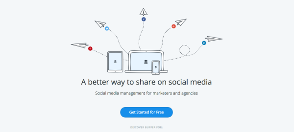
The buffer homepage employs simple CTAs that urge visitors to get started with their product immediately and at no cost. The minimalist design and color draws the eye right to the CTA buttons. buffer also wisely uses multiple CTAs at the end of their blog posts, one encouraging blog subscription and one to sign up for their product.
Blog
Although maybe not thought of as a conventional design tactic, incorporating a blog into your website is crucial to lead generation nonetheless. Your blog attracts visitors, improves SEO for your site, and helps to establish you as a subject matter expert, all helpiong to increasing conversions. According to Hubspot, 82% of marketers who blog daily acquired a customer using their blog, as did 57% of marketers who blog monthly. A blog is an instrumental tool in pushing visitors to your landing pages – remember those CTAs I mentioned earlier?

Example: Game Ready
To help grow their business, Medical Device manufacturer Game Ready implemented a keyword and blogging strategy that helped optimize their website, boosting their online presence and improving lead generation. Blogging regularly was a key factor in the 110% growth in organic leads they saw within the first year.
What web design tactics have you implemented to help drive leads?
Digital & Social Articles on Business 2 Community(45)
Report Post


