Video is a storytelling medium. Done right, it’s a powerful way to sell your brand in a concise and highly engaging manner.
But could you take it a step further? SnapApp’s interactive video Builder is a great way to drive even further engagement from your video content. In this week’s Product Feature highlight, we’ll show you some quick styling tips to preserve the charm and storytelling power of your video – while upping the engagement with interactive elements.
1. Use Pre-Video to Create a Super-Clickable Intro
The SnapApp Builder includes a pre-video section where you can place content pages you want to appear before your video plays. This is great for a title page with introductory info and a call to action encouraging interaction. We’ll show you how to style this title page to look like it’s part of the video.

First, you’ll want to add a background image for your content page. To make your intro tile feel like a part of the video, we’ve found it’s best to use the thumbnail image from your video provider, or a screenshot of the first frame of your video. Make this the background image of your title page.

The next step is to make this background image a strong foundation for your call to action. To do that, we like to add a darker overlay so the CTA pops. First, add a square to the page using the shapes tool and set it to the same height and width as your canvas. Layer it to the back, and set its opacity to 50%. You can make the square any color you want, just ensure it’s dark enough to contrast against your call to action. We’ll use black for this example.

Next, we’ll add introductory text welcoming our audience and letting them know they can interact with the video as it plays. We’ll style this text to match the colors used throughout the video. It can help to add a shape and drop shadow to this text to make it really stand out.

Lastly, our call to action button. To add an extra layer of polish, upload a custom button for the title page. If you’ve got some design savvy or have access to a designer, a neat styling trick is to remove the fill but keep the border for the main button image, then upload the same image with the fill intact for the button’s hover state.

2. Use Shapes and Shadows for In-Video Content
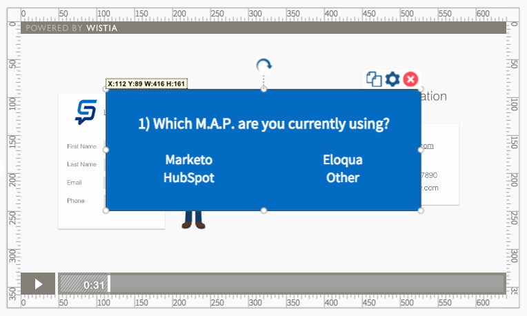
Now that we’ve got a great looking intro page, we’ll want to add some questions throughout our video to increase engagement and get to know our audience a little better. We’ll use shapes to provide a background for these questions and add shadow effects to give them some depth.
Add a shape to each page where questions appear, and layer them behind the questions. We’re going to pause the video for the user to answer our questions, so we’ve positioned our questions in the center of the app.

To create the illusion that the questions are actually superimposed over the video, add a border and shadow to the background shapes. We’ve used the shadow tool to position the shadow an equal distance from the bottom and right corners of the shape. Then, we used the opacity tool to make the shadow slightly transparent for a finishing touch.

3. Add Animations to Your Content
Finally, let’s use the animation tools to bring our video content to life. Animations are a great pairing with video because they simulate motion to the user, making your interactive content feel like part of the video. We’ve added the “Fade” animation to both our questions and shapes so our content smoothly fades into appearance when the video pauses.

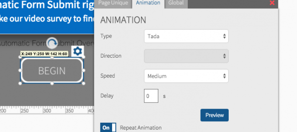
Let’s also add a repeating animation to the begin button on our title slide for a call to action effect. You can repeat animations by turning on the repeat tool in the animations config menu.

4. Don’t Forget Post-Video!
Post-video pages appear after your video finishes playing. This is a great space for summary content and a lead form. We’ve placed a lead form at the end of our video, and styled it using the background image, shapes, shadow, and animation effects used above.
Digital & Social Articles on Business 2 Community(37)
Report Post


