— November 22, 2017
With billions of shares passing through the social platforms each day, it is getting harder to stand out on social media. Back in the day when Facebook, Twitter and LinkedIn were just getting started you could succeed by just publishing great content.
Now there is so much noise that you have to have something extra just to get someone’s attention.
It’s exhausting.
That’s why I think it’s so important that creators focus on making their social media visuals world class. It’s that extra little thing that can make your share stand out like a beacon.
You’ve already created amazing content, don’t let it go to waste because you picked a poor visual. That may sound a little scary to some but there are tons of tools out there that make the design process simple.
Combine that with each of the tips below, and you can create amazing social media visuals in no time.
So let’s get started!
1. Keep It Consistent
Consistency is key when it comes to producing visuals for your brand. Whether it is an infographic, a poster or an invitation, they all should be similar in design.
And this doesn’t mean that you should just use your brand colors across a bunch of different designs. Instead, the visuals should a feel the same, and like they came from one single designer. Even if you have a team of designers working for your company.
One of the best examples of consistent branding comes from Spotify:
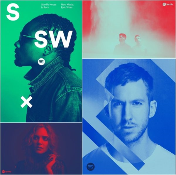
They have basically claimed the duotone as their own branding, to great success. I know I am seeing something from Spotify as soon as I see those two colors masterfully blending together.
Not everyone can take risks like Spotify, but I know they can follow Quuu’s lead:

Each one of their blog posts use a similar design to create a cohesive brand. This is so simple that you can create it in a few minutes. Now they all might not look exactly the same but they all feel the same. And they will definitely stand out on social media.
At Venngage, we also try to keep all of our blog headers extremely consistent. Just take a look at the examples below :

This makes it easy for readers to identify our posts out on social media or on other sites. And that is very important when you are fighting a thousand other posts for their attention.
Again, they may not look exactly the same but it feels like one designer created all of them. When in fact, those examples were created by completely different people.
The visuals that Moz creates for their social media post is another good example of using consistent design correctly. Almost every visual that they share follows a similar formula. It is almost like they use a template for each of their visuals :
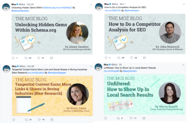
Their shares can be spotted from a mile away because they use that template consistently.
I would recommend creating a templates like this for your each of your main social accounts. It makes it very easy to be consistent, without having to reinvent the wheel each time.
This will save you a ton of time in the long run and help your brand in the process.
2. Use A Compelling Color Scheme
To create an effective social media visual I would recommend making it very eye catching.
You are not the only one trying to get the attention of a reader or user. There are millions of other brands pumping content into the social media platforms.
This means that for yours to stand out it needs to have a very unique or compelling visual. You can easily upgrade any visual or design by using a bold or loud color scheme.
It is one of the bigger trends in design in 2017 and beyond, so be sure to get ahead of your competitors. And it is a swing in the other direction from minimalist design that has dominated the past few years.
You may be asking what are bold or loud colors?
They are colors that jump off the social media feed and punch you in the face. Like this example of a Facebook ad that Venngage used recently. We actually found that this color scheme was very successful in a Facebook ad study we did earlier in the year :

This extremely radiant yellow definitely jumps off the page and grabs your attention. This especially true on social media as well, because of the white backgrounds and neutral colors.
I mean Facebook, Twitter, Instagram and LinkedIn are mainly a white space with a few accent colors. bYou need to create visuals that don’t sink into that background, but stick out like a sore thumb.
That’s why I would never recommend using light or neutral colors for any of your social media visuals. It’s just a recipe for disaster, trust me.
Additionally, below is an example of a bold color scheme that we used to get over 12k shares:

This was the most successful articles I have shared over the past year and I’m confident that this visual helped. Honestly, it is pretty hard to keep scrolling when you see something like that in your feed.
Not only is the background color very bold, but the three other colors add to the uniqueness of the visual. And this is what you should strive to do with each of your social media visuals.
Gimlet Media, my favorite podcast network, is a perfect example of using bold colors in their shares too. Just take a look at the visuals below and you will see:
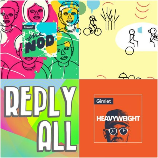
They are able to use a mix of a bunch of colors to really stand out on social media. And all of those would make me stop and read that Tweet.
3. Include Icons, Illustrations & Graphics
As you saw in some of the examples below, we really like to use icons.
They add so much to a visual that the written word cannot. Plus they are built for giving context quickly, which is essential on social media.
You want people to be able to know what your share or article is about as fast as they can. And with a well designed icon or illustration that can be done. That is why so many companies are using illustrations and icons in their social media visuals.
Like MailChimp, with this holiday themed image:

Google Analytics:

Hubspot:

Wired:

And many more because it’s so effective.
It also makes your company or shares feel a lot more real. Instead of using a one-size-fits-all image or stock photo, you can take the time to create something that no one else will have.
When consumers are constantly looking for genuine experiences, that is huge. Now if you do not want to use only icons for your social media visuals, you can pair them with text or titles.
As you can see below, Constant Contact uses this tactic very effectively:

The icon is used to draw the eye and give a little bit of context about the posts or share. Then the title shows the reader exactly what it is going to be about.
Then the reader can decide if they want to learn more about it before they even real the Tweet or share.
It is a great combo, that almost anyone can create in a few minutes.
4. Stop using irrelevant Stock Photos
One of the quickest ways to upgrade your social media shares is to stop using random stock photos.
I think that some of the stock photos from Pexels and Unsplash are great to use, just take the time to find the right one.
If you are wanting your shares to stand out from the noise then using the first stock photo you find is the wrong way to do that.
Not only are they super vague, like the one below :

They also are already being used by every other person or brand on social media.
Like this one, which I actually used for a few projects before:

So instead of standing above the noise with a great visual, you become part of the noise.
That image could be used by literally anyone on the internet as their featured image or social media visual. And that is the point of stock photos, to appeal to the biggest cross section of users. But with that they sacrifice the uniqueness that your visuals really need to succeed online.
This one is a lot better, in my opinion, if you were sharing something about tech :

It’s brand new and hasn’t been used to death by the other tech writers yet either.
But you do not have to replace a bad stock photo with a good one, you can always create a unique visual.
For example, which visual would you more likely click on, this stock image :
Or this custom image from GrowMap:
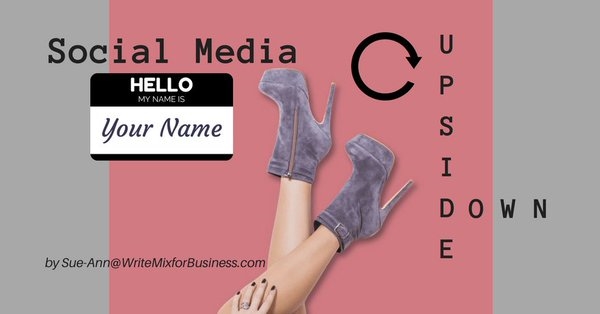
You’re more likely to click the one from GrowMap, because it looks like they took more than one second to decide on their social media visual.
I think that a lot of people spend a lot of time crafting the perfect share or tweet and then forget that they need a unique visual. But now with so many shares and content out there, I really think the image is more important than the text.
Be sure to take a little time to create something that you are proud of and stop using random stock photos.
After you’ve created social media visuals that represent your brand, the next step is for you to effectively promote them on social media. Tools like Viraltag let you put your social media marketing needs on autopilot, saving you time and increasing traffic.
So here’s a quick recap of everything I’ve gone through in this article –
- Make sure the images you create are consistent and in line with your branding
- Use a compelling and eye-catching color scheme with bold and vibrant colors
- Icons, illustrations, and graphics give an added boost to your image, as they describe the context quickly
- Use relevant stock images, or create your own graphics to personalize them
Hope these tips help you create visuals you are proud of! Let me know what you guys think in the comments below.
Digital & Social Articles on Business 2 Community
(24)
Report Post


