404 pages can be the worst.
They are a kick to the shin for users who are actually managing to be somewhat productive, for the most part.
We say “can be” and “for the most part” because sometimes, brands that serve those errors turn those volatile moments into successful visits, or even delightful whimsy.
The sites that support user tasks or create branding moments understand one thing:
Little moments, when engineered properly, matter.
You should always try to avoid 404 errors. But the fact is, even other sites linking to you badly creates unwanted 404 errors.
So once you’ve cleaned up in-house, it’s time to think about fixing that error page for all the other things you cannot control.
It helps to start with the basics.
What is the 404 page?
The 404 page is what users see when trying to access a URL that does not exist on your server.
Why is it a 404, exactly?
The 404 is just the most popular of a group of bad requests – think of it as the Adam Levine of the bad requests.
You almost never hear the names of all the other guys, but there’s the 401 (you’re not authorized to view a page), 405 (the method’s not allowed), and lest we forget, the 417 (expectation failed).
Suffice to say, it’s the most recognized name in a family filled with names you don’t want to hear. So maybe it’s more Tony Soprano than Adam. (Sorry, Adam!)
What does Google say about 404 pages?

Here it is, in verbatim:
“If you have access to your server, we recommend that you create a custom 404 page. A good custom 404 page will help people find the information they’re looking for, as well as providing other helpful content and encouraging them to explore your site further.”
What that means, in non-Google-speak, is …
- Be helpful
- Keep the users navigating when they hit 404s
- If we see them use the back button, you can kiss your rankings good bye
Got it?
What do Google’s 404 pages actually look like?

Ugh.
Not cool, Google. Not cool.
So what should my 404 page actually look like?
Your site can look like it’s been shot by a bullet and it just … died, and it will still work, or it can be matter-of-factly and still not be successful.
It doesn’t matter what your 404 page looks like.
It only matters what your 404 pages do.
Okay, what should my 404 page do?
Now we’re getting somewhere.
Your 404 page only has enough goodwill for two things:
- Remind a user why a brand works (get brand equity)
- Help the user find what it is he or she is actually looking for (reduce exit rates)
You can’t explain why the error occurred. You can’t talk about why your site is great in an “about us” way. You can be self-aware that the 404 page is annoying, or you can lead down the most common paths taken by your users.
Are there any examples of sites doing the branding thing well?
Blizzard and Urban Outfitter nail the “talk in the language of your customer” bit. They know the 404 can be annoying, but they create a “moment” to share with you.
Here’s what Blizzard does when it sees a funky URL:

And here’s how Urban Outfitter handles errors:

Both are well designed from a branding standpoint, reminding you why you love them in the first place, and showing you that they remain “in character” even when the site has a few setbacks.
Generally, though, this tactic works for better known brands with more equity to pull from.
For all the other sites out there, you need to reduce the exit rate from the 404 pages.
Are there examples of sites reducing exit rates?
For 404 pages to have low exit rates, the user tasks need to be visible, front and center. Zappos and Hotels.com show different ways you can do this, and the Zappos example actually gets to play with a little whimsy in the process.
Here’s what Zappos shows when you hit a snag:

Here’s what Hotels.com shows in case there’s a hiccup:
Whether you have a list of core tasks, a search bar, or both is up to you. The important thing is to start with the most common user tasks for the site, and then give them prominent real estate on the 404 error page.
Help Your Ecommerce Visitors Recover With 404 Page Design
Keep customers on your site even when they encounter the dreaded 404 error. Get tips HERE
Are there any sites that manage to balance branding and user tasks?
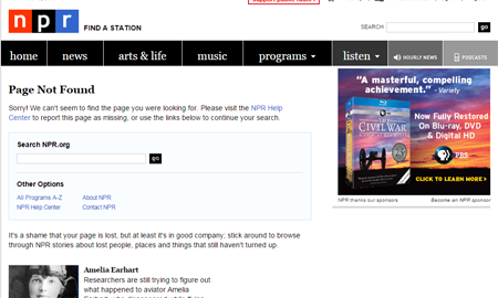
NPR’s error page does really well when you … (okay, we’re out of ways to say the URL cannot be found, so we’re just going to say NPR can’t find it, okay?)
Here’s what NPR shows when it sees a URL that it cannot find:

A search bar, a set of things to do, AND a list of other people and places that haven’t turned up. What’s not to like? They get the brand right, and they still manage to be helpful.
So what do I need to do to improve MY 404 page?
The first thing you need to do is look at your current exit rate for the 404 page. That should be available on Site Catalyst, WebTrends, Google Analytics, or any other clickstream tool you use.
Then, you can get to work. Provide the tasks your users commonly take on the 404 page. If you have the ability to add a search bar, you can test throwing one in there – it should help.
Finally, make sure you’re talking in a way that your users can relate to, rather than in codes, (404, 417) or in happy talk or corporate speak.
From there, you can measure your exit rates, and look for drops, and then test until the page is tuned.
Digital & Social Articles on Business 2 Community(101)
Report Post


