— June 21, 2018

bottlein / Pixabay
A solid landing page is one of the most effective ways for a company to maximize its online presence. In fact, data shows that when executed the right way, landing pages can increase conversions by as much as 100%.
So how does that work?
Designed with one key objective in mind, landing pages use persuasive copy and compelling imagery to convert visitors into leads, where they’re then sent to the next stage of the buyer’s journey.
An amazing landing page is more than just a sales pitch – it’s a way to connect with your audience by expressing your solution to the unique problems your visitors may face.
Let’s look at how you can build the perfect landing page and some examples from companies who are doing things right.
Building the Perfect Landing Page
First things first: It’s important to understand that each case is unique when it comes to developing a high-functioning landing page. While some landing pages might call for long-form, others might need to be minimalistic and to-the-point.
So while there may not be a one-size-fits-all approach you can use, there are a few essential elements that should be included in your landing page.
These elements include:
- A persuasive call-to-action (CTA) located in a position that captures the reader’s attention.
- A headline that clearly states what you’re offering.
- A visual component relevant to your product or service, like a video or picture of the product being used.
- Copy that’s scannable and easy to understand.
More often than not, simplicity is the best approach to creating a conversion-driving landing page. The reason: According to a study conducted by the Nielsen Norman Group, the average person reads anywhere between 20% to 28% of the written content on a webpage.
Adding unnecessary information in your landing page could distract or confuse your visitors, so keep your message short and direct. Save the more technical information for your blog content or downloadable resources.
Sometimes contextual examples are more helpful than generalized tips, so let’s jump now to five different examples of landing pages that were able to generate more leads and break down what works well about their approaches.
1. SproutSocial
With the help of attention-grabbing imagery, social media management company SproutSocial successfully created a landing page that readers can skim over and still learn about the services the platform offers.
Using only a few short sentences, Sprout’s landing page tells visitors how their management platform can be used to enhance social media marketing campaigns.
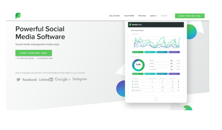
Moreover, the placement of their bright green CTA button under the headline attracts the reader’s attention, encouraging them to register for a free trial and see firsthand how they improve social media marketing. When scrolling down, visitors are met with screenshots of the platform alongside headlines describing some of the services SproutSocial provides.
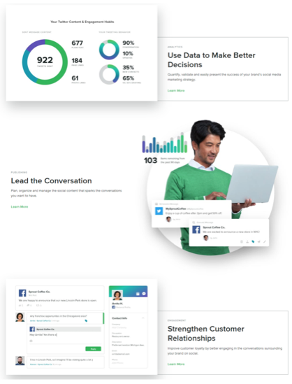
What makes this landing page especially great is its word choice. Instead of simply highlighting their services, Sprout uses each headline to demonstrate how the visitor will achieve better results with the help of their social media solutions.
2. Blackbaud
Blackbaud’s landing page for Target Analytics does an excellent job summarizing the services provided without cluttering the landing page with irrelevant information.
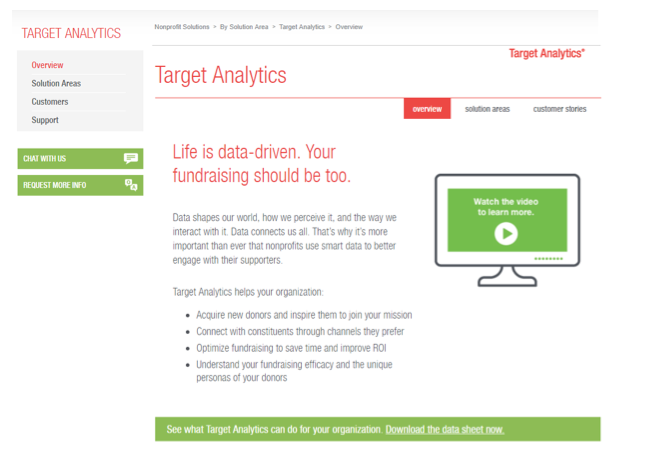
The first thing visitors notice when reading the landing page is Blackbaud’s commitment to enhancing fundraising campaigns using a data-driven approach. The bright red headline immediately attracts the reader’s attention, highlighting the important role data plays in organizing fundraising events. By using bullet points to list the key benefits of smart data, Blackbaud effectively summarizes the advantages their platform has to offer in a way that’s quick and easy to read.
Another great feature of this landing page is the video clip located just to the right of the Target Analytics description. More than just an explanation of how Target Analytics works, the video is a testimonial from a Smithsonian Institute director, who explains in detail how Target Analytics helped their programs grow over the past two decades.
Finally, there’s the CTA, which is conveniently located just under the product description. The bright color and strategic location of the CTA causes it to jump out to the reader, encouraging them to download Blackbaud’s data sheet to learn more about their services.
3. Paycor
Paycor is a resource-management company that specializes in recruiting, human resources, and payroll solutions for small and medium-sized businesses.
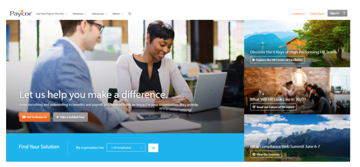
The well-placed headline in the center of the photo does a great job summarizing the services Paycor offers, while its orange button grabs the reader’s attention and invites them to watch a short video about Paycor’s business solutions.
But what really makes this landing page special is the qualifying assessment located under the main picture. Standing out from the rest of the web content, this bright blue bar is impossible for the reader to overlook and offers something your everyday CTA does not – a tailored management solution.
After entering a few basic details about their organization, visitors are given a list of management options that best suit their company’s needs. Along with letting prospective clients come up with a service plan made especially for them, this assessment lets Paycor capture leads by collecting the form data of the participants.
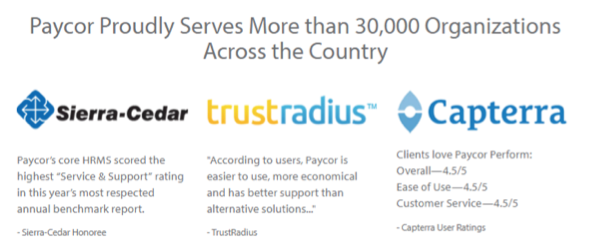
Using social proof, Paycor is able to tell bottom-of-the-funnel leads just how effective their business solutions are. Not only does the visitor see high-quality testimonials from three leading tech companies, they also learn that Paycor’s services are trusted and used by more than 30,000 satisfied customers nationwide. Not bad.
4. CA Technologies
Software development company CA Technologies specializes in helping businesses develop secure and stable applications to enhance their day-to-day operations.
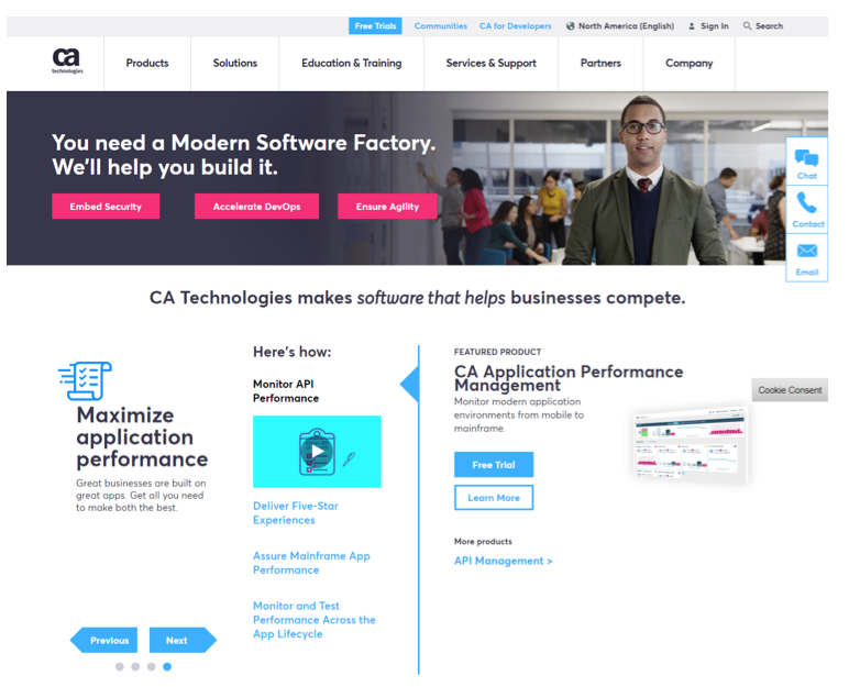
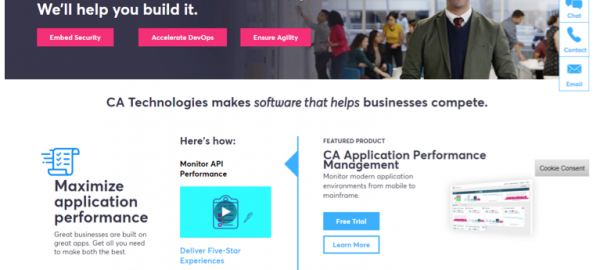
When loading CA Technologies’ landing page, the visitor immediately learns of the company’s main objective, which is to help businesses build better apps. We see this not only in the banner at the top of the page, but also in the headline directly below it.
Within the banner are three call-to-action buttons which promise prospective customers three important things: security, quick development, and agile solutions. And by clicking on the buttons, the reader can learn more about each service offered and how it benefits them.
The interactive menu in the center of the page further highlights the advantages of working with CA Technologies. There, visitors can click on links to learn more about the company’s services, as well as register for a free trial.
5. Bottomline Technologies
When it comes to optimizing your landing page, placement is everything. Visitors should have an idea of how your services can help them within the first few seconds of scanning your landing page. And in order for them do to that, your core message needs to be the first thing that sticks out.

In a few short sentences, Bottomline Technology’s landing page successfully does this by illustrating their services in a few short words. The four buttons inside the picture tell the visitor who Bottomline is and how they can help prospective clients, while the banner under the featured image tells the reader how many businesses have benefited from Bottomline’s services.
Then there’s the CTA, which uses bright, contrasting colors to attract the visitor’s attention and persuade them to become the next business to make the switch to Bottomline’s streamlined payment solution.
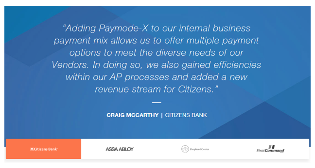
Finally, there’s the social proof located near the bottom of the page. Each testimonial perfectly illustrates how a particular client overcame an obstacle thanks to Bottomline’s services. Not only do these testimonials help prospective customers get a better understanding of how Bottomline’s solutions can help their business, they also give the company a credibility boost.
Building the Perfect Landing Page
Let’s recap.
First of all: There’s no hidden secret to developing the perfect landing page. As you can see from the examples above, amazing landing pages don’t stick to one single format. There are many different ways to build a great landing page, but there’s one key ingredient included with every optimized landing page – value.
Above everything else, your landing page should offer a solution to a problem commonly experienced by your visitors. It needs to acknowledge the problems your readers face, then offer an innovative solution that helps them overcome those problems.
For this reason, it’s important to think about the needs and expectations of your target market as you develop your landing page. By doing so, you can successfully bring value to your landing page and make it stand out from the competition.
Digital & Social Articles on Business 2 Community
(140)
Report Post