![]() by Pratik Dholakiya December 1st, 2014
by Pratik Dholakiya December 1st, 2014
I’m a huge online shopper. Hell, I’m a shopaholic in general, period.
But there’s something about online shopping that makes it extra special to me. Online shopping is a little like Christmas. Placing an order and waiting with bated breath for your goodies to show up at your doorstep what’s not to like about it?
Since I have honed my online shopping skills into a fine art form, I consider myself a bit of an authority on what works for me as a shopper and what does not. (The fact that I’ve been helping e-commerce stores do just this for a while now is an added bonus.)
So here’s my list of checkout must-haves for any e-commerce store.
Keep checkout short
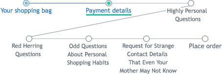
This is not just my opinion. Research by the Baymard Institute shows that the average checkout process is 5 steps long. Baymard’s research also tells us that average shopping cart abandonment rates hover at 68%. Online shopping experience and usability tests tell us that one of the key reasons users drop off from a shopping process is the excruciatingly long checkout processes.
Put these three pieces of information together and what do you get? Yes, keep your checkout process short if you don’t want to bore your users to death and make them dump you in a blink. This has been repeated over and over again, but you’d be amazed at the sheer number of e-commerce sites still making the same mistake. Don’t do this:
Take inspiration from this excellent piece on creating great landing pages your checkout process is the equivalent of a landing page for a non-e-commerce brand and the basic conversion principles remain the same.
And self-contained
Once a user has selected a product, added it to their cart and started the process of checking out; you don’t want any potential distractions to lead them away from completing the transaction. This obviously means no pop-ups or banners or cross-sells during the checkout process, but it also means that don’t offer the user the temptation of the navigation bar with other product categories or header banners with some other enticing offer that might cause them to move out of the checkout process.
A self-contained checkout process ensures that the checkout module is completely separate from the rest of the site. As mentioned earlier, it will have no distractions like the navigation bar or product categories, what it will have instead is a progress indicator that informs the user about how many more steps are left to complete the transaction. It will also have detailed information about the selected product exact product name, product image, total price with all applicable taxes included, shipping costs and times and return policy. It’s also a good idea to include contact information within the checkout process so that users can call / email / chat with a company representative for queries regarding a transaction.
Offer real-time product availability updates
How many times have you hunted down that perfect leather jacket the right color, the right size only to have it go out of stock after you pay for it? A product that goes out of stock once it’s paid for amounts to a terrible user experience and must be avoided at all costs.
A good way to avoid this and to encourage immediate purchase is to show updates like ‘Only 3 items left’ or ‘Last 3 items’ for products that are running low on stock. This prepares a user for a stock-out; if it were to happen. It’s also a good idea to automatically update the inventory information of a product that has been added to a cart if the stock runs dangerously low. An alternate product suggestion in case of a stock out, during the checkout process no only avoids users being frustrated, it also shows that you are a proactive brand that really cares.
Auto-fill wherever possible
One of the worst things about online shopping is the endless forms that one has to fill out to complete a purchase. Keeping the forms short is one way of tackling user boredom and drop-offs. The other way is to be proactive about filling in data that is easily available to you without asking the user for it explicitly.
Instead of asking users for their ‘City, State, Country and Zip Code’ in that order; try modifying it to ‘Zip Code, City, State and Country’. In most cases, once you have the right zip code, you can pull the city, state and country from online databases.
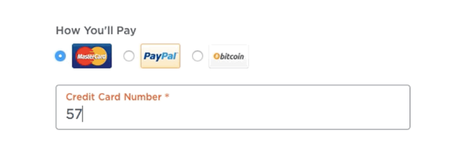
Another field that has great auto-fill potential is the credit card type. All credit cards have a standard combination of numbers in the beginning of a card number that can be used to identify the type of card it is. Instead of asking the user to pick the type of card during the payment process, auto-identify the card type using the initial digits of the card number and let them continue with the payment without unnecessary fields to be filled.
Sync your offline and online checkouts
Run an online store and an offline one as well? Most brick and click retailers have inventory, checkout processes and payment information for both platforms completely independent of each other. This scenario is the perfect recipe for a financial mess when it’s time to reconcile the books for both the online and offline businesses at the end of the financial year.
Avoid digging a hole for yourself by using a POS system like Shopify’s that manages transactions for both your online and offline stores simultaneously. With a POS system that is brick and click, you get to see inventory levels at the store level and in the warehouse at a glance, customer details are captured and stored centrally in one database and payments are processed in the same manner using the same software, making your online and offline stores two halves of one whole.
Conclusion
Your checkout process is the home stretch for converting a visitor on your site. Whether you pick your best runner in the final stretch or go with just about anyone makes all the difference between a site that converts consistently and one that depends on good old luck to see itself through.
Post from: Search Engine People SEO Blog
5 Checkout Mantras to Revitalize Your Retail Business
—
Written by Pratik Dholakiya, E2M Solutions Blog
The post 5 Checkout Mantras to Revitalize Your Retail Business appeared first on Search Engine People Blog.
(425)
Report Post


