Let’s admit.
You want it badly, don’t you?
All the blog posts you publish, valuable freebies you give away, free trials of your products, and everything else are used to collect leads and turn them into paying customers.
And your sales page is the gateway. That’s where the real magic happens.
All the time, money, and energy you spent on developing your sales page are because you believed that the more compelling your sales copy is, the more customers it’ll generate.
But the sad part is:
You don’t see that magical conversion in yours.
Yes, your website’s traffic may be growing, and people like your content and even sign up for your lead magnets. But as you push your leads to your sales page… the ball drops, and you wonder:
Why doesn’t your audience click that buy button?
Why is your sales page’s conversion low?
Don’t your readers trust you?
Or you might be missing something important.
Well, maybe.
Maybe something is missing. Something that others have, who smoothly down their prospects into their sales funnel and turn them into customers like a piece of cake, but you don’t.
In this post, I’ll talk about some elements, which are extremely crucial in the success of sales pages and can make your copy more seductive, persuasive, and highly convertible.
So, ready?
Let’s start.
#1. Keep It Minimal
You may have heard, “Less is more.” Sometimes it’s true. Especially in the case of the sales page’s design and its elements.
Imagine you land on a sales page that has a trendy look, beautiful images, and links to a whole lot of useful resources.
You may think, your potential buyers will like it. However, the study says a different story.
Sales pages (or landing pages) with a simple, minimal design have higher conversion rates as compared to more modern looking sales pages.
And the reason is the lack of focus.
A human’s attention span has been reduced dramatically in the last few years. Holding your reader’s attention has become more challenging as it has never been before. That’s the reason you see most professional businesses using a minimal design for their sales pages.
Unbounce, for instance, uses a simple, minimalist design for its lead generation landing page course.
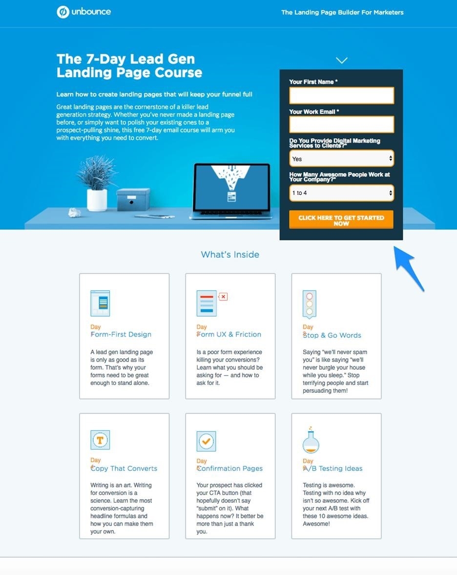
As you can notice in the screenshot above, there is no irrelevant content on the page. The headline is clear, and all the elements have plenty of space in-between to breathe. All the content on the page pitches just one idea to its audience. Nothing to distract.
Takeaway: Keep your sales pages as focused and as simple as possible. And remove all the irrelevant elements that may distract the user.
#2. Tell Success Stories
Would you buy a product that sounds amazingly great, but has no happy customers?
Probably not, because trust is a huge factor in buying decisions.
To show off your product’s functionality and benefits is one thing, but to show off the faces of real people who used your product and are happy with the outcome is a completely different story.
Tell success stories of your existing clients. How has your product enhanced their business or life? It builds trust, and your potential buyers can see real examples of your product’s benefits.
If you don’t have any significant success stories as of now, try testimonials. They are short and easy to add. They also show a glimpse of how people are happy using your product.
Copyblogger, for instance, shares their students’ experiences on its Authority Program sales page.
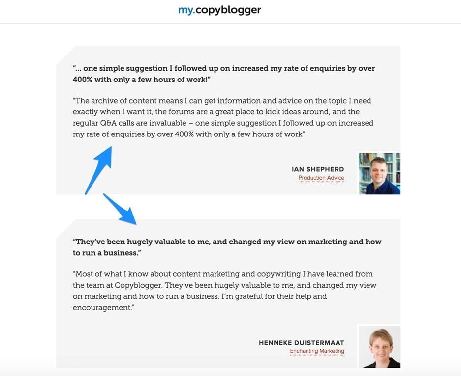
As you can see in the screenshot above, Copyblogger’s students share their results, how their businesses and lives changed, and their overall experience they got after this course.
These real life stories and experiences are important in building trust. Your prospect can see how others are getting benefits using your product or services. It is the proof that it works.
Takeaway: Show your real life clients and their stories on how they used your product and got positive results.
#3. Show Off Your USP
For those who don’t know the meaning of USP, here’s a simple definition:
“A unique selling proposition (USP, also seen as a unique selling point) is a factor that differentiates a product from its competitors, such as the lowest cost, the highest quality or the first-ever product of its kind.”
The actual point is:
You’re not alone in the market. You’ve got competitors, selling a similar product, and they’re also giving their best.
So why should anyone buy your product? What is special about your product or service that no one else in the market can provide?
Is it some extra functionality, excellent support, or the best price in the market?
You need to find the answer and brag about the same to your prospects.
No, you don’t need a big, super magical USP. It could be small, but it needs to be useful and valuable to your customers.
Take a look at an example:
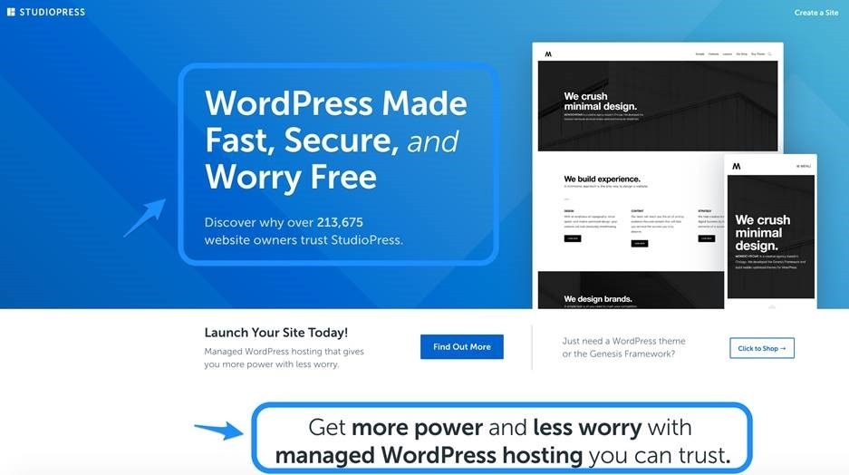
While there are many web hosting companies around, StudioPress is specifically focused on WordPress hosting. In their WordPress hosting package, you get awesome responsive designs, rock solid security, award-winning performance, advanced SEO, hassle free setup and more.
Takeaway: Find your USP and speak it loudly. Your prospects will notice and consider what they will lose if they don’t buy from you.
#4. Include A FAQ Section
What happens right after you think about buying a product and before you click that buy button?
You ask questions, right?
You clear your doubts. You don’t like it when some hidden terms and conditions pop up after you make the purchase.
Similarly, as you finish explaining your product, its features and benefits, and raise an interest to buy, some small but important questions will come up your prospect’s mind.
It could be about payment methods, refund policies, support, updates, or anything important related to your product and its work.
Though these questions may sound small or obvious to you, they’re critical for buyers and play a crucial role in the buying decisions.
The point is:
You need to answer some common questions that may come up and stop your potential buyers from buying. Clarify every little detail because you don’t want your buyers to feel cheated, return, and give you negative reviews.
Here’s an example:
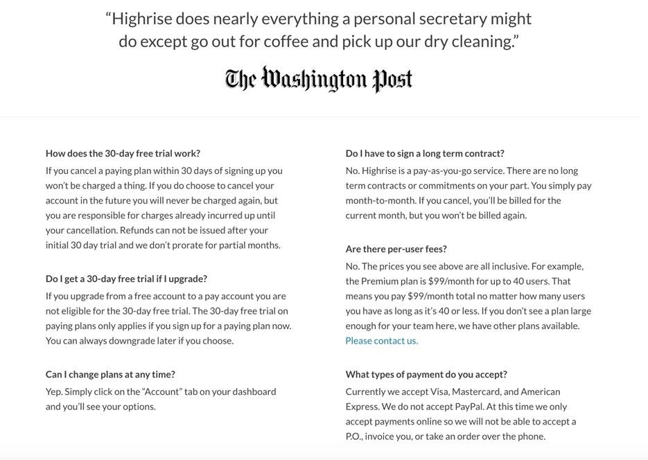
Along with explaining everything about the product’s pricing and features, Highrisehq also has a FAQ section answering questions about the purchase, making the picture clearer, and bringing down all the barriers that may stop the readers from purchasing.
Takeaway: Include a FAQ section where you answer some common questions and help your readers make a more sensible decision.
#5. Give Freebies Or Discount (Time Sensitive)
We, humans, are lazy, and most of us are procrastinators. We often like to postpone our decisions. And we postpone our decision until we can no longer wait or we get a sudden urge to make the decision right then.
Tell me if this happens to you?
You see a product, and you like it. You want to buy it, but for some reason (or no reason) you want more time. You decide to return to this page some other time.
And often, that time doesn’t come.
The same thing happens to many of your potential clients. They are interested, but they postpone clicking that buy button.
For such cases, you need to go one step further. You need to offer something irresistible and time-sensitive. It could be a special discount or an extra value free of cost.
Digital Marketer, for instance, offers a free certificate for their base program for a limited time period, which is worth $500.
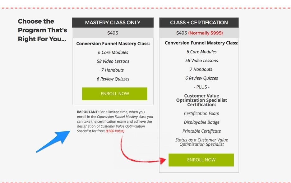
This offer will bring out their audience from their lazy, comfort zone and buyers have to think because these offers are limited and they will get more value for less (or same) amount.
Takeaway: Include time-sensitive freebies or discounts to create urgency. Buyers will realize if they don’t click that buy button right now, they’ll miss these extra perks.
Embrace The Power Of Your Sales Page
Have you ever gone to a sales page and felt so persuaded and connected?
The idea and content combined beautifully and came out so profoundly that you visualize the whole picture clearly, got excited, and confirmed you’ll get your results.
That’s how your sales pages should be.
In the world where a whole lot of other brands proposing similar offers, some uniqueness and credibility from you must be visible to your audience.
So start reconstructing your copy and draw more audience to it.
Embrace the power of your sales page.
You can do it.
The post 5 Crucial Elements Of Seductive Sales Copy appeared first on Search Engine People Blog.
(53)
Report Post


