Most businesses have more than one type of audience or buyer persona. In fact, you’re probably targeting at least two or three different niches at any given time.
LinkedIn has proven itself as an effective tool for reaching out to leads and speaking to your target audience. But you’re not alone if you’ve ever felt like you’re generalizing your messaging too much, or like your content strategy is all over the place trying to be diverse.
To solve that problem, we recommend turning to LinkedIn Showcase Pages to help you give the right attention to the right personas.
What Are LinkedIn Showcase Pages?
These are pages that you can create in addition to your LinkedIn Company Page that can speak directly to whatever audience you dedicate it to.
You can create a community within your follower base around content on specific topics. Showcase Pages give you an opportunity to create valuable, relevant, and extremely niche content for different target audiences.
Not every buyer persona is looking for the same thing or has the same pain points. By crafting content tailored specifically to them and providing them with their own watering hole, you’ll be able to engage them on a totally different level.
It’s like if someone made a media room filled with all of your favorite books, movies, music, or games and furnished it exactly to your liking so you can spend time in it whenever you wanted.
Bliss.
How to Create a Showcase Page on LinkedIn
It’s actually a terribly easy process. We broke it down into five simple steps:
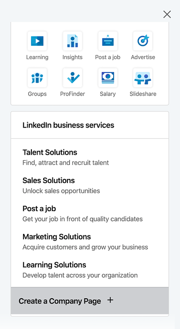
1. Click the Work Icon.
You’ll find it in your navigation toolbar on the far right corner.

This will open a drop down menu of options. Scroll to the bottom and select “Create a Company Page.”
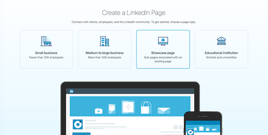
2. Select a Page Type.
Click the Showcase Page option.
3. Enter the Necessary Information.
Enter as much detail as possible under “Page identity,” including some “Profile details” if you have any. Make sure that you fill out any fields that have an asterisk (*) next to it.
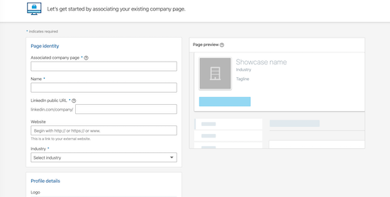
You’ll see the “Page preview” update in real time, giving you an idea of how your Showcase Page will appear on your Company Page.
4. Verify Your Authority.
This box verifies that you have the right to create the page on behalf of your company and agree to LinkedIn’s terms. You can’t move on without clicking it.

5. Create the Page.
Once you select the “Create page” button, you’re done! Easy peasy, right?
You can provide more context and information to add value once you’ve built the page following these steps.
LinkedIn Showcase Page Best Practices
Just like any other LinkedIn or website page, you’ll want to make sure that you’re capitalizing on the opportunities that Showcase Pages provide.
Here are just a few tips you can try to make the most of your new page:
Build Your Page Out Fully.
Even though you only have a few, specific information fields are required through the process of making your page. It’s far more to your benefit to flesh out the details as much as possible.
Title
This is where you want to be really unique. Each Showcase title has to be original because LinkedIn doesn’t allow duplicates. Kind of like a user name, once it’s taken, it’s off the market.
Being original will also attract more followers, kind of like a subreddit.
You have a 100 character limit, so be as concise as possible.
Description
Provide an overview of what the page is about while still engaging your target audience. Make it enticing!
Website URL
This is a great opportunity to direct some traffic to your company website. If the Showcase Page is about a specific service or product, consider linking back to a relevant landing page on your site.
Logo
Branding is still as important as ever on these pages, so don’t skip this element. Logo sizes are 100×60 pixels, while square logos are 50×60 pixels.
Hero Image
Hero images on Showcase Pages are larger than those on Company and Profile pages, so be sure to take advantage of the extra space. Images should be at least 974×330 pixels in size.
Take Advantage of the Page Limit.
LinkedIn allows you to host up to 10 Showcase Pages at a time. That’s 10 different personas you can target.
On average, most businesses have less than that count, so you should be able to create a dedicated page for each audience.
Just make sure that you’re prioritizing which ones are going to be the most valuable to your business.
Don’t Forget About SEO.
Showcase Pages are actually SEO friendly, so you won’t want to ignore your best practices here. These pages will definitely be indexed by search engines, like Google and Bing.
The better optimized your pages are, the higher the chance that your target audiences will find them by organic means.
Create Quality Content.
Now that you have these designated spaces for specific topics, it’s time to tackle developing unique content strategies for each of them.
Do your research on what your ideal personas are interested in and how they prefer to consume their content. Is it through articles? Video? Podcasts?
Don’t be afraid to be diverse in what you post as updates either. Leveraging different forms of content can help keep your followers engaged.
The Best LinkedIn Showcase Page Examples
There are some pretty impressive Showcase Pages out there already, and they’re being leveraged by some pretty big brand names. Here are some great ones that have wowed us.
Micro Focus Government Solutions
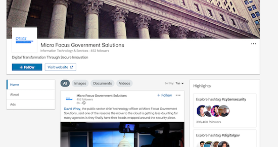
We’ve put a pretty heavy emphasis on having each Showcase Page be specific and unique. Micro Focus, a software and technology development company, executes this idea well.
One of their five Showcase Pages covers how their business contributes to government solutions. And it has less than 500 followers at the time this blog’s been published.
Not exactly an impressive count.
But, upon closer inspection, those 452 followers have come to this page looking for very specific content. Micro Focus may not have to sweat having a low count when they know that these are highly engaged users.
Besides, all four of their other pages have follower numbers in the thousands.
Adobe Creative Cloud
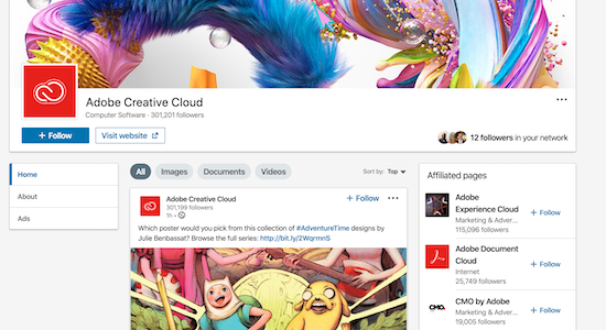
Adobe has a page dedicated to their product hub, Creative Cloud, to connect users with one another, and also with the brand.
It’s an extremely branded page that aligns exactly with what consumers know about Adobe. Creative. Fun. Innovative. They even highlight artists in their updates.
Adobe’s website link doesn’t take visitors to their corporate homepage, but to their Creative Cloud landing page, where their audience can learn more about the software and services offered.
Microsoft
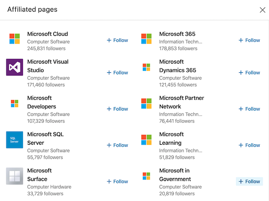
Microsoft has taken full advantage of the fact that you can have more than one Showcase Page at a time. In fact, the software company has 15.
When you’re a software giant with a full deck of services, you can get special favors and exceptions it seems. And you can clearly see just how many offers they have on their Affiliated Pages list.
These are only 10 of theirs, and each is dedicated to either a product or audience that’s directly related to the brand. Many are actually resource hubs for those looking to know more about their investments.
Salesforce

This CRM software giant has done an excellent job of diversifying their pages in order to target different niches in their large customer base.
Another exception to the 10 pages rule, Salesforce has a page for each of their services, for developers, small businesses, and so on and so forth. It’s a pretty comprehensive roster that can include anyone who has interacted with their brand on any level.
It’s not the scale of their pages that’s impressive, though. It’s just how detailed each one is. Take a look at their Salesforce for Service page.
Instead of having just a generic copy of their marketing- or sales-focused pages, this one is very uniquely catered toward the service aspect of their brand. Even the hero image is uniquely specific!
Cisco
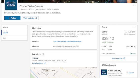
Cisco has a page dedicated to their Data Center that doesn’t skimp on any details. Audiences can get a pretty firm understanding of what the page is about and what the Data Center does for both the company and for them.
The SaaS company took it a step further and even included their address, a map, and a regularly updating analysis of their stock!
LinkedIn Showcase Page Analytics
LinkedIn does a great job of providing you with all the necessary metrics you need to track how your pages are performing.
After you’ve created your Showcase Page, you’ll want to measure how effective it’s been regularly. Be sure to look at:
- Visits: How many visitors are landing on your page? Where are they coming from?
- Follows: How many LinkedIn users are following your page?
- Likes: Are users engaging with your updates and liking your content?
- Comments: How are users reacting to your content?
- Shares: Are users sharing your content with others in their network?
Once you know where you’re standing, you can turn to different optimization strategies to try and boost your LinkedIn engagement and the success of your Showcase Page.
There you have it! Interacting with your personas on a more individual level is remarkably easy if you’re using LinkedIn Showcase Pages to target them.
Make the most of these new channels of engagement and elevate your brand to new heights.
Digital & Social Articles on Business 2 Community
(221)
Report Post
