The landing page is an important part of any digital campaign. In this case, it’s not just the journey, but the destination. And when your prospects are being filtered to a complicated or confusing destination, you can’t expect the best results. So jump on the bandwagon and find your way to landing page bliss (and media dollars well spent!).
1. Why a targeted landing page is key.
When a prospect sees an ad through Google, social media, etc., they’re reading a specific directive. There’s a specific type of visual and call-to-action. Most likely, you have a targeted strategy to this ad, and you should continue utilizing that smart approach all the way through. See it through by sending your “warm” prospects to a neat and tidy landing page that plays into the same creative design and messaging. This is targeting to its fullest!
2. The importance of good design.
Make sure your landing page is a piece of your prospect’s journey–and feels in-line with everything else they may have seen or interacted with in their interaction with your brand. The color, design, messaging and overall feel should retain the same sense that your ad originally had. Otherwise, your viewers will feel like they missed their destination, and took a wrong turn–not a good feeling or customer journey. What you’re after: a cohesive brand experience.
3. Tie back to your CTA. (And make sure it’s a good one!)
Put it right there in front of your prospect on the landing page. If you mentioned a “free downloadable guide to landing pages” in your ad, well, you better have that free guide ready and downloadable right away. The prospect should not even have to click through to any other pages. If you’re trying to get them to sign up for something or capture their email address for additional communications through your marketing funnel, include your form right away.
4. Utilize forms. Which brings us to…forms.
There are very few cases in which a landing page should not have some sort of data capture. Typically, the goal is to either receive a conversion right away, or, retain their information for an eventual conversion later. Which means, in addition to providing a cohesive entry point, your landing page serves two purposes. Make sure your forms are short, concise and to the point. Nobody will fill out too much information on an arrival landing page.
5. And a logical next-step.
Or maybe they are ridiculously interested (good!), which can happen! For this reason, you should include some sort of navigation or next-step (especially as an after-form-submission directive). If you get someone to accomplish the two goals you set out for them to do (or even one), you don’t want them leaving. Include a few buttons or a truncated navigational menu to ensure they venture outside through the rest of the site–instead of the rest of their browser!
Actions to Take Now
How can you get started now? Make sure your website is ready for the influx of traffic! Check out this great post on how to ensure a sticky site with full usability. You want to ensure people are landing on your site and interacting. You can generate a simple landing page from your current website. If using WordPress, utilize a single-column page and integrate widgets into the page for a form capture.
Examples & Quick Tips (images via Hubspot)
Keep it graphically simple!

Ensure it’s easy on the eyes!

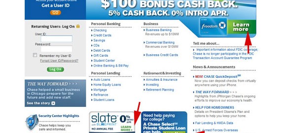
And don’t clutter it up!

And, most importantly, don’t just set it go! Throughout your digital campaign, don’t forget to take a deep look at your landing page! It’s not always the first thing your prospect sees that draws the in or deters them away…sometimes it’s even the last.
Digital & Social Articles on Business 2 Community(64)
Report Post


