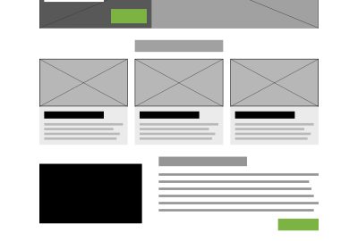
If you’ve been talking with any web company about a new design or redesign, you’ve most likely heard the term “wireframe” come up during discussions about the web development process. A wireframe is a very basic layout of a web page that includes no color, no imagery and, in some cases, no text.
So, why is it important to create these skeletons for a future website design? Why can’t we just jump right into the good stuff and create beautifully detailed designs right away? It can be easy to get anxious when it comes to getting a new site, but taking the proper steps is vital in ensuring success.
Here are 5 reasons why wireframing is a definitive step in the web design process.
Wireframes Create Hierarchy
When beginning a web design project, you start with a list of features and content that needs to be included in the site design. When beginning to create wireframes, the designer will then create a visual hierarchy with those elements on the page. Typically after seeing these wireframes clients can more easily be able to tell you which elements are or more important than others.
It may take a bit of back-and-forth to get it right, but once you’re completed with wireframes you will have a framework for your designs with a clearly defined hierarchy of elements on each page as well as a completed site map.
Wireframes Help to Define Features and Functionality
As stated before, you’ll often times begin a web design project with a long list of features and other content that should be included in the designs. Wireframes will help the designer determine what pages need to include which features and the basic functionality for each of those elements.
We often hear our clients mention they want a calendar or a blog, but there are MANY different ways a calendar or blog can look and function. Creating wireframes will help both the web team and the client better understand which type of calendar or blog is best for their site users.
Wireframes Determine the Layout with User Experience In Mind
As designers, if we skip the wireframes, we tend to get caught up in the little details to make the site look good. When jumping right into designs we sometimes forget about the usability and functionality for the end users.
By eliminating the color, imagery, and other details, you’re forced to think about only the layout and functionality of each element on the page. Your focus will only be on the structure needed for the best user experience. With a strong user-centered structure, you will be able to design a website that is both visually pleasing and functional.
They Save Time
I can personally say from experience that it is much easier to completely change a wireframe layout than it is to change a fully designed website’s layout. Wireframes will solidify the layout and basic functionality of features prior to spending the time to make it look good. In turn, you will be able to more confidently design your website without the need to make major changes further down the road.
They Create Order
Jumping into a design right away can be a confusing mess. With that list of features in your hand you can easily forget things, put things on the wrong page, or even include features that aren’t REALLY needed. Often times you will end up creating designs based on assumptions rather than knowledge, and that is the last thing you want to do.
Wireframes will bring order to the chaos. At the end of the day, you will have solid layouts to build your designs on. And more importantly, everyone involved will be on the same page.
Wireframes will eliminate headaches that can pop up later in the design process. There are many tools available for creating wireframes including balsamiq and sketch. At Keystone Click we typically use Photoshop or Illustrator to create our final wireframes, but sometimes the old fashioned pencil and paper works best!
Digital & Social Articles on Business 2 Community(42)
Report Post


