Popups work.
So let’s just fast forward through all that “popups are so annoying and can’t actually work!” malarkey, can we?
Aweber found in one case study that switching to a popup form compared to a sidebar form increased email sign-ups by 1,375%. If you want a few more proven results from popups, check out our article Should You Use Website Popups?.
Sold?
Alright, what exactly is an entry popup?
An entry popup is a popup that pops up right when the visitor lands on a page.
So why do entry pop ups work?
Entry popups work because they require (as extreme as that sounds) the site visitor to act. Whether it’s to fill out the form or to click the close button, they have to click on something to continue viewing whatever wonderful content you have on your page.
E-commerce websites typically employ entry popups because they make it easy to offer a promotion that can influence a visitor’s shopping experience. This way visitors are aware that they have access to a discount before they even begin shopping.
Take notes from these 5 smart e-commerce entry pop up examples and try them on your website today.
Frank & Oak

Frank & Oak started their menswear business online and now have brick-and-mortar stores across North America, so they know a thing or two about e-commerce success.
If it’s your first time on Frank & Oak, an entry popup offers you 15% off your first purchase for your email or social information. Right out of the gate they present a great offer that actively requires you to say “no, I don’t want 15% off my first purchase.
This way they can send you your discount and some good stuff; as they say right below their CTA. It’s a great and simple way of welcoming a new lead. With this small offer, Frank & Oak is able to capture lead information to continue the conversation further down the road.
Inside the entry popup, Frank & Oak acknowledges the annoyance of popups, but uses an offer to decrease friction and incentivize users to convert. In other words, “we know pop ups are annoying, but how about a discount before you begin shopping?”
What can we learn?
Don’t be afraid to get creative with your popups. Use fun language and present a valuable offer your visitors can’t refuse. Using an entry popup is a great way to influence a visitor before they begin experiencing your website.
Fabletics

Fabletics is a subscription-based activewear brand that is changing the way e-commerce is done. Users pay a monthly subscription fee and can choose to spend their credit to shop or to skip the month.
Fabletics does something entirely unique with their popup. Before you can explore the site you’re prompted to fill out a survey on your activewear needs: what activity you’re doing, where you’re doing it, your sizes, favorite colors, and more. Once you complete the survey you receive 50% off their VIP membership.
It’s clearly a more time-consuming type of popup but it does an awesome job of qualifying leads before progressing further into their site. Fabletics can then get a good sense of what clothing, what activities, and what interest categories are the most relevant to their users. That way all of their promotions, new products, and creative content can be segmented accordingly in their email marketing campaigns.
What can we learn?
Consider asking your visitors and readership for a little information in your pop up. This allows you to know who’s visiting and what they’re interested in.
This way you’ll be able to segment your visitors and send them tailored emails with a more personalized feel.
Revolve Clothing
 Revolve Clothing is a popular e-commerce clothing shop that carries some of the hottest clothing brands from around the world for men and women. Revolve Clothing is well-known for their widespread presence online, so it would make sense that they would have a solid entry popup.
What I love about Revolve’s pop up is the attention-grabbing communication (and image, for that matter). The casual language in combination with a 10% offer works really well. It manages to capture some of your information about what you’re looking for and sends you a coupon for your first purchase.
What can we learn?
A strong image with bold colours can be an effective attention grabbing tool.
Use your offer as an opportunity to capture information about users visiting your website. Especially for new visitors, prompting them to enter their email address and segmenting them based on gender can be a great way to personalize their experience.
BarkBox
 BarkBox is a monthly subscription service for your furry little friends. For a small monthly fee, BarkBox will send you a selection of toys and treats for your pet.
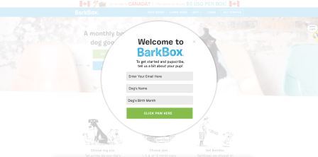
The entry popup BarkBox uses is unique because visitors are asked to enter in their dog’s name and birth month, not their own information. It relies on that fact that everyone loves to share everything about their pets.
This is a smart move on the part of BarkBox, because it seems much easier/less invasive to provide your dog’s information than your own. The comedic language and the smart pet reference is just sugar on top.
What can we learn?
Getting creative with your form fields on your entry pop up can change your visitor’s perspective. Capture information that is essential to your business and that can influence the way customers interact with you.
Think of ways you can use fun language in your call to action, like “click paw here”.
CrateJoy

On CrateJoy you can search the web for the subscription box of your dreams. You can pretty much find anything you want and send it to yourself on a monthly basis.
Crate Joy’s entry popup is for a online contest to win the subscription box of your choice — there’s a new winner every month. For your email you’ll be entered into the contest and receive the latest subscription box news.
What can we learn?
Use an entry popup that doubles as a sweepstakes as a fun way to engage with your audience and gather lead information. If your visitors are entered into a recurring contest then your emails will always be of high interest to them.
Still not convinced about using entry popups?
Granted, entry popups work best for e-commerce websites but a creative marketer can adapt them to any website.
By priming your visitor with something they should keep in mind while viewing your website, like a discount or promotion, you can influence their experience with your brand.
Entry popups can also be a great opportunity to learn more about your visitors, with something like a short survey.
For all that popups are worth, be sure to mix it up, test and experiment, and try using them to get to know your visitors.
Digital & Social Articles on Business 2 Community(111)
Report Post


