— November 6, 2018
Despite all the eulogies, email – and specifically, newsletters – are a red hot marketing channel. Some 3.8 billion people use email and 32 percent of people sign up for a company’s newsletter when they’re thinking of buying. Yet newsletters don’t get much love from marketers.
After receiving a truly lackluster newsletter from a big brand with lots of resources, I wondered, who is doing newsletters right? So I subscribed to 100 of them. Here are five things the best ones did differently.
1. Signed up for their own newsletter
Just like purchases, newsletters have their own journey. But most journeys I experienced were confusing, and marketers appear not to have tested their own forms to make sure they were easy to find and fill out.
One-third of forms were difficult to find. Companies placed them in non-obvious places, like the bottom of the page, or in a popup which only appeared once. And while most forms were short, with an average of 2.1 fields, a handful went off the deep end and asked for as many as 11 fields.
The longer the form, the more I found myself entering fake information just to get through. Which raises the question, what good is asking for more data if it’s wrong?
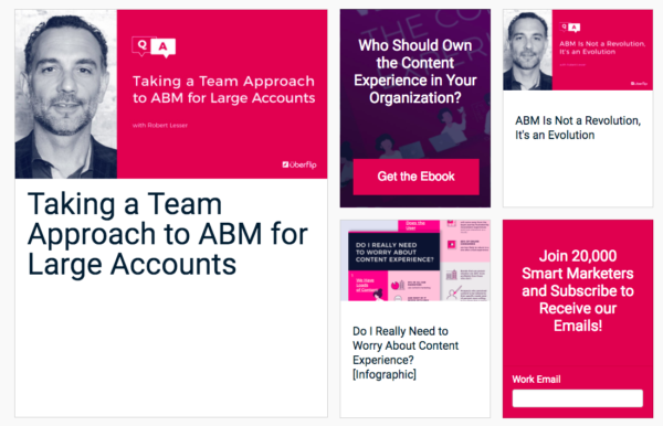
The top performers’ forms were very different. They sat as brightly colored content blocks within their blog – always there when needed – and were short, asking for an average of 1.8 fields. (Most only asked for an email.)

- Uberflip’s form is easy to find — it sits as a content block in its blog.
2. Checked their email delivery rates
If all the marketers in our study had signed up for their own newsletter, they also would have also noticed that many of their emails never arrived. I filled out 100 companies’ forms and over a three month period, 22 never emailed anything at all. Of those that did email, 13 percent sent at least some emails to spam. One social media software firm sent 100 percent of its emails to spam.
All top-performing newsletters, on the other hand, tested. They successfully sent emails upon signup, none of which were flagged as spam.
22 percent of companies never emailed anything at all.
3. Chose a recognizable send-from name
I received emails from three types of sender: the company name, a person at the company, or just a person’s name. Which is best? I’ve ranked them by how recognizable they were:
- A person at the company, such as Team @ SaaStr or Ash at Buffer.
- The company name, such as Litmus.
- A person’s name, such as Nina Zoukelman.
“A person’s name” is last on my list because whenever I signed up for a company and received a random name in my inbox, it set off my spam senses. It may have been intended to build a relationship, but these companies risked having their emails deleted when I didn’t realize I was getting the newsletter I had asked for.
Companies that used the company name were at least immediately recognizable, but you can have the best of both worlds: Use the person’s name at the company. It’s both a personal touch and highly recognizable in the inbox.
4. Edit for clarity
Many newsletters were difficult to understand. Their authors riddled them with jargon like “game-changing,” buzzwords like “AI-enhanced,” and clichés like “move the needle,” and I had to read them several times to understand their message.
Top-scorers wrote differently. They featured a consistent tone, used precise language, were jargon-free, and were entertaining to read. As a result, I didn’t actually notice the writing – I was too busy reading and enjoying. So I asked the authors of newsletters that scored high on writing, how did they do it?
“Don’t overwhelm your audience with text,” said Tallie Gabriel, social media editor at the content marketing software firm Contently. “Ask yourself, ‘How can I address my point as clearly and concisely as possible while keeping with my brand’s tone?’ If you can throw in some humor and exciting data to keep your audience engaged, even better. But above all, be consistent.”
Anand Sanwal, author of the CB Insights newsletter, added, “Whatever you do, don’t be boring, especially in B2B. Most B2B newsletters are jargon-infested drivel. They forget that the people reading want to be educated but also entertained.”
“Don’t be boring, especially in B2B.” – Anand Sanwal, CB Insights
5. Invested in well-designed emails
Visuals might be even more important than writing when it comes to retaining readers. Just consider how much more approachable a wall of text becomes when you break it up with a big, colorful quote. Or better yet, turn it into an infographic.
The difference between them was that good newsletters tried to do less. Where the average newsletter was convoluted, used small fonts, used multiple columns of text, and wrote too much, top newsletters were simple, clear, short, and above all, pretty to look at.

- Invision’s emails were clever, beautiful, and easy to understand.
For great newsletters, less is more
Building a newsletter is a marathon, and winners travel light. The best newsletters in the study took the time to eliminate needless steps and making signing up simple. They tested their email deliverability, invested in writing people actually want to read, and hired designers. They built experiences, not drip campaigns, and that makes all the difference in keeping readers coming back.
Want more tips on building your newsletter? Download the full study.
Digital & Social Articles on Business 2 Community
(70)


