— August 29, 2017
Brick and mortar retail is taking a hit. Recently, many of the major retailers such as Macy’s and Sears have announced stores closing all over the United States. While some believe it is due to a weak economy, the reality is that online sales are killing walk-in retail.
Stores that want to make money need to have an online presence. Over the last 20 years, ecommerce has taken off and has now become one of the most used shopping methods by consumers.
The more stores that have an online footprint, the more crowded it has become. As with brick and mortar, stores need to find a way to stand out online. The lack of knowledge of how to run an ecommerce platform has caused many retailers to fail in the online game.
The number of options afforded to ecommerce players are endless (website designs, shopping carts, etc.), making it more difficult to stand out from the crowd if you don’t have the right setup. If you cannot differentiate yourself from the competition, you may as well shut down your site.
“Having so many good options – and some lingering bad options too – can make the process of picking an ecommerce platform seem more complicated,” writes Armando Roggio for Practical Ecommerce.
So, what are the better ecommerce players doing to stand out from their competition.
1. Eliminating Clutter and Reduce Steps
Ever clicked on a website and immediately feel information overload? How long before you clicked off simply because you didn’t feel like navigating through it?
My point exactly.
Eliminating clutter has helped many ecommerce stores to stand out. And clutter means more than just pages with too much information.
“De-clutter the page and limit the amount of information you ask from the user,” writes Khalid Saleh for Usability Geek. “Use smart forms that pull in city, state information, etc. from the zip code. Leverage Google auto-fill forms to help users checkout faster.”
Basically, retailers need a website that is easy to use (both navigation-wise and checkout-wise). People abandoning shopping carts because they have to input too much information is common. After all, people can find the same or similar products through a competitor who doesn’t make things so difficult.
So how do you eliminate steps? Saleh makes a great point above. Use auto-fill if you can and don’t make people jump from one screen to another to complete the checkout process.
Companies such as Amazon.com have this down. Ever seen their 1-click ordering? Once you have your account set up, all you need to do is click the buy button and everything is completed for you. No going to multiple screens or filling in the same information over and over.

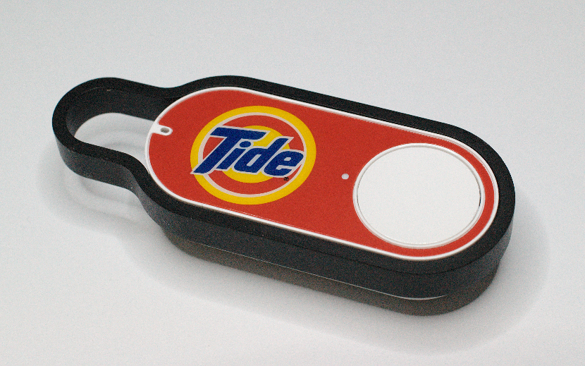
Amazon.com dash buttons allow consumers to simply push the button and place a preset order for certain products. Out of laundry soap? Simply click the button next to the washer. Image obtained from Wikimedia Commons.
Amazon.com even goes a step further by offering “Amazon Dash Buttons” where you don’t even have to be on a computer to place an order.
2. Quality as the Main Focus
Quality, quality, quality!
Gone are the days of seeking the absolute rock-bottom price. People are now looking for value and are willing to pay, as long as they receive quality.
Great examples are freelance marketplaces, Upwork and Freelancer. I will not call out which one I think is better, but I will say that one has a vigorous screening process for freelancers. If you are looking for quality, one excels above the other. While you may get a better deal on one, you receive better quality on the other.
Many retailers offer quality guarantees on products, including offering free shipping on returns so that buyers don’t pay out of pocket when there is an issue. Getting rid of things like “restocking fees” have helped sites earn repeat business.
By focusing on quality, customers know they can trust that site and will return over and over while the competition still struggles to convert new customers.
3. Being Socially Responsible Helps the Bottom Line
We are in an era where being socially responsible is rewarding, both personally and professionally.
“People like to feel that they are doing good for the world,” writes Thomas Smale for Entrepreneur, “even when they’re shopping online. From the user’s perspective, seeing that you, the brand owner, have donated a portion of your revenue will seem a selfless act. And it will help the user feel good about doing business with you.”
While we receive the joy of helping others, companies have found that corporate social responsibility has also helped them stand out from their competition.
How much does it help, you ask?
A 2013 study conducted by Cone Communications and Echo Research reported by Entrepreneur.com showed that 82 percent of consumers in the United States consider corporate social responsibility when deciding where to shop. 82 percent!!!
Companies such as Walmart, Microsoft, and Coca-Cola give away a lot of cash to charitable causes. Walmart alone gave $ 301 million to charitable efforts in 2015.
This is one reason why companies are very open about their charitable work. In fact, some businesses are even giving a percentage of sales to charities. This is an easy way to market their corporate social responsibility.

SRR presenting a check to the United Way in 2010. The company donates $ 500 to the choice charity of company employees who works a month without a lost day due to work related injury. Image obtained from Wikimedia Commons.
Finally, companies that want to take things a step further are inviting employees to choose the charitable programs the company gets involved with. This is a way to turn employees into brand ambassadors while at the same time participating in corporate social responsibility. A win/win for the company.
4. Elimination of Hidden Fees
I hate hidden fees! (Don’t we all?)
Think about ordering a pizza online. While your bill may initially be $ 15 (thankfully as you may only have a 20 spot), by the time they add on the delivery fee you are at $ 22.
Hidden fees are not only my pet peeve, but for many others too. According to Time.com (who also points out the frustration of pizza delivery fees), “the only thing these fees do is mislead the consumer by adding a hidden mark-up to the advertised price.”
And that is exactly how consumers feel – misled.
There are some that have eliminated hidden fees, but as Time.com points out, these fees are needed to recoup the cost of doing business. What many retailers don’t get is that people will gladly pay these fees if they know about them upfront and are not surprised by the markup at the last minute.

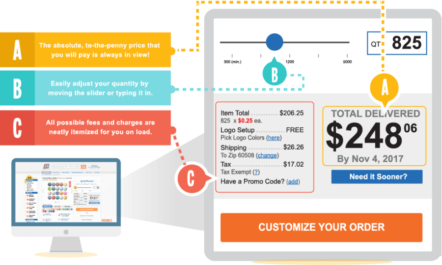
No Surprise Pricing: costs presented upfront vs. hidden from customer. Image obtained from Quality Logo Products website.
Some retailers have made the choice to be upfront about their pricing from the start instead of displaying fees later in the buying process. As shown above, Chicago-based promotional products distributor Quality Logo Products is doing just that. They are changing this frustrating trend with what they refer to as No Surprise Pricing. Visitors to the website see all associated fees from the beginning to the end of their order. The price on screen also self-adjusts in real time based on any changes made during the customization process.
5. Professional Photos over Stock Photos
Simple enough. Using professional photos can set you apart from others who are using the same stock photos.
There are only a few websites out there which have free images. In fact, there are really only a few quality sites that offer paid images. Regardless, everyone is using the same images.
So why not use your own?
“A stock image risks being no more distinctive than a black T-shirt at a heavy metal concert,” writes Jonathan Crossfield for Content Marketing Institute. He makes a good point which is why retailers wanting to stand out should avoid using them.
If you want some proof behind the madness, look no further than Neilson Norman. In 2010, they published a study showing that some types of stock photos are completely ignored. This means that people will see your website as if it is your competitors. You are trying to stand out, not blend in.
When I talk about professional photography, I don’t necessarily mean you need to hire an expensive photographer. You can do your own photography to both save money and stand out from stock images.
Final Thoughts
As with any business, standing out from your competitors is vital. If you can’t do so, you will drown in the sea of competition.
For those in the ecommerce space, this is even more important. With so many people selling their products or services online, you must find a way to shine through in order to convert customers that would otherwise buy from someone else.
Using things such as quality, bottom line pricing, and corporate social responsibility are all good ways to help stand out.
What methods do you use to stand out? What examples from other websites can you share for others to see?
Digital & Social Articles on Business 2 Community
(78)
Report Post


