— August 21, 2017
There are 2 types of people in the world…
Which one do you want your subscribers to be included in?
Well, if you have subscribers on your list who haven’t opened or clicked through your messages over an extended period of time, it’s time to do something about it. Have you thought about where you might have been going wrong? And what little changes you could bring in to make your emails more interesting?
Let’s have a look at 5 things to consider if subscribers are no longer showing interest in your emails:
1. Subject Line
For a subscriber, subject line plays an important role in deciding whether an email will be opened or not. So, don’t be boring! Spice it up, bring humor, be catchy, witty – think about why they would want to open your emails.
For a subscriber, subject line plays an important role in deciding whether an email will be opened or not. So, don’t be boring! Spice it up, bring humor, be catchy, witty – think about why they would want to open your emails.
Instead of the good old “Your subscription is going to expire” – Warby Parker went ahead with “Uh-oh, your subscription is expiring”. See what they did there? A little play of words – and you are a winner, well almost. Subject lines should ignite a certain amount of curiosity, urgency, and excitement among your subscribers. Here are some other catchy subject lines we stumbled upon:
Refinery29: “A broke girl’s guide to a luxury vacation”
Zillow : “What can you afford?”
Buzzfeed: “Not cool, guys.”
Moreover, most emails contain – “Having trouble viewing this email?” as their pre-header text. Your subscribers wouldn’t want to read that, now do they? They wouldn’t even want to read the subject line AGAIN in this text. So, what to do?

This is a great example of how your pre-header text should be. A great combo of subject line and pre header encourages subscribers to open an email.
2. Hero Image
Images help to enhance email engagement. Just like a superhero saves the world, a hero image can save a campaign from going unnoticed. A hero image is that image in the email which speaks what your brand or campaign is all about, and that is why it should be relevant. This can be a series of images or just one prominent image featured in your emails. These images should tell the story right away.
Here is one cool and classic example of how to “sell” your brand in a witty way. This Mother’s Day email has relevant images that don’t fail to grab subscribers’ attention:

3. Email Copy
Subscribers might get bored with your emails if you are sending the same kind of template or content all the time.
Firstly, don’t beat around the bush, subscribers rarely read walls of content – write precise content that’s easy to understand and engaging as well. Don’t mislead your subscribers. Tell them what the mail is about and what action you intend them to take. Plus – add relevant landing pages to take them to the page they need to visit.
Secondly, remember that your subscribers have subscribed to get informed and educated about your brand, and this would lead them to make a purchase; they aren’t always looking for a purchase – so don’t be pushy. Plus, make the emails conversational – like you are talking to them. You don’t have to be formal unless the campaign demands– it’s a put off.
Here is one great example by JetBlue:
Thirdly, make your copy engaging and interesting by using a GIF or a video wherever it makes sense. Did you know that GIFs have become the most popular method of adding animation to an email, helping campaigns to attract subscribers? Just make sure the email clients your subscribers use support GIFs, if they don’t, a fallback is a must.
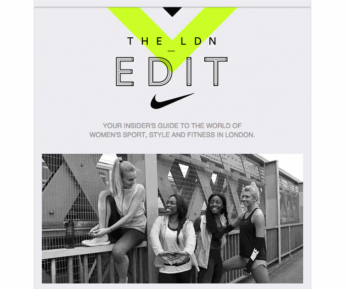
Take this one for example. A classy use of GIF by the legendary Nike – the “tick mark” is enough to recognize the brand.
Videos are another source of generating more leads through email marketing. These could be anywhere from being funny, a behind-the-scene at work, a promotional one – anything that grabs the eyeballs.
4. Email Frequency
The most common reason people want to opt out of your email lists is that they get too many emails, which annoys them. You don’t want to annoy them, do you?

Moreover, sending too few emails is also not a good thing to do. In order to ensure that your subscribers do not forget you or get upset by too many promotional emails, you need to set the email frequency right. This can be done through testing and also by asking the subscribers to set the preferences themselves.
5. Too long/cluttered emails
Conveying your desired message in the most minimized way possible – this is what a minimalist email does. Lesser space and more impact – technology today is all about this notion. Plus, it’s easy on the eyes, has more grasping power and easy to navigate through; much effective than the lengthy and complex emails. Clean fonts, exciting colors and directions – this is how it should be. Here is a really nice customer appreciation email by Grammarly:
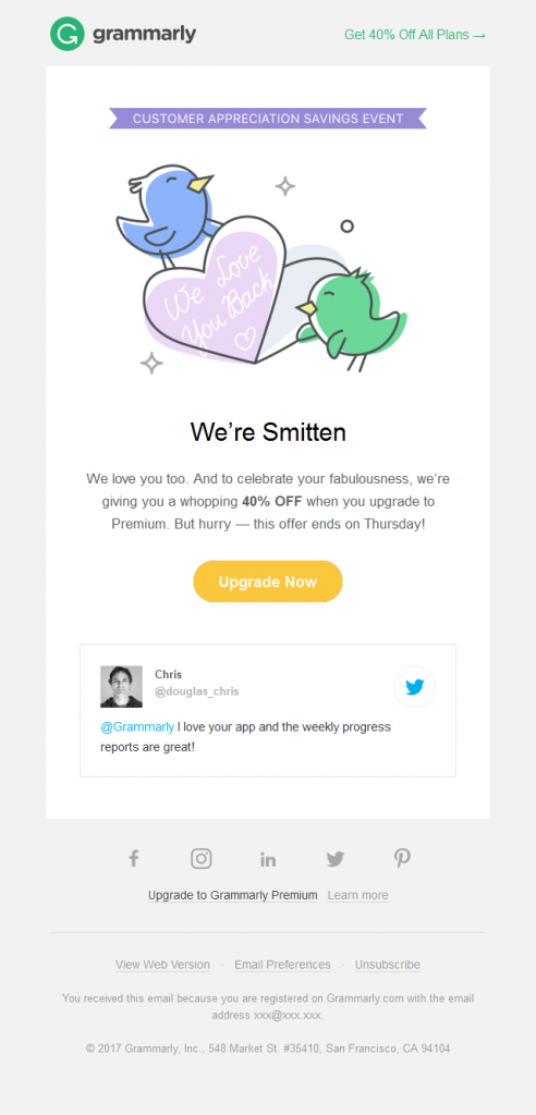
Short and sweet – they even smartly put up a tweet in the end by a user appreciating them.
If you follow the best practices as mentioned in the 5 points above, you will certainly keep your email subscribers happy about receiving emails from you. The goal of these emails is to win back those subscribers who are inactive and therefore, every aspect from subject line to CTA, should be perfect.
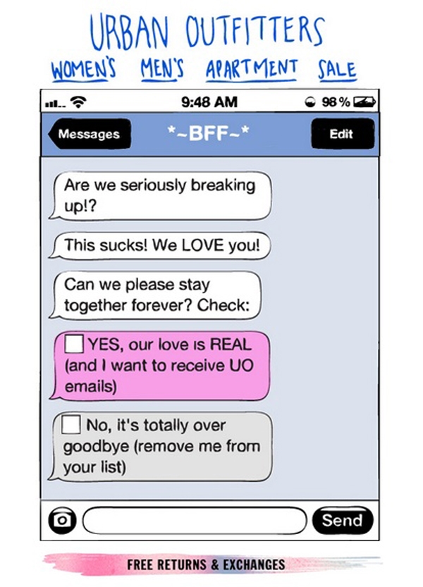
But if they, at some point in time, do lose interest, send them a re-engagement email something like this one – a funny and quite relatable example of a re-engagement campaign from Urban Outfitters:
Wrap-up
As email marketers, keeping subscribers engaged gets a little complicated after a time – because email marketing is a toiling task. But, the more the hard work, the better would be the results. Main thing to be kept in mind is – avoid being repetitive and always strive to bring in new ideas to make your emails more interesting and tempting. Make your subscribers’ inbox a pleasant thing to scroll through!
Digital & Social Articles on Business 2 Community
(37)
Report Post