— October 4, 2018
Before we dig into our interplanetary advice (no, really, anyone from anywhere can use these tips), let’s take a step back. You can’t even begin to create an effective promotional email if you don’t know what your goal is. Ask yourself:
- What are you offering?
- Whom are you offering it to?
- What do you want readers to do with your email?
- Do you want to convert readers into buyers or spread awareness for a new product?
Answering these questions will help you determine your goal and drive direction during the email creation process. Now, on to some tips and promotional email examples.
How to write a promotional email
1. Subject line
Subject lines are the first thing recipients see, and they can make or break your email open rates. Creating subject line copy that is awesome and attention-grabbing should be a priority as you write a promotional email, so be specific about the promotion you have without sounding too spam-like (e.g., don’t use “FREE, open this email NOW” as a subject line). Additionally, don’t promise something in the subject line that you can’t follow through on. Here’s an open-inducing subject line from online consignment store thredUP:
![]()
2. Email body
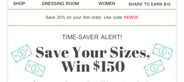
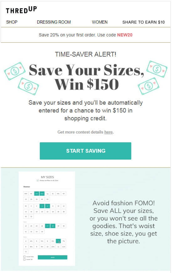
Whatever you promise in your subject line, make sure you follow through. Show that your emails are of value so recipients look forward to seeing things from you in their inbox. Demonstrating this value will capture, and keep, your potential customers’ attention, while endearing your brand to readers and encouraging them to take action. Here’s a good promotional email example from thredUp that not only shows how the company backs up the promise made in the subject line above, but also gives readers a reason to be excited about the email:
3. Call to action (CTA)
Your CTA should drive to the action you want readers to take from your email. A good way to get people to act is by not telling them everything about your promotion. Capture their interest and then leave something to the imagination to get them clicking to your site. Keep in mind, though, that you need to be respectful of readers’ time: Don’t create copy or a CTA that misleads your reader. For instance, if your CTA says, “learn more about this promotion,” but sends people to your homepage, your blog or an unrelated product page, you’re betraying the trust they exhibited by clicking your CTA.
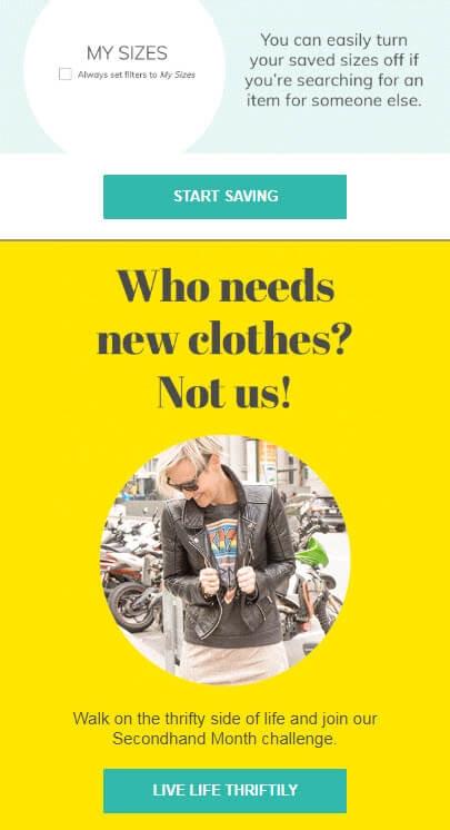
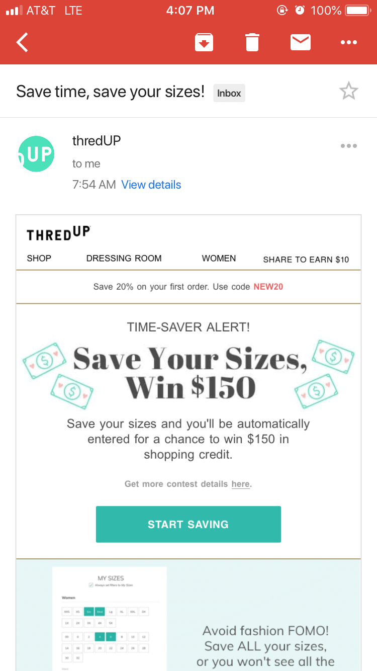
ThredUP effectively uses two CTAs in the email below. The first CTA, “Start saving,” ties in with the subject line and the rest of the email body, while the secondary CTA at the bottom drives a different action.
4. Email format
Make your email easily scannable with things like images, bullets and titles. Break up the information by placing your main message at the top of your email, which broadcasts its importance.
5. Mobile-friendliness
People are glued to their phones. If you want them to be glued to your emails as well, captivate them with the above tips while also ensuring your emails are mobile-friendly. To be mobile-friendly, your emails must have a responsive design, meaning that the visual and copy components of your email will readjust to any screen size it’s being viewed on. Here’s thredUP’s email above as seen on a mobile screen:
Now that you’re in the know, create a promotional email and blast it into space (or readers’ inboxes). We think they’ll be impressed.
Digital & Social Articles on Business 2 Community
(44)
Report Post