Take time now to review your email programs to ensure they’re optimized for success in Q4 and beyond.
One of the things I brought back from vacation, besides a great tan and lots of memories, is a treasure trove of email ideas. As I mentioned in my previous MarTech column, I don’t work when I’m on holiday, but relaxing in a new environment always unleashes my creative energies.
As part of that creative surge, I assembled a collection of email campaigns and practices that impressed me because they exemplify the best practices for emails you should send at key points in your program.
If these summer months are a slow period for you, take time now to look through these emails or use other sources to come up with ideas and innovations you can test and implement for your program.
None of the emails below will get you to your email goal alone. But they could make it easier for you to reach the finish line before everyone around starts losing their minds in December and screaming down the hall for you to send another email.
1. Acquisition
Adding subscribers is critical for your email program’s health. But many retail websites have defaulted to putting the email opt-in form at the bottom of the website. They just want to get the email address and go.
Putting the form at the top of the website can be challenging from a tech perspective. It’s valuable real estate, and many marketing departments don’t want to give that prominent spot to email. But study after study reinforces that when an acquisition form is up at the top, you get more registrations.
If your brand puts the form at the bottom of your website, try to get it moved to the top, even as a test. Also, think about getting more than just the email address on the first go-round. Send the subscriber to an easy-to-use, mobile-friendly registration page where you can collect the information you need to inform your welcome email, automations, triggers and segmentation.
What could you use? Location, gender identification, content or frequency preferences? Birth month if you send birthday emails?
Besides these standard identifiers, consider your customers and what data you need to send more valuable content. This example from Scout & Nimble, a designer furniture retailer, shows how you can use a bottom email form placement to your advantage by asking potential customers if they are also designers.
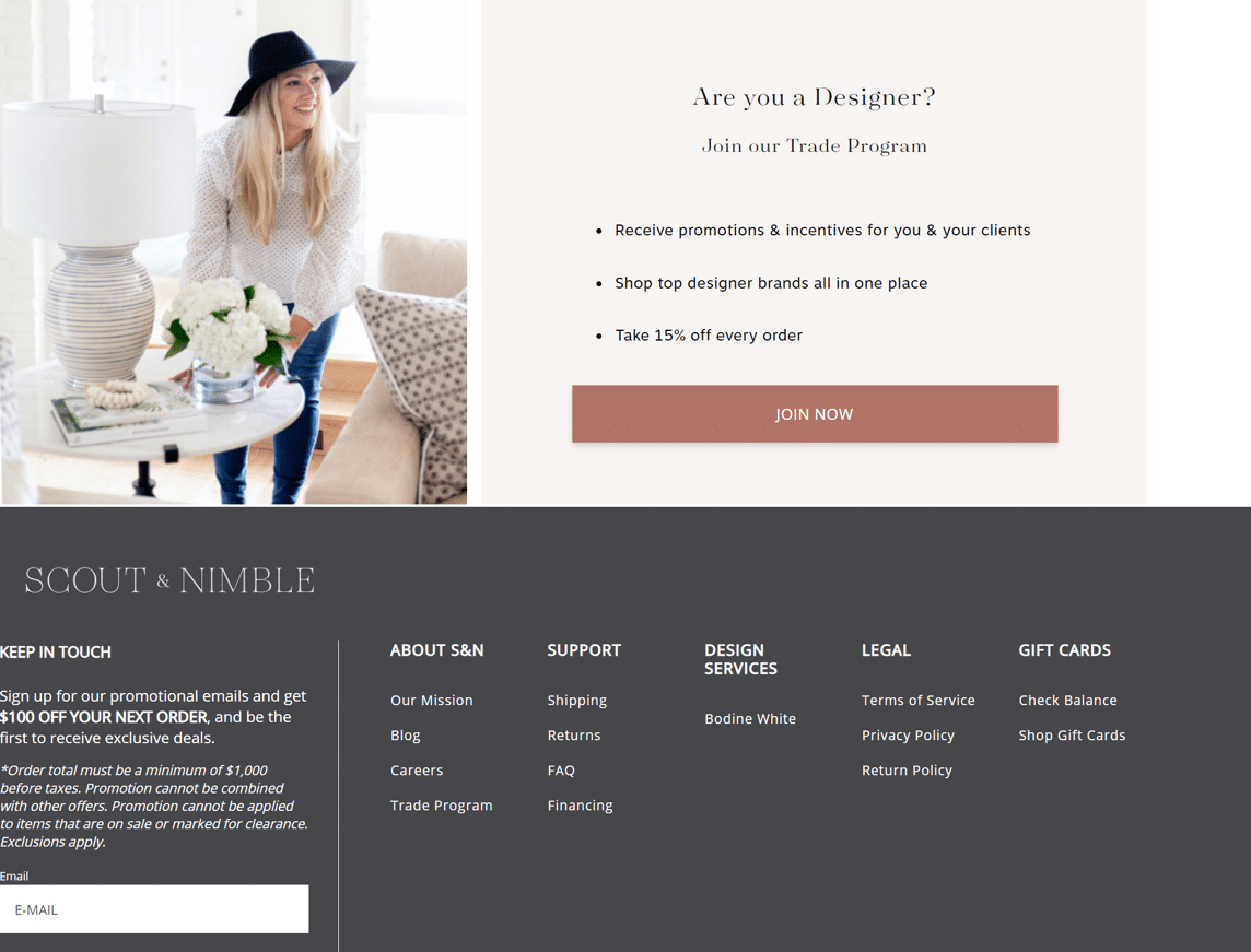
Here, the company recognizes they have two kinds of customers — individual buyers and interior designers working with clients. The company devotes significant page real estate to show designers the value proposition for signing up with its trade program, which presumably includes customized emails separate from the campaigns it sends to home shoppers.
Your takeaway: Try to show that you can increase your acquisition rate with the acquisition form at the top. But also look for ways to get more information from your subscribers that you can use in automations, copy in your welcome email, targeting and more to differentiate among your different groups of customers.
2. Welcome email
It’s still one of the most important emails you will send subscribers. It’s the first email from you in their inboxes. We always emphasize that your welcome email should meet these qualifications:
- Represents your brand well.
- Looks good on mobile.
- Allows for images both enabled and blocked.
- Says “thank you.”
- Includes personalization.
- Has brand statements.
- Includes any disclaimers.
Welcome emails get high open and engagement rights. Deliver it within the first two minutes after opt-in, and you’re creating an excellent brand first impression.
Getting it wrong means you start off on the wrong foot and might not recover. The email below is a welcome email I received from a retailer that apparently forgot many Gmail and Yahoo! Mail users don’t enable images from brands they’ve never seen before. Here’s how that email looked when I opened it:
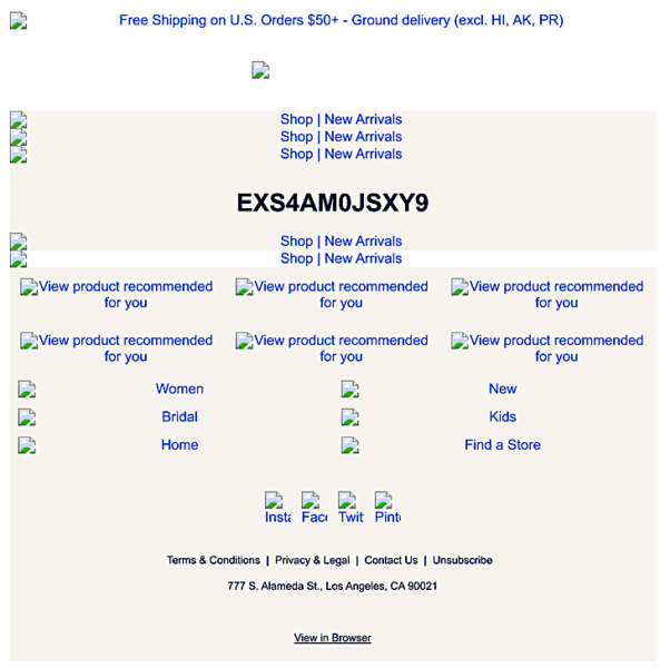
The only meaningful copy I could see was the preheader, the brand name (edited out here to avoid shaming), the promo code, alt text and footer copy, none of which is compelling enough to prompt me to click through.
Now here’s a welcome email that I love from Ooni, a European pizza oven manufacturer:
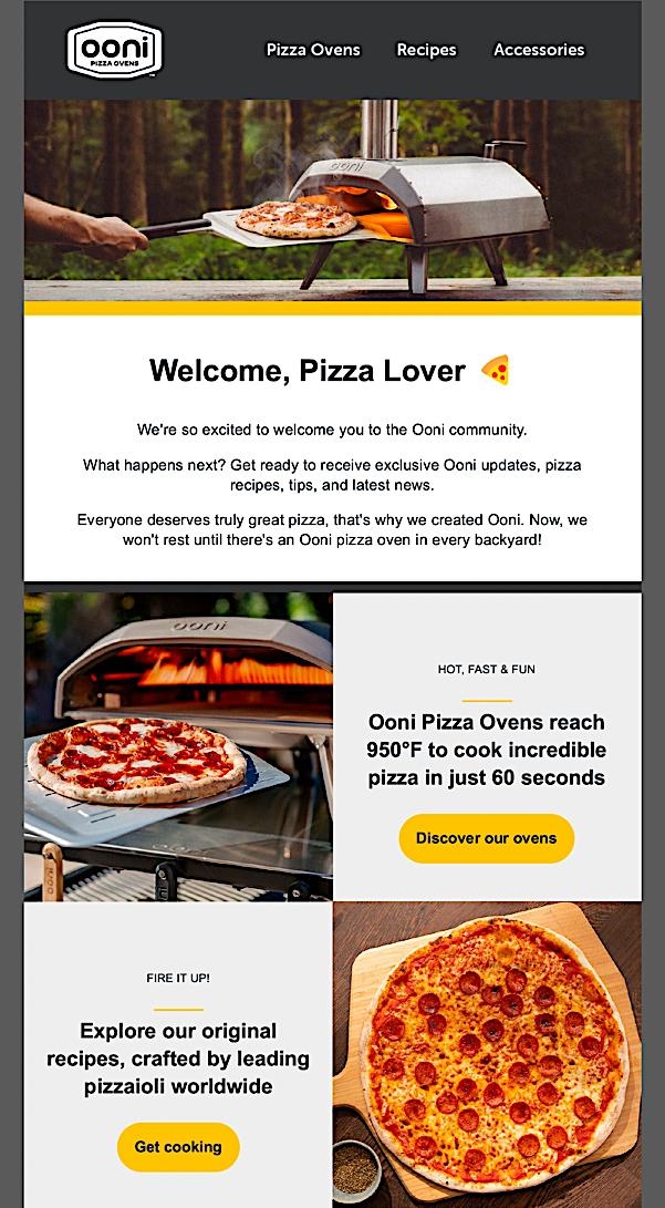
Before I enabled images on this email, I could read the text next to the images, so the email didn’t have to rely on the images to deliver its message.
This email is everything a welcome email should be. It features images of a pizza oven in use, reminds me why I bought it, has product recommendations, and moves me to take the next step, which is to make a darn good pizza. And I could do that because I watched the videos I learned about in the email.
Here’s a quick check-up for your welcome email:
- Is it short and sweet and to the point?
- Does it say thank you?
- Does it reiterate your brand value?
- Does it convey that you are glad they used their personal email address to sign up?
- Does it represent your brand’s current look and feel?
- Have you added anything to it in the last 12 months that’s exciting and new about your brand?
- Is the navigation right?
- Did you send it right after confirmation?
You should update your welcome email first because you’re acquiring new subscribers daily.
3. Onboarding email series
An onboarding series expands on a welcome email and tells the story essential to your brand experience. Suppose you have to explain a process or gather data through progressive profiling. In that case, those messages usually go into your onboarding emails before you drop your customer into your regular promotional schedule.
But not every brand needs an onboarding series. I talk as many brands out of doing an onboarding series as I talk brands into doing one. You need to pass the BS test: Do your customers really need an extra email or two beyond the welcome email? You must be very critical when you look at the need for an onboarding series because so many I see are just one email after another.
There are two basic types of onboarding programs. One is educational or informative. Another uses a progressive series of emails, sent at specific intervals, that follow the customer’s natural evolution through their experience with the brand.
The DIY website builder Wix sends an excellent welcome and onboarding program. I’ve used Wix for a long time; it got me out of hand-coding websites.

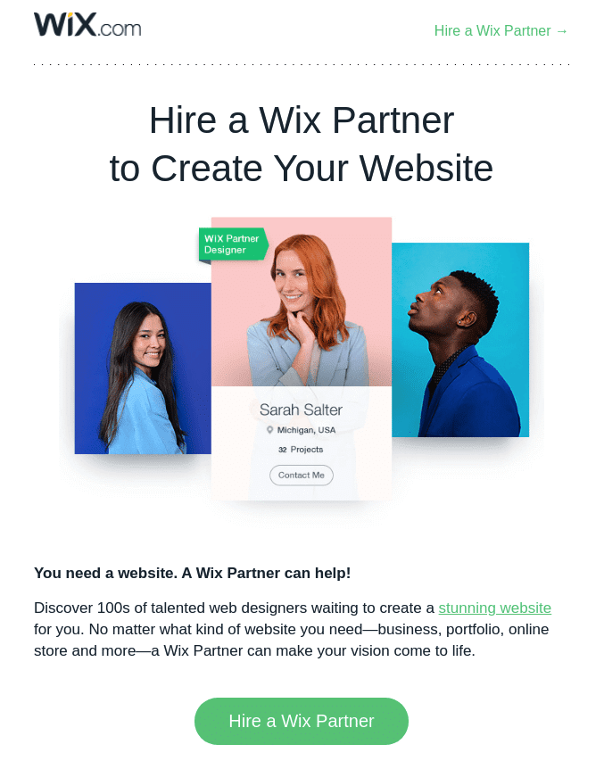
Wix’s email series encourages new users to start immediately, reiterates the value proposition and begins setting expectations for what to do, how to start setting up a website and how to overcome the fear of screwing up.
I also like the email that promotes their partnership program (second email). It’s a logical extension of the core brand.
As a retail brand, maybe you need an onboarding program; maybe you don’t. If you’re selling things without a compelling story, maybe not. But go through the process to decide whether you have a story and a reason to tell it and expect customers to be interested. You know it when you need it.
4. Transactional emails
Customers value transactional emails the same as they value welcome emails. Transactional emails shouldn’t simply report the financial details. They should include everything a customer needs to know about that transaction. Is it easy to read? Does it look professional and aligned with the brand?
Beyond these basic requirements, look at your transactional email templates to discover whether they take advantage of the powerful cross-sell and upsell opportunities that are part of the transactional process.
This is the point where customers have their wallets out. It’s the ideal time to present complementary purchases or to suggest the next product a customer would purchase in their product cycle. Data analysis can show what that likely purchase, called the next logical product, might be.
The Nordstrom example shows how well this premium retail brand understands cross-selling and upselling in transactional emails.
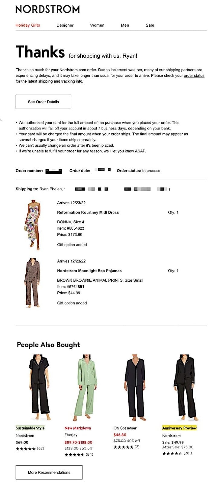
This style of suggestive selling has become a common practice. Still, Nordstrom takes the “People Also Bought” module an extra step by including customer ratings with the product pictures, descriptions and price tags.
If you do customer ratings and reviews, find a way to dynamically insert high-rated products in a cross-selling/upselling module in your transactional emails. If you aren’t doing this right now, you’re missing a gold mine of revenue growth through email. I know retailers who make 50% of their email revenue from triggered and transactional emails; add-ons like these are part of how they do it.
Here’s a quick check-up for your transactional emails:
- They represent the brand well.
- The information is displayed clearly and concisely.
- The email is informative and comprehensive.
- It cross-sells and upsells to other categories, including complementary and next-logical products.
5. Marketing automations
Like transactional emails, triggered emails are the money trees of email. When you have them, you can walk into your office in the morning, run a revenue report and discover you made money overnight without sending a promotional campaign.
The birthday greeting is one of the most popular triggered emails. I recently celebrated my birthday, and I got a slew of email greetings from brands. Now, that was nice. But they were all bland. “Happy birthday” and a few paragraphs of “Buy our product because we’re so great.”
Guess who sent me the best birthday greeting of the bunch this year? Not some edgy D2C brand or a multinational company with a marketing team and budget to match. Nope. It was CareCredit, a healthcare and wellness credit card.
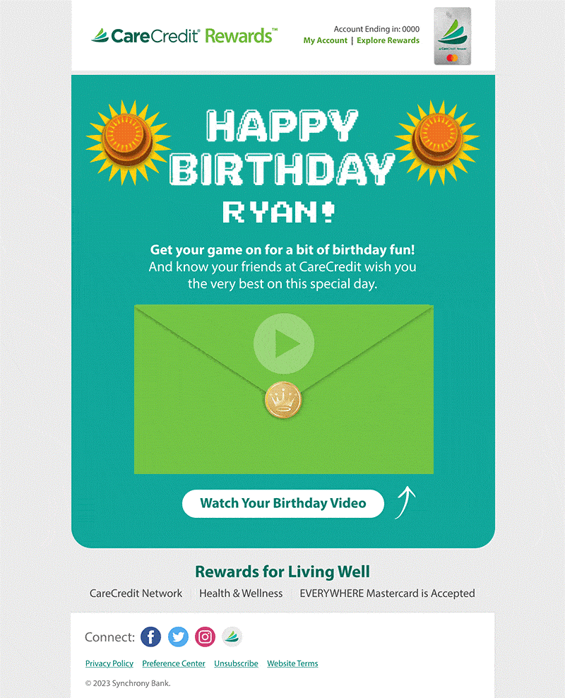
I loved this card because it was straightforward. It had clever animation and didn’t try to sell me anything. (I know, I know. I just told you to add cross-selling to transactional emails, but there’s a time and place for everything.)
This is just a fun little card that wishes me a happy birthday and a nice life. Does it make me want to use CareCredit more often? I don’t know, but I thought about them more because of this card than I do with their business-as-usual emails. And look! I just shared it with you all, so now you know about this brand, too!
If you send birthday emails, what could you do to make them better? Your copy should be genuine and authentic. If you offer a gift or incentive, use it to thank your customer for being on your list. Be creative with animation or video.
Birthday emails can be tricky. Make sure your marketing automation is robust and accurate. Check on them regularly to be sure they’re firing as they should, especially for birthdays at the end of the month.
6. Opt out / opt down
While researching this column in my Gmail inbox, I did my annual purge of emails I no longer care about. And that yielded a big surprise: how many brands use the one-click-and-you’re-out method?
These brands didn’t fight hard to keep me, and I don’t mean they made the unsubscribe hard to find. They didn’t allow me to change the frequency or find more relevant emails in other categories. Instead, I got taken to a landing page that said, “Thanks for unsubscribing,” like the one below. They didn’t even give me the option to resubscribe in case I had hit the unsub by mistake.
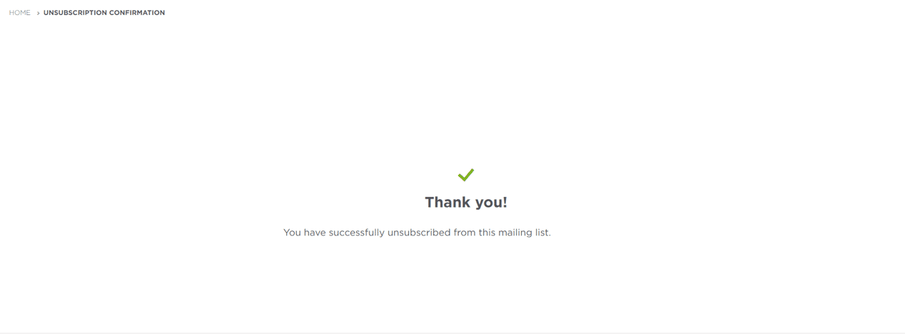
When I think about how hard companies work to acquire email addresses and how much they spend on acquisition, I wonder why they don’t try harder to keep me around.
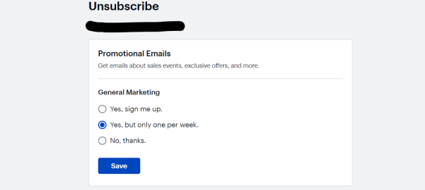
Best Buy has the right idea. Now, I like Best Buy, but I don’t need an email daily. Once a week is fine. It’s like getting the old-fashioned Sunday circular (and if you don’t know what that is, go ask your parents).
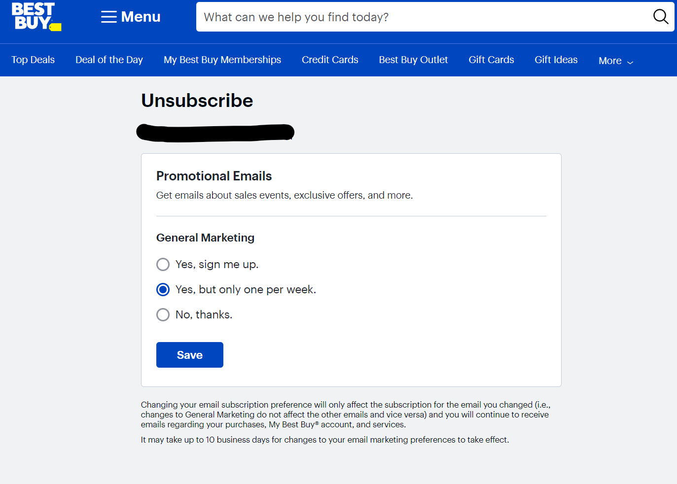
Best Buy lets me choose between opting down to a lower frequency and opting out altogether. They’re doing what more brands should do — fighting to keep me as a subscriber, even if it means changing the relationship.
You can even measure how many subscribers you retain when you give them options. You can use “save rate,” a metric that tracks the percentage of people who click your unsubscribe link but don’t actually unsubscribe.
Keep your email programs in tip-top shape for Q4
These are the foundational elements of an email marketing program. Anyone doing business on the internet needs to have these emails. Add in a full set of promotional emails, and you’re ready. These emails are essential for growth, for revenue that you aren’t collecting now and for programs that often get overlooked.
Q3 is here now, but Q4, like winter, is coming. Even if your business isn’t affected by the holiday Q4, now is still the time to review the programs in your world.
Everything can be optimized. Everything can be tweaked and tested. I’ve given you a list of things to test: new functionality, new timing, new data, new authenticity, new ideas. What can you do to make your email program smarter and more efficient?
Email is not “set it and forget it.” Email is “set it and revisit it.”
Take time now to review these and other programs to ensure they’re working correctly, aligning with your brand, and doing the very best they can.
The post 6 key email programs to optimize before Q4 appeared first on MarTech.
(20)
Report Post