— February 23, 2018
Email has the highest conversion rate and ROI as compared to all other marketing tactics. Thus, when we talk about conversions, email is the king of all marketing tactics. For your email campaigns to be effective, you should be able to convert your email audiences into customers.
To get your conversion rates pepped up, you need to pair your email campaigns with well-designed landing pages.
Landing pages are an integral part of any marketing campaign. It is where the conversion happens. A well-designed landing page can persuade the visitors to provide contact details, make a purchase, signup for a newsletter, download content or request demo or consultation.
In this article, we take you through the mistakes marketers often make while creating landing pages with ways to avoid them, for a successful email marketing campaign.
But first,
Why are landing pages important?
A landing page, also known as a “lead capture page” is an indispensable part of your marketing strategy, where your visitors take a step further towards becoming customers. Almost half (48%) of the businesses build a new landing page for each marketing campaign according to Marketing Sherpa. Here are the reasons why a landing page is important for your marketing strategy:
Supports your business goals: Your business can have various goals such as promoting a product, getting new customers, targeting a niche, closing more sales or collecting information of your existing customers. Landing pages help you in achieving these goals.
Generates leads: Landing pages help you in improving your lead generation efforts. Instead of redirecting your visitors to your company’s homepage, send them to targeted landing pages that would increase the chances of generating leads.
Improves conversions: The design and content of your landing page can influence a visitor’s decision to sign-up or make a purchase. A landing page can also help in tracking reconversions of your existing leads and hence can be used to identify which prospects are more engaged with your business.
Lets you collect your prospects’ information: Every time a prospect fills a form on your landing page, you get valuable data about them such as their occupation, location, contact details, and persona. This can be used to understand what type of visitors are getting converted.
Gives insights into your marketing activities: When a landing page is linked to an email, a social media campaign or a piece of content, the activities on the page can be recorded and the insights can be drawn to know which channel got you the maximum leads. Such insights can be useful in refining your campaigns and improving the effectiveness of your campaign.
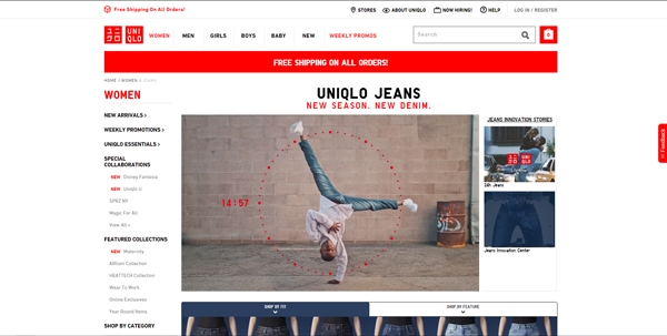
Take a look at this email and its connecting landing page.
Landing Page

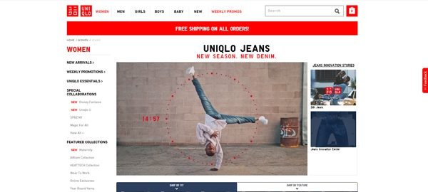
This email from Uniqlo has multiple CTAs that are linked to different landing pages. Here, the email has separate landing pages for Women’s Jeans, Women’s Shirts, Men’s Jeans, Men’s Shirts and a common landing page for both men and women. The common landing page features a video supporting the product, followed by distinctive product images and CTAs.
Specific landing pages linked to the various CTAs in the mail make it relevant and involve the visitors in your landing page. This is a great example of a combo of email and its respective landing pages.
Now, let us go through the common mistakes that you may make while creating landing pages for your emails and steps to avoid them.
Common Landing Page Mistakes
1. Too many distractions
Adding unnecessary information and beating around the bush, instead of keeping the message concise is something you tend to do. Using multiple images, text and CTA on your landing page will be a distraction to your visitors and will take away the user’s attention from the core message.
To avoid the mistake: While designing your landing page, your main aim should be to have a conversion-centric content and design. Avoid adding any extra information that isn’t related to the primary offer/message that you want to convey to your visitors. Highlight the main message to keep the users focused on the key message and guide them to the main action they should be taking.
2. Having a single landing page for multiple offers
Your landing page should not be the one-size-fits-all kind. Marketers often create a single landing page for multiple offers and services, instead of targeting specific buyers’ needs. Having a landing page that promotes the same service, product or offer and which is common for everyone on your email list will result in failure of conversions.
To avoid the mistake: Target specific customer/prospect groups with the help of specific landing pages that are tailor-made to meet your business goals. Create separate dedicated landing pages for each business goal, targeting different buyer personas or selling points. This will help in better targeting your prospects and increase the chances of converting them into leads and customers.
3. Lack of optimization in forms
One thing marketers often overlook while designing landing pages is not optimizing the forms for conversion. They often fail to design the landing pages with conversion in mind. For someone who is in the Awareness stage, asking for details more than the name and email address would lead to losing them. It is, therefore, necessary to include forms that are relevant to the targeted audience and tested and optimized for conversion.
To avoid this mistake: Get a good optimization tool that lets you test and track your landing page performance. Start out with the basic information such as the name and email address and test for the various target groups to know what works best. Review the performance and identify areas that can be simplified to get maximum people to sign up.
4. Poor mobile compatibility
It is 2018 and majority of landing pages are still not optimized for a decent mobile experience. With heavy imagery and design, the landing pages face loading issues on mobile devices. Also, the CTA going unnoticed is often a matter of concern in landing pages accessed on mobiles. Such errors fail to give a consistent experience across devices.
To avoid this mistake: Make sure you create landing pages by keeping mobile and other smart devices in mind. Keep the design and code lightweight to avoid loading issues. Stick to a single-column layout and place the CTA above the fold. Moreover, keep the content to a bare minimum and use responsive form designs that can adapt to different screen sizes.
5. Confusing Calls to Action
The main aim of creating landing pages is to generate leads and convert visitors and the CTA is the deciding element. If there are multiple calls to action on a landing page, it confuses the visitors and leads to killing your conversion opportunity. Moreover, the CTA is often overlooked amidst the content and design elements of the landing page, which leads to losing your potential customers.
To avoid this mistake: Make your CTAs prominent on your landing page. Instead of including more than one CTA, include a single one that grabs the visitors’ attention and stands out on the entire page. Use appropriate colors and design elements to make them visually appealing and evident. Also, place the CTA where it is more noticeable and test different variants to know what works well.
6. Slow Loading Time
Poor loading time is one of the major issues that hinder conversions in landing pages. Your visitors would leave your landing page if it takes too long to finish loading. According to a recent research, 53% of people will abandon a page if it takes more than 3 seconds to load. It is, therefore, necessary to boost the speed of your landing pages.
To avoid this mistake: To make sure your page performs well, keep a check on it with regular speed tests and optimization. Minimize the use of bulky designs and codes and optimize for varied devices and screen sizes. Also, use a fasting hosting provider and minimize redirects. Landing pages that load faster have higher rankings on Google and PPC ads.
Before creating your next landing page, check out the anatomy of a perfect landing page. Download the ebook:
Wrapping Up
Avoid these mistakes and try to be as relevant as possible to provide a remarkable landing page experience to your visitors. The ultimate goal of your business is selling your product or service and an effective landing page will help in moving your prospects a step closer to become customers.
Digital & Social Articles on Business 2 Community
(66)


