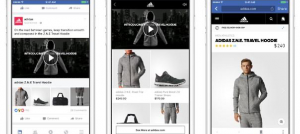
Catalog campaigns are a great way to leverage a product feed to create ads on Facebook and Instagram. Once your integration is finished, it’s pretty easy to get campaigns up and running and start making sales.
While the default settings for Catalog campaigns can perform really well, there are lots of ways you can customize your campaigns to be sure you’re reaching the right users with the right products and in the right way.
In this post, I want to take you through some of my favorite ways to be sure I’m doing just that.
6 steps to customize your Facebook Dynamic Product Ads
There are several different elements within Facebook Dynamic Product Ads that you can customize, including ad text, prices, frames, image presentation, ad formats, intro cards, and more. Let’s take a closer look at each one.
1. Leverage dynamic text from your feed in ad copy
When writing your ad text, Facebook allows you to pull in text dynamically from your feed to make the ad is as cohesive with the products being shown as possible.
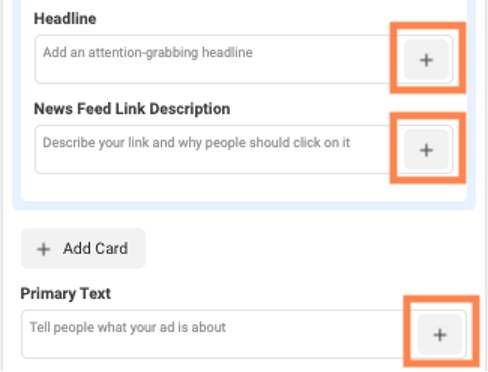
When you’re in one of the text fields, client on the + button at the end of the field and you can see the full list of variables available.
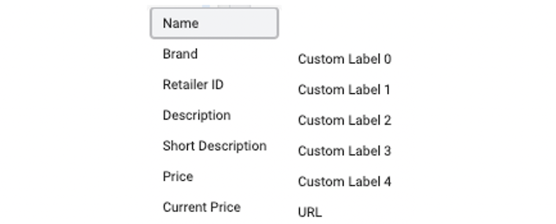
Depending on how you want to frame your products, you can use any combination of these to make a compelling ad.

You can either use these as the sole text in the space, or you can write custom messages around the dynamic fields to still reflect your brand.
2. Customize images with prices/frames
In addition to the text, you can also spruce up your images from your feed as well. The first way is the most basic, but it can have a big impact.
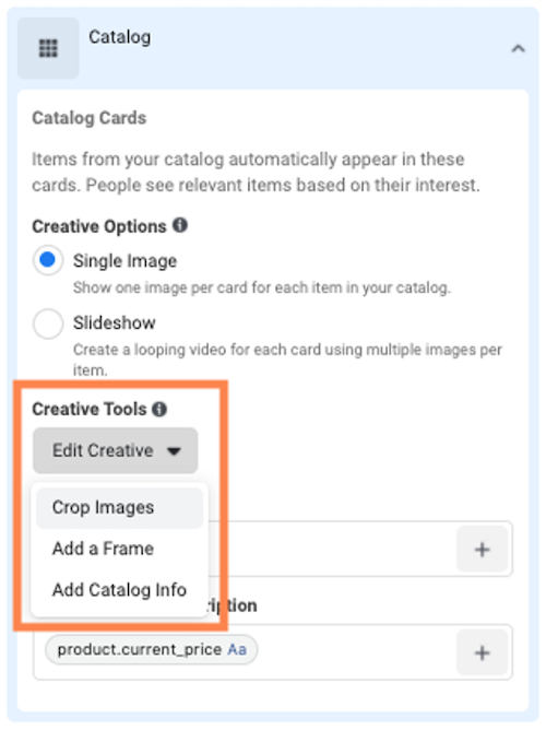
When you add a new ad, click on Creative Tools then choose how you want to customize your creatives.
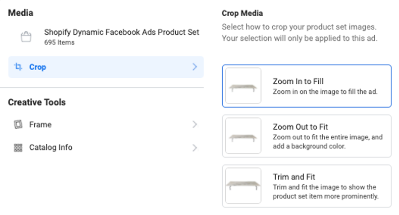
The first option is to Crop the Image. Here, you can choose how you want to arrange the image from your feed in the ad. Depending on what your photography looks like, it might make sense for you to Zoom In, Zoom Out, or Trim & Fit.
Ideally, your product will take up the majority of the space in the ad so it’s large, easy to see, and gives the user the best sense of what they’ll be getting.
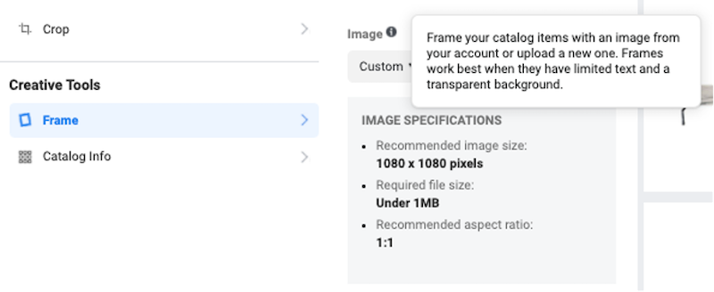
The second option is to Add a Frame. Frames allow you to literally put a frame around the product itself. As you can see here, these work best when they have limited text and a transparent background so the product can shine through.

Lastly, you can add Catalog Info to the image in many of the same ways that we did to the text fields.
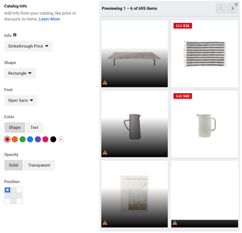
There are only a few options here with most focused on price, but this can be a compelling way to grab attention in the Facebook or Instagram platforms. The image above shows the Strike Through Price, including the original with a strikethrough, then the new sale price to show off the discount.
You can also now see the different levers you can pull to customize the new text. You can change the shape of the price field, it’s font, the color of the shape as well as the text, choose the opacity, and choose its position within the creative.
3. Utilize slideshows where possible
Did you know you can have multiple images for each product in your feed and you can then turn that series of images into a slideshow?
Well, now you do.
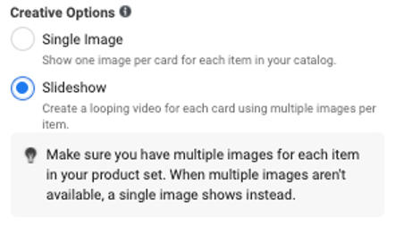
One of the issues many brands have with Dynamic Product Ads is that they typically look less than appealing with a single product on a white background.
But if you have multiple images, you can turn them all into an eye-catching slideshow.
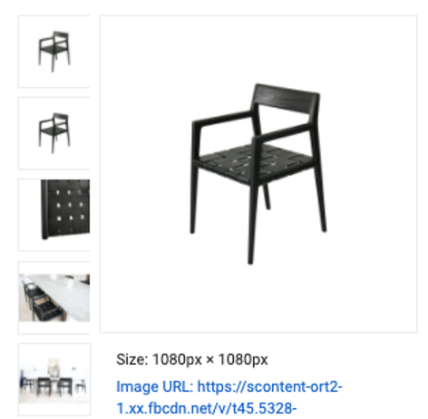
In the image above, you can see there are five images for the same product. Two are nearly identical, but the other three do a better job showing the chair’s craftsmanship as well as real life staging. I think we all agree that the combination of all of these images makes for a more compelling ad than just the single product image shown off to the right.
4. Be selective with your products
Aside from optimizing the creative, think about what products you’re advertising.
Are you using the top sellers? Are you only showing things that are always on sale? Are you focusing on your brand staples or the extras?
Depending on what you want to convey to your customers, you can select which products you’re advertising and leave some out of the feed entirely.
Creating a product set in Facebook is very simple and helps you focus only on a certain list of items rather than your entire catalog.
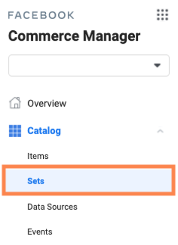
In Commerce Manager, head down the left side of the interface and click Sets.
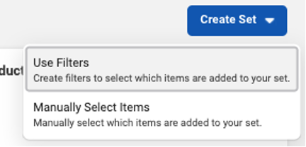
There, in the upper right, you can start to create product sets either by using filtering options from your feed or manually selecting them one at a time.
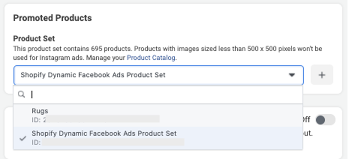
To apply this product set to your campaigns, you simply head to the Ad Set level and adjust the settings around feed.
Now all products shown in Dynamic Product Ads in that ad set will show only from the product set you’ve created in Commerce Manager.
5. Test all ad formats
For the majority of this post, I’ve shown examples of Carousel ads (and the tip following this will be no different), but there are three different types of ads you can use in Dynamic Product Ads.
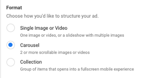
As attractive as Carousels can be, Single Image ads often do very well on Facebook. Rather than showing multiple options on different cards, this ad creative will show only a single product. In some accounts, this can be a big benefit as you can craft ad copy more specifically to each product knowing that larger ranges won’t be shown in a Carousel.

Additionally, Collection Ads can be a great way to have both a curated and dynamic aspect to your ads. For these ads you’ll still leverage the catalog feed for a portion of the ads and the instant experience, but you’ll also be able to choose an image/video to start off the experience.
6. Use a curated intro card
Honestly, this is likely one of my favorite customizations you can make on a Dynamic Product Carousel Ad. It also doesn’t require any fancy work within Facebook Ads to make it work or multiple images added to your product feed.
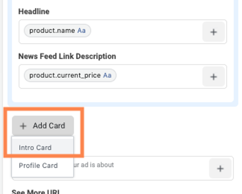
Directly under the Catalog card, you can click Add Card and choose Intro Card.

From here, you can create a standard Carousel card just like you would on a conversion-focused campaign.
This is the easiest way to customize a Carousel ad in DPA to be very eye catching at the beginning, then allow users to scroll through the standard set of carousel cards with your product images from your feed afterward.
The first challenge in selling on Facebook and Instagram is to have an attractive enough ad to get the user to stop scrolling. If you’re worried that a product image with a whilte background won’t do it, leverage an Intro card for a fully curated first impression, then let the user browse your wares in the rest of the ad.
Customize your Facebook Dynamic Product Ads today
There are a number of ways you can customize your Dynamic Product Ads to be eye catching and conversion focused without having to spend tons of time. Hopefully these tips have gotten you thinking how you can spruce up your ads and start making more sales from your catalog on Facebook and Instagram:
- Leverage dynamic text from your feed in ad copy
- Customize images with prices/frames
- Utilize slideshows where possible
- Be selective with your products
- Test all ad formats
- Use a curated intro card
Digital & Social Articles on Business 2 Community
(72)
Report Post