— June 17, 2018

My business is content marketing, but there’s not always a clear line between content marketing and business strategy. In the digital world, the two become so enmeshed that the average shopper doesn’t always distinguish between bad website content and bad business practices. They just know they don’t like it.
Are these website content mistakes driving your customers away?
So let’s take a look at some online practices that send prospective customers running for the door. If you find yourself nodding along as you read, don’t stop there. Ask yourself if you’re guilty, too.
Not making it crystal clear who you are, what you do, and who your customers are (or aren’t)
Don’t you hate it when you take the time to read a business’s home page, their about page, and a few blog posts, and you still have no idea what the heck they do? There are a few companies that don’t have to introduce themselves or justify their existence. But unless you’re Apple, Twitter, Facebook, etc., you’re not one of them.
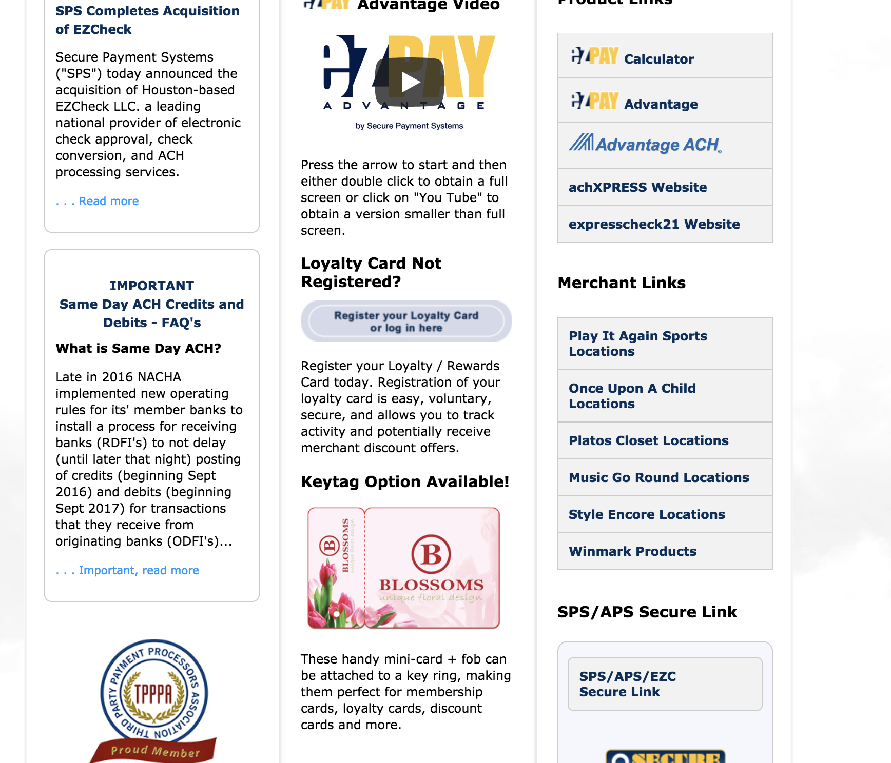
Here’s an example. I wound up here by searching for “accept secure payments.” If you didn’t already have a specific pain point in mind, it would be hard to tell from the homepage whether this company’s solution would be a good fit. When I searched for that term, I was looking for a company that could help with PCI compliance, but I couldn’t even find information on whether their own products are PCI-compliant. No further digging required…I’d move right on to a competitor.

So don’t be like those annoying people at networking events who just assume everyone in the room knows who they are. Show a little humility, because, unless your brand is a global household name, you’ve got some ‘splainin’ to do.
Requiring a credit card for “free” trials
Let me say right up front that I’m a business owner, too. I like making a profit as much as anybody, and I know there are costs associated with free trials. But hear me out on this one, OK?
Take a minute to think of it from the customers’ perspective. Saying, “Hey, here’s a free trial! Just give me your credit card number, and I won’t charge you for two weeks!” sends a couple of messages, and neither makes you look very good.
You’re taking advantage of people who forget to cancel their free trials
I’m all about personal accountability, so I’m not denying that people who don’t set reminders to cancel the free trials are partially at fault. But, when you look at the numbers, it becomes clear that some subscription-based companies have recognized a valuable revenue stream. About 48% of Americans who sign up for “free” trials forget to cancel them before the trial period ends and the charges begin…charges that add up to a whopping $ 6 billion per year.
Not a shabby revenue stream from a product or service that isn’t being used and, therefore, costs little to nothing to support.
That’s strike one. Strike two is bad enough to cancel out any need for a third strike.
You think your product is so bad that the only way you’re going to make money is from trial periods that are never canceled.
Seriously, y’all. That might not be the message you intend to send, but that’s the one your customers receive. Why else would you use a tactic that continues to charge people well after they’ve stopped using your product — and have most likely forgotten all about it?
C’mon, folks. Sure, there are a few legitimate reasons you might decide to ask for a credit card first, but your customers don’t care about that (and it’s not their job to). If your product is really that great, put some skin in the game and offer a trial period that doesn’t require a credit card. If people love it, they’ll be back with credit card in hand.
And then there’s that personal data thing…
Governments around the world are tightening the reins on the collection and use of personal data. The GDPR, in particular, only allows business to collect a customer’s personal data when there’s a legitimate business need. I don’t know that this particular question has come up (the law just went into affect a few weeks ago), but collecting payment information before you even know whether you’ll need it seems like a risk without a benefit. GDPR compliance aside, if a customer’s data is stolen during their trial period, you’re liable for payment data that you never even had a chance to use.
Not being user-friendly
I’m a nerd. One of the first things I do on Tuesdays is check Amazon and Audible to see which new books are out. And, when it comes to user experience, Audible wins hands-down.
Audible is an Amazon company, so it’s doubly hard to understand why their site is so much more user-friendly than Amazon’s. If I hover over a book listing on Audible, I get a popup with all the info I need to make a decision. On Amazon, however, I have to click on the book and dive down a level to find the deals. Double the clicks to do the same job. Most of the time, I’ll do my “shopping” on Audible and only go to Amazon to make the purchase (if I want the Kindle edition).
I know it’s a small thing. The point is that it’s a small thing that could so easily be fixed. Amazon can get away with it, but, for the rest of us, choosing not to do something so obvious and simple — something that would make it easier for customers to give us their money — doesn’t seem very bright.
(I seriously doubt that anybody at Amazon is reading this, but, if so…could I pretty please have a backlink?)
Writing over your customers’ heads
(Also known as starting too far down the sales funnel)
I see this everywhere, and it’s typically a result of the curse of knowledge. Once you get to a certain level of expertise, it’s hard to remember what it was like to be a novice. So businesses skip right over the basics and wind up leaving out a whole segment of prospective customers.
Here’s a personal example (yes, I’m revealing my ignorance)…my husband and I recently set up an LLC. When I was filling out the application for a business checking account, it wanted to know the LLC’s annual revenue and when that amount was reported. It’s a new LLC…how the heck do I know? It was frustrating for me, and looking at it from the bank’s perspective, they probably have to spend a lot of time correcting mistakes. It would be a lot easier for everyone if they just explained it on the front end.

Even FAQs sometimes generate more questions than they answer. So if there’s the slightest chance that prospective customers might not share your level of expertise, follow the advice of one of my former co-workers and put the hay down where the goats can get at it. Even rocket scientists can’t be experts at everything. All that brain bandwidth taken up with physics might not leave any room for things like DNS servers, taxes, or whatever else it is you’re a genius at.
Making stuff hard to find
Just about any parent can tell you a story about their straight-A student who can’t find the box of cereal that’s right under their nose. And, just as my kids want to get back to playing Fortnite, your customers have other things they’d rather be doing than scouring your website for the information they need.
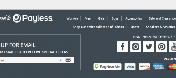
Once upon a time I wrote blog posts for Payless Shoes, and they weren’t happy with their traffic. To me, the reason was obvious. Want to see if you can find their blog?
Give up? I don’t blame you. It’s here, in the footer:

Your customers don’t have time to play treasure hunt. If you want them to read your content, make it obvious.
Not addressing obvious questions/objections
One of the key tenets of persuasive writing is to defuse objections before someone brings them up. If there’s a weakness in your value proposition, it’s far more powerful to address it proactively.
How you make money
Every now and then I’ll hear someone raving about a new website or app that has made their lives so much better — and it’s FREE! Then I ask how the company makes money, and they look at me like I have two heads.
All of us in marketing are familiar with the admonition that, if you don’t know what the product is, you are the product. That’s because data is valuable. But it also comes into play with things like referral sites. If a site makes recommendations, I want to know if the businesses in question are paying for those referrals.
That’s why being open about your revenue stream plays such a huge role in building trust. A Place for Mom does this well. They make no secret of the fact that their revenue comes from the communities they refer people to:

The same people who would get all up in arms and go on a Twitter rampage if they discovered this kind of information on their own probably won’t give it a second thought it you throw it right out there like it’s no big deal.
What your value proposition is
I recently came across a company that provides its users with branded shortlinks. They do a great job of describing the benefits of branded shortlinks, but they do a poor job of describing their own value proposition. I can’t figure out why I’d pay them for something I can do myself on a “good enough” basis. There may be a good reason, but I can’t figure out what it is, and they don’t explain it.
Solving your own pain points rather than your customers’ pain points
I can’t think of a single business whose survival doesn’t depend on maximizing revenue and reducing costs. But you don’t want to take it to such extremes that customers start wondering if you and your product are worth it. Here are a few examples:
Apple’s Genius Bar
When is the last time you tried to make an appointment at the Genius Bar? They put a lot of effort into making it really, really hard. If you start from the homepage and click support, they give you several self-help options, but I had to dig down one more level to find a single mention of the Genius Bar. And then I had to drill down yet another layer to get to the first hurdle for making an appointment. After drilling down three more layers, I discovered that they didn’t think the options I chose were worthy of an in-person meeting and therefore didn’t offer me the option of making an appointment.
I finally Googled “make a Genius Bar appointment.” Even then, I had to drill down a few layers, and then it asked me to enter my Apple ID. Which presents yet another problem: If the device you want to take in isn’t listed under your Apple ID, you can’t make an appointment (unless you lie). Our family has 12 Apple devices under 6 different Apple IDs. I’ve got better things to do than trying to guess the right combination.
We know you have to control labor costs. But nobody but Apple could get away with shouting “Go away!” in their customers’ faces. So please don’t try.
Telling your customers what’s best for them when it’s obvious what’s best for you
I’m currently in love with a couple of freemium WordPress plugins. I’d love to upgrade to the paid versions. But I can’t — unless I buy a bundled subscription that’s pretty darn expensive and includes lots of things I’d never use. Their FAQ page explains that they believe customers get the best experience when they buy the whole package and use the various components together.
I don’t know about you, but I think I’m better suited to make that decision for myself. So I call BS. I’d respect them a lot more if they were honest and said, “We make more money this way.”
Requiring a demo
There are a lot of SaaS websites out there that ask you to schedule a demo to “experience” their product. That reminds me of 1990s gyms that wouldn’t give you a price over the phone; you had to come in for a tour first. If customers request a demo, that’s one thing. But making it a requirement benefits you, not the customer. And they know it.
And one more that’s just plain annoying…
Please don’t congratulate me for buying your product. That’s pretty arrogant, you know? A simple “thank you” would be much more appropriate.
Conclusion
I know this reads like “Patti Podnar’s Gripe List,” but I’m not unique. Your customers aren’t lucky to have you; you’re lucky to have them, and both your content and your business processes should reflect that.
Not sure how you measure up? I can review your site and provide you with a report detailing strengths, weaknesses, recommendations, etc.
Digital & Social Articles on Business 2 Community
(79)
Report Post


