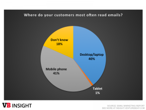
If you’re in ecommerce, developing a mobile app for your business is a smart move. Most web browsing nowadays is done through mobile devices, and mcommerce (shopping on a mobile device) has exploded in popularity as part of the omnichannel retail strategy.
Of course, with popularity comes a more discerning customer. If a mobile site is badly designed, customers are unlikely to purchase something or return in the future.
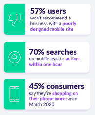
This idea applies to dedicated apps, too. Apps offer multiple benefits to smaller businesses, like new sales generation, increased visibility and—obviously—added revenue. But all these benefits are nullified if the app itself is low quality.
Since apps get deleted very quickly, you need to make a great first impression. Otherwise, you risk spending a lot of money on an app nobody will use.
Read on to learn about some of the most common mistakes made during app development and the best ways to fix these problems before they affect your business.
1. Too Little Product Information
Right off the bat, it’s easy to lose sight of an app’s purpose. Apps allow us to streamline the shopping experience and encourage a purchase.
However, this streamlining can manifest as pared-back information about what you’re selling. This means that when you populate a product page, you reduce the amount of information on it.
While this seems like a way of making products more accessible, it ultimately backfires. It’s true that customers want an app that’s easy to use. But they also want to consider their purchase before they make it. Since it’s so easy to compare products online nowadays, a lack of basic information (like dimensions, materials, or functionality) hampers the buying process.
That’s why it’s best to include as much detail about your product as possible. At the same time, you don’t have to show all of it at once. You can start with simple things (like the product’s name and dimensions) and include other info (like included accessories) in expandable sections further down. You can also sync your inventory management system to show the real-time number of products available.
This allows you to balance simplicity and product information, preserving your app’s look without sacrificing what customers actually want.
If you’re at the start of your app development, now is also the best time to establish your testing process. You can easily, for instance, make a Laravel app more testable.
2. Not Enough Images

Whatever you sell—speedboats, stationery, or something else entirely—images are a crucial selling tool.
They work alongside other information like dimensions and features—customers will take all the info that you can give to them. The problem is that sometimes, designers don’t include enough images to help them make the right choice.
When it comes to something big (like a piece of furniture, for example) a customer needs to be able to imagine it in their home. So let them get to grips with it—include a zoom feature, and show it from many different angles. Show it in situ, and also devoid of backgrounds; you can’t anticipate what your customer’s home looks like, after all.
You should include both portrait and landscape images, too. This allows customers to get the best look at your product regardless of how they use their phone.
3. Too Many Functions
Of course, developers can go the other way with features of the app itself. It’s tempting to add a long list of features to your app, in order to distinguish it from competitors. Practically speaking, however, you should focus on the basics—at least to begin with.
There are two main reasons for this. The first is that on mobile devices, screen space is a limited resource. Adding in extra functionality can make an app feel cluttered, and make it more difficult to use. The second is that if your app tries to do too much it’s more likely to crash.
That’s the only excuse someone needs to delete your app. And if enough people leave a negative review, that can deter other customers from downloading it in the first place.
So, focus on key features at the beginning. Every ecommerce app needs the hamburger button, search bar, profile page, and shopping cart.
You can certainly add additional features, but these must be a response to customer demand rather than in anticipation of it. Augmented reality is very popular right now, for example, and can be useful depending on the products you sell.
Since customers are fickle—app deletion jumped 70% from 2019 to 2020— mobile testing helps to squash any bugs or other problems you might face.
4. No Action Feedback
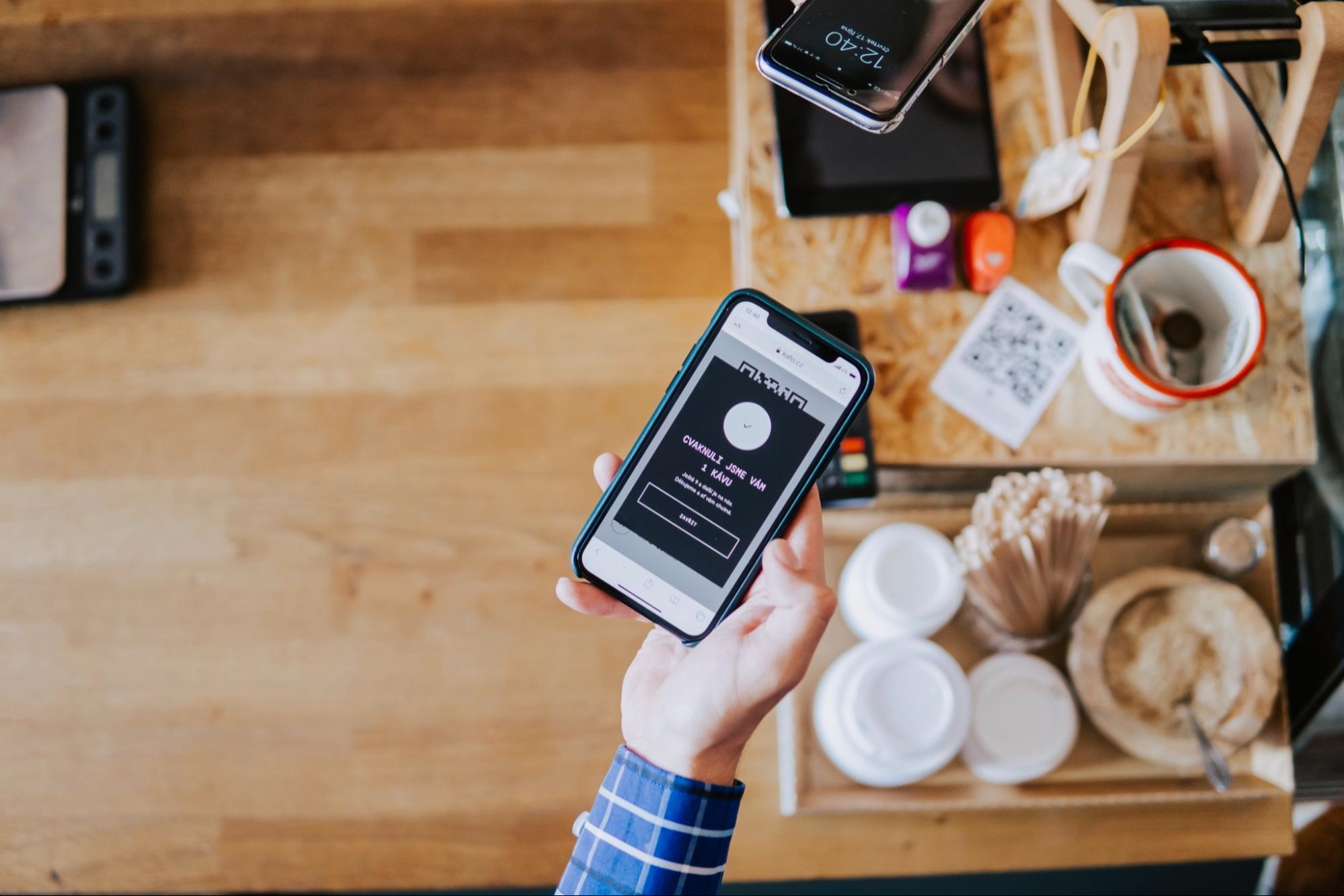
This refers to simple, in-app notifications that you’ve completed key actions (such as adding a product to your cart or completing a purchase). If you neglect to add these features to your app, your customers may be unsure if they’ve completed the action.
While this sounds like a minor concern, it can potentially have a big impact on sales follow-through. So make sure to weave action feedback notifications throughout your app, and consider how to make them appealing. A bold, positive notification for completing a purchase could help attract future purchases.
This is the kind of thing that outsourced QA can identify. Regardless of the form it takes, QA is essential for top-notch app development.
5. Obligatory Sign Up
Even with password-tracking tools, keeping track of accounts and passwords is a pain in the neck.
Today, the average user has around 100 passwords, so adding another to the list isn’t all that appealing. It’s particularly annoying for ecommerce customers, who (understandably) want the buying process to be as frictionless as possible. Forcing customers to sign up for an account is sure to deter them from buying anything at all.
This is particularly annoying for developers, since customer email addresses are extremely useful. They allow you to get a broader slice of customer data, and they’re an opportunity to send people marketing messages in the future.
The key here is to work with the customer rather than against them. Instead of forcing sign up to checkout, offer a guest checkout option instead; any purchase is better than no purchase at all.
Alternatively, you might want to offer login via an existing social or email account. Since these accounts see frequent use, it offers a compromise many customers will be happy with.
6. Long Payment Process
Picture this: Your customer’s found just what they’re looking for on your website. They go to pay for it…but the payment process is taking forever. Is it really worth all this trouble?
Every finance process and payment takes some time—at least in the early days. But you need to make them as simple as you can; try to limit the process to two screens at most. Since today’s phones offer handy features like credit card scanning, it’s easier than ever to help customers buy from you.
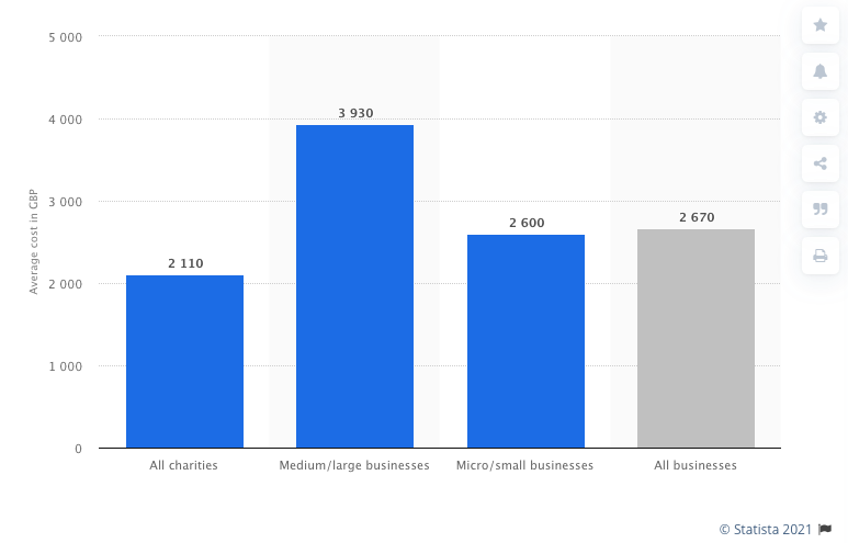
While the payment process should be streamlined, make sure you don’t compromise your app’s security. Today, the average cost of a security breach is £3,930 for medium to large businesses—a significant blow to both your finances and reputation.
It’s also worth applying this idea of streamlining to your testing procedures. An automation test paired with continuous integration testing is ideal for businesses without the time or resources for manual testing, allowing you to put time back into the hands of your developers.
7. Pop-ups
Few things are more annoying than pop-ups, even if they offer a clear benefit to your customers. By their very nature they’re an intrusion, disrupting whatever task your customer was in the middle of.
Excessive advertising and notifications are major reasons for deleting an app—more so than the app crashes mentioned earlier.
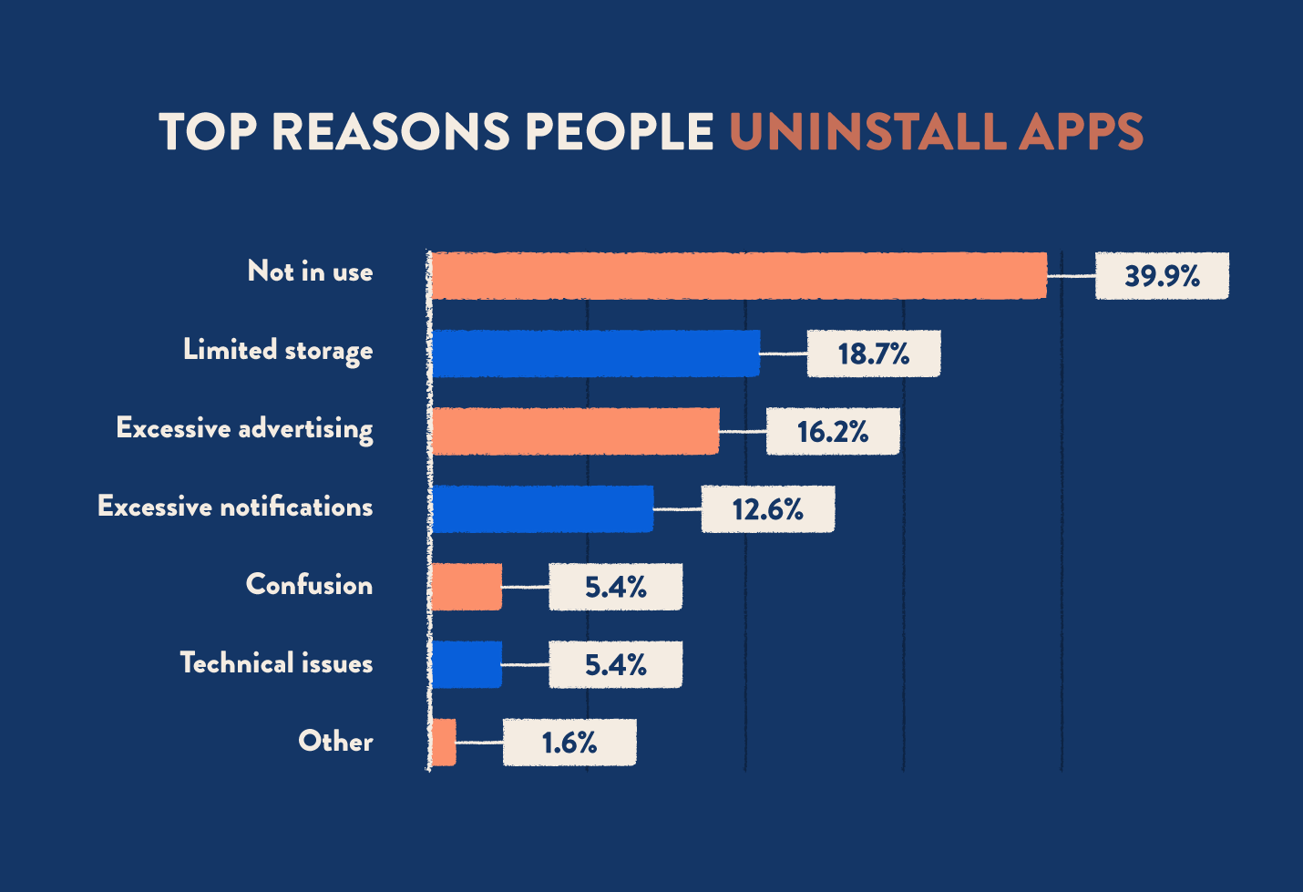
There is a place for pop-ups on your app. But they work best when used sparingly. Stick to using them for things a customer directly benefits from—special offers or events, for instance Walmart key dates 2021, or a summary of their cart contents. These kinds of popups are far more likely to be tolerated—or even approved.
Conclusion
Good app design acts as an extension of the mobile device itself. It should be intuitive, frictionless, and seamlessly integrated into our lives. The flaws we’ve highlighted upend that idea, by adding unnecessary steps or disrupting the task at hand.
Furthermore, remember that an app—while useful—is but one part of a larger business plan. Consider what other customer acquisition strategies you can use to draw customers in, such as the shape of your customer support or promotion on other channels.
You should also think carefully about the customer experience itself; this is often a key point of differentiation between you and your competitors.
By taking a comprehensive look at your app’s design, you can smooth out the buying process and make something truly indispensable to your customers.
Digital & Social Articles on Business 2 Community
(59)
Report Post


