Considering where this post appears, what I’m about to say might seem blasphemous, but I’m going to say it anyway.
I can’t stand online advertising.

As a savvy online consumer, it’s very rare that I don’t know where I want to buy something before I start shopping around. Sure, I might be occasionally tempted by a great offer by a retailer I’m not familiar with, but generally speaking, I already have a good idea of where I want to shop long before I sit down to browse. As a result, most online ads seem cheap, disruptive, or misleading – which is why I rarely pay attention to them (when I’m not using an ad blocker, of course).
Facebook ads, however, are much better at piquing my interest. Quite often I’ll see ads that aren’t just visually appealing, but also closely align with my interests. I see ads regularly that offer something I’m most definitely interested in, or that are directly tangential to things I’m thinking of buying. This makes them significantly more appealing – and much more effective.
In today’s post, we’re going to be taking a look at some of the best Facebook ad examples I could find. We’ll examine what makes them particularly effective, as well as ways you can make your own Facebook ads more compelling. By the time you finish this post, you’ll have several actionable ideas you can apply to your own Facebook ad campaigns right away.
Facebook Ad Example #1: Slack
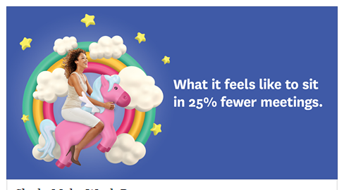
I recently praised Slack for how cleverly the messaging app leverages its value proposition in another post, and the company’s Facebook ads are similarly appealing.

This ad popped up in my News Feed a few days ago and immediately caught my eye. It’s a universally acknowledged truth that virtually everyone hates pointless meetings, and the simple – yet highly effective – visual illustrating what it feels like to sit in 25% fewer meetings is a powerful draw to Slack as a communications platform.
In addition, the ad is playful and takes full advantage of Internet parlance and imagery (namely meme-style unicorns) to make its product more relatable. The CTA is also well-positioned for the ad, as asking users to sign up based on this information alone might not be the most effective strategy.
Overall, it’s a great example of how a work-focused communications tool can be advertised well in a predominantly personal social media environment, and how even the most practical product or app can be made to seem more “fun.”
What You Can Learn/Steal From This Facebook Ad
- Focus on how users or customers will feel after using your product
- Be imaginative with your ad creative/imagery
- Consider whether a snappy, memorable tagline (i.e. “Make Work Better”) will work for your ad
Facebook Ad Example #2: Google
In what might well be the grandest understatement I’ve ever written, Google knows a thing or two about online advertising. With this in mind, it should come as little surprise that Google’s Facebook ads are very compelling, even to someone with only a passing interest in the product in question.

This ad gets a lot of things right. Firstly, the visual continuity between this ad and the rest of the Google/Alphabet brand is seamless and reinforces the brand behind the offer, the importance of which we discussed in more depth in this post about Facebook landing pages.
Secondly, this ad very cleverly uses simple yet active verbs combined with aspirational language to create excitement about the product, namely its cloud computing platform. Google could have chosen any number of the platform’s features to focus on, such as speed or security, but opted to emphasize “building what’s next” as the ad’s hook, which makes the ad much more compelling and helps the viewer visualize what they could do with the platform – an important first step for any ad.
Thirdly, the ad’s color palette is worth mentioning. Not only does the vivid, primary blue color fit well visually with the predominantly blue palette of Facebook itself, it also reinforces the emotional impact of the color blue itself, among which are trust and stability (which is why blue is such a common color among large tech companies).
Granted, this ad’s targeting is a little off, as I’m only a hobbyist coder as opposed to a professional developer looking for a cloud platform, but overall, Google nails it with this ad.
What You Can Learn/Steal From This Facebook Ad
- Use active verbs in your copy
- Try using a simple – yet bold – primary color scheme
- Experiment with financial incentives
Facebook Ad Example #3: A&E, Bates Motel
Timely holidays are an excellent opportunity to launch a themed Facebook ad campaign, but so many businesses drop the ball when it comes to the ad creative of these campaigns. Either their ads are bland and forgettable, or their offer sucks, or the messaging of the ad is simply tone-deaf (think social media promotions that attempt to capitalize on celebrity deaths, for example).
This Facebook ad example, however, for A&E’s hit show Bates Motel, most definitely kills it (pun absolutely intended).

This ad gets it right on so many levels. For one, there’s the implied reference to Norman Bates’ unhealthy devotion to his mother, a crucial pop-cultural element of the Psycho franchise that even those who haven’t seen the show may be familiar with. This subtle reference not only “softens” the ad, making it more approachable, but also fits perfectly with the implicitly creepy tone and style of the ad.
When it comes to the ad’s creative itself, A&E opted for a predictable but effective Mother’s Day greeting card-style visual, with a handwritten message from Norman to his beloved mother. Considering how prominently Mother’s Day messaging was likely to have been in users’ News Feeds this Mother’s Day, the ad fits in very well among the organic messages users likely saw.
It almost goes without saying that entertainment networks like A&E typically have much larger budgets for ad creative. However, that doesn’t mean you can’t apply these techniques when it comes to your own seasonal and holiday ad campaigns. Is there another angle your campaigns can take during popular holidays? Are there other ways to focus on the unique selling proposition of your business while using appropriately seasonal messaging?
Take a leaf out of A&E’s book and think carefully about your ad creative for time-sensitive campaigns.
What You Can Learn/Steal From This Facebook Ad
- Pop-culture references can be very effective, if executed well
- Include a short, memorable hashtag to encourage social promotion of seasonal events/sales
- Conduct competitive intelligence research for your competitors’ seasonal ads, and ask whether there are any missed opportunities you could leverage to stand out
Facebook Ad Example #4: Dollar Shave Club
The men’s grooming industry is a billion-dollar business (expected to bring in approximately $ 21 billion in revenue this year alone), making it a tough market for businesses offering men’s grooming products. That hasn’t stopped one of the industry’s biggest players, Dollar Shave Club, from differentiating itself in an increasingly crowded market, however.

This ad is extremely clever in that it doesn’t try to appeal to the heavily gender-normative ad creative favored by some other shaving companies, but rather attempts to highlight its products to an entirely different audience – namely, women.
The ad copy pokes fun at other grooming product companies while implying Dollar Shave Club’s progressive attitude in the first two sentences, immediately setting itself apart from companies like Gillette, which have begun to eat into Dollar Shave Club’s dominance of the grooming products sector with gender-specific products that strongly conform to typical norms (the “pink” razors the ad makes fun of).
This opens up its existing product lines to a vast new audience without having to launch any new products, and establishes Dollar Shave Club as a progressive, forward-thinking company that is aligned with changing societal values. These two elements alone make this a great example of how an ad can speak volumes about your brand and introduce popular product lines to new demographics and audiences. Brilliant.
What You Can Learn/Steal From This Facebook Ad
- Leveraging inclusive brand values can be a major selling point and key differentiator
- Examine your targeting settings and primary audiences – is there a way to promote an existing product line to an entirely new audience?
- Following this research, take a look at your buyer personas – are they truly representative of your ideal customer, or are you inadvertently overlooking potentially valuable audiences?
Facebook Ad Example #5: Shopify
Shopify is another brand I’ve featured in previous posts, but its Facebook ads are remarkably compelling and demonstrate a keen awareness of the business’ core demographics and target markets. Check out this ad that was seen in Facebook News Feeds in April:

Shopify understands that many of its prospective users have never considered monetizing their hobby or craft products, or opening their own ecommerce store. However, that’s precisely what makes this ad so compelling. Shopify knows its audience, and so goes after first-time ecommerce craft retailers with this tempting positioning.
Imagine it – someone who’s been making scarves for years, whose family and friends are always telling them, “You should sell these! You could make a killing!” sees this ad. They reflect for a moment, before thinking, “Y’know what? I should sell my scarves!” At this point, they’ve already bought into Shopify’s message, and may begin exploring getting started with the platform. (Check out my post about marketing strategies for Etsy sellers and other craft businesses for more on how to get started with this type of marketing).
Aspirational language and messaging are common themes in Shopify’s Facebook ads. Take a look at this example:

Once again, Shopify demonstrates a keen understanding of its target audience, as well as how to leverage the visual nature of Facebook ads to create a clean, minimal, and compelling ad experience. This ad poses a question to prospective ecommerce store owners that they may have even asked themselves before, making this ad a very tempting proposition.
The upper copy is a little ambiguous. To me, the connection between “taking care of your needs” and operating an ecommerce business isn’t immediately obvious, but overall, this is another great example of how Facebook’s visual ads can fit well in users’ News Feeds, leverage aspirational messaging to great effect, and how brand continuity across multiple ads can be very compelling and effective.
What You Can Learn/Steal From This Facebook Ad
- Use aspirational messaging to appeal to users’ hopes and ambitions – how can your product or service help them become who they want to be?
- Ask questions in your copy using the voice of the customer
- Consider the aesthetic you want your ads to have – clean and minimal? Colorful and vibrant?
Facebook Ad Example #6: Heal
Despite amazing technological advances in modern medicine, actually going to see a doctor remains a huge pain in the proverbial ass. Even routine checkup appointments can quickly swallow an entire afternoon. That’s why Heal, a Los Angeles-based startup, set out to change the way we see our physician.

The ad for the Heal app above hits the mark on almost every level. The copy above the visual immediately explains what Heal is, while the image itself reassures the viewer with a combination of a friendly, approachable image (featuring a smiling doctor wearing a branded Heal lab coat), and an unmissable trust signal from a household name right in the middle.
The copy above the image may seem minimal, but the ad very cleverly uses words like “discover” to create a sense of intrigue and hint at the potential sense of satisfaction users could experience by using the app. In addition, clearly stating that the Heal service operates on an on-demand basis aligns closely with the expectation of convenience that is rapidly becoming the norm for virtually all service-based businesses. Finally, the ad doesn’t just promise a house call by any doctor, but a great doctor, another subtle but compelling word choice that contributes to the overall success of the ad.
What You Can Learn/Steal From This Facebook Ad
- Make customer pain points central to your messaging
- Include strong, recognizable trust signals if possible
- Revisit your copy to identify opportunities to include more compelling language
Facebook Ad Example #7: Athos
My wife bought me my first Fitbit as a gift a few weeks ago, and I’ve been obsessed with it since I opened the package. Like millions of other people, I’ve become a firm believer in the theory of the “quantified self,” which is what makes this ad for Athos so compelling.

The ad copy is solid, but it’s the hero image that really sells the Athos app and “smart” clothing. Almost immediately, it’s reasonably obvious what Athos does, even if you’re only casually familiar with similar apps. A screenshot of the app on its own probably wouldn’t have the same effect on the viewer, whereas the juxtaposition of the two elements of the image together results in a strongly intuitive image.
That said, this ad isn’t perfect. The focus on the Fitbit-like tracking heuristics is a very compelling angle, but personally, I don’t think the ad sells the relationship between the app and the actual clothing line sufficiently. Even though it’s a highly effective image, I’m more interested in the app and what it tracks than the clothing itself, and that’s before I even begin to think about how the clothes look or fit. Generally speaking, though, this is still a great ad, and demonstrates how powerful the right images can be in Facebook ads.
What You Can Learn/Steal From This Facebook Ad
- Examine wider consumer trends to see whether you can align your ads with existing successful products on the market – even those in other verticals
- Look at the imagery of your ads on its own, with no copy – could the average user tell what your product or service does without any explanatory copy?
- Consider investing in professional product/studio photography, especially if you’re in a “lifestyle” business
Hopefully, these examples have given you a few ideas of things you could try in your own campaigns, or at least look for next time you’re sneaking a look at Facebook when you’re supposed to be working. Yes, you – we know exactly what you’re up to.
Are you advertising on Facebook?
Watch the video below to learn how to capture more leads and sales:
Digital & Social Articles on Business 2 Community
(218)
Report Post


