— August 13, 2019
Despite WhatsApp, Instagram, TikTok, Snapchat, Facebook, and the multiple apps for digital communication popping up on our phones and desktops, email marketing continues to be one of the most powerful methods to reach and connect with audiences meaningfully.
But for all the care that goes into making the newsletters, we still have to jump the first hurdle: getting readers to sign up.
No matter how good your emails are, it makes little difference if your audience isn’t reading them. And they should be! According to Constant Contact:
- Email has higher conversion rates than social media and search combined.
- For every $ 1 spent on email marketing, the average return is $ 38.
- 72% of customers prefer emails for business communication, and 61% report enjoying weekly promotional emails.
Those are statistics no modern company can afford to miss out on.
For any company struggling to grow their signup lists, we searched the web for popular email lists and found ones that genuinely made us want to subscribe. The following examples show how these companies won our trust – and our email addresses.
Anne-Onyme / Pixabay
B2B and B2C Sign-Ups
With customers thirsting for personalized experiences, B2B and B2C companies have the most to gain from building email relationships with their potential customers, and the most work to do to make it happen.
In general, audiences will need to know that you’re not going to use their email just to sell to them, and that they’ll be getting something from the exchange.
General Assembly
General Assembly has a solid reputation already for digital courses and education, and knows what its audience is there for. Its sign up newsletter offers a solid exchange from the get-go: 25% off a course in exchange for an email.
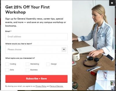
A well-designed pop-up can boost conversions, if they’re attractive, to-the-point and offer your customers exactly what they want. Wishpond has a library of professionally designed pop-ups by industry and style, templates to help you craft your messaging and guide your target audience towards signups – try it for yourself today!
Smashing Magazine
Smashing Magazine dedicated a whole landing page to its newsletter signups, and let users know what they were getting: from frequency, to the subjects of back issues, to how much promotional material they could expect.
The social proof of how many other followers there are (written right on the CTA) appeals to our psychological desire to belong to a group. And, to top it off, you get a free eBook.
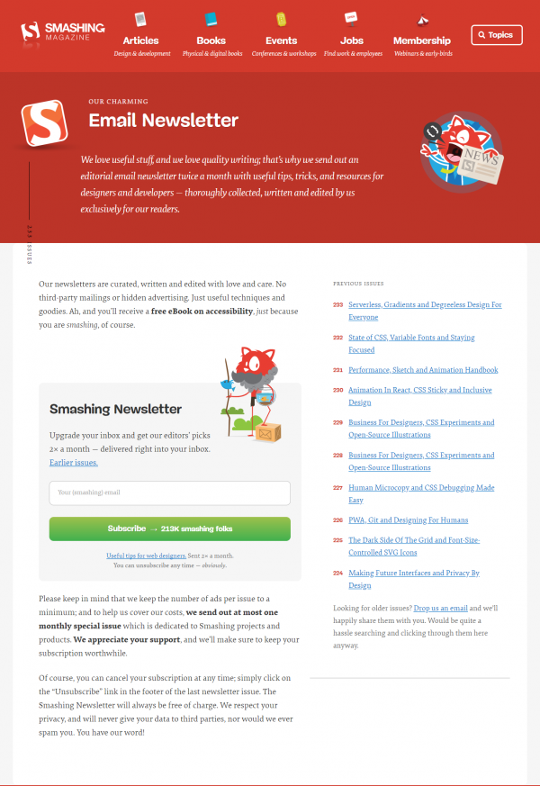
When you do sign up, you get a validating, ‘You rock!’ message, and a ‘thank you’ email along with your free ebook to ensure you feel you made the right decision and bolster your sense of loyalty.
Pro-tip: Thank you messages are important! Validate your subscribers with a welcome email, asking them their opinion or following up with offers to free content or more about your brand.
Non-profit Sign-Ups
This is a particularly challenging sphere. Unless you’re already on a person’s radar, it’s hard for non-profits to combat the image they have as guilt-mongering or fear-mongering. The last thing people want when they open their inboxes is to feel guilty, angry or afraid.
An NGO’s best tactic is to offer people inspiration and happiness, as the newsletters below did. People today are flooded with bad news, from climate change to famine to disaster. They are unlikely to respond to negativity and even less likely to invite it into their mornings.
What they are more likely to invite is positive stories, bright pictures, follow-ups to characters they’re invested in and a chance to make a real, measurable difference to causes they care about.
National Geographic
If it surprises you that National Geographic is on the non-profit sector of this, that’s a good thing. (Also, it surprised us too).
The publication is so high quality that we forget that it’s part of the National Geographic Society, a 501 c 3 organization whose remit is actually education and preservation.
They put a lot of effort into their newsletters, and offer on a variety of topics based on the reader’s individual interest. Each is filled with in-depth reporting and world-class photography.
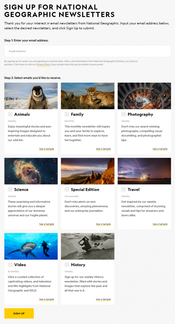
National Geographic’s budget is out of most organizations’ reach, but their genuine dedication to quality and reader interest isn’t.
The British Heart Foundation
Even non-Brits can learn a lot from the designers and writers at the British Heart Foundation, who use bright colors, hopeful imagery and creative copy to connect with audiences.
Instead of ‘sign-up’ or ‘take action’, they use thematic plays on their theme, like ‘break heartbreak forever’, or ‘learn about will power’ (to take audiences to a section of their site on leaving donations in their wills.)
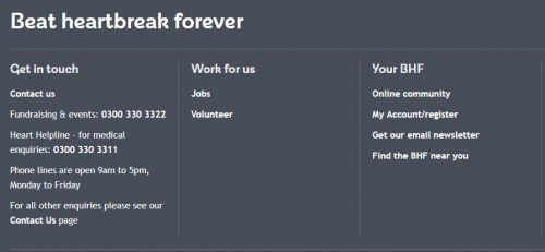
The playful copywriting takes what could be a grim theme and turns it empowering, delightful, entertaining, and something you’d want in your inbox.
Pro-tip: Putting care into the design and wording of your pages and sign-ups will go a long way to attracting subscribers. A simple, ‘sign up here’ is standard, but more eye-catching or personalized offerings let subscribers know that they’re inviting a distinct voice and brand and unique offerings into their inboxes.
News and General Interest
Curation is increasingly popular as a service, and although space is crowded, many readers are overwhelmed by how many news sources there are, and will pay for trusted, comprehensible curation.
Bloomberg’s “Money Stuff”**
Bloomberg’s ‘Money Stuff’ is written solely by Matt Levine, and many readers are loyal to the column just for his style of writing. A former consultant-turned-writer, Levine’s irreverent, sharp, insightful writing is a roundup of the day’s most talked-about (and most obscure) financial news.
The column’s subscribers come straight from Bloomberg readers who enjoy the column itself, and Levine promotes it with a pinned tweet on his own feed. (Not an insubstantial plug, from someone who has more than 80,000 followers).
hi
1. my newsletter is still free
2. it is called Money Stuff
3. you can sign up for it here https://t.co/mTlB1XlfU7— Matt Levine (@matt_levine) May 9, 2018
Wait But Why
‘Wait but Why’ is a quirky, stick-figure blog-turned-professional(ish?) content site exploring – well – anything. Written by Tim Urban, it was a blog that built up such a following, it became some form of monetized on Patreon.
Its tone is as friendly and self-effacing as it is knowledgeable, and it often pokes fun at its own stick-figure drawings, although it doesn’t shy away from revealing each post takes research, effort and discussion.
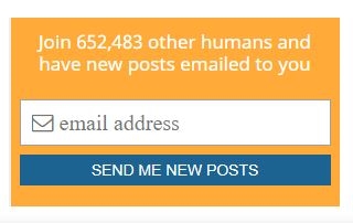
This level of transparency is endearing to readers, as is the social proof on its subscription box at the side: by revealing its subscriber count, it offers potential subscribers the reassurance of belonging to a large club: nearly 700,000 subscribers can’t be wrong.
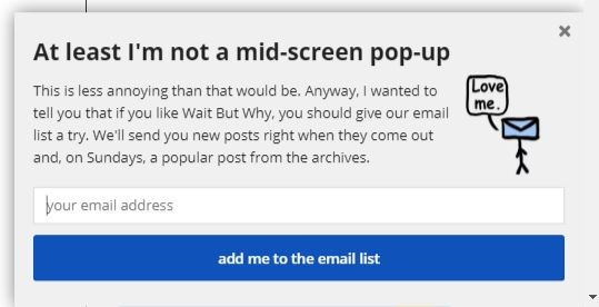
Additionally, in case you miss the side bar offering the mailing list, as you scroll, you’re greeted by a pop-up at the side of the screen. The tongue-in-cheek tone and illustration are endearing and eye-catching, are great for scrollers who ignore sidebar buttons and options (many, in the age of digital ad fatigue), but might be interested in the newsletter if they saw it.
Daily Pnut
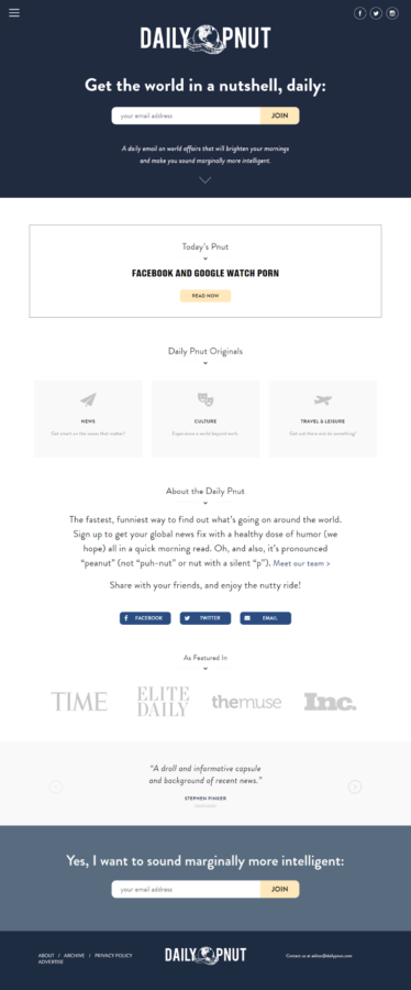
Daily Pnut is a daily curation of global news. A mix of editorial and curation as a service, its landing page is geared entirely towards sign-ups, with clear CTAs, social proof, friendly, clear copywriting that mimics the newsletter itself, and minimal hard selling.
Its product offering is both aspirational and achievable (‘sound marginally more intelligent’) and comes with approvals from academic heavyweights like Noam Chomsky, Steven Pinker and Ian Bremmer.
Need help building a landing page to maximize your conversions? Wishpond’s library of templates, segmented by industry and type, is full of expertly designed pages to help get you started – no developer required.
Summary
Overall, these newsletters show there’s no one magic way to get people to sign up for your newsletters. But it undoubtedly helps if you include:
- Discounts or sales on your products or services on sign-up
- Pop-ups to draw attention to the opportunity to sign up
- Creative copywriting (after all, if your sign up buttons are interesting, your emails probably will be too)
- Social proof (like subscriber count or testimonials from current readers or writers)
- Examples of past newsletters
Digital & Social Articles on Business 2 Community
(225)
Report Post


