If you’re interested in online marketing and you want to easily close marketing packages with clients, there are three words that can help:
- Optimization
- A/B testing
- CRO – Conversion Rate Optimization
We won’t just promote you via organic search. We’ll set up Google AdWords and A/B split test your landing pages to optimize them and improve conversion rates.

Whoa! I am totally sold. Where do I sign up?
But let’s get serious. Every now and then new buzz words pop up and become popular for a while. That is until everyone is using them, at which point a new buzz word starts to circulate. Once upon a time it was promotion on Google, then it moved to advertising on Facebook, as well as a bit on YouTube and social media. My favorite buzz word is Engagement. A bit of a bizarre word, isn’t it? Over the last two years it seems the whole subject of optimization has gained a lot of momentum. If you really wanted to, you could even call 2014 “The Year of Optimization.”
So why all the hype, and why is optimization one of the most important things in online marketing today?
The answer’s quite simple really. Let’s say you have a Google Adwords advertising campaign that brings you 100,000 visitors a month.
- Your average cost per click is 25 cents
- Total monthly expenses: $ 25,000
Any online purchase made via your site gives you a gross profit of 75 dollars. If we calculate the profit for a 0.5%, 1%, or 2% conversion rate it would be:
- 0.5% = 500 purchases = $ 37,500
- 1% = 1,000 purchases = $ 75,000
- 2% = 2,000 purchases = $ 150,000
As I mentioned above, the cost of the campaign is 25,000 dollars. In addition you have fixed costs of 15,000 dollars for the construction of the landing page, campaign management fees, design, software, and more. Total net profit for the conversion % would be:
- 0.5% = (-$ 2,500)
- 1% = $ 35,000
- 2% = $ 110,000
This is how it looks in a table:
Parameter 0.5% Conversion 1% Conversion 2% Conversion Total Visitors to Page 100,000 100,000 100,000 Cost Per Click 0.25¢ 0.25¢ 0.25¢ Total Cost of Advertising on Google $ 25,000 $ 25,000 $ 25,000 Average Conversion Rate 0.5% conversion 1% conversion 2% conversion Number of Conversions 500 1,000 2,000 Gross Profit Per Conversion $ 75 $ 75 $ 75 Total Gross Profit $ 37,500 $ 75,000 $ 150,000 Campaign Cost $ 25,000 $ 25,000 $ 25,000 Other Fixed Costs $ 15,000 $ 15,000 $ 15,000 Net Profit (-$ 2,500) $ 35,000 $ 110,000
You can now see that a campaign of 25,000 per month is not that high. A conversion improvement of 0.5% and even 1% (if there was no optimization work on this site in the past) is entirely possible. So isn’t it worth investing $ 10,000 or $ 20,000 in optimization of your landing page, if by doing so you can earn an extra $ 50,000?
Of course it is.
That’s why more and more people are realizing that great potential exists when we stop, think, analyze and improve.
Small changes to a landing page can double, triple or even quadruple the results.
Optimization Methodology
Now let’s talk about processes. Many businesses jump into the optimization process without prior planning and real  consideration. A red or green button that says Sign Up or Register Now. A long or short landing page, and a random image are common experiments that look convincing. This is especially true when the results show an increase of 88.6% after one small change. But could that small change really make that much difference? Does the fact that it worked for one business mean it will work for another? Does this mean that color X has more conversions than color Y?
Nope.
That’s why you need to do two things before you construct the optimization process:
- Define the parts of the pathway in the conversion funnel that need changing.
- Construct a process to optimize those parts.
Seven Mistakes You Shouldn’t Make When Optimizing Your Website
Mistake #1: The Micro Test
It’s great fun examining the effect of a button’s color. It’s easy, requires little effort and very little thinking.
“I read a blog post on X, showing that a red button has negative associations and therefore it has a lower response rate than green. So can you please change all the red buttons to green.”
Absolute rubbish. When you plan an optimization program, think broad. Look at the big picture. Map out the entire pathway in the funnel and think of any friction that could prevent users from taking action.
After you’ve done that, you can drill down to examine smaller changes, but even then don’t jump straight for the button’s color. Consider checking larger components that may affect behavior first. When I go through an optimization process for a client, first I make sure the message that appears on the landing page exactly matches the message that appeared in the ad. I’ll also ensure both meet the need the user expressed in their original keyword search.
Make sure the message on the landing page exactly matches the message that appeared in the ad.
I came across this ‘Home Insurance’ landing page, which looks like an advertisement for a bed company, because of a hero image of a sleeping couple.
What were they thinking? Where does it show me what it promised in the ad? What does a picture of someone sleeping serenely have to do with home insurance? (I know, you’re saying it conveys a sense of security, but to understand that can take ages. You only have 5-8 seconds to convince the visitor that they’ve arrived at the right place.)
I was looking for home insurance because that’s what I want to buy. Not a down pillow.
Mistake #2: Putting High Hopes On the Optimization Process
Optimization is an awesome thing. It can improve results by hundreds of percent, but often the problem lies in the product itself or in its target audience, and not in the color or text on a button. If you can’t sell your product to a customer face-to-face, it’s likely the product is not suited to your target audience, or you’re reaching out to the wrong audience.
Sean Ellis, Founder of Qualaroo, once defined that a product is suitable for your target audience if 40% of your users will be disappointed if you take the product away.
In short, make sure conversions are happening first. Only after you’ve done that, should you examine how to improve them.
Only after getting some conversions, should you examine how to improve them.
Mistake #3: Drawing Conclusions Too Fast
You’ve seen it before: a client asks you to examine the effect of a certain change. Two days later and after a 54% increase in conversions from one of the variations, they ask you to end the experiment and announce a winner.
Hold your horses.
Never stop testing before seven days have passed (assuming you had enough traffic on those days), and before reaching 95% confirmation that the data you received is statistically meaningful.
I often wait until there have been 100 conversions (on every variation) in addition to the above two criteria. The reason for this is you can never know if the factor you’ve examined via A/B testing is the one which led to a change in conversions.
Often you’ll notice alarming differences between days of the week, weekdays versus weekends and between different hours of the day. For a large number of my clients, conversions between 8 a.m. and 4 p.m. are higher by dozens of percent!
Another mistake that’s important to note is experimenting repeatedly “just to check”: It’s best you don’t do this.
After you’ve waited long enough to get statistically meaningful data, analyze the information gathered in the previous experiment, see what its implications are and only then start planning the next experiment.
For example, if an experiment reveals that emotive headlines have a stronger impact on your users, don’t go for an experiment that examines the color of a button. Instead examine which emotion works better: would positive emotion work better than negative? Does the presentation of the negative work better than the presentation of the positive?
But what happens if you haven’t found significant statistics after 200 leads or more? Try to run various segments such as the time of day, day of the week, type of device, country/city, and source of traffic. See if you manage to find a significant statistic for one of them. If not, perhaps your research hypothesis was incorrect and you should raise another hypothesis and examine it from scratch.
Here’s a great post by a guy named Alex, who openly shares the processes he’s working on with his startup company to create a turnover of $ 100,000 per month. His last post talks exactly about this point, that often A/B testing will not bring you significant results, and that’s OK.
In short, on the one hand be thorough and don’t jump to conclusions. On the other hand don’t be discouraged that you were unable to reach a conclusion. Just keep trying. I highly recommend using this tool that allows you to enter visit and conversion data of various landing pages. You can then test their statistical significance.
Mistake #4: Do What Someone Else Did
This is my absolute favorite. There’s nothing more amusing than reading a post showing the importance of an orange button (“because that’s what Amazon does and it works for them”) and then running and changing all the buttons on your site to orange.
It’s possible that doing this will improve your conversion rates, but you won’t know for sure until you do real scientific testing.
Mistake #5: Running Multiple Simultaneous Changes
I’m not sure if I need to tell you this, but because I’ve come across it before I think it needs some emphasis.
Never perform several tests on a number of elements at the same time.

If you’re checking the color of an “Add to cart” button, test it all on its own and wait a few days before testing the “Checkout” button. Don’t even consider testing the “Subscribe” button yet. The same goes for other elements throughout your conversion funnel.
Do one thing at a time, test, analyze, and then move on.
Mistake #6: Ignoring Minor Improvements
This mistake is common in large organizations. They tend to ignore results that haven’t reached double-digits.
Think about it: an improvement of 3% per month can bring you tens of percent improvement per year. This is without taking into account the fact that if you have TONS of traffic. An increase by even a tenth of a percent could add another few million to your bank account.
Mistake #7: Just Test
Often your client/CEO will hear a lecture about the importance of A/B testing. They’ll then hunt you down the following day insisting you to start doing it ASAP.
This is when you explain to them that, just like any academic research – without accurate formulation of a research question and hypothesis – it will be a waste of time. The optimization process should start after you have done market research and identified a number of points that could affect/hinder conversions by your users. Only after you’ve filtered down the answers, reached a few almost identical conclusions, and seen which one has the highest effect – only then is it time to start A/B testing.
Example: Not long ago, I sat and thought with a client who is a big cheese in the academic world about how to improve the percentage of leads on their landing page. He went on about how we should phrase our headlines to convince users to leave their details in the space provided.
After much discussion we hadn’t reached a conclusion, or at least none we were willing to sign on. So we decided to do a short market survey and ask our customers, the prospective students, what they thought.
After thorough research, we discovered that at the stage where we’d been trying to sell them our product, the product wasn’t even on their minds! They hadn’t noticed the message we’d tried to convey. Only half a year later would they begin to debate where to study, at which time they would open their eyes and notice the marketing messages designed to get them to register.
As a result, we completely revamped the language of the landing page to conform to customers at the early stages of the funnel. It was then much easier to see which headline worked better.
In a nutshell:
Long before you think of A/B testing, get to know your target audience and their needs.
Finally, Some Important Points
1. Conversions Are Great, But Aim To Increase A Customer’s Lifetime Value – LTV.
A 200% conversion won’t help if your product doesn’t provide value to the people purchasing it. It’s possible your customers’ expectations of a product are greater than what it can realistically deliver. Essentially you’ve made the product sound life-changing, when in reality it won’t change your customer’s life. This causes customer disappointment. You’re not delivering what you promised thus they’re unhappy with their purchase.
Disappointment may also stem from customers not knowing how to use the product properly.

It’s important to provide that knowledge with the purchase instead of looking only at the short-term.
It reminds me of all the people who say that “Advertising on Google AdWords is rubbish”, because they tried to go it alone and had no success. So it could be that optimization sent your conversion rates rocketing, but ultimately if your customer wasn’t able to enjoy the product as expected, you’ll take a serious hit somewhere down the line.
2. Never Perform An Experiment Without A Question And Hypothesis
In real studies, there is no such thing as research without a research question and hypothesis.
Every serious study opens with a question like:
In this study we would like to examine whether advertising on Google’s content network works better than Facebook.
This research question is exactly what the study aims to examine.
A research hypothesis (one or more) is a claim that the research will either prove or disprove, and is based on certain rules and relationships between variables. For example, a study that examines the effectiveness of Google vs. Facebook, the hypothesis could be that:
There is no difference between the Google Display Network and Facebook. This is because both involve a passive user search, as opposed to Google Search in which the user is active.
The study examines whether there is a relationship between the level of involvement and the conversion potential of a user. After this we can start to run campaigns to see if the hypothesis is correct.
The reason this is important is because a change in the color of a button or the location of a form can be interesting. However if there is no logic behind the experiment, the chances of it actually leading you to meaningful conclusions are incredibly slim.
For example:
A possible research question might be:
Should text on a button in a landing page that takes leads to Google advertising appeal to a user’s emotion or intellect?
The hypothesis would be:
People hate to be suckers when it comes to services like Google advertising, so appealing to emotion (“I’m sick of paying Google so much money. Tell me how to save 40%!”) would be more effective than appealing to intellect (“Register now and find out how to save 40% of your Google costs”).
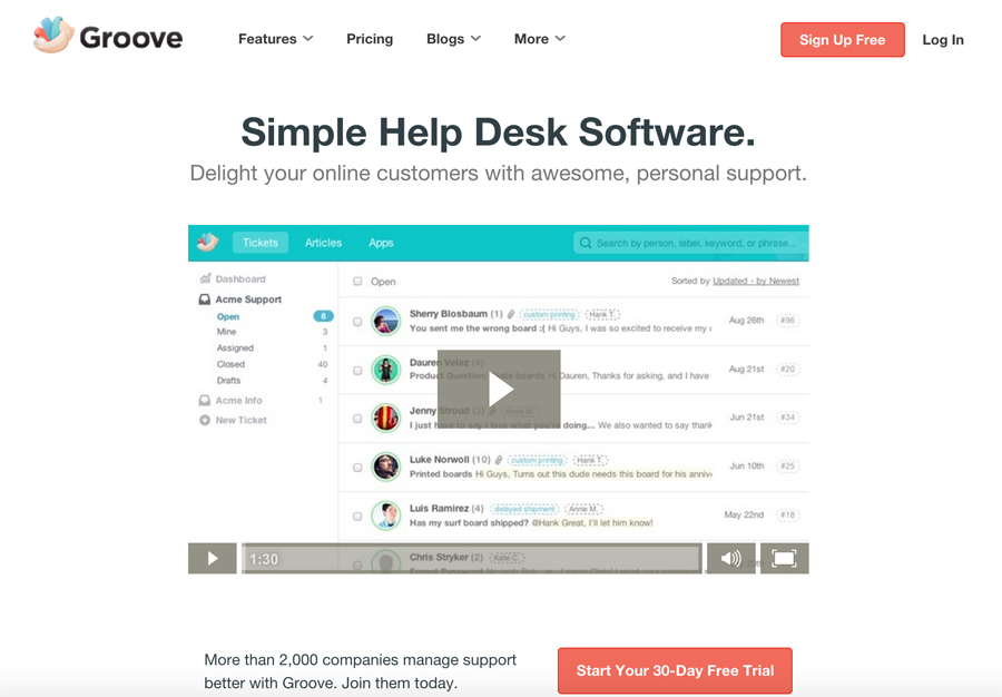
Here is an example of a landing page for GrooveHQ, with one variation stating simply, “Sign up Free” (this is, after all, the phraseology users are familiar with when registering for a web service): 
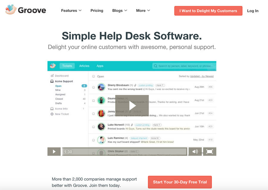
For the second variation, they used a phrase that appeals to a user’s “self,” and gets the user on board by making them want to come of their own initiative, without selling it to them:

Here’s another fine example of a case study performed by SONY, to see if what motivates their customers is customized computers, or the computer’s price. This example is a good one because it has everything you need in the construction of the optimization process:
- The current and problematic situation (insufficient response to banners)
- The research hypothesis (consumers get confused from two different messages in one banner)
- The definition of the variables in the experiment (the two messages)
- The performance of the actual experiment
Summary
This post focused on the most common mistakes of the optimization processes (mainly A/B testing). In future posts I want to talk about some slightly heavier things on the macro level, such as the design of goals, panels, segmentation, brief writing, persona characterization and more.
Now, it’s your turn:
Have you had the opportunity to give optimization a go? What do you think is the correct work model? Do you have interesting insights that are worth learning from?
Digital & Social Articles on Business 2 Community
(391)
Report Post


