Have you or your company brainstormed for creative email marketing designs only to come up short with clicks and conversion?
Outstanding email marketing designs have long been an integral part of marketing campaigns—like with Amazon, Nintendo, Spotify, Netflix. These companies are known for their emails that we can actually decipher the best email practices with their own campaigns. We all know that directing people to open your emails is not easy. Actually, it’s stated that almost 300 billion emails are sent and received daily since 2017 and is expected to increase in 2020. So, you can imagine how difficult it is to capture people’s attention.
As a matter of fact, experts say people have an attention span of only 8 to 11 seconds when reading emails. With this in mind, email marketing designs have drastically changed over the years to cater this psychology. Marketers and copywriters have been looking for ways to fit into those short seconds and still make people take action. A pool of surveys and articles from marketing experts have talked about the best email marketing designs and practices being done today and with AI-technology and ever changing trends, it’s really something to consider when making emails.
The Dawning Age of Automated Emails
Artificial intelligence and email marketing designs are no strangers to each other. In fact, AI practice has seeped its way into the very channels we communicate with our audiences. The ability of AI to change how customers receive emails from us are still being developed (so it’s alright if you’re not using it yet). From personal recommendations to synchronized channels, AI is a step towards progression and can help tap into new ways we can do email marketing.
But this does not mean that AI is perfect (and will replace your job at your company). AI functions to perform the metrics it is asked to do—and only just that. Take for example opening emails. The amount of times recipients open emails they’ve received are measured by marketing tools. And it seems certain words like ‘urgent’ or ‘alert’ have the power to make people open their emails more often. But let’s say your company’s used AI to send out this email ‘Urgent—this is very important for you to see’ and the email contains a sale of a product, this could ruin brand trust if customers often receive email subject titles that make them feel like they’re in danger of something and could lead to spam filters and unsubscribing customers.
We can all agree that AI makes certain tasks easier. But they can’t replace human emotion or empathy that most marketers and copywriters often hold close and impart whenever necessary.
Top Email Marketing Designs
There is no wrong way to create emails but the best email marketing designs convert more. One thing expert marketers always keep a close eye on is how email campaigns are changing. And we took the liberty of making a list here in order for you to know and apply on your own emails.
1. Personalization and dynamic emails for more personal content
Personalized content and dynamic emails are the top priority for more conversion and response. In fact, AI has a role to play when it comes to these personalized content. Through AI, customer behavior can be used to highlight products or services that they like and can be placed in the email you send them. For example, the items they have browsed or have placed in their shopping carts can be used to recommend related items. Another would be updates to features they commonly use.

Source | ReallyGoodEmails
Take this email from ReelGood for example. Through the streaming service’s AI, their email contains personalized recommended movies dependent on the customers streaming habit—and even has an option to ‘See Your Recommendations’ button clickable through the email. Though AI still has to perfect its algorithms to take this further, what we have now can certainly yield the same results. The email itself is strong enough to make customers click on their website, get more views, and gain more trust more other customers.
2. Interactive and engaging content to keep people in full attention
Interaction, gamification, and engagement are the second most important things tied up in email trends next to dynamic, personalized content. In fact, AI research is being conducted to optimize interaction through emails like having an integrated cart or ‘1-click buy button’—similar to Amazon—contained in the email. But AI isn’t capable of that just yet. In this age where the world is always pressed for time, an interactive email comes off as a 5-minute break time for readers, and that removes the impression that whatever your email contains is taxing to read.
A great example of interactive content are those feedback boxes to submit ratings or reviews. Take a look at this email by CodeCamp:

Source | ReallyGoodEmails
The email starts off with a relatable introduction (and a really good image on top) and asks the reader, who we can assume joined CodeCamp, to leave a review themselves at the bottom by adding a clickable button at the end, offering convenience and time-saving option. Engagement? Check. Interaction? Check.
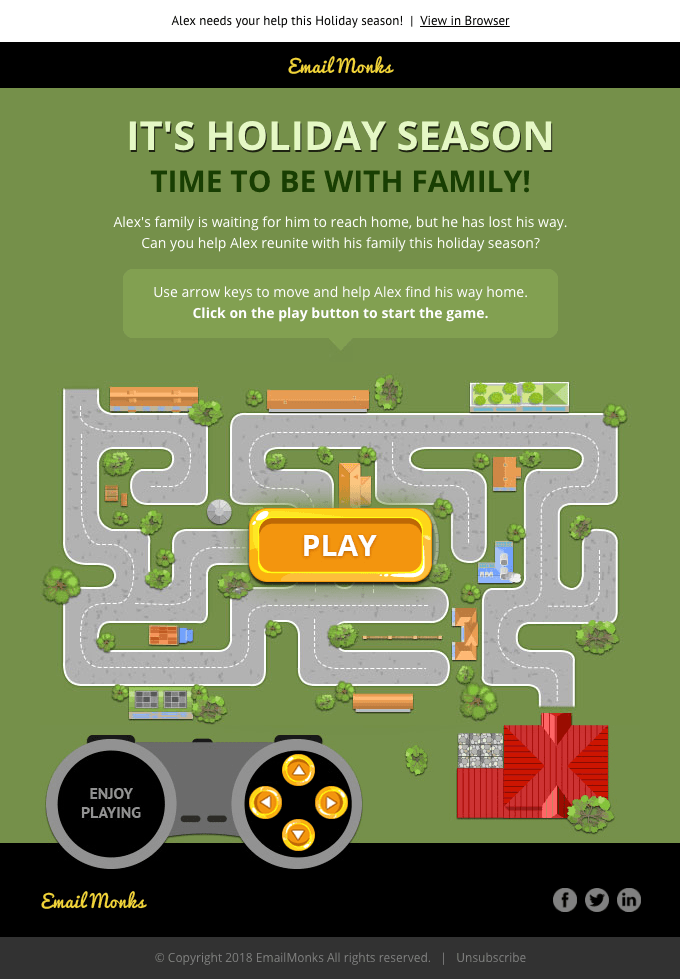
Another popular example that is taking email marketing design by storm are games like this one from EmailMonk.

Source | ReallyGoodEmails
Instead of the usual “Happy Holiday” cheers, EmailMonk opted to greet people with a mini-game that reminds people of the true meaning of the holiday season. This email stands out from the usual monotone greetings we get from email subscriptions and takes advantage of a fun, gamified email that leaves a good impression from customers.
3. Innovative live content
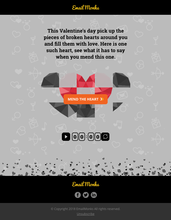
The reason email marketers love to use live content is not only does it bring something different, but it also makes your subscribers open your emails more than once when done properly. Live content may contain weather updates, event countdowns, up-to-date inventory lists, live sports or event results, medals, or trophies. These content change in real-time and makes use of live content format better than anything else. Take a look at another example from EmailMonks:

Source | ReallyGoodEmails
This email can be sent a week ahead or a month ahead of the event date and customers may open them at different times. A countdown to Valentine’s Day can be seen and starts the moment the email opens. Not only does this give a personal touch, but the email combines utility with innovation enforcing engagement AND re-engagement when customers open them again. This email could act as a reminder of your event and at the same time provide details and a call-to-action that would certainly seal the deal.
4. Animations like GIFs, CSS, etc.
While text and copies are important, they work best with great animations. Customers often have better brand retention when animations come into play. It also makes people recognize your company more and would further engage them into reading your emails completely. Whether done for humor or amazement depends largely on your target audience. The millennial generation for example loves funny animation. Take a look at this Lyft email here.
This Lyft Scooter was so successful because the seemingly possessed scooter seen in the email was placed right at the center of the email and would immediately give the reader what the subject is. It’s simple, yet captivating and fun to look at it. And it works very well.
Take note of the simplicity of email marketing designs done by Lyft here. Emails can become a huge pile of animation garbage and rather do the opposite thing you’re expecting. Animation-loaded emails would definitely make your customers click away if they take too much time to load.Your animations should be kept to a smaller file size, accommodating everyone with various network speeds and those people who don’t have time to wait for your GIFs to load (8 to 11 seconds, remember). It’s all about finding a good balance of uniqueness and simplicity.
5. Synchronized emails with other channels
Again, AI is not yet capable of synchronizing emails completely with other apps or digital platforms like website log-ins. That would take some time. What we mean with synchronized emails is the content must be similar with other forms of media like social media, webpages, and landing page. In our experience, our clients prefer having multiple channels containing similar things instead of isolated updates and content being sent out through email. And they also reported success with these kind of email marketing designs.
If you’re going to announce a new product, disseminate the information across all your available channels. Customers respond to that more, and would make yourself easily searchable with search engines in the end. Two birds with one stone.
6. Accessibility and empowerment through technology
A few blog posts before, we talked about how voice search marketing is becoming an emerging marketing trend. That’s because nowadays we are gravitating towards a more inclusive form of business activity and customers (and with some genuity, top businessmen) have a preference for businesses that empowers people with disabilities and the marginalized.
A good example, emails can make use of voice assistance for people who have reading impairments. Some companies make the most out of voice assistants like Alexa, Bixby, and Siri by integrating them with their emails. The thing is, the use of voice assistance helps all audiences by providing accessibility to people with vision impairment, while at the same time providing emphasized engagement to all your customers.
Undoubtedly, marketers are shifting to a proactive approach to email accessibility through the use of technology. And this trend is most likely to stay. Features like vision support and color-blind assistance are no longer uncommon. And ultimately, this would help you encapsulate even a broader audience and would add to better branding.
7. Templates whenever necessary, drop it for one-time use
Emphasis on: whenever necessary. Email templates can help shape your business brand. A great example would be your own subscriptions. Check out how some emails have similar templates. If you ever wonder why some companies do that, because this gives branding and allows customers to expect emails from you on those certain things like updates on your website, your products, or your services.
But for one-time announcements, dropping templates altogether would be a good idea. For announcements that are too important, you can opt not to use a template to avoid fatigue and inattention.
Remember Email Marketing Designs Change Over Time
The ones listed above are showing trends that come and go and trends that stay. But our audiences would always feel fatigued by repeated trends. Considering that emails fly through the internet at a crazy speed, our jobs have become more dynamic than ever. The digital age asks us to be more proactive and more attentive to what our customers our looking for and to look out for technological advancements that would revamp how we should brainstorm ideas. Email marketing designs would always reflect what the customers want and need. So you should make the most out of it.
Digital & Social Articles on Business 2 Community
(29)
Report Post


