— June 30, 2017
You’re probably familiar with popups.
You might even be using them already.
And if you’re not?
You’re missing out on a TON of sales opportunities.
In fact, when following best practices, it’s not uncommon to increase your conversion rate by as much as 1,000% by using popups.
But it’s not only SaaS companies and information marketers who are benefiting from popups; many e-commerce stores are using them to their advantage, too.
In this post, I’ll share with you seven e-tailers who are using popups to engage their visitors and what you can learn from their success.
7 e-commerce popup examples that won’t hurt the user experience
1. Soaked In Luxury
Many e-commerce stores are using popups for list building. And for good reason:
They’re highly effective at generating leads (if you do them well, that is).
Soaked In Luxury is using them, too, and they’ve created an amazing popup:
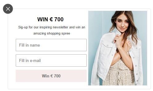
As a lead magnet, they chose a competition with a great prize:
Money.
All you need to do is sign up for their newsletter and you’re in for a chance to win a free shopping spree.
Not bad, right?
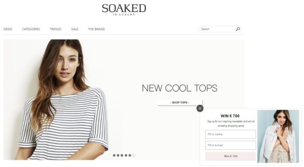
Moreover, the popup’s design is consistent with their site.
Soaked In Luxury has used the same tone of colors, a white background and an overall simple design for both their website and their popup:
My favorite part?
Their call-to-action (CTA) copy.
Unlike other sites that ask visitors to “Sign Up!”, Soaked In Luxury invite users to “Win €700.”
Writing benefit-driven CTA copy that’s consistent with the popup’s headline not only addresses what’s in it for the reader; it drives a ton of conversions.
2. Matas
Popups are good for more than list building:
They can also help improve the user experience on your site.
Take, for example, Matas, a Danish drugstore chain.
They’re using a popup to guide their visitors in making the right choice of foundation:
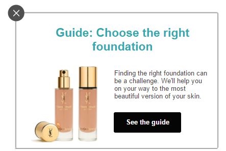
This popup is only shown on the right side of pages with facial products making it informative rather than intrusive.
Furthermore, it has a clear CTA with copy telling you exactly what you’ll get from the guide.
The fact that they added an image of foundation makes the popup drive more conversions. It attracts the attention of the visitors and helps them quickly understand what the popup is about.
3. B&O Play
Some popups can also be used to survey visitors.
B&O Play created this popup to asks visitors which color they liked the most for a particular product:
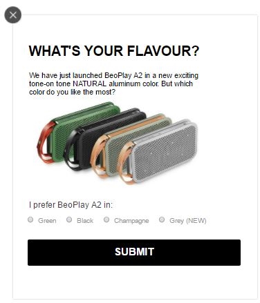
This popup helped B&O Play discover which color their customers preferred while helping them promote the new grey BeoPlay A2.
The simple design of the popup makes it pleasing to the eye, and the white background makes the different colors of the product stand out so visitors can easily decide which is their favorite.
The use of checkboxes makes it easy for visitors to quickly answer the survey, submit their answer and return to shopping.
4. Nordisk Film Cinemas
Popups can also be used to attract new membership customers—especially if you offer a nice freebie along with the membership as Nordisk Film Cinemas has done in this popup:
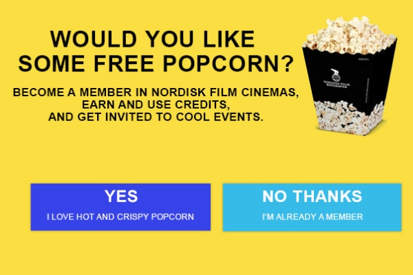
What makes this popup unique is it has an enticing headline (who doesn’t want free popcorn?), copy explaining what members will get from becoming a member, and an enticing CTA.
They’ve also added an image of popcorn which makes the popup even more irresistible. It drives more conversions by attracting the attention of more visitors.
5. Livingshop
Livingshop, a Danish store selling designer furniture, found a clever way of making visitors return to their site.
They made a popup Christmas calendar.
By telling visitors they would offer something new every day until the 24th of December, they build a curiosity gap into their user experience (who knows what they might offer tomorrow?).

By making a Christmas calendar of popups, Livingshop turned the popup into something exciting instead of something intrusive.
Rather than scare customers away, this popup invites visitors to return the next day to see the new offer.
The popup has a simple and clean design with natural colors and an image of Christmas presents which intensifies the mystery of not knowing what the offer is.
By telling visitors they can “Save up to 50%…”, Livingshop makes the visitor interested without revealing what the exact offer is.
6. Datamarked
As mentioned, popups can also be used for surveys. For instance, you can ask your visitors what they think of their experience on your site or how they heard about you.
You could choose an exit intent trigger to ask abandoning visitors what they think of the user experience on your site.
Or, you could choose a time-based trigger on your success page and ask visitors who just bought a product for feedback.
Datamarked did the latter on one of their sites:
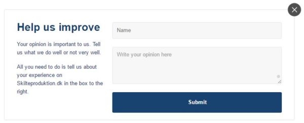
This popup has given them a lot of valuable feedback that they have used to improve the user experience on their site and more.
7. NetLingeri.dk
Popups are also a great way of catching abandoning visitors and making them stay on your site.
Netlingeri.dk does this by offering visitors who are abandoning products in their cart a discount of 10% that they can use now or later:
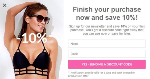
The popup is triggered by an exit intent which means the popup will hardly ever hurt the user experience because the visitors who see it were already leaving.
So either the visitors exposed to the sleeknote will leave like they intended in the first place, or they’ll stay for their discount code and on the same time get signed up for NetLingeri’s newsletter.
You’ve got nothing to lose with a popup like that.
Conclusion
As you can see, popups are good for many things (not just list building) and often, they can actually improve the user experience on your site rather than hurt it.
So if you’re not already using popups, you should get started right away. I hope these examples can be of some inspiration when you create your first one.
All of the popups in this blog post were made with Sleeknote, a lead generation tool that helps you generate quality leads through your website. Try it here for free.
Digital & Social Articles on Business 2 Community
(80)
Report Post

