— February 12, 2018
In a digitally-driven world, the devices are getting smaller and the messages crisper. Your emails need to fit into this world and grab the attention of your target audience. It’s not as easy as it sounds.
Minimalism became a part of the visual arts at the end of the Second World War. However, today minimalism has become more of a necessity for aesthetic and attention-grabbing designs. So, how would you describe minimalistic design? When you strip the design to its basics and keep it simple, it becomes a minimalistic design. There is an absence of unnecessary features, which used to be added earlier to give ornamental effects to the design. With minimalistic designs, the white space provides the much-needed impact and pleasing look to the email.
As an email marketer, you cannot ignore this trend and should be aware of the best practices involved in creating a minimalistic email design.
Best practices to design minimalistic emails
A perfect balance between the visual elements, i.e. images, video etc. in the email design and the typography is essential for the design to work. The visuals should not overbear the content and vice versa. You can pair simple visuals with interesting quotes to create this balance.
Effective use of the grid
The use of the grid in creating a minimalistic design will help make sure you don’t add any extra elements to your design. The placement and structure of your email design can be planned with ease when you use the grid.
Opt for clear typography
The choice of typography is very crucial to your email design. It should be in sync with your brand’s image. Use a single font throughout the email. The text should be aligned to the other elements in your email.
Be direct with communication
With minimalistic designs, you are dealing with fewer elements. It is important to communicate your message as directly as possible. This would help improve engagement.
Use of icons
Icons can help communicate what you want to say effectively. As the use of text ought to be less, in this case, it is important to choose the right icons in your email design.
Choice of colors and use of symbolism to communicate the message is also an essential aspect of the minimalistic email design.
A lot of brands have successfully used minimalistic email designs to communicate and convert their customers. Let’s have a look at how they have done it.
Minimalist Brands
iMac Pro
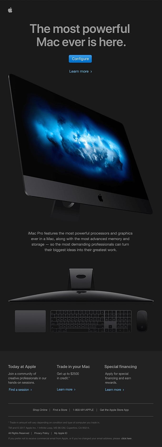
Apple is known for sending out minimalistic emails. They prefer the clean design and simple fonts to communicate their message. This campaign for iMac Pro is no different. The color and the iMac Pro image balance out in a definitive way. The images convey what the email wants to say directly.
Herman Miller
You can include several images and still create a minimalistic email design. Herman Miller’s email is an apt example of this. The call-to-action is quite prominent in the email, and the hero image helps communicate the message effectively. The white space is well-balanced in this design.

Casper’s
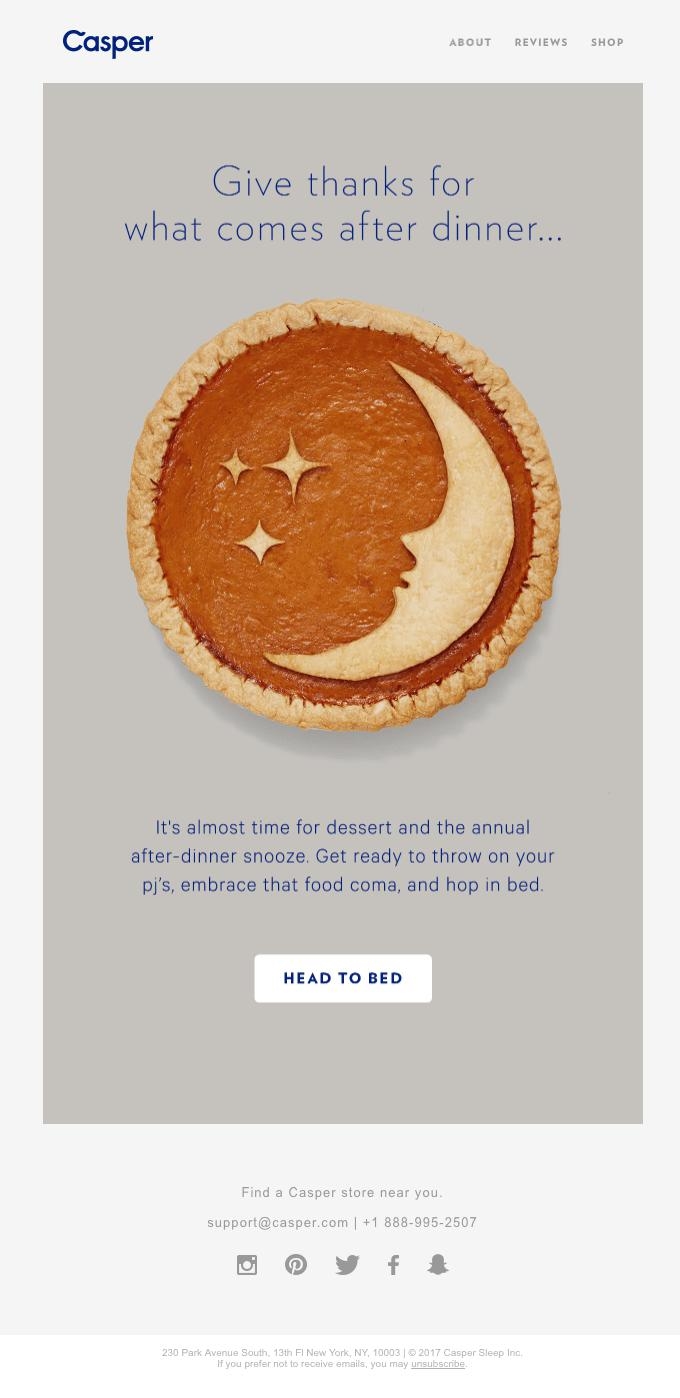
What better way to end a Thanksgiving dinner, than a good night’s sleep. Casper knows this best and has put out an email campaign for this. The image followed by a content that communicates this message makes the email look pleasing. The call-to-action is quite promising; the target will surely click on it.
Nest
ADVERTISEMENT
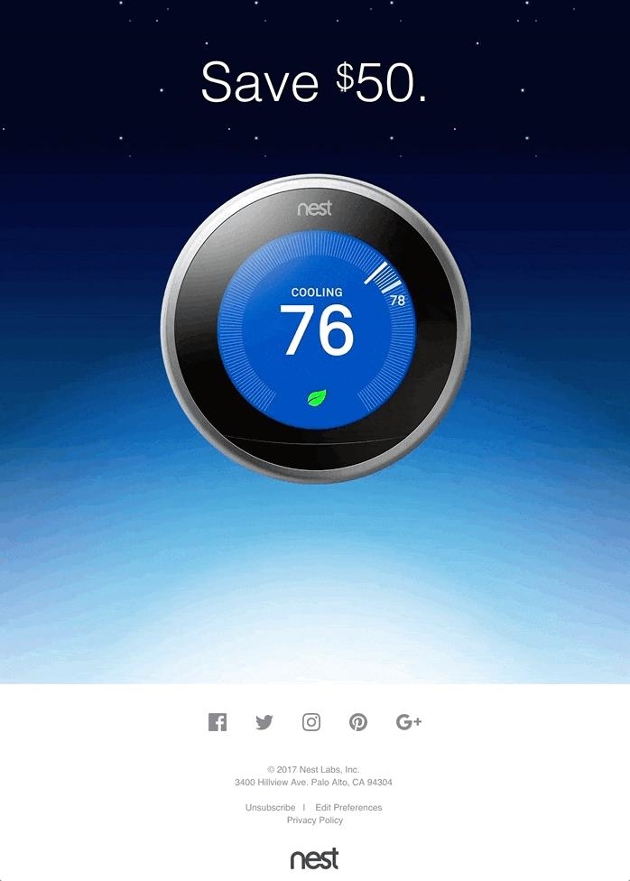
This energy savings campaign by Nest to promote its thermostat proves how you can design a minimalist email while having interactive elements. The brand has used GIF to promote the discount it is offering.
Chop Chop
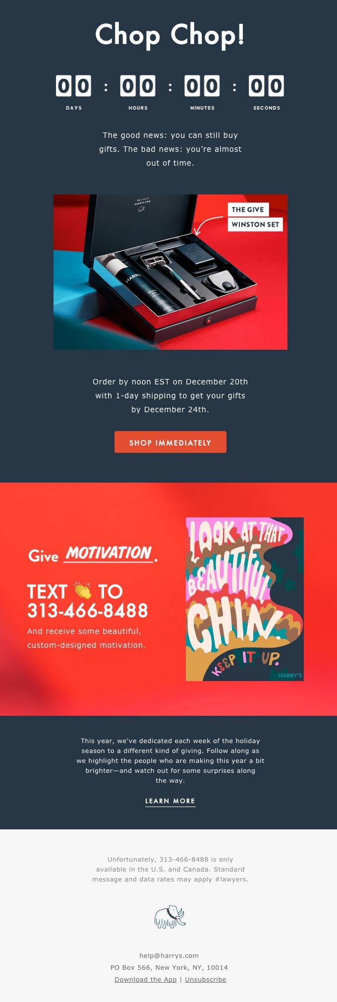
Adding the countdown to your email helps create the necessary impact. It helps communicate “you are running out of time” and gets people to hurry up with their orders. Fewer words and better impact- that’s what you get by adding the countdown to your minimalist email. Chop Chop’s holiday email has done this brilliantly. The consistency in fonts and the choice of colors help them stand out in the competition.
Bose
The email campaign for the soundsport pulse wireless headphones by Bose has a balanced and clean design. They have an underlying theme “taking the workout to the next level”, and you can see it throughout the email i.e. in the content and the visuals. The same call-to-action has been placed in two different places within the first scroll, demanding an action.

Illustria
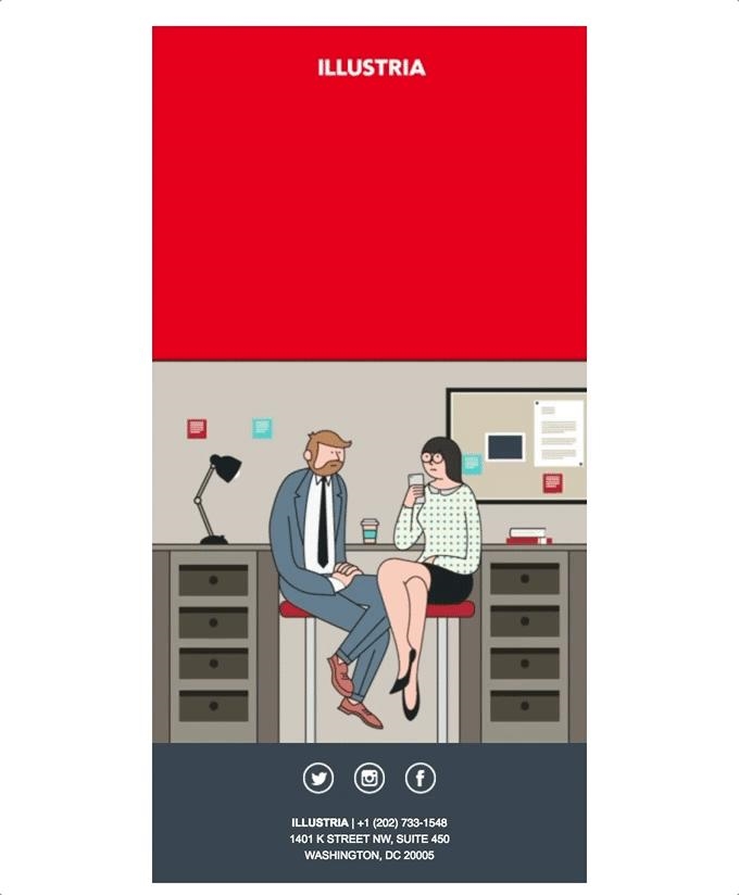
The Labor Day campaign by Illustria is the perfect example of minimalistic design. A GIF with a few words is used to communicate the entire message.
Wrapping up
Minimalistic designs give out a very simplistic yet aesthetic appeal to emails. You can add interactive elements to the emails for improved engagement and conversions.
The choice of fonts and colors plays a vital role in designing your email. Make sure you use the grid for better use of white space, and a balance in the design.
Have you been using minimalistic design in your emails? Let us know about your experience in the comments.
Digital & Social Articles on Business 2 Community
(38)
Report Post